
Rohan Jat
YouTube Thumbnail & Social Media Designer for Creators
New to Contra
Rohan is building their profile!
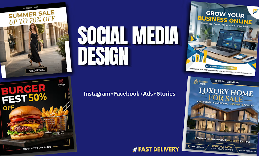
The goal was to demonstrate range — showing I can design for completely different industries, each with its own visual language, rather than having one "look" that gets forced onto every client. Fashion, tech/business, food, and real estate all sell very differently, so each piece needed its own color logic, tone, and hierarchy while staying consistent in production quality.The
Problems I Solved -
1.Every industry has a different "trust color," and using the wrong one kills credibility.
Luxury fashion needed black/gold (premium, aspirational). Business/tech needed blue with yellow accents (professional, energetic, growth-signaling). Food needed red/yellow (appetite-triggering, urgent). Real estate needed a dark navy/gold palette (stability, high-value). Applying one "template style" across all four would have made at least three of them look wrong for their market.
2.Balancing bold text with photo-realism.
Every design combines a photographic background with punchy typography sitting on top. The recurring challenge is that big bold text can easily overpower or clash with a photo. I solved this with consistent techniques: dark gradient overlays or solid color blocks behind text (not directly on busy photo areas), and keeping headline text limited to 2-3 words max so it reads instantly.
3.Making a static image feel "scroll-stopping" in under 1 second.
Social feeds move fast, so each design leads with one dominant visual hook — a model mid-stride, a dashboard on a laptop screen, a fully-loaded burger, a house with pool lighting at dusk. The hook comes first, offer/message second, CTA last, always in that visual order.
4.Consistent CTA placement and clarity across every format.
Every design ends with one unambiguous action — "Explore Now," "Get Your Free Strategy," "Order Now," "Contact Now." No competing buttons, no more than one instruction per design, so viewers aren't stuck deciding what to do next.
5.Designing for both feed and Stories without losing legibility.
Layouts were kept in safe zones with enough padding around edges, so the same core design translates cleanly whether it's cropped for a square feed post or a vertical Story.
Attraction Principles Used Throughout
Industry-specific color psychology instead of one default palette
Single visual hook + single CTA per design, avoiding clutter
Typography hierarchy — headline size always dominates subtext and CTA, so the eye has one clear path
High-contrast text placement — text always sits over darker/solid zones, never directly over busy image detail
Fast delivery emphasis — production speed was also a deliverable, not just the visuals
Result
A 4-piece set proving adaptability across verticals — same design discipline (hierarchy, contrast, one clear action) applied consistently, but tailored visual language for each specific audience and industry.
1
12
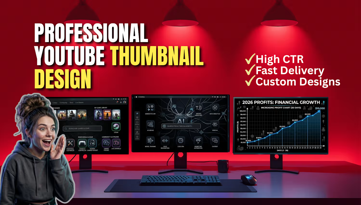
i have created this thumbnail for demo purpose to show my design creation skill using canva
1
51