
Rodrigo Martínez
UX & Visual designer crafting impactful brands
Profile in progress
Rodrigo is building their profile!
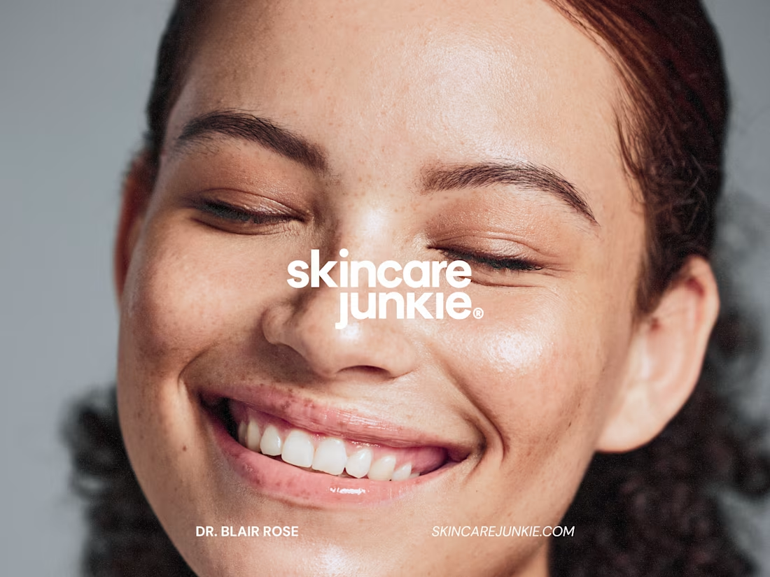
How do you get skincare enthusiasts to actually understand a product — not just scroll past it? 🧴✨ That was the challenge behind my work with Skincare Junkie in 2025.
The goal was to create multiple marketing campaigns that genuinely resonated with skincare lovers, paired with a homepage built to convert.
So instead of leaning on hype, I focused the strategy on engaging storytelling and ingredient education — helping people understand not just how each product enhances beauty, but how it promotes real skin health. On the homepage side, I reworked the UX/UI to guide visitors from that first spark of interest all the way to conversion.
The result was a set of campaigns and a homepage experience that spoke the language of skincare junkies — and moved the needle on conversion in 2025.
Curious to see the full picture? I've put together the complete showcase — campaign work and UX/UI breakdowns — over on Behance: https://www.behance.net/gallery/242050641/Skincare-Junkie-Campaigns-2025-by-OC
(https://www.behance.net/gallery/242050641/Skincare-Junkie-Campaigns-2025-by-OC)#MarketingCampaign #BrandStrategy #Storytelling #ContentStrategy #DigitalMarketing #CreativeDirection #Branding
1
1
27
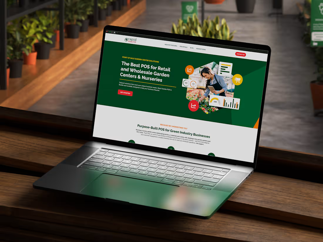
How do you fix conversion without buying more traffic?
RapidGarden is a point of sale platform for garden centers, part of the RapidPOS family. Great product. Loyal customers. But a website that looked like it escaped from 2008.
The instinct on everyone's mind was simple: get more people to the site. My read was different. The traffic wasn't the problem. The destination was. Slow pages, spam-magnet forms, and copy that talked about "POS software" while actual buyers were searching how to keep their garden centers running.
So instead of chasing a bigger crowd, I rebuilt the front door. A design system tied into the RapidPOS ecosystem, responsive templates specified down to every breakpoint, and a blog rebuilt around real research instead of feature dumps.
The payoff was almost suspicious: MQLs up 157%, organic conversions up 62%, engagement up 90% year over year, cost per lead down 55%.
Turns out the growth was never hiding in more traffic. It was hiding in trust. Where do you spend your effort first: getting people in the door, or giving them a reason to stay? 👇
#uxdesign #productdesign #conversion
0
36
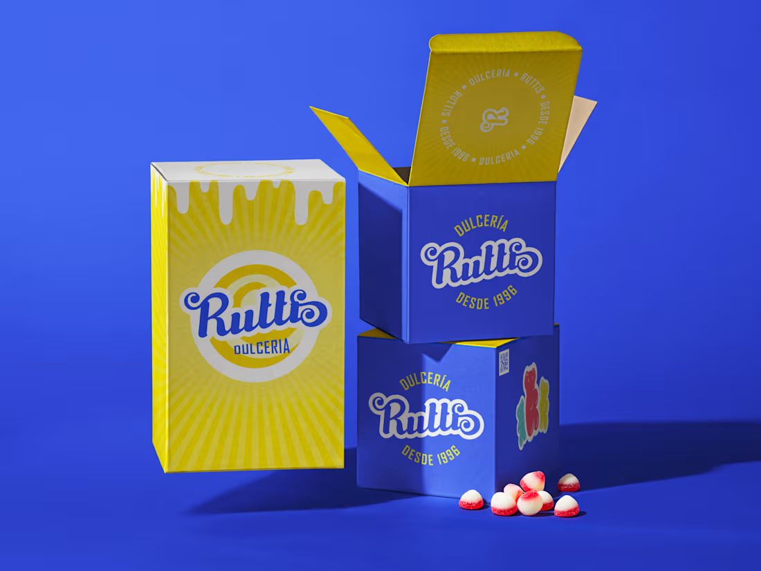
Dulcería Ruttis is a personal branding project created for a small candy shop in Mexico City that has been sweetening life since 1996. The identity captures the joyful, nostalgic spirit of a classic neighborhood sweet store through a bold and playful visual language. Anchored by a vibrant blue and yellow palette and a friendly script logo, the brand feels both cheerful and confident. A signature gummy bear mascot and a lively set of candy illustrations, including lollipops and jellybeans, bring energy and personality across every touchpoint, while "quality guaranteed" badges reinforce the shop's long standing reputation.
1
87