Richard Bernard - Backend Engineer | ContraWork by Richard Bernard
Richard Bernard

Richard Bernard

Product designer( figma ) Framer developer (framer)

Ready for work

Richard is ready for their next project!

So I took a job from a client that wanted a website for his hotel.....so I said so no more, so I built this in two weeks! Take a look. https://deluxe-gumdrop-7f79ac.netlify.app/
1
11
Cover image for Most finance apps don’t fail
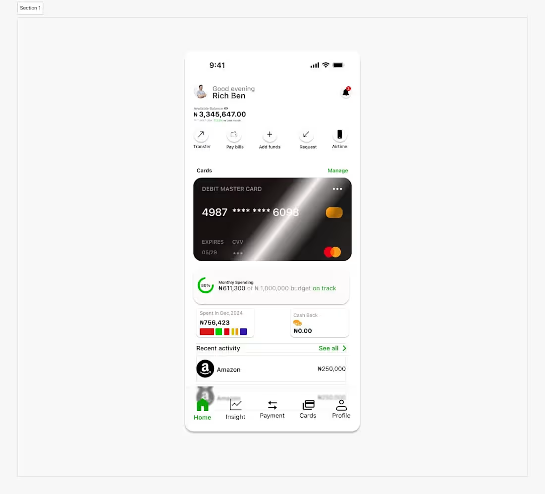
Most finance apps don’t fail because they lack features. They fail because they feel… overwhelming. Too many numbers. Too many buttons. Too much thinking. So I asked a simple question before designing this: What if managing money felt calm? Not stressful. Not confusing. Just… clear. This concept is built around that idea. The moment you open the app, you know exactly where you stand. Your balance is visible. Your actions are obvious. Your spending is quietly guiding you in the background. No noise. No friction. No guessing. Because good design in fintech isn’t about decoration—it’s about trust. Every spacing choice, every icon, every card, every interaction is intentional: → To reduce cognitive load → To make decisions faster → To help users feel in control of their money This is how I approach product design. I don’t just make screens look good. I design systems that solve real user tension. For founders building in fintech (or any product that handles complexity): You don’t need more features—you need clarity. That’s what I bring to the table. — Open to working with teams building meaningful digital products.
1
10
Cover image for This is a one page
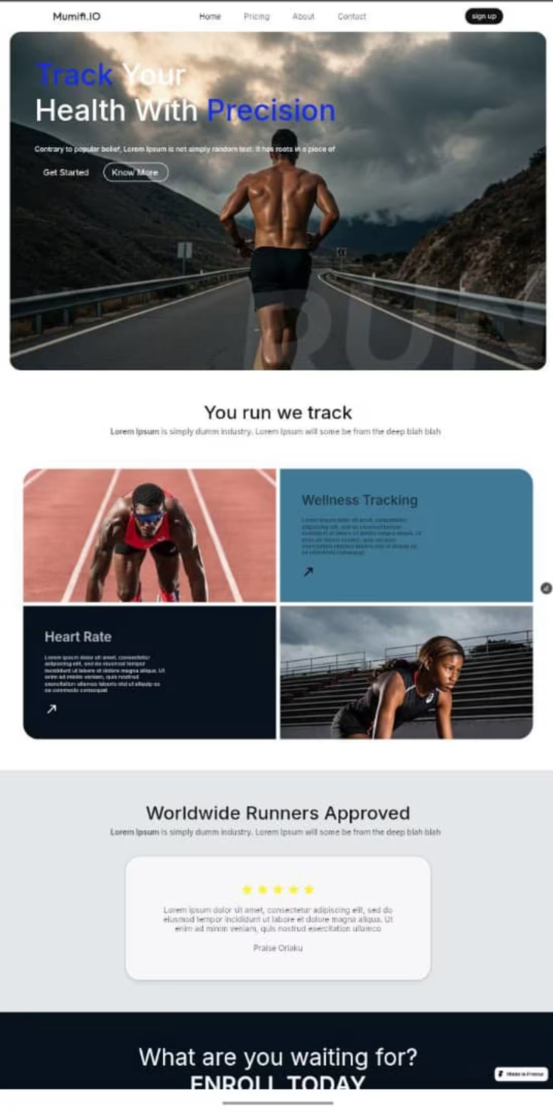
This is a one page a framer website.
2
2
42
Cover image for Real Estate CRM Dashboard Design
I
Real Estate CRM Dashboard Design I designed a premium Real Estate CRM Dashboard to help agents manage leads, deals, and showings in one streamlined workspace. The goal was to create a clean, action-oriented interface that improves daily productivity and gives teams clear visibility into their sales pipeline. Deliverables Dashboard analytics and KPI cards Hot leads tracking table with quick actions Deal pipeline overview Modern dark UI system with consistent components Tools: Figma • UI/UX Design • Product Strategy This project showcases my ability to design scalable, data-driven dashboards that are both functional and visually polished.
2
50
Cover image for What do you think about this video streaming app?
What do you think about this video streaming app?
0
17
Cover image for Redesigning the way we experience movies on mobile 🎬📱** Th...
Redesigning the way we experience movies on mobile 🎬📱** This concept explores a movie streaming app UI inspired by The Matrix — focusing on clarity, immersion, and ease of use. Key design highlights: Bold visuals that set the mood instantly Clear CTAs like Watch Now, Add to My List, and Trailer Smooth navigation from discovery → details → action Content-first layout that keeps users engaged without friction Good design isn’t just about how it looks — it’s about how effortlessly users move from interest to action. Would you watch a movie on this interface? 👀 Let me know your thoughts.
1
19
Cover image for Crypto Wallet App UI Concept A clean and user-friendly crypt...
Crypto Wallet App UI Concept A clean and user-friendly crypto wallet interface designed to make managing digital assets simple and intuitive. The dashboard gives users a quick overview of their total portfolio value, daily performance, and easy access to core actions like buy, sell, send, and receive. Asset listings are clear, well-structured, and easy to scan. The “Buy Crypto” screen focuses on simplicity—search, filter by popular assets, view prices instantly, and continue with confidence. The layout prioritizes clarity, accessibility, and a smooth user experience for both new and experienced crypto users. Designed with usability, clarity, and trust in mind.
1
17
Cover image for 📚 Bookly — Book Reading App UI/UX Bookly is a mobile readin...
📚 Bookly — Book Reading App UI/UX Bookly is a mobile reading app designed to make discovering and enjoying books simple and personal. The focus was on smooth onboarding, easy authentication, and personalized recommendations from the first interaction. Users select their favorite genres, sign in effortlessly, and land on a home screen tailored to their reading habits. The interface uses clean layouts, soft colors, and clear navigation to create a calm, enjoyable reading experience.
1
12
Cover image for Retaining customer is the priority of every company. This ap...
Retaining customer is the priority of every company. This app does all of that. I'm open to suggestions.
1
10
Cover image for Good design saves time.
Good design saves time.
1
4
Cover image for A cargo shipment website. Design is all about the little det...
A cargo shipment website. Design is all about the little details that makes the difference.
2
28
Cover image for E-commerce skincare website, mobile view.
E-commerce skincare website, mobile view.
1
8
Cover image for What do you think about this?
What do you think about this?
0
6
Getting product ready and retaining users, should be one of the priority of a designer . What do you think?
1
11
Cover image for Design became fun for me, when I understand I solved real wo...
Design became fun for me, when I understand I solved real world problems, and in real time.
0
10
Cover image for And the web 3 space is not left out. Creativity becomes fun,...
And the web 3 space is not left out. Creativity becomes fun, when design becomes your hubby
0
8
Cover image for Design is all about creating solutions and retaining users. ...
Design is all about creating solutions and retaining users. It's a business and should be treated as one too. What do you think about this UI?
2
1
22
Cover image for An onboarding screen for a real real estate mobile app. Clea...
An onboarding screen for a real real estate mobile app. Clean UI experience, to help new user get the hang of it without feeling lost
1
2
33
Cover image for Ice-cream website design
Ice-cream website design
1
2