
Reginald Nwankwo
QA Testing · UX Design · Web Design for EdTech & Startups
- 1
- Followers

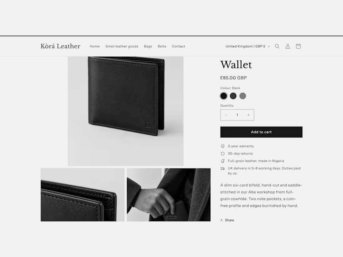
A Shopify concept store for a fictional Nigerian leather brand selling to UK buyers. Clients who hire Shopify developers judge structure first, so every decision here has a reason.
The buy box. One clear action: Add to cart, with "Buy it now" removed. Colour and hardware swatches, sizes as buttons, and a sticky add-to-cart bar on mobile that mirrors the real button, including sold-out states.
Trust where the decision happens. Warranty, returns, sourcing and UK delivery with duties sit directly under the button, and the delivery line changes with the shopper's country.
Editorial tied to the product. Each product shows the workshop that made it and how to care for it. The stories are entered once in Shopify and reused, so Aba and Kano products tell different stories without duplicated content.
The purchase path. Filters by colour, hardware and price, quick add from collections, and a cart drawer that tells UK shoppers how far they are from free delivery. Checkout runs in GBP.
Built on Shopify's Dawn theme with custom Liquid sections and blocks, tested at phone and desktop widths. Concept content: the brand, workshops and product photos (AI-generated) are illustrative.
Need a store with this kind of structure? See my Landing Page Design & Build service.
https://contra.com/s/2mZeQooO-creative-landing-page-design-and-build
2
1
44
Empty Space Is a Clue
Sometimes, the problem with a screen isn't what's on it but It's what's missing.
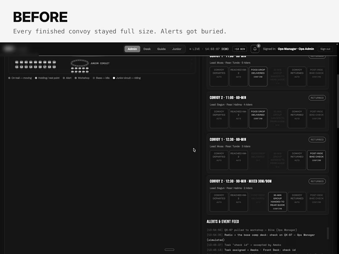
While building an ops dashboard for an adventure business, I noticed a big empty space under the live map. It looked like a layout bug, but the real problem was that finished convoys stayed on screen, pushing alerts out of view.
So I set three rules: show what's happening now, keep warnings easy to spot, and put tools in one place.
Now, only active convoys take up space. Finished ones collapse into a single line, and managers can see when the next group leaves and whether it's ready.
There's still empty space on the right, and that's intentional.
I used to see empty space as a layout problem. Now I know it can mean everything is working as it should.
Have you ever found a bug by noticing what was missing?
0
41
AI-driven QA System for EduAI Pro Teacher Pathways
1
1
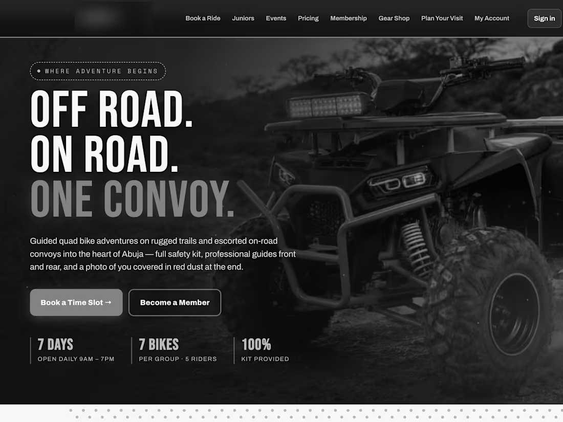
A premium guided quad bike adventure business in Abuja, launching soon. It serves adult riders, families, corporate and school groups, and children aged 6–12 on mini-ATVs. I'm its product manager and co-director. The brand stays private until launch.
Safety is the brand's core promise, so I designed it into the product: CBT certification, per-rider waivers, ID verification and a sign-in-to-pay flow.
Everything is mobile-first, because customers arrive from Instagram, TikTok and WhatsApp.
Customer booking and rider dashboard: finished
Staff mobile portal: working prototype with simulated data
Operations dashboard, GPS fleet tracker and admin control centre: in design
Status: pre-launch.
If you need a mobile-first site or booking flow for your business, see my Landing Page Design & Build service to get started.
https://contra.com/s/2mZeQooO-creative-landing-page-design-and-build
0
59