
Websites should feel like something.
1
5
86
Hero Section Exploration for Escape.
2
4
106
unpopular opinion: your SaaS hero is boring and it's costing you customers nobody remembers another gradient + dashboard screenshot this is what happens when you treat your homepage like a piece of art.
2
80
Starting off the week with a hero that actually earns attention.
4
100
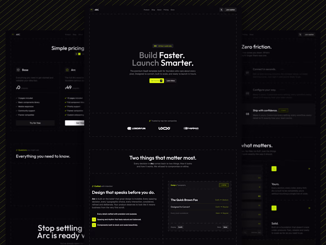
Introducing Arc -> a premium dark SaaS Framer template built for founders who refuse to settle.
10 pages. Custom code components. Interactive hero. Command palette feature card. Typography system. Pixel perfect on every screen.
This is what $129 quality looks like. Dropping soon on the Framer marketplace.
Built by a designer who got tired of seeing the same template sold 500 times in different colors.
5
100
Made this in 10 minutes !!
6
115