Maxim Rask
Brand identity designer. Visuals that stick.
New to Contra
Maxim is ready for their next project!
Social Content Visuals
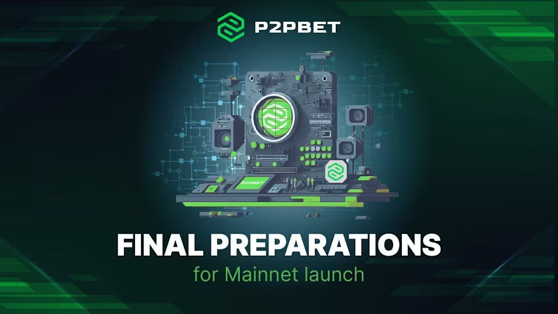
P2PBET
Created a branding style and set of illustrations for P2PBET X posts.
Green-and-black cyber palette with a circuit-board motif ties every post to the brand's tech identity, while a consistent header format (logo + topic label) keeps the channel scannable across different content types :announcements, warnings, community updates.
Built to make each post instantly recognizable as P2PBET, whatever the topic.
1
11
Event Branding
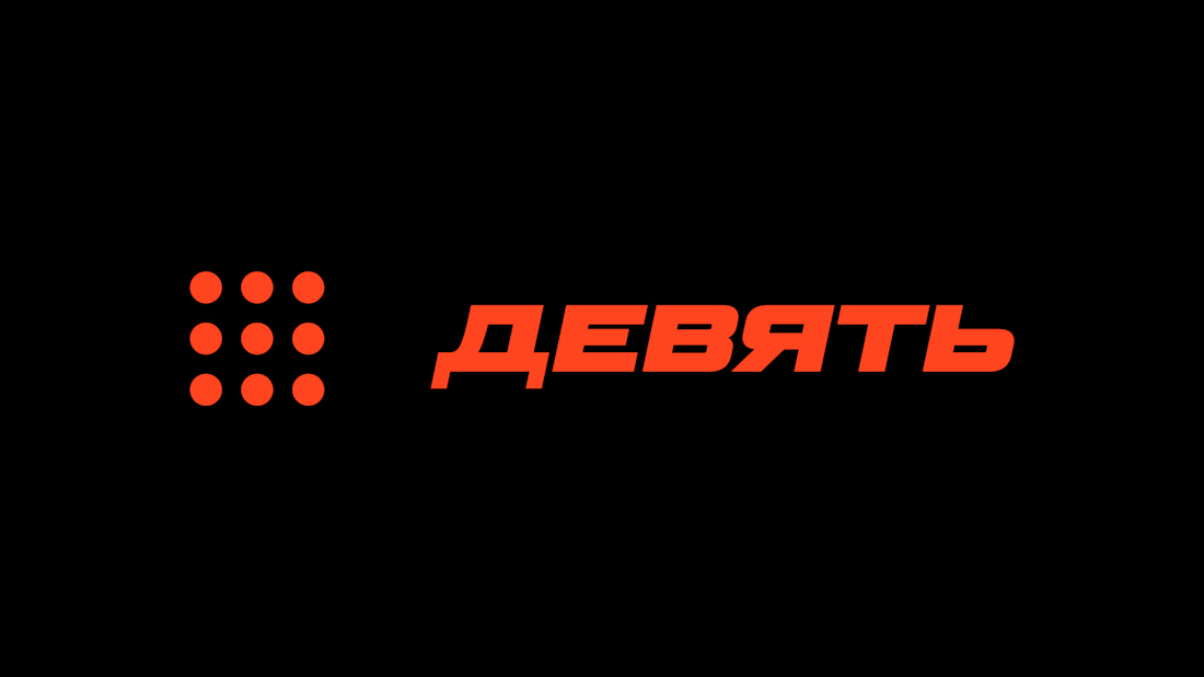
Nine DJ Series
Designed the visual identity for Nine, a recurring DJ event series (bassline, hardstyle, drum'n'bass lineups).
Concept built around the number nine as a clock motif: nine black dials at different angles, doubling as both a countdown symbol and a graphic system flexible enough for posters, stories, and video intros.
Bold red-orange field, high-contrast black typography, sharp diagonal cuts on the wordmark: designed to read instantly on a phone screen and hold up in nightlife/flyer contexts where most event graphics blur into noise.
Applied across event poster, video teaser, and a modular icon set for recurring use across the series.
1
1
22
Brand & Visual System
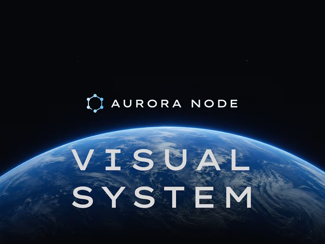
Aurora Node (cross-chain infra)
Built the full visual identity for Aurora Node's mainnet launch: distributed node infrastructure aimed at both developers and institutional investors.
Brief: feel alive and technical, not corporate or academic.
Deep blue gradients, glowing node structures, cinematic lighting designed to read as premium infrastructure rather than a static diagram. Delivered launch visuals, modular info cards, and the full X presence (banner, profile, posts) on one consistent lighting/spacing logic, so the system scales from a tweet card to a pitch deck slide without breaking identity.
Result: a cohesive visual language that signals credibility from the first impression - the only brief that matters in Web3.
1
31
Presentation design
Synergy Guild (GameFi)
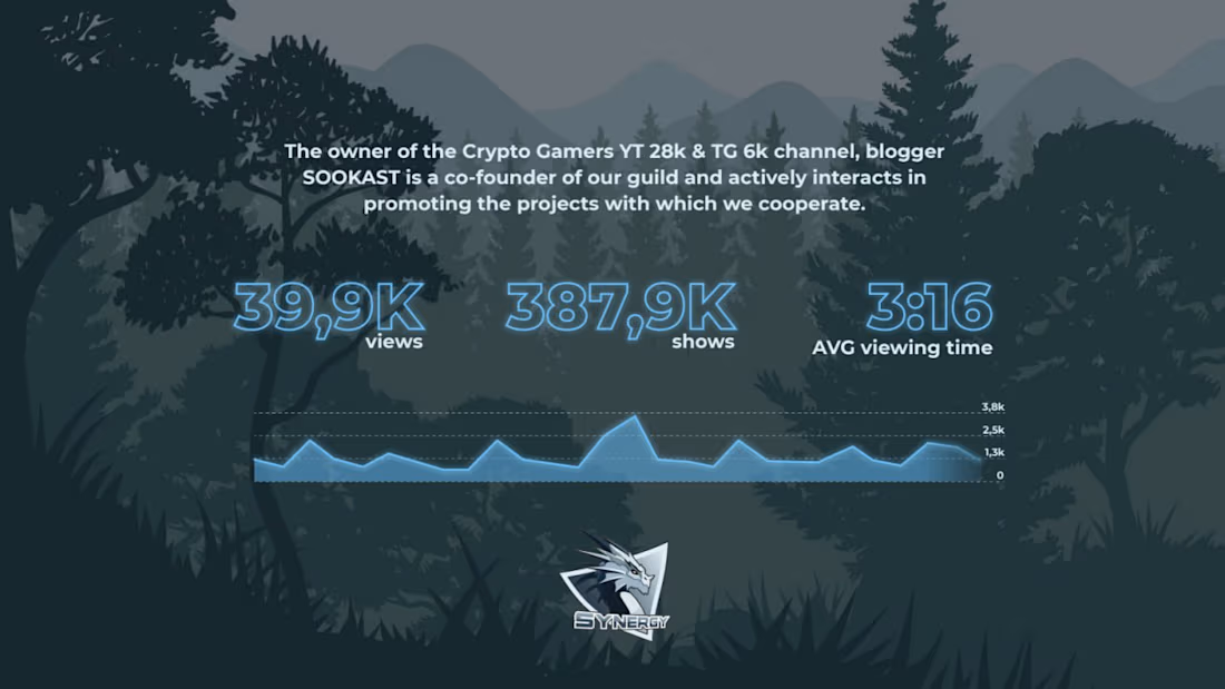
Designed a pitch deck for Synergy, a GameFi guild organizing tournaments across web3 games.
:The brief: position the guild as a credible partner for brands and projects, backed by scale (400+ active players) and track record.
Dark fantasy visual style built around the guild’s dragon logo, keeping the brand consistent from cover to stats. Used by the guild for partnership and sponsorship outreach.
1
33