


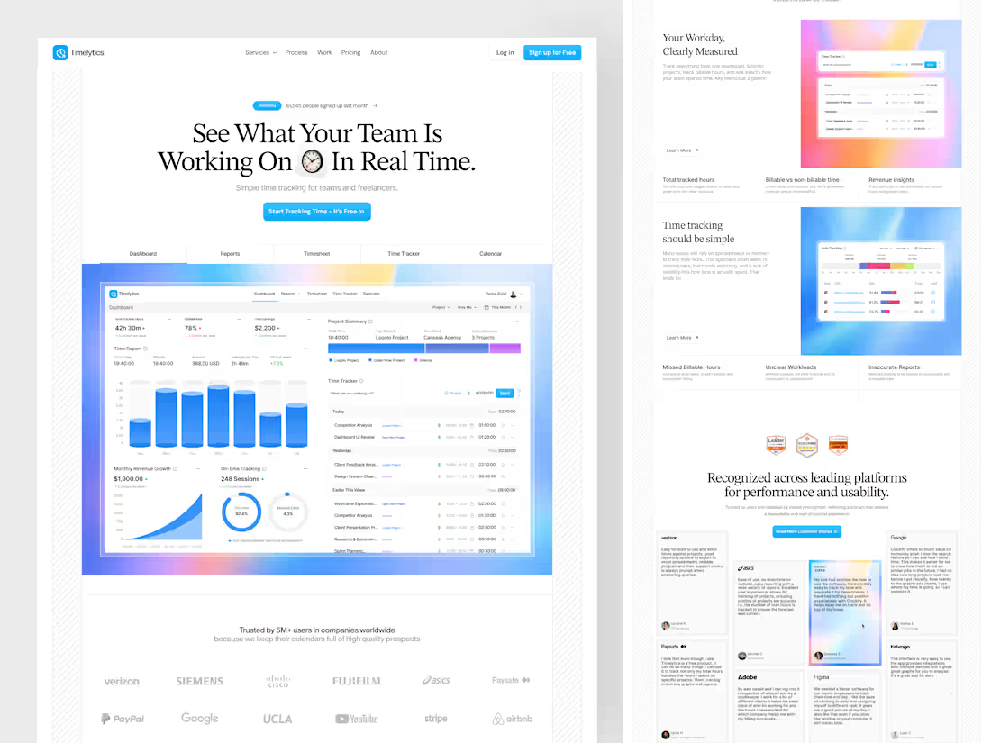
This design explores a modern Time Tracker Landing Page designed to clearly communicate productivity, visibility, and performance for teams and freelancers. The goal was to create a structured storytelling flow—from highlighting real-time tracking capabilities to showcasing reports, revenue insights, and workload clarity.
The layout focuses on strong hierarchy, clean typography, and clear sectioning, making complex data-driven features easy to understand at a glance. This exploration demonstrates how a well-crafted SaaS landing page can simplify a complex productivity tool into a clear, engaging, and conversion-focused experience.
1
18
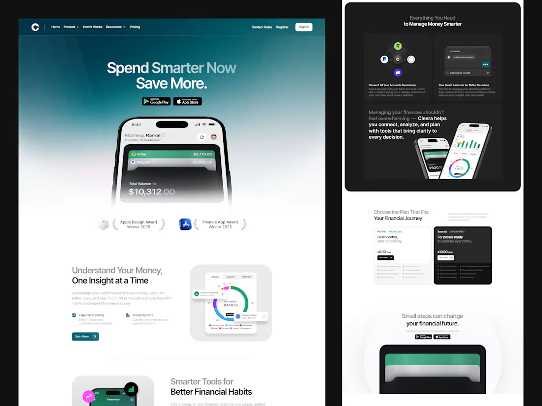
Designed to make personal finance feel simpler, and clearer. This concept focuses on smooth hierarchy, modern fintech visuals, and an intuitive flow that helps users track, understand, and improve their financial decisions with ease.
1
29
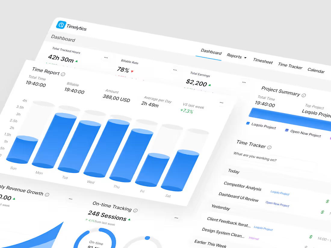
Inspired by Clockify, this dashboard exploration focuses on improving the overall UX by going beyond basic time logging. The goal is to enhance clarity, tracking quality, and behavioral insights so users can better trust and understand their time data.
What do you think about this dashboard direction? We’d love to hear your thoughts.
4
4
93
Hello Folks 👋🏻
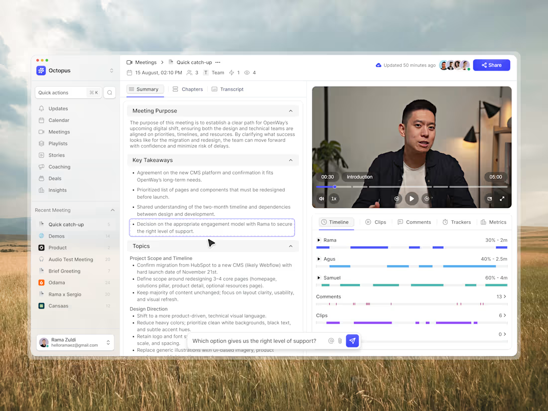
Meet Octopus Notes, an AI-powered notetaker designed to capture every important moment with ease. From meetings to brainstorming sessions, it automatically transcribes, summarizes, and highlights key takeaways, turning conversations into organized insights you can act on instantly. With seamless video integration and smart context awareness, you’ll never miss a detail again.
Let me know what you think! 🚀
27
284