
pro
Priyank Agarwal
Your vision, my design, their obsession
Ready for work
Priyank is ready for their next project!
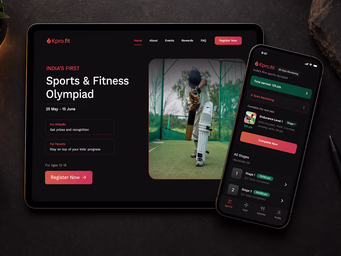
Khiladipro Website and Mobile App
0
0
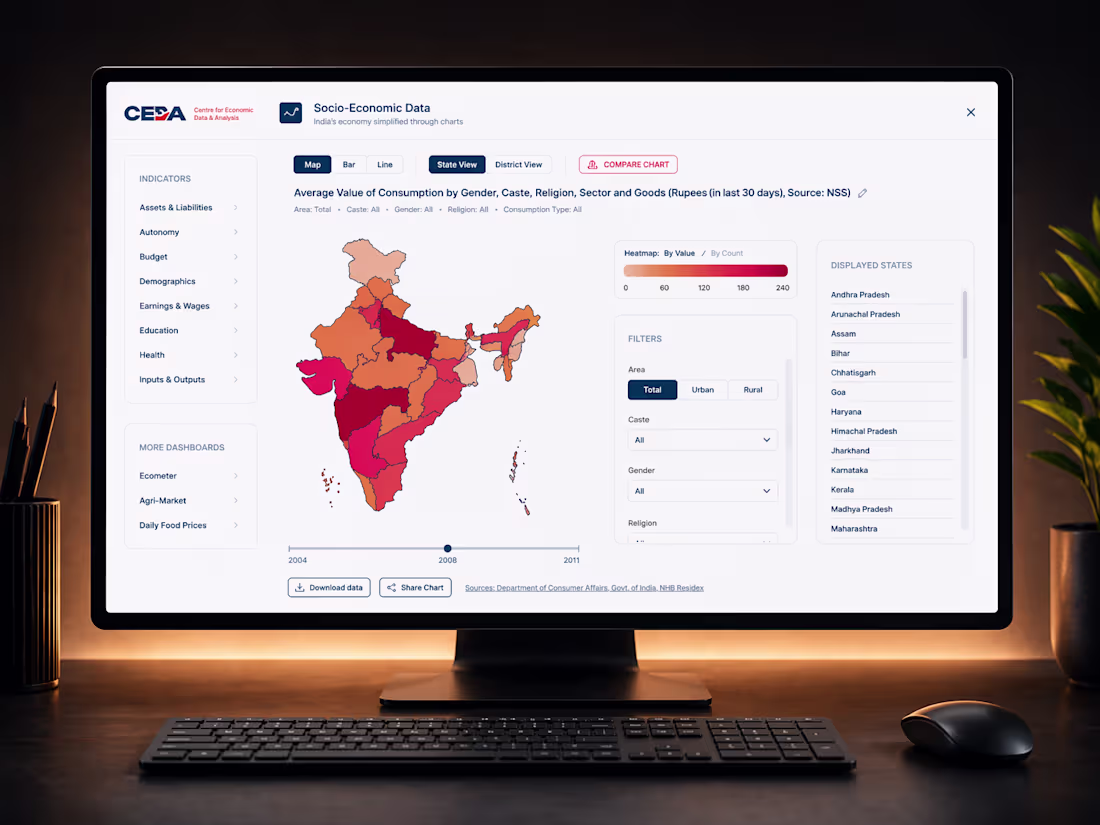
Economic Dashboards for Ashoka University
0
0
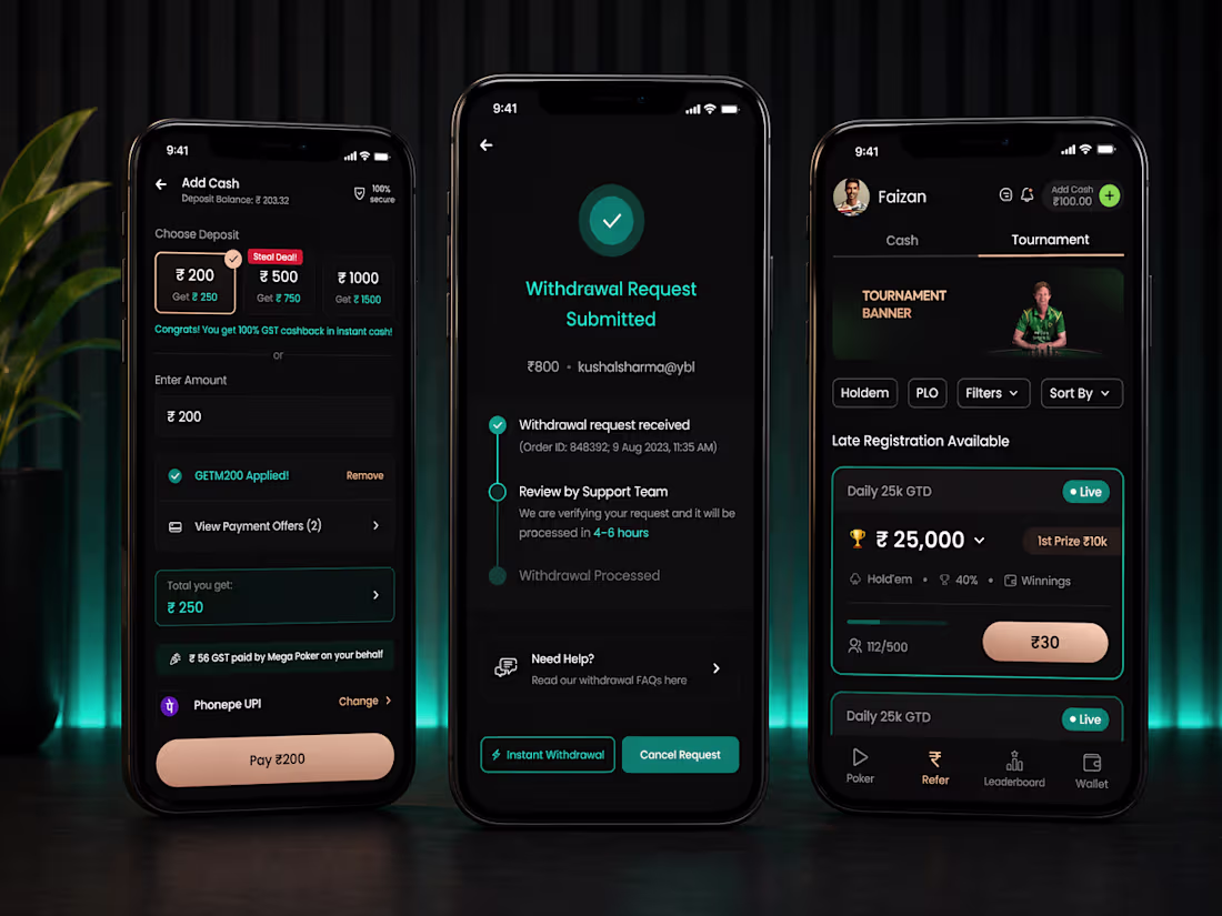
Mega Poker App Flows Redesign
0
0
We've all experienced this: you're trying to adjust a slider on your phone, but your own thumb completely blocks the number you're trying to read. You end up doing a weird swipe-lift-and-guess routine just to see where you landed.
It's an ergonomic flaw in default mobile Ul that most apps just accept. I was working as a Product Designer at a Gaming company, where the UI involved financial buy-ins. Making the user guess their exact input wasn't an option.
Instead of dropping a native slider component onto the canvas and moving on, I decided to design around the physical reality of the human hand.
🛠️ Here is how I fixed the interaction:
Move it out of the way: The moment you press the slider, the value label scales up and shifts vertically, breaking completely free from your thumb's footprint.
Force the focus: As you drag, the background Ul blurs out. This isn't just an aesthetic choice—it removes visual noise so you are only focusing on the changing numbers.
Clean resolution: Release the slider, and the interface snaps back cleanly to its resting state, confirming your exact selection.
If you are looking for a product designer who sweats the details and builds interfaces that actually feel good to use, let's talk! 🤝
1
38
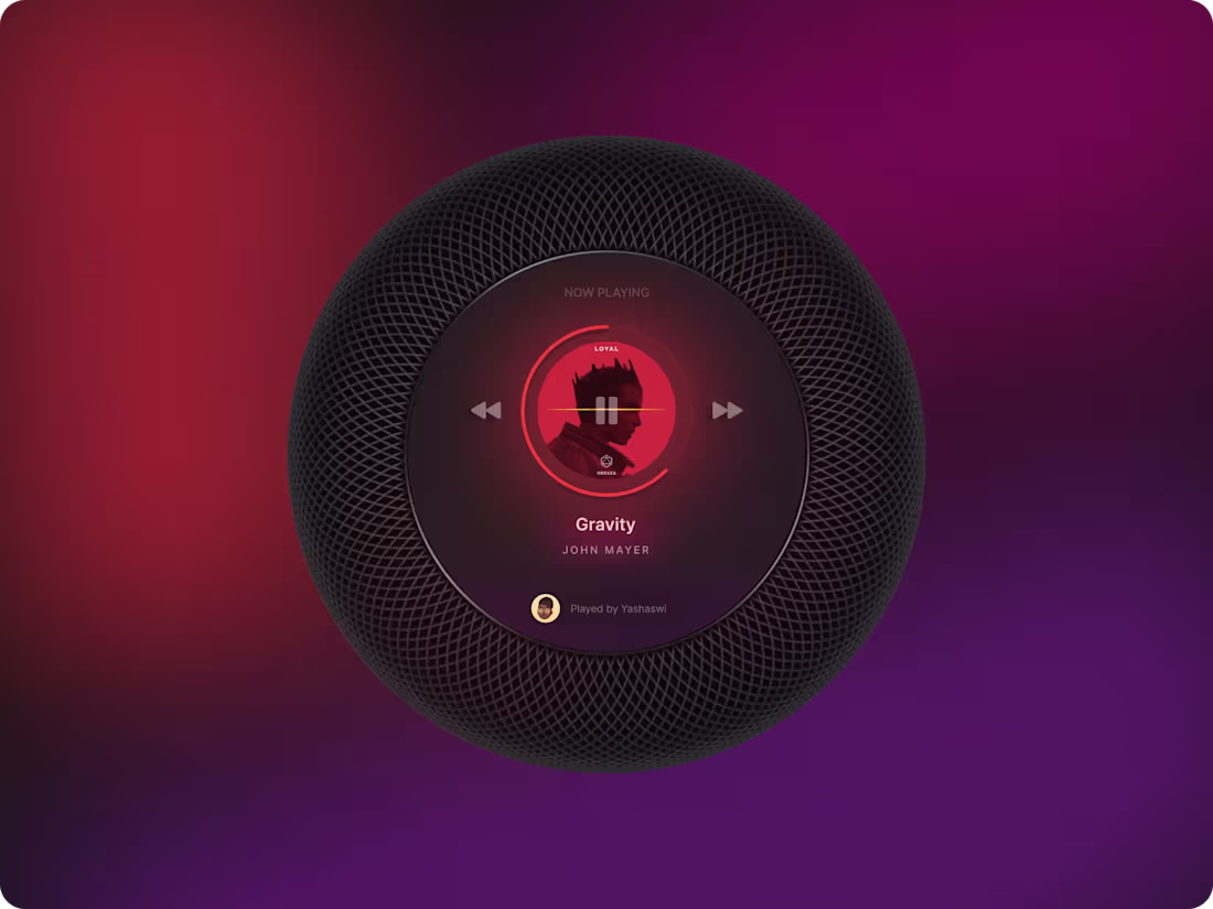
Music on Apple Homepod (Explored gradients, blurs and non-rectangular interfaces)
0
34