Princess David
I turn brands into marks people remember.
New to Contra
Princess is building their profile!
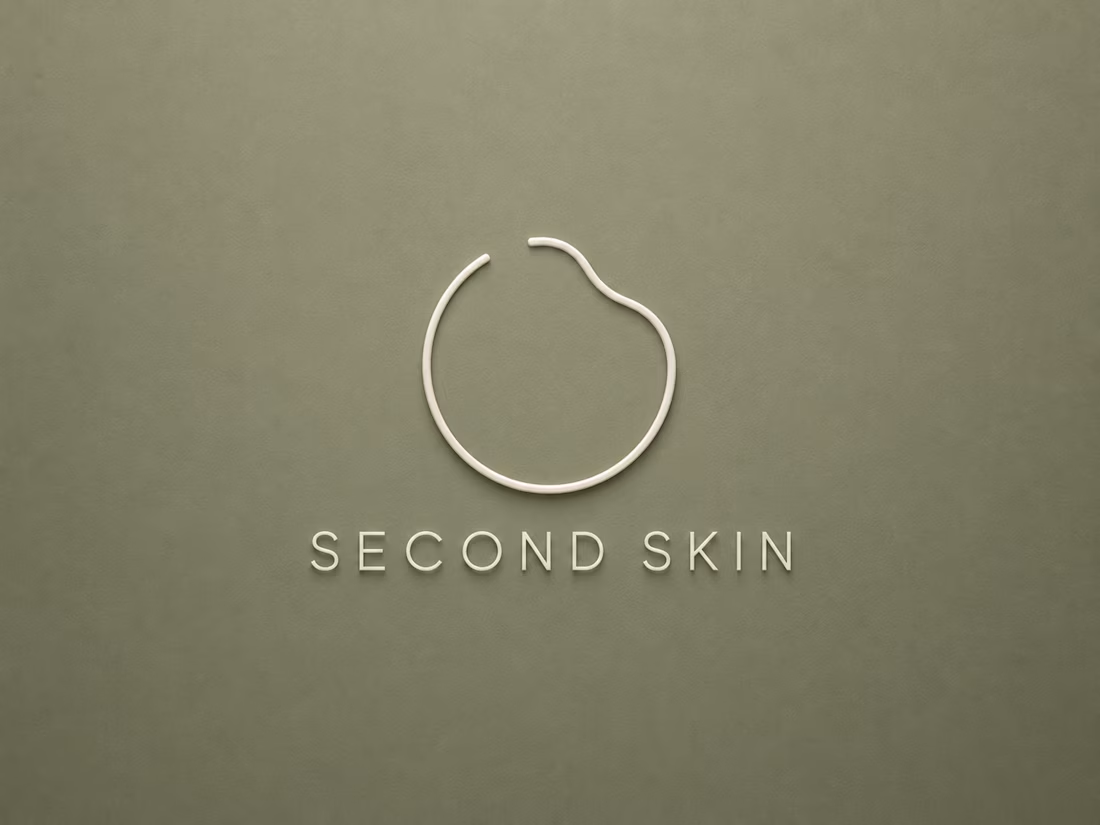
Second Skin is a minimalist skincare brand built on a single idea: good skincare shouldn’t announce itself. Most brands in the category default to leaves, water drops, or breezy “natural” imagery — I wanted something quieter and more precise, closer to a dermatological product than a lifestyle one.The mark started as a single continuous line..an open circle, left unclosed on purpose, suggesting both a droplet and a barrier without illustrating either literally. I tested dozens of gap placements and line weights before finding the one that felt calm rather than accidental. From there, the system built itself around restraint: a clean, quiet sans-serif wordmark set below the mark, a muted clay-and-sage palette that avoids the industry’s overused pastel greens, and packaging that leaves most of the surface empty on purpose, letting the product, not the branding, do the talking.
0
3
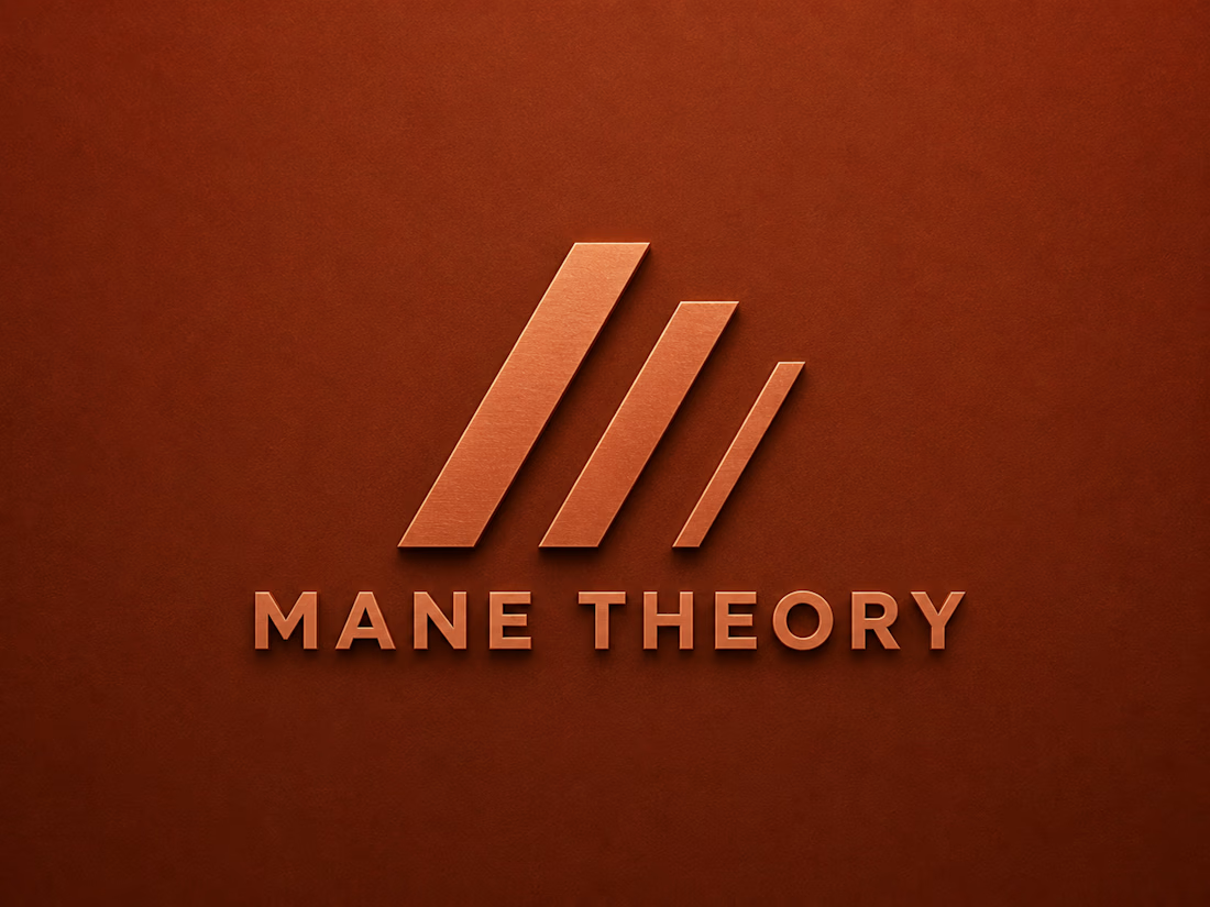
Mane Theory is a haircare brand built on the idea that great hair is a science, not an accident and the identity needed to say that without leaning on the industry’s usual visual language of flowing strands and soft-focus photography. I built the mark from a simple system instead of a picture: three diagonal bars, fading in weight from left to right, suggesting movement, volume, and structure in a single abstract gesture. Getting the fade right took several rounds, too subtle and it read as decoration, too bold and it lost the sense of motion. Once locked, the mark became the anchor for the whole system: a bold geometric wordmark set beneath it, a copper-and-rust palette that reads warm and expert rather than ‘natural beauty’ cliché, and packaging applications that let the mark stand alone on-shelf without needing the full logo lockup.
0
5
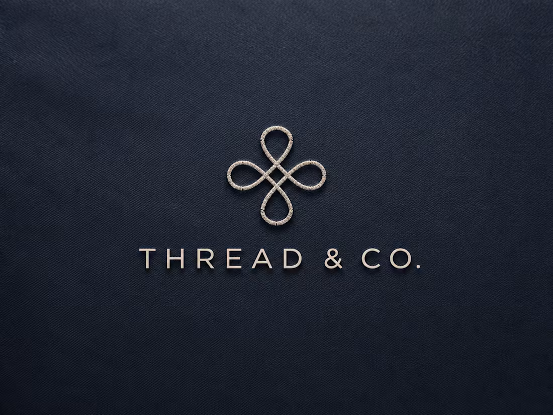
Thread & Co. needed an identity that felt effortless without feeling forgettable — a tough balance for a clothing brand where most competitors either shout with logos or disappear into minimalism. Instead of a wordmark alone, I built the brand around a single symbol: a stitched loop, drawn as a dashed line closing on itself, that could live independently of the name entirely, on a button, a woven label, or a hang tag. The process started with rejecting the obvious: no hangers, no scissors, no literal sewing icons. I explored a dozen loop and knot variations before landing on one that read as a finished stitch, not a doodle. From there, I built the full system, the hang tag application with a punch hole, a small-caps wordmark that stays quiet next to the symbol, and a muted indigo-and-stone palette that feels closer to a fashion editorial than a sale flyer. The symbol was designed to scale from a 10mm woven tag up to a storefront sign without losing its shape.
0
4
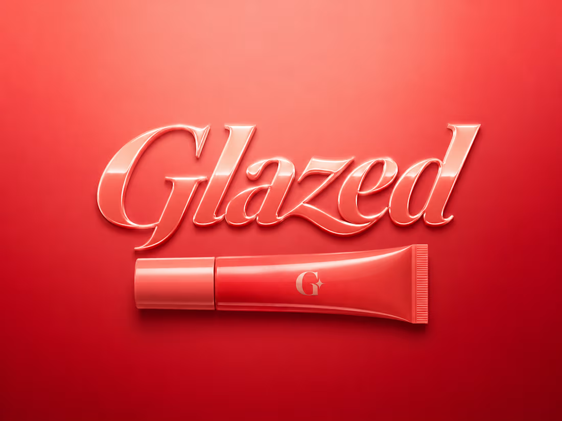
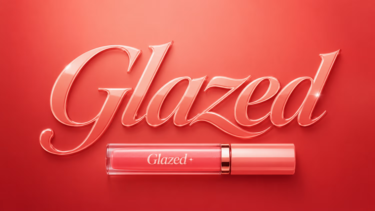
Glazed started with a simple question: what does shine actually feel like on a page? Not sticky, not childish — earned. I built the brand around a custom wordmark instead of an icon, letting two connected letterforms carry the whole personality, with a soft glossy curve that mirrors the product itself. The palette moves in warm coral and deep red, rich enough to feel premium rather than candy-coated. Every touchpoint..tube, packaging, social — traces back to that one typographic decision, so the brand feels inevitable rather than decorated. It’s proof that sometimes the boldest move in beauty branding is restraint.
1
12