
Piyush Lakhani
App Developer | iOS | Android | Swift | Flutter | AI LLM
- $1k+
- Earned
- 1x
- Hired
- 5.00
- Rating
- 6
- Followers

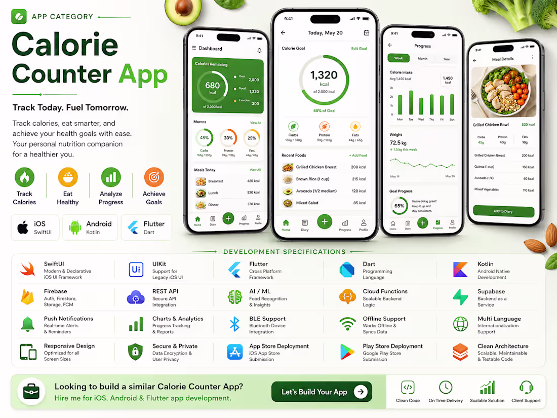
Calorie Counter App
0
47
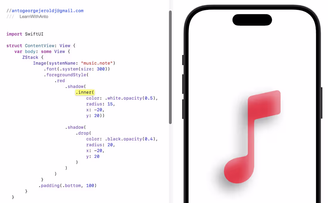
Want your icons or shapes to feel real and pop off the screen?
In iOS 16+, you can combine inner + drop shadows to create rich depth — just like pro design tools 🎨✨
🎶 Why This Shadow Combo Rocks:
🟪 Inner Shadow — Soft Highlight
🖌️ Adds a gentle glow inside the shape, perfect for embossed, neon, or polished effects.
🟧 Drop Shadow — Realistic Depth
📦 Makes your symbol visually lift off the background with smooth elevation.
🌟 Put Them Together and You Get:
✨ More dimensional, dynamic icons
🪄 Smooth, premium lighting
🎛️ Perfect for music UIs, buttons, cards & standout elements
📱 A modern, high-quality look your users feel instantly
Blend realism + style to make your UI come alive 🎨💡
0
99
Excited to share a small learning project — an iOS UI called CreditPay, inspired by Neo Financial (https://www.linkedin.com/company/neo-financial/) 💳
I built this mainly to practice SwiftUI interactions and animations. The focus was on getting the basics right while experimenting with motion and visual polish:
• Swiping between cards
• Subtle 3D tilt using drag gestures
• A clean details view with animated credit usage
• Light haptics and gradients for a premium feel
It’s a simple project, but a fun way to learn how small UI details can make an experience feel smooth, fast, and enjoyable.
Would love any thoughts or feedback ✨
#SwiftUI
(https://www.linkedin.com/search/results/all/?keywords=%23swiftui&origin=HASH_TAG_FROM_FEED)
0
93
Experienced Flutter Developer for iOS and Android Mobile App
1
3
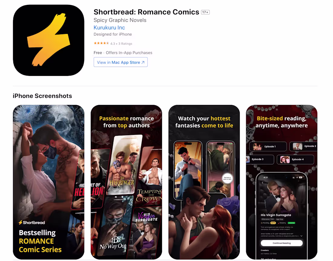
Shortbread: Romance Comics App Development
0
6

3asafeer School: Learn Arabic Mobile App Development
0
3

Teji Mandi:Stock/ETF Portfolio - Android | IOS Mobile App
0
2