
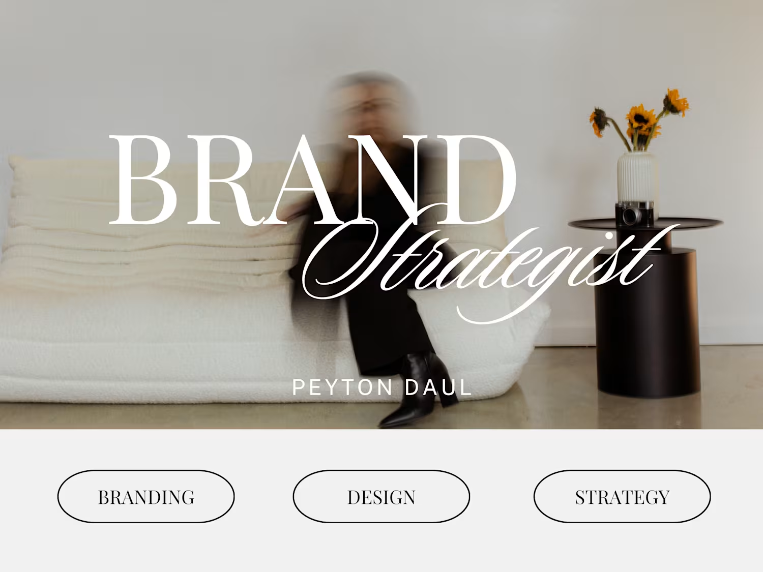
Peyton Daul
Brand Designer and Marketing Strategist
Ready for work
Peyton is ready for their next project!
I wanted to do something a little different than what I usually do. I’ve always loved children and don’t get to design for kid-focused brands as often, and wanted to create the opportunity to play with that energy.
To push myself creatively, I asked ChatGPT to act like a client and give me a full brief for a children’s brand. It gave me Puff’s Playland a bright, imaginative world centered around play and creativity!
I also wanted to use this opportunity to draw a fun mascot! I drew Puff the Dragon myself in Procreate, then brought him into Illustrator to vectorize the drawing and design the full logo system. From there, I built out the color palette and overall look and feel for the brand. Keeping it light, airy, and super friendly.
I really love how this project turned out! I love him and can't get over how cute he turned out!
1
76
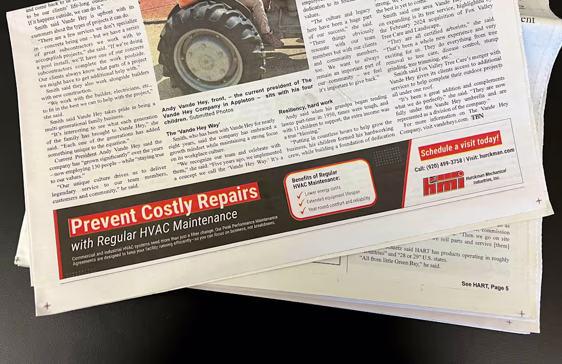
There’s no better feeling than seeing your work in print!
I designed this ad for Hurckman Mechanical Industries, and it’s always rewarding to see a project come to life beyond the screen.
2
24
201
Velore: The Art of Softness.
This is one of those projects that reminded me why I love branding. Velore is a luxury spa concept built around the idea that softness can be powerful. The brand explores how calm, texture, and emotion can create an experience that feels timeless and human.
I created a primary logo, submark, color palette, typography, website mockups, brochure, packaging, social media, and large-scale ads. Every part of it was created to feel intentional, warm, and a little romantic.
I’m really proud of this one! It feels thoughtful, complete, and true to my creative style.
1
35
229
Hi, I’m Peyton, and this is my first post on Contra!
I recently completed a branding project for Kaz Tile and Flooring, a small tile and flooring installation company in Green Bay, WI.
Most small subcontractors don’t take branding seriously, so standing out came down to clean design, clear messaging, and authentic color choices. The earthy, youthful tones give the brand a dependable yet modern feel that matches his work.
The final package included:
- Primary, secondary, and submark logos
- Icon and design elements
- Business card, invoice, and website mockups
- Photography style
- Three typefaces and a full color palette
This project came together in the best way, feeling grounded, professional, and true to his story. If you want to chat about your own brand ideas, you can reach out to me here on Contra!
25
98
632
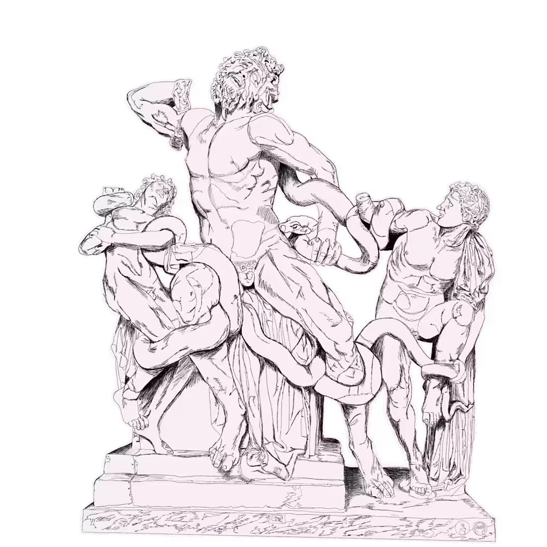
Laocoön and His Sons: One Line Sketch
This piece started with a photo I took at the Vatican Museums. I’ve always loved how this sculpture captures emotion through tension, and I wanted to reimagine that feeling in a simple, sketch-style one-line drawing. I created it in Procreate on my iPad, focusing on contrast and movement rather than detail.
I create similar illustrations for clients, turning reference photos or concepts into original line drawings!
20
196
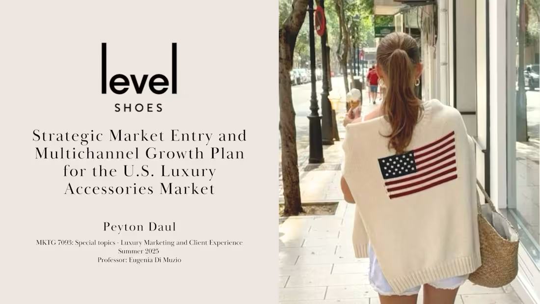
Level Shoes: U.S. Luxury Market Expansion Strategy
0
9
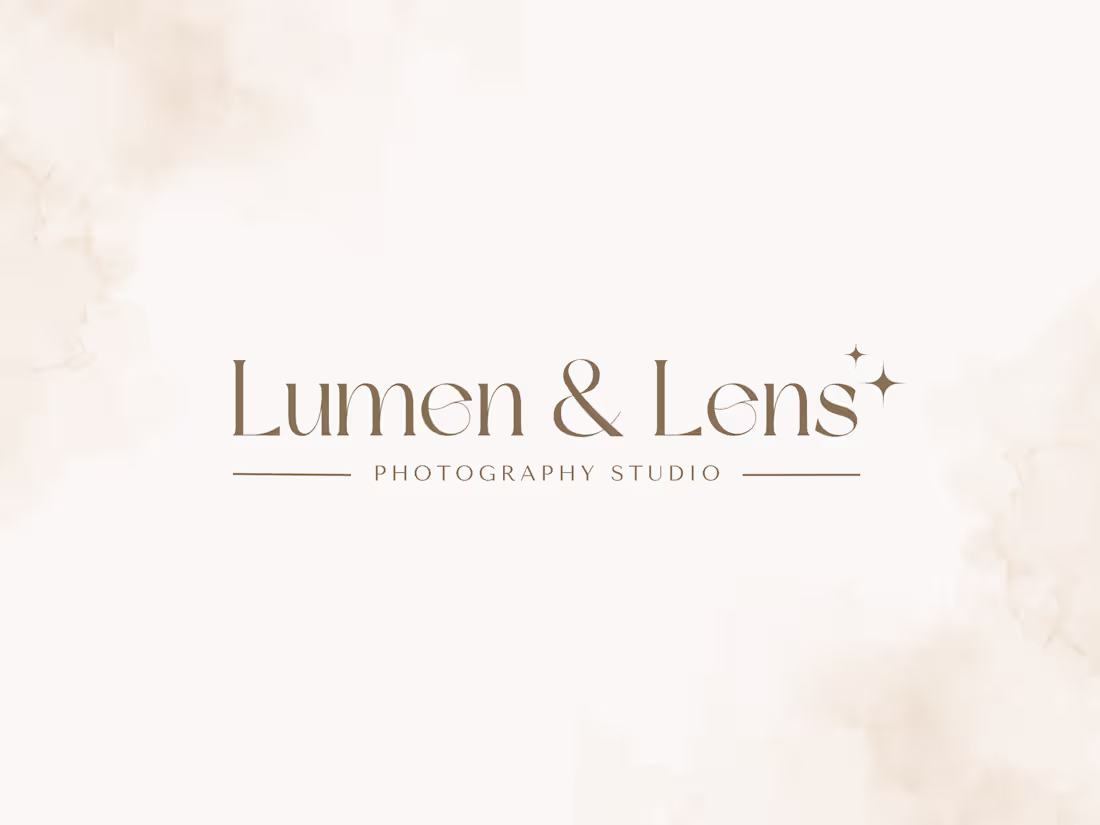
Lumen & Lens: Logo Design
Developed a refined logo for a boutique photography studio, featuring a modern, feminine aesthetic in soft beige tones.
Deliverables included a primary logo, secondary mark, and black-and-white variations for flexible use across digital and print applications.
15
146