
Peter Schnabel
Pixel-perfect design meets scalable full-stack development
New to Contra
Peter is ready for their next project!
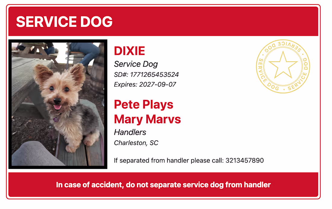
This ID card design demonstrates a mastery of high-stakes information architecture, prioritizing critical safety data through a bold, red-and-white visual hierarchy. By balancing clear photographic identification with essential administrative credentials and emergency protocols, the design provides a professional and functional tool for service dog handlers. The clean typography and use of a formal verification seal underscore a commitment to creating reliable, high-utility documents that are as visually authoritative as they are practical.
0
54
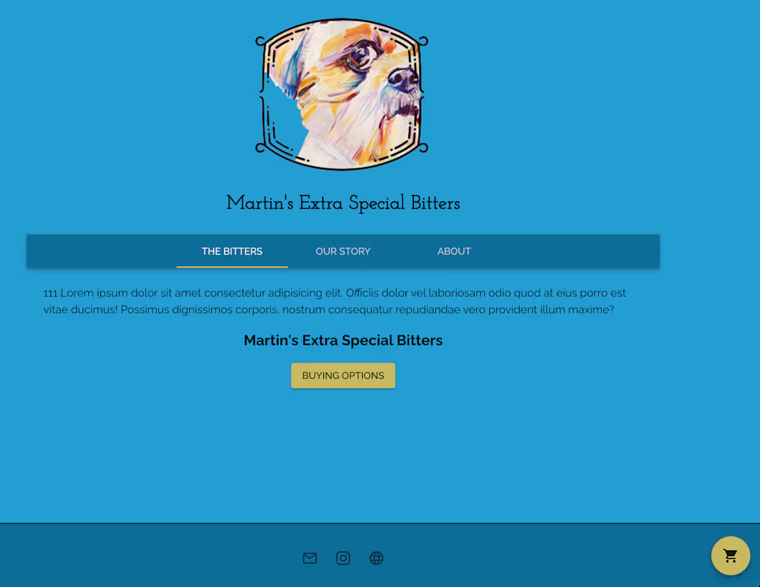
This interface represents a bold departure from traditional e-commerce layouts, utilizing a vibrant, illustration-led design to establish a strong brand identity. By integrating a clean, tabbed navigation system and a highly visible floating action button for commerce, the site demonstrates an ability to blend expressive artistry with intuitive user flows. The result is a pixel-perfect, responsive environment that prioritizes both visual impact and functional simplicity."
1
2
72
This component demonstrates a sophisticated asynchronous notification framework that prioritizes non-intrusive user guidance. By incorporating timed auto-dismissal and distinct visual hierarchies, the design ensures that critical system feedback—such as status warnings and input instructions—is delivered without disrupting the primary search-and-convert workflow. The use of precise micro-interactions, including dynamic countdown timers and staggered entry animations, underscores a commitment to professional-grade usability. Every element, from the high-contrast typography to the subtle use of color-coded alerts (blue for info, orange for warnings), is engineered to maintain a clean, dark-mode aesthetic while maximizing system-to-user transparency."
1
62
This component highlights a sophisticated approach to mobile-first utility, employing a dynamic floating action menu to consolidate administrative functions into a singular, intuitive touchpoint. The implementation of contextual tooltips and staggered micro-animations underscores a commitment to pixel-perfect interactivity, ensuring that essential tools—like error reporting and history management—are accessible without cluttering the primary user interface.
1
73
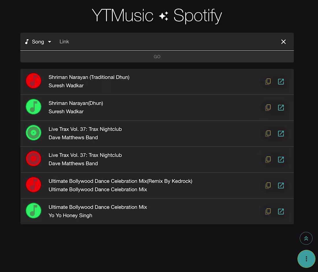
This interface demonstrates a commitment to utility-driven design through a high-contrast dark mode and a pixel-perfect layout. By balancing vibrant iconography with a logical hierarchy and consistent spacing, the composition ensures that complex cross-platform music metadata remains accessible and intuitive. The result is a clean, minimalist approach to development that underscores a developer’s ability to build reliable, user-centric tools where every pixel is dedicated to enhancing functional precision.
1
50
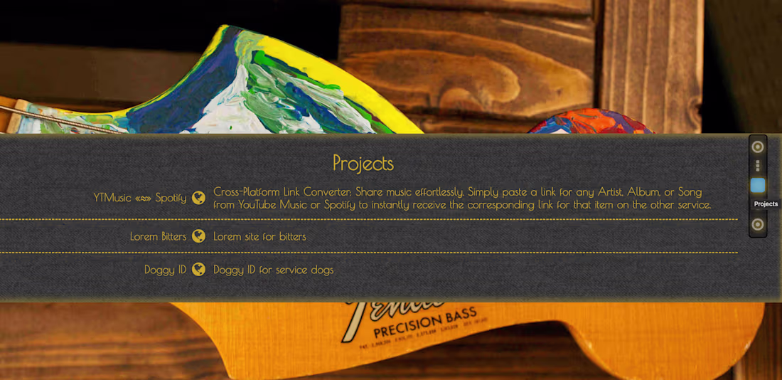
The design seamlessly integrates technical precision with artistic expression, juxtaposing structured UI elements against a hand-painted Fender Precision Bass. This aesthetic choice highlights a developer who prioritizes both robust functionality and sophisticated visual design.
1
54