Peter Eniola
Product Designer & Framer Expert
Ready for work
Peter is ready for their next project!
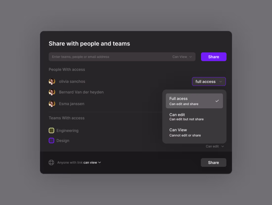
A minimal, user-friendly Share Screen modal with clear permissions, preview, and one-click controls for fast, confident sharing.
day 33
2
1
17
clean and minimal design
Day 31
0
7
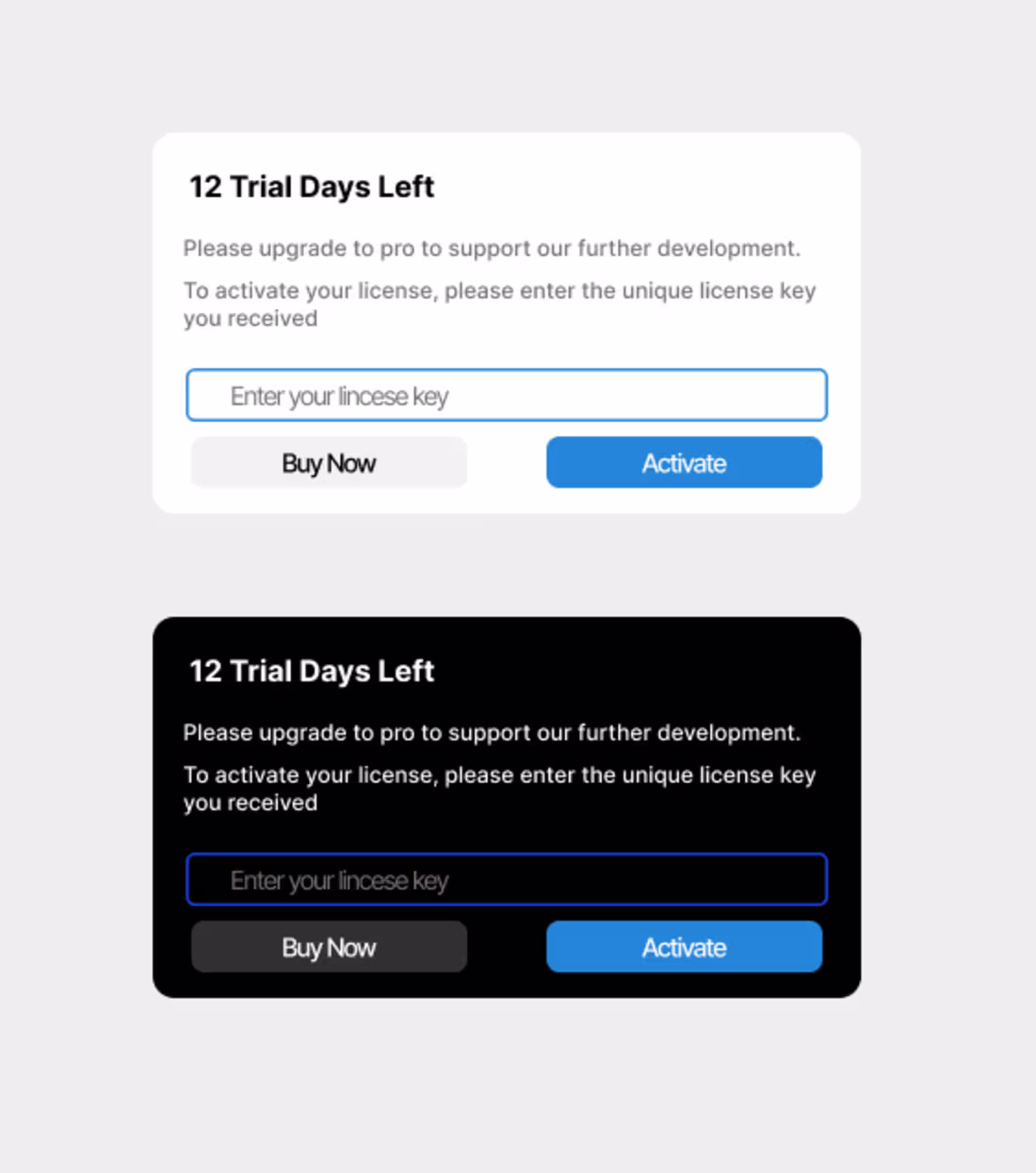
I designed a trial modal that’s clean, simple, and user-friendly. It highlights the key details clearly and guides users to start their trial with a smooth, modern layout that feels elegant and inviting.
Day 30
2
2
14
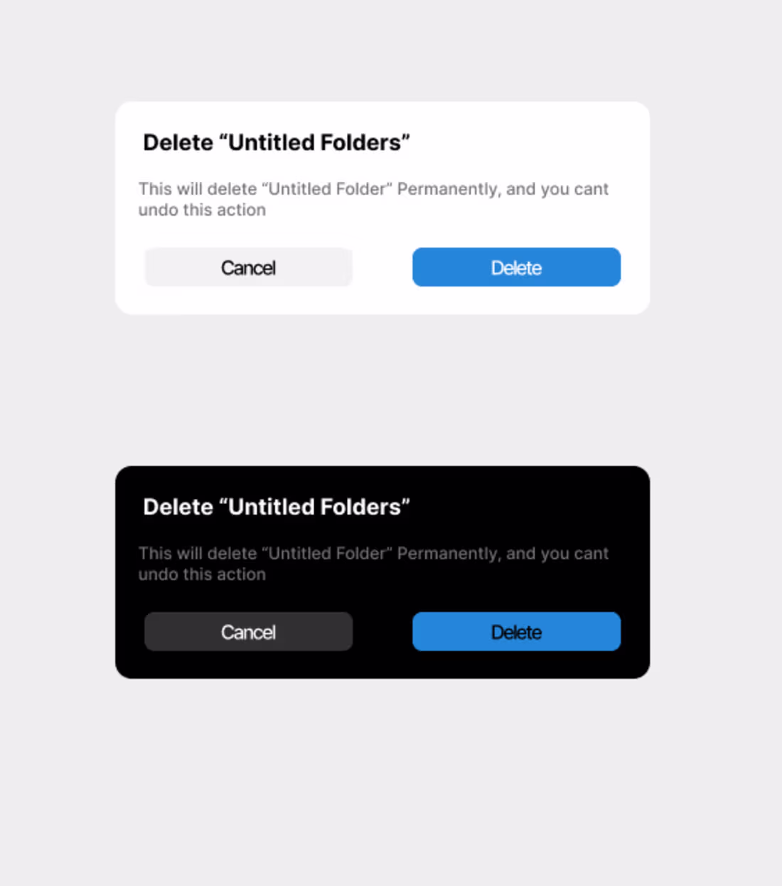
I just created a clean and elegant modal with a minimal layout, smooth spacing, and a clear focus on the main action.
Day 29
4
2
22
I just completed the text-to-image AI dashboard design. It features a clean, intuitive layout that makes it easy for users to enter prompts, generate images, and manage their results.
day 28
0
4
A clean design isn’t created by just one element it’s the result of several principles working together in harmony. But if you ask most designers, two things stand at the top: visual hierarchy and typography.
So, designers out there… what truly makes a design clean?
Is it the way hierarchy guides the eye? Is it the clarity of the typography? Or is it the balance of space, alignment, and simplicity?
Let’s talk what’s the key to your clean design style?
Day 26
1
10
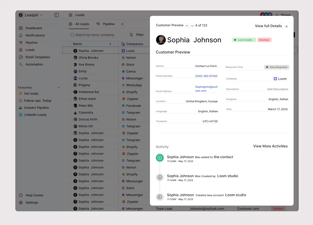
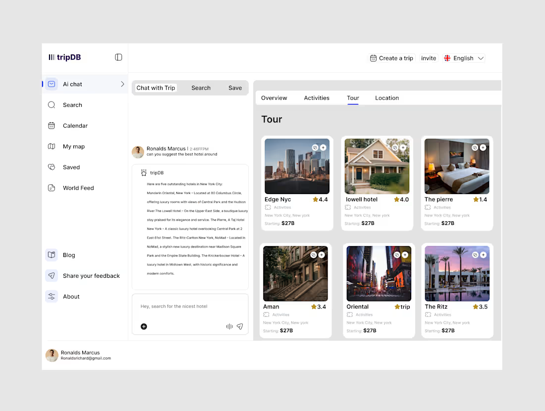
I just added some new details to the lead CRM UI design, enhancing clarity, improving the layout, and making the overall experience smoother and more intuitive for users.
Day 23
1
7
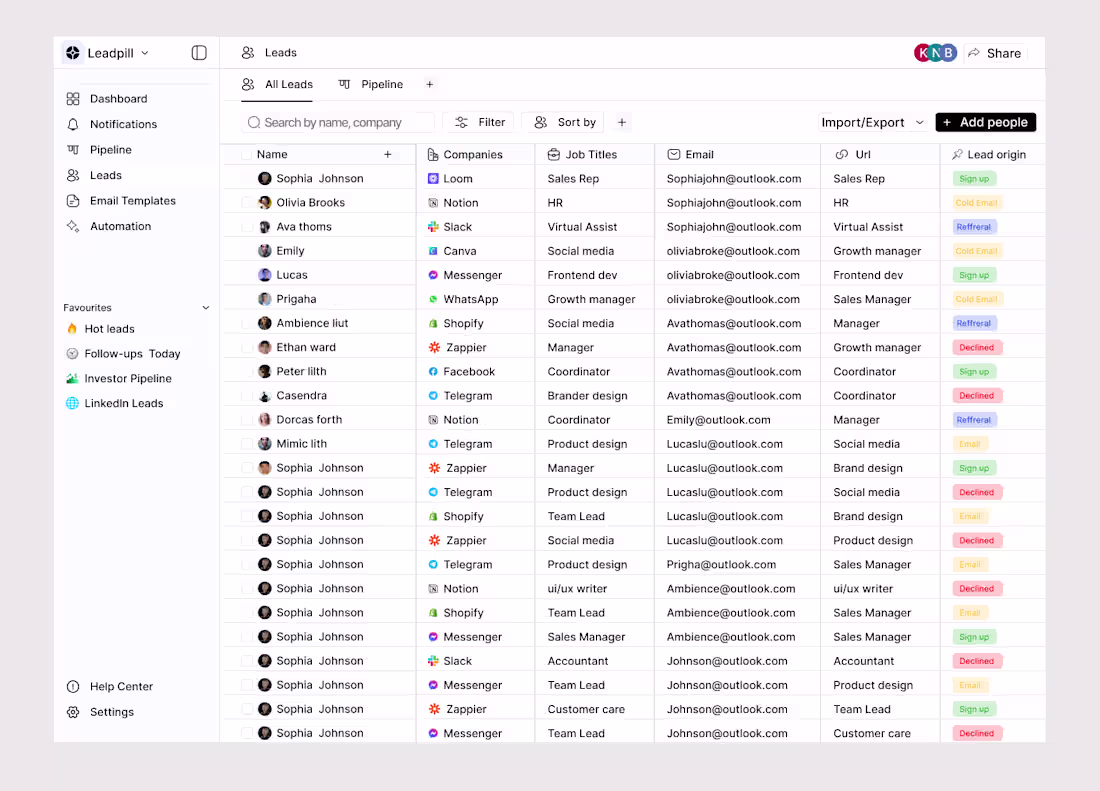
I just finished designing a lead CRM UI that’s clean, organized, and easy to navigate. It helps teams manage, track, and follow up on leads effortlessly, with a layout that keeps everything clear and efficient.
day 22
0
9
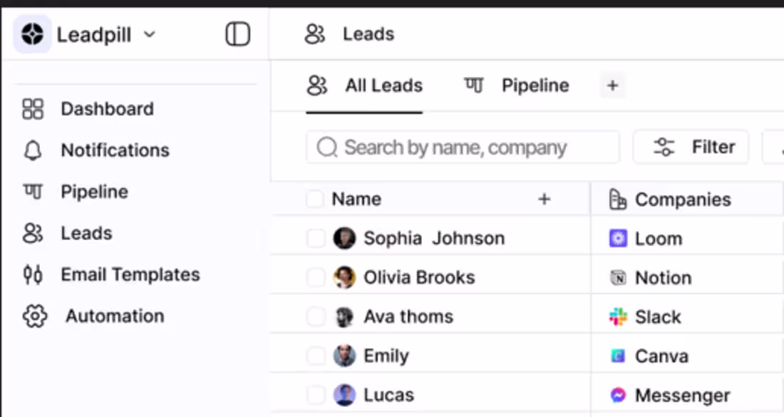
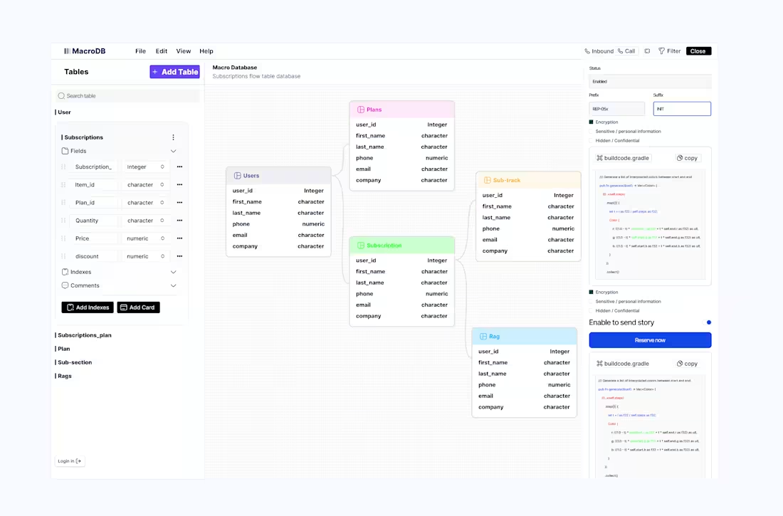
I’m currently working on a lead CRM UI design that focuses on clarity, smooth navigation, and helping teams manage leads effortlessly.
day 21
0
17
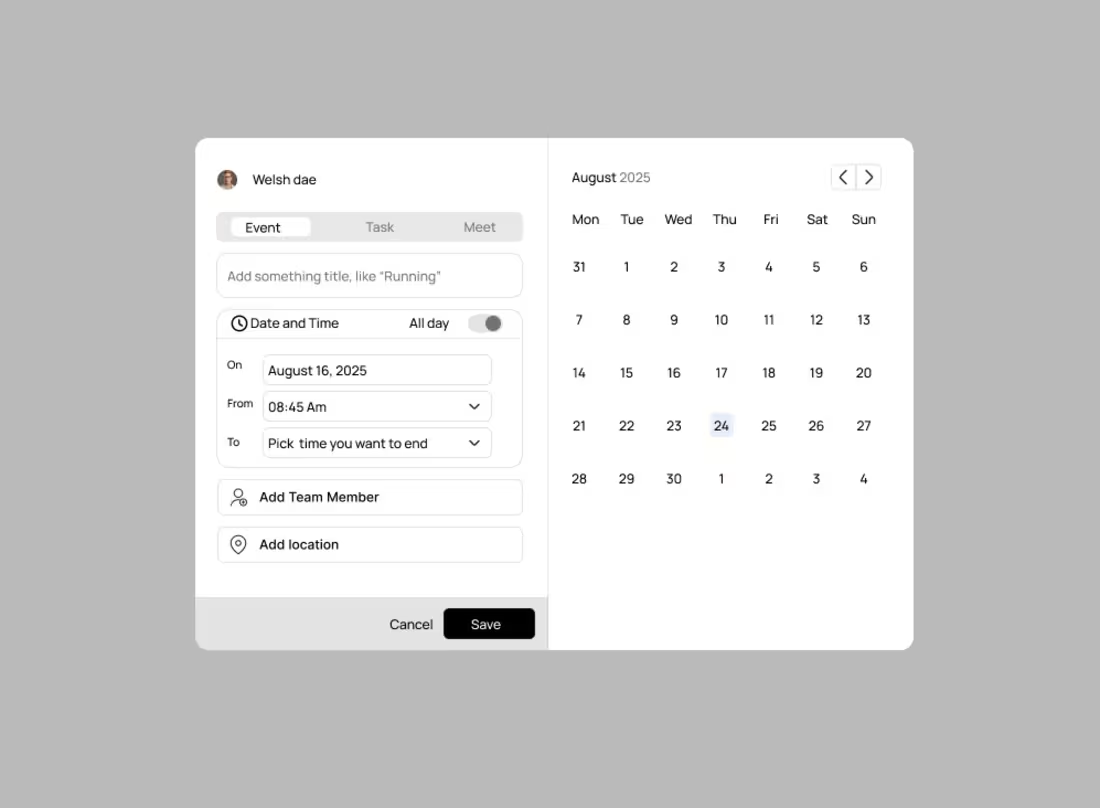
I just developed a simple calendar component.
It’s clean, functional, and fits into our current design system.
If anyone has suggestions or improvements, I’m open to feedback so we can refine it together.
Day 20
1
15
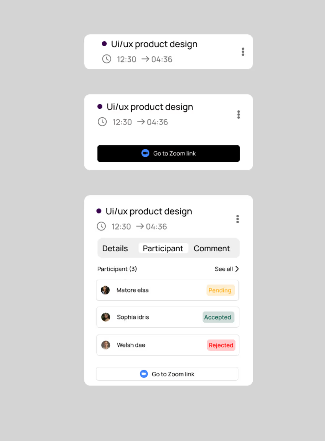
a simple Zoom-style call popup that’s clean, minimal, and easy to use.
Day 17
2
21
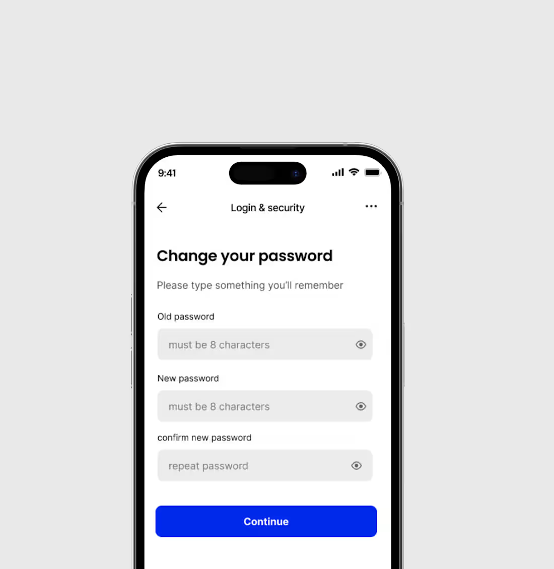
A change password screen that’s simple, clear, and easy for users to complete.
Day 16
0
16
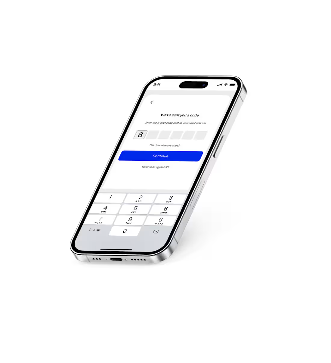
I just worked on an OTP verification page that’s clean, simple, and user-friendly.
Day 15
0
18
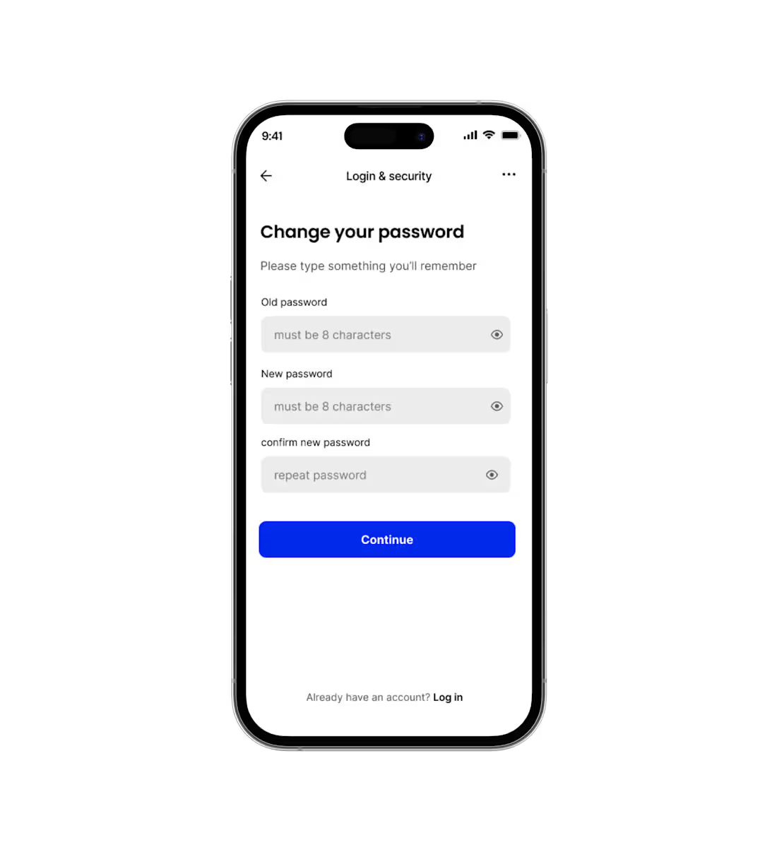
I just designed a reset password screen that’s clean, simple, and easy for users to navigate. It guides users smoothly through entering their email or creating a new password, with clear instructions and a minimal layout to avoid confusion.
day 14
1
23

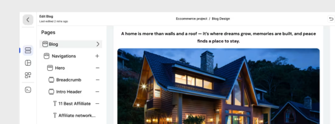
I just completed the UI design for a website builder that makes creating and customizing websites simple and visually engaging. The design focuses on a clean layout, intuitive navigation, and a seamless drag-and-drop experience.
Day 11
1
15
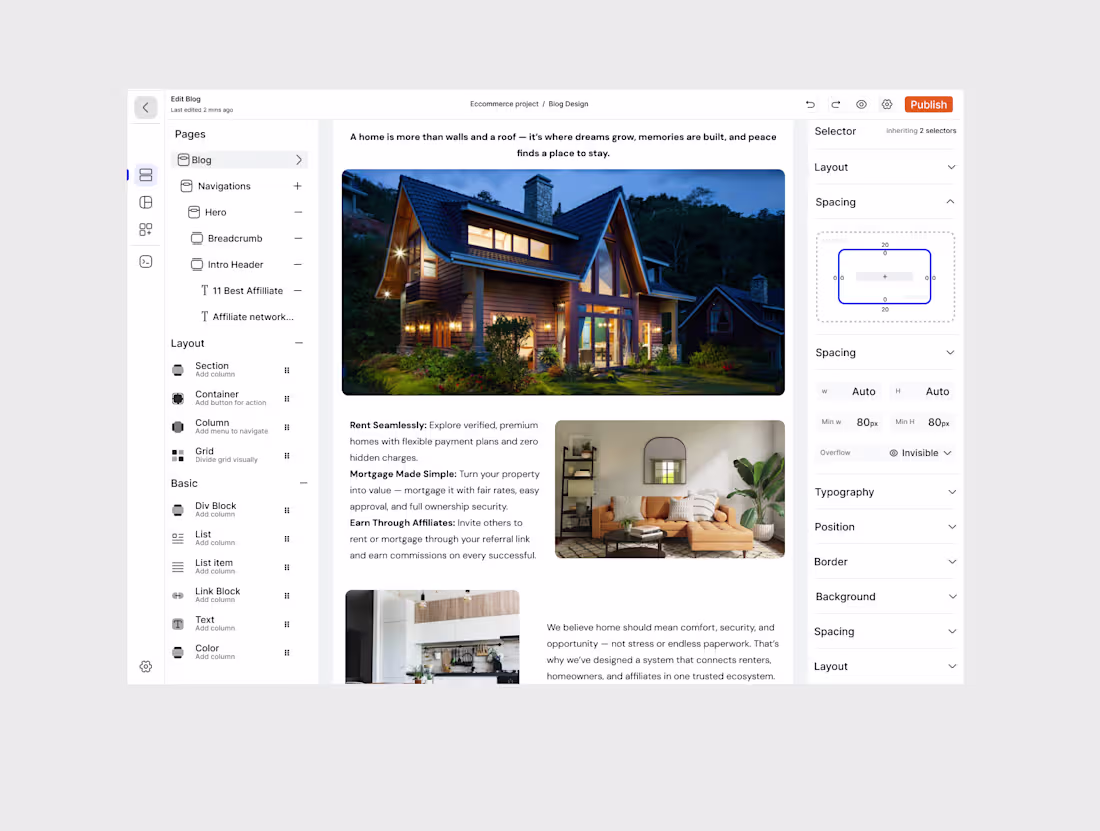
I just completed the UI design for a website builder that makes creating and customizing websites simple and visually engaging. The design focuses on a clean layout, intuitive navigation, and a seamless drag-and-drop experience.
day 11
2
4
56
working on a website builder that makes creating stunning, responsive websites effortless. It’s designed with simplicity in mind — allowing users to drag, drop, and customize elements without any coding skills.
2
3
51
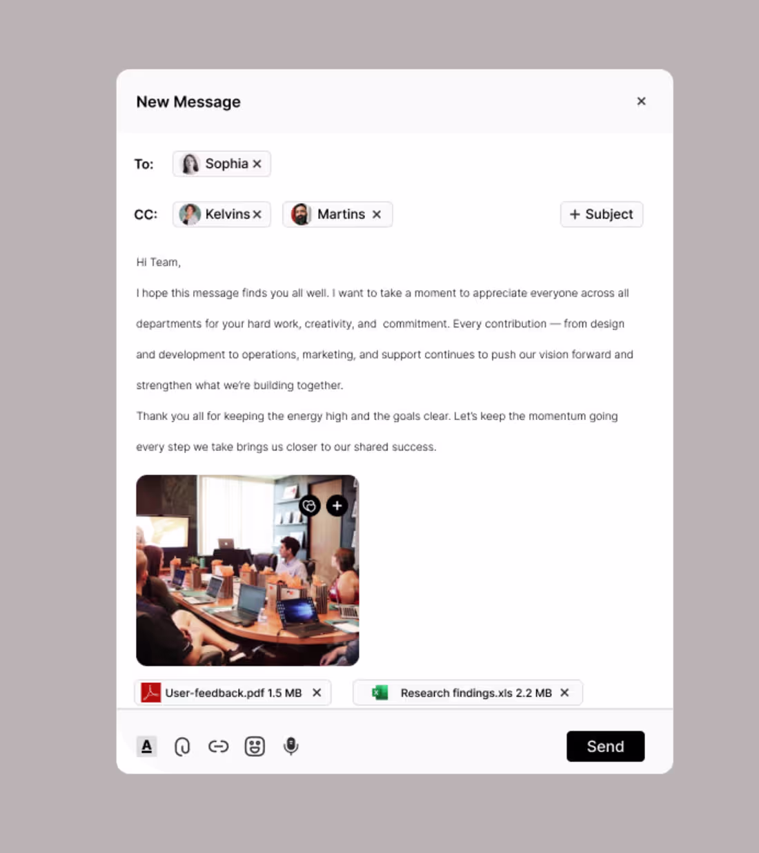
I just designed an email messaging platform that makes communication simple, fast, and organized. It features a clean interface, smart inbox, and smooth navigation to help users manage messages with ease.
day 10
1
33
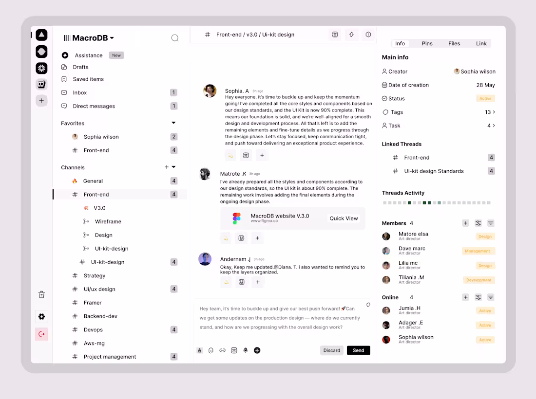
Experience seamless teamwork with our all-in-one Project Management and Team Messaging Platform, built to simplify how teams plan, communicate, and execute projects. No more switching between tools — manage tasks, chat in real-time, share files, and host meetings all within a single intuitive workspace.
Powered by AI, the platform intelligently assists your workflow with task suggestions, deadline reminders, and productivity insights. From startups to global teams, it’s designed to boost efficiency, keep everyone aligned, and ensure projects move from idea to execution smoothly. Simplify your workflow. Amplify your teamwork.
day 6
1
25
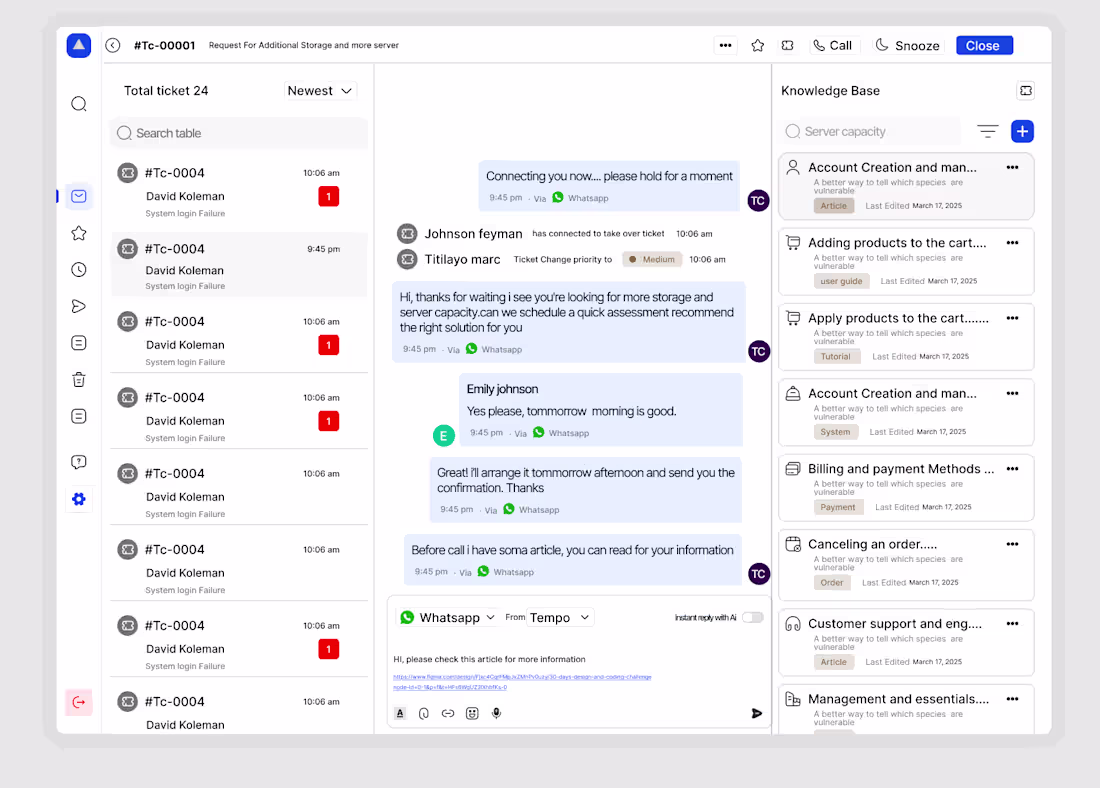
I recently designed a modern and intuitive Customer Support experience focused on speed, empathy, and efficiency. The goal was simple to make every customer feel heard, valued, and helped effortlessly.
This design reimagines how users connect with support teams by combining:
💬 Seamless Live Chat: Real-time conversations powered by smart automation and human touch.
📂 Ticket Management System: Simplified tracking for both users and support agents.
🔔 Smart Notifications: Keep customers updated without overwhelming them.
🤖 AI-Assisted Replies: Suggested responses that help agents save time while maintaining a personal tone.
You need a design
Reach out
Day 5
2
32
Hey, I’ve designed an AI SaaS page — I’d love to hear your feedback and any suggestions for improvement.
day 4🔥
1
34
Hey! I just finished designing an AI automation dashboard. I’d really appreciate any feedback or suggestions for improvement.
2
39
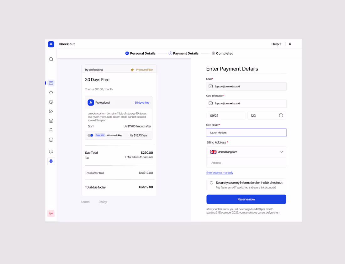
Hey, I’ve designed a checkout page
I’d love your constructive feedback and suggestions for improvement.
day 2
1
31
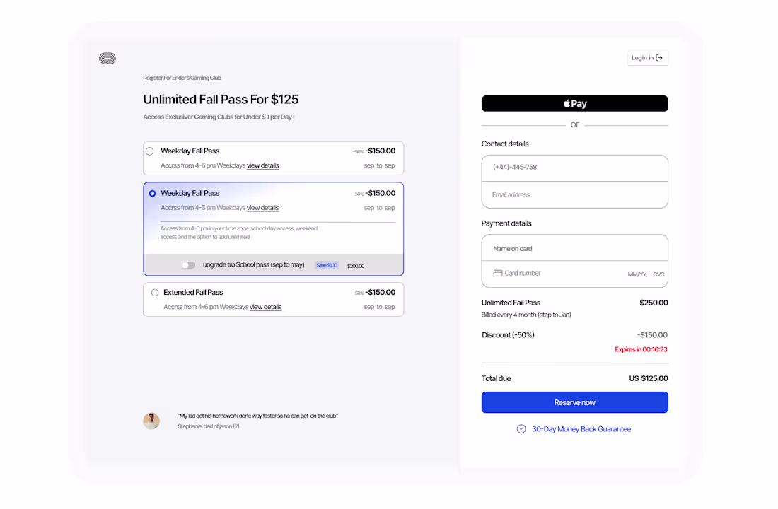
Hey, I’ve designed a checkout page — I’d love your constructive feedback and suggestions for improvement.
1
33