
Timeline
2015 – 2017
Role
Lead Designer & Brand Architect
TimelineRoleProject OverviewThe ChallengeThe SolutionQuin Bite Original Flavours: Vata, Pitta, KaphaQuin Bite TasteOF Edition: America, India, ItalyQuin Bite Six New Flavours: Blueberry, Choco Mint, Coconut, Choco Coco, Brownie & HazelnutKey AchievementsBrand Identity CreationFirst Quin Bite Mascot ConceptsQuin Bite Logo ConceptsQuin Bite Icon Logo & StampAlternative concepts for unreleased flavoursPackaging DesignDigital PresenceConsistency & LongevityThe Design JourneyEarly ConceptsThe contest-winning designs for the original Vata, Pitta & Kapha flavoursRefining the winning concepts into the final designsExpanding the Flavour LineGlobal SeriesPromotional EcosystemQuin Bite Stand flat & 3D views Quin Bite Brochures (A3)Results & ImpactLessons Learned
Project Overview
The Challenge
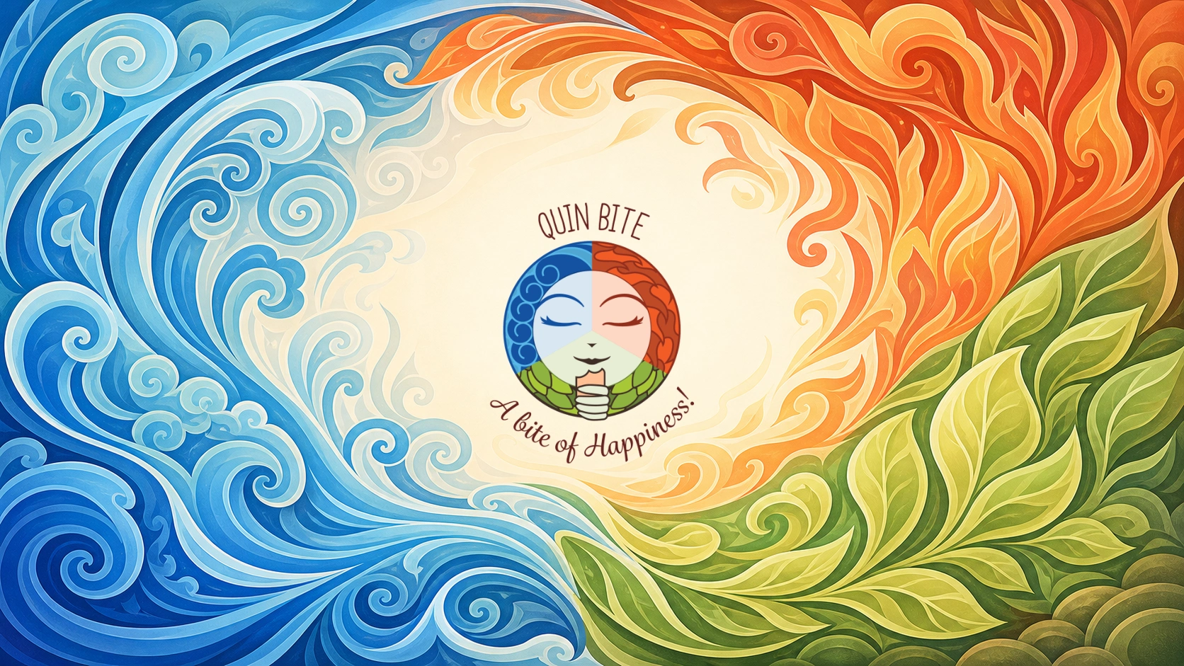
In 2015, Quin Bite was a new entrant in the organic snack market, seeking a distinctive identity that would resonate with health-conscious consumers worldwide. Their vision was to create a brand rooted in Ayurvedic principles, while remaining playful, approachable, and instantly recognisable.
The Solution
I entered and won a global contest on 99designs, where my concept for the original Quin Bite label and mascot was chosen. This victory marked the beginning of a long-term collaboration in which I became the main designer for their brand identity and packaging.
Quin Bite Original Flavours: Vata, Pitta, Kapha

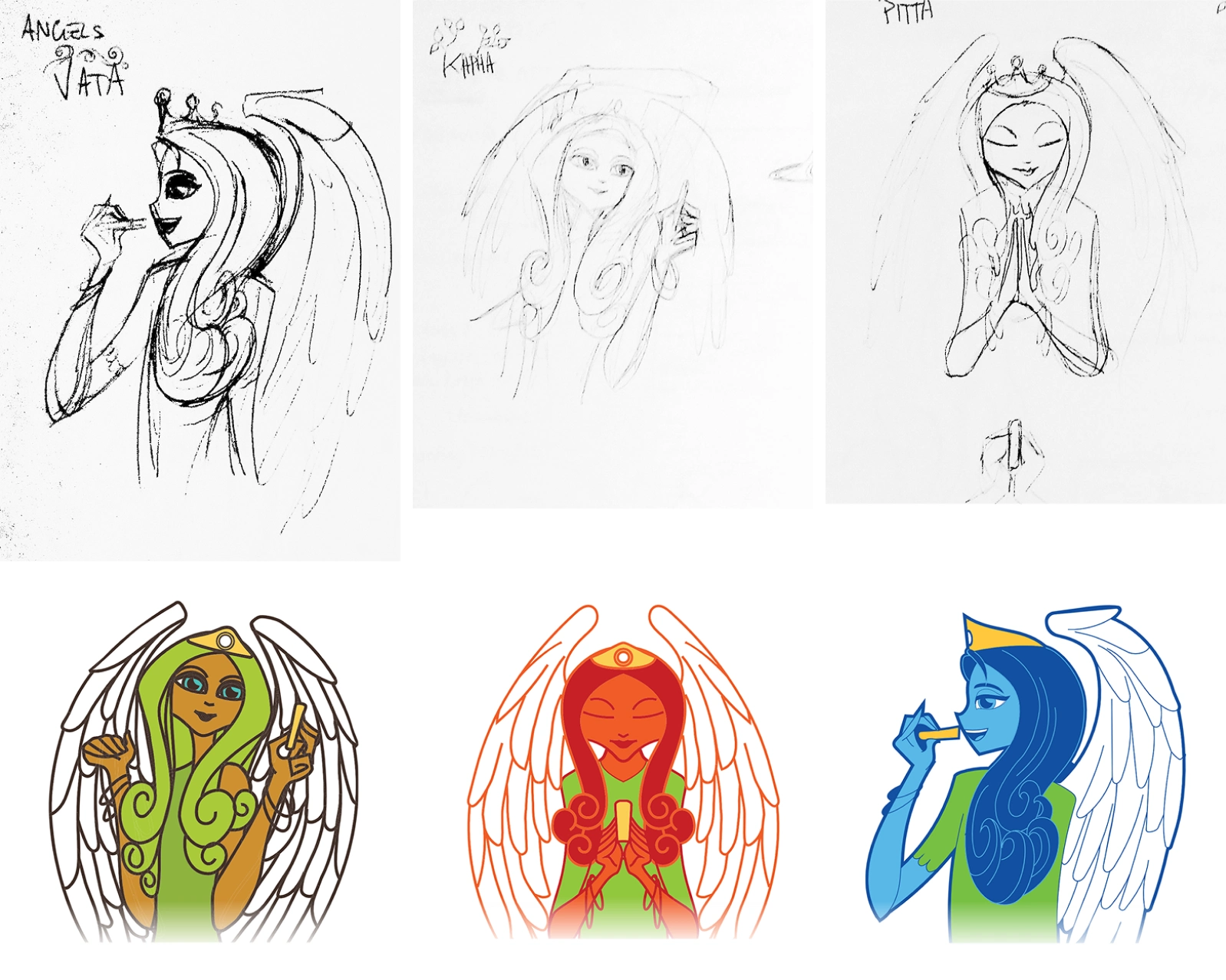
Angel Mascots for the original three Ayurvedic flavors: Vata, Pitta, and Kapha

Quin Bite TasteOF Edition: America, India, Italy
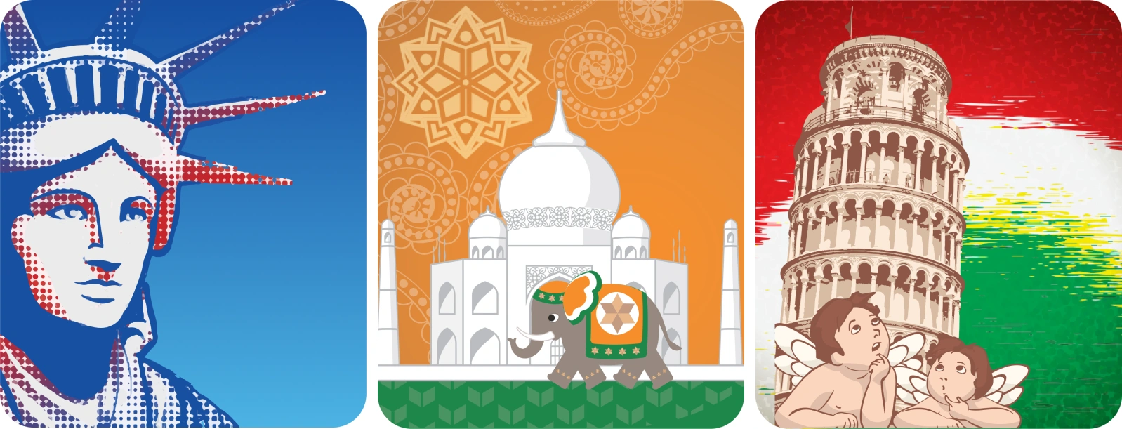
My designs shaped the Taste Of series (America, India, and Italy), where each box featured custom illustrations and 3D renders, reinforcing the brand’s global appeal.

The “Taste Of” series: America, India, and Italy with culturally inspired packaging

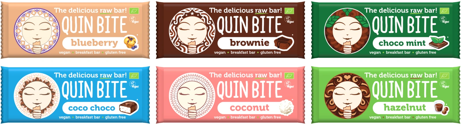
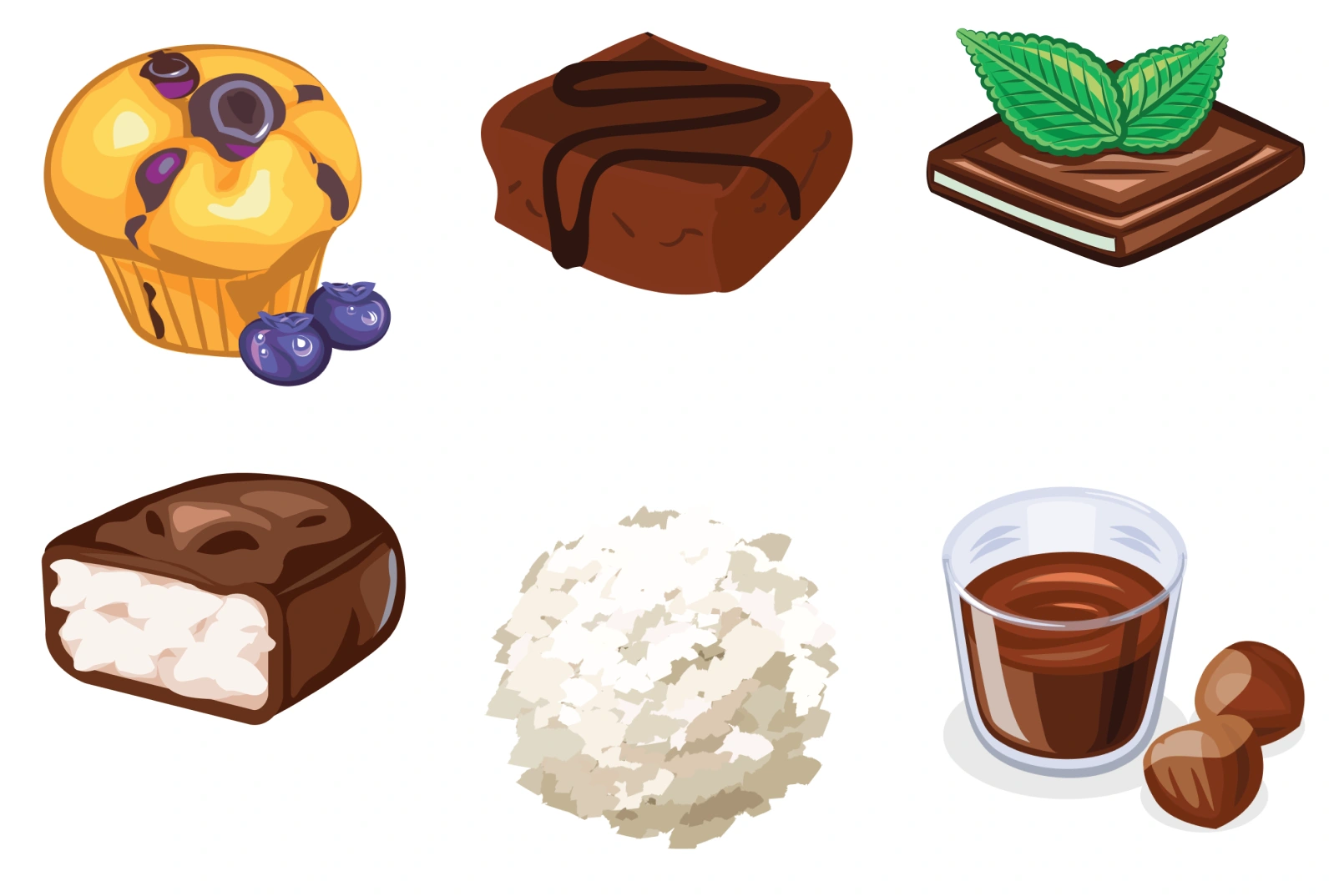
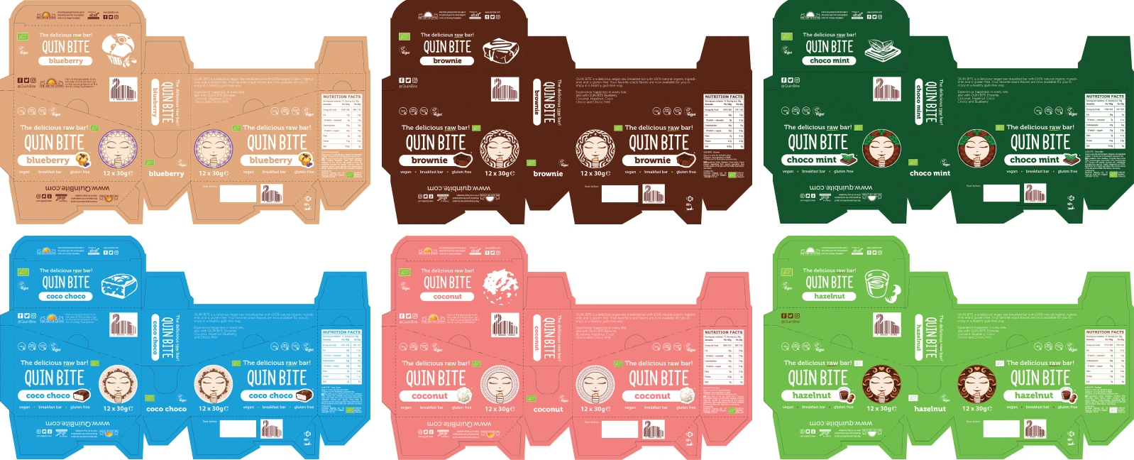
Quin Bite Six New Flavours: Blueberry, Choco Mint, Coconut, Choco Coco, Brownie & Hazelnut
From the first three Ayurvedic flavours—Vata, Pitta, and Kapha—I designed the logo and mascot that became the cornerstone of Quin Bite’s visual identity. Over the years, I expanded the brand with packaging for six new flavours—Choco Mint, Hazelnut, Coconut, CocoChoco, Brownie, and Blueberry—as well as promotional materials including flyers, stickers, stands, and the original website.
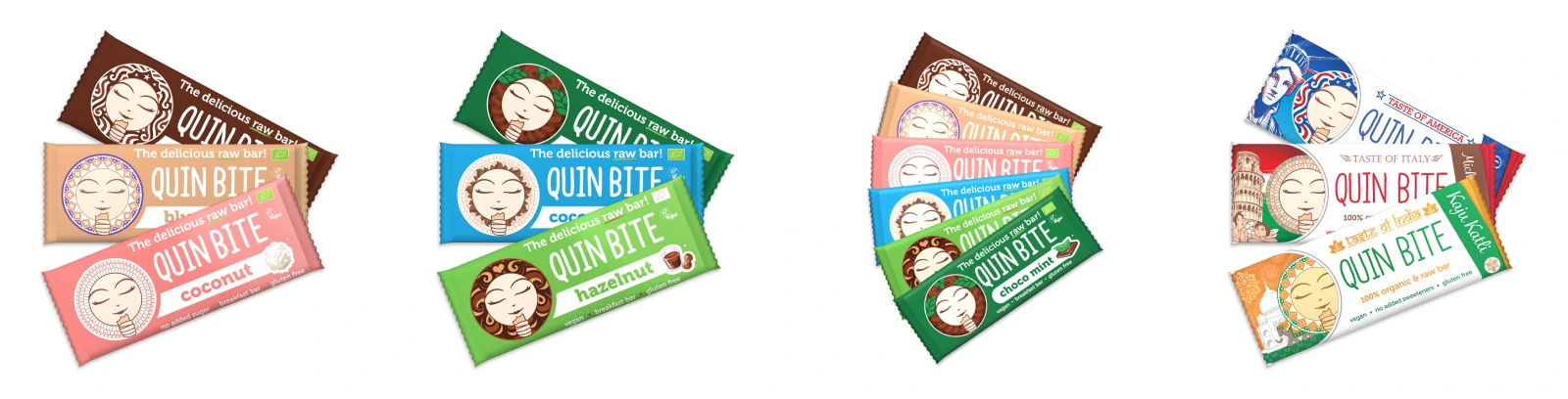
Expanded product line featuring six new flavours with original illustrations & 3D bars
Key Achievements
Brand Identity Creation
Designed the original mascot and logo, inspired by Ayurveda’s three doshas.
First Quin Bite Mascot Concepts
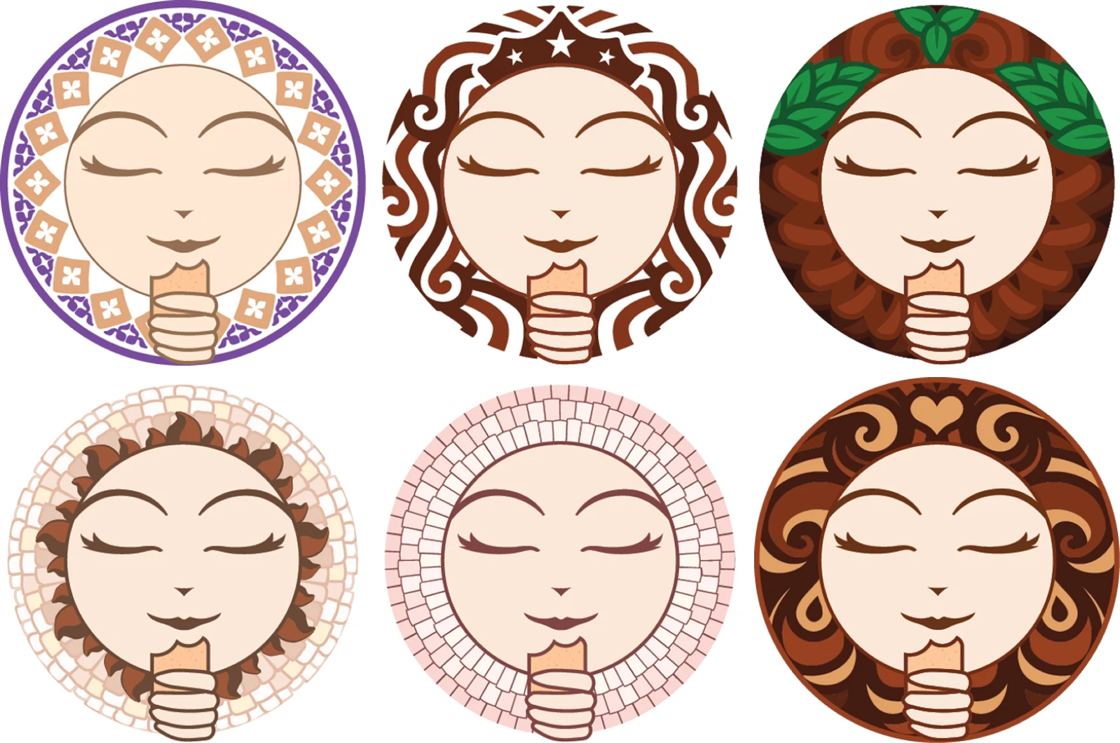
The playful mascot and logo design that became Quin Bite’s brand identity
Quin Bite Logo Concepts

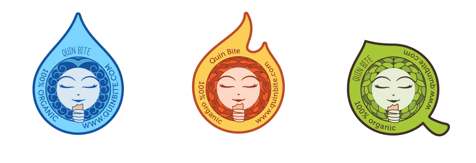
Quin Bite Icon Logo & Stamp
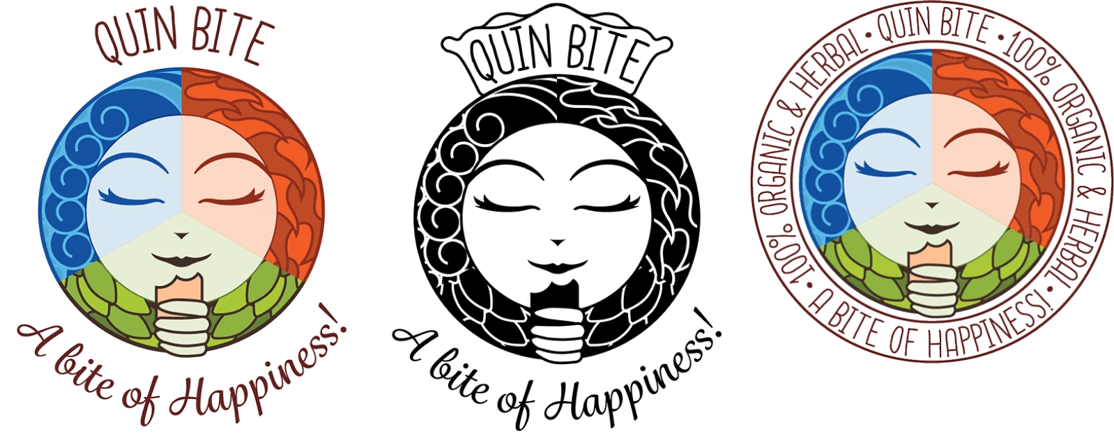
Alternative concepts for unreleased flavours

Three concepts for flavours that were not released at that time: Banana, Orange and Raspberry
Packaging Design
Created wrappers, boxes, and promotional materials for the first three flavours, then expanded to six new flavours with unique illustrations and 3D renders.
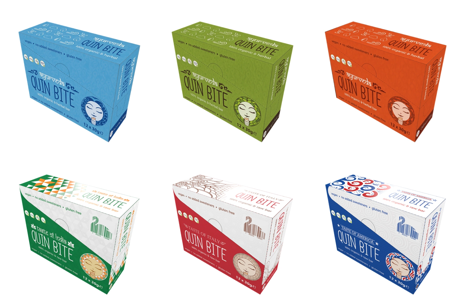
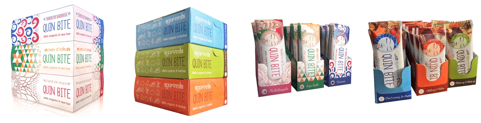
3D -endered mockups of the boxes for the Ayurveda and "Taste Of" series
Digital Presence
Designed and developed Quin Bite’s first website, establishing their online identity.
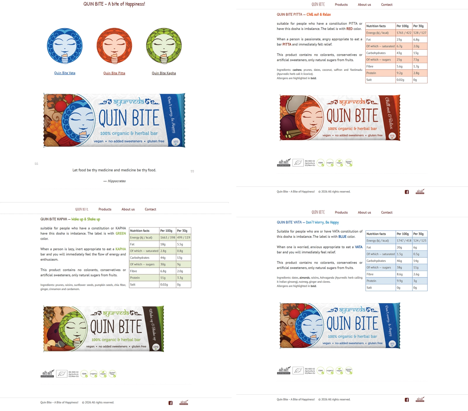
The original Quin Bite website design established their digital presence.
Consistency & Longevity
My original designs have remained the foundation of Quin Bite’s brand, guiding subsequent products and ensuring recognisability across markets.
The Design Journey
Early Concepts
The Ayurveda-inspired labels were my first contribution, balancing vertical layouts and playful mascots. These designs set the tone for the brand’s identity—natural, vibrant, and approachable.
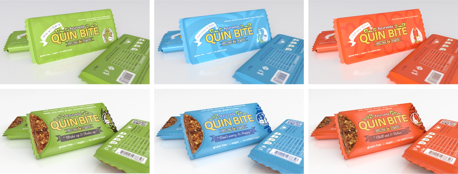
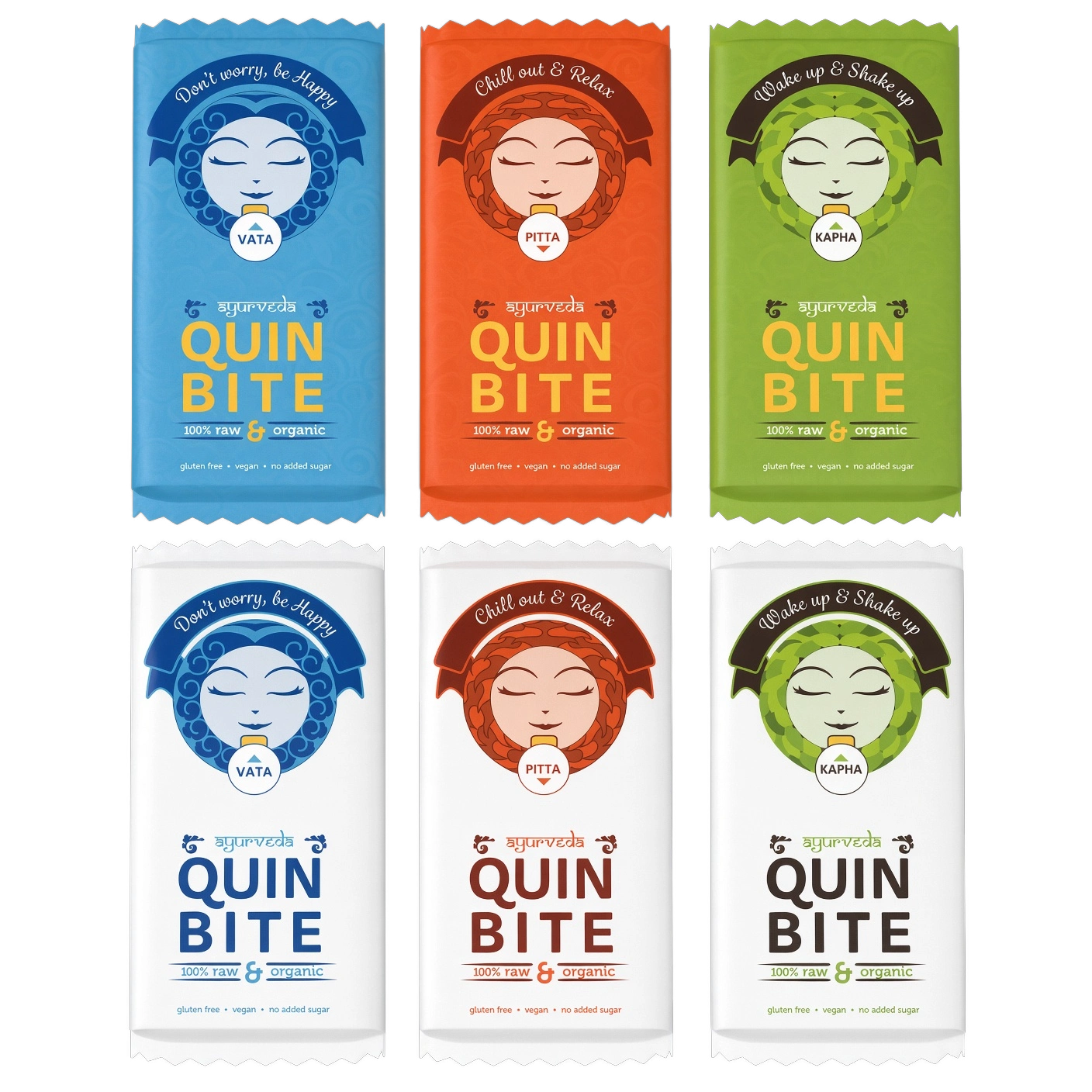
Alternative vertical 3D concept for the Ayurveda-inspired labels
The contest-winning designs for the original Vata, Pitta & Kapha flavours
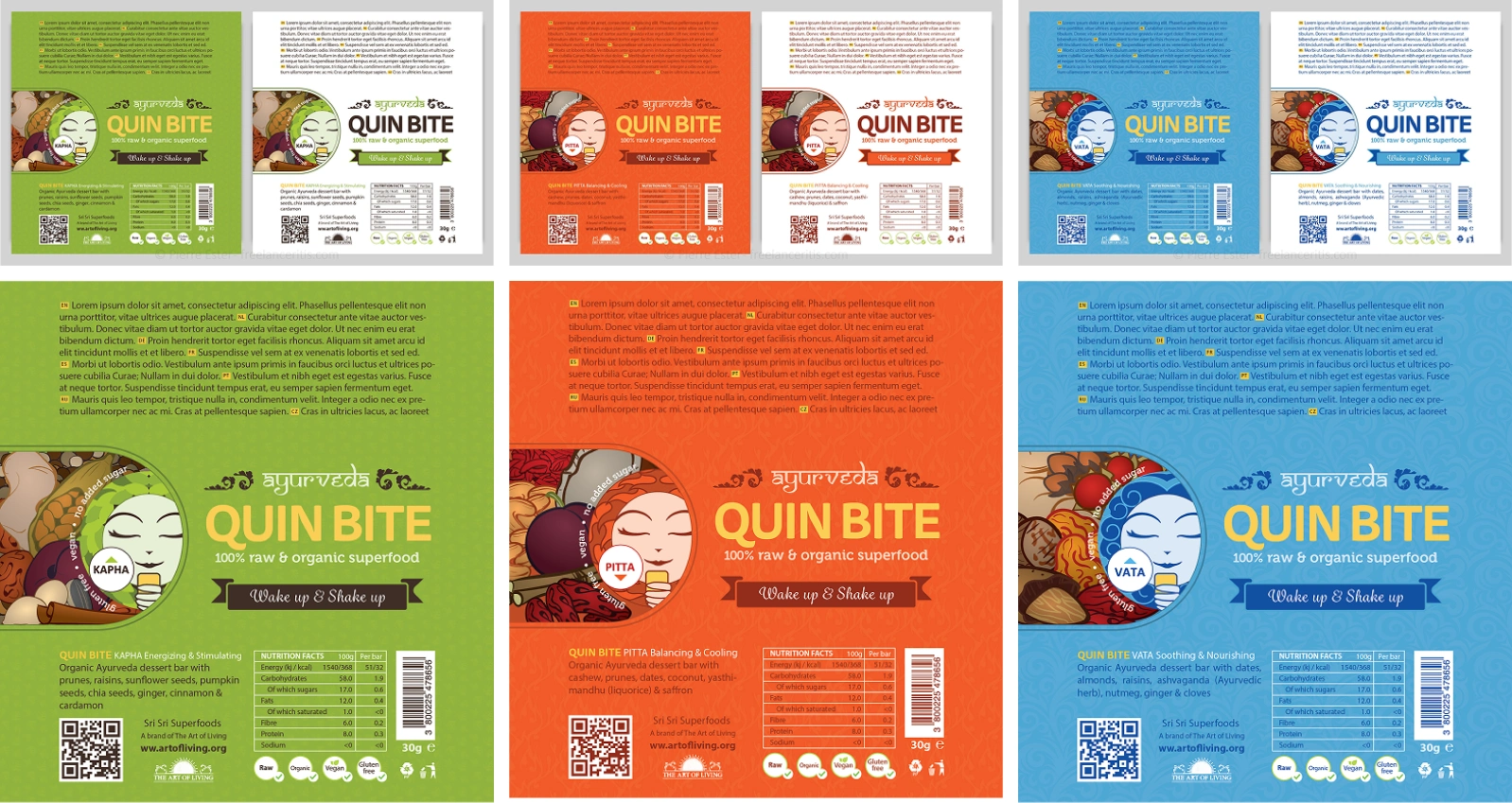
Label designs for the contest-winning concepts
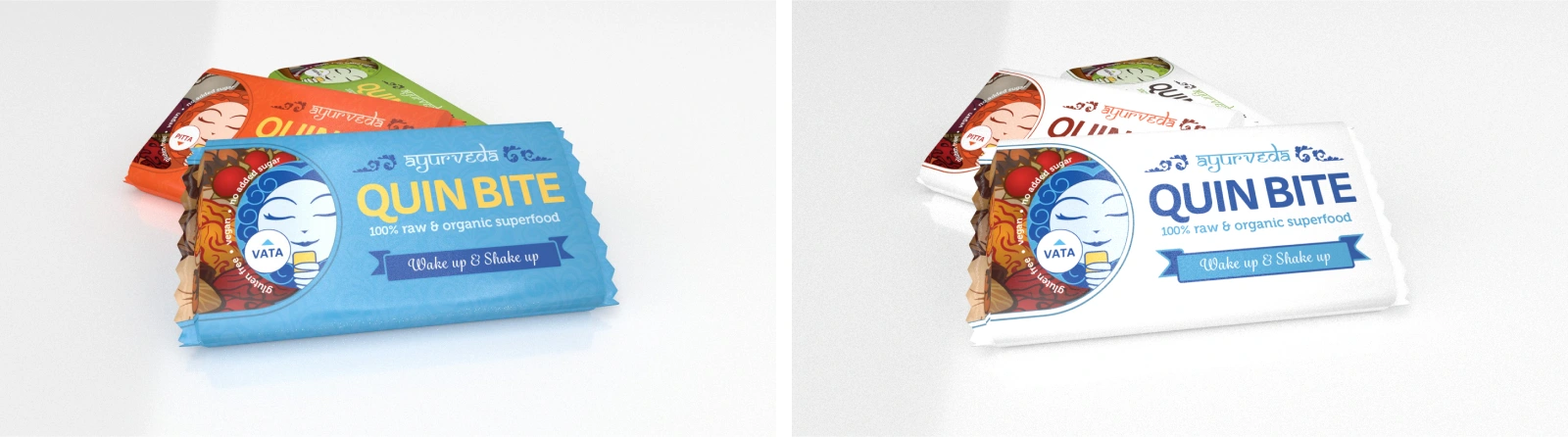
Refining the winning concepts into the final designs
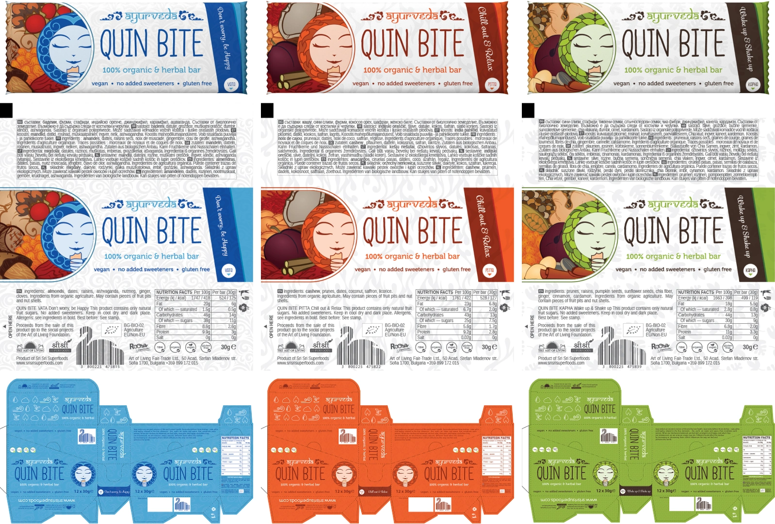
The final packaging design for the Ayurveda Quin Bite labels and boxes
Expanding the Flavour Line
When Quin Bite introduced six new flavours, I created packaging that highlighted each ingredient with original vector illustrations and hard-surface 3D modelling for boxes. This ensured the products stood out on shelves while maintaining brand cohesion.
Global Series
The “Taste Of” collection required a different approach: integrating cultural motifs and storytelling into packaging. I produced custom illustrations and real-dimension 3D renders for boxes representing America, India, and Italy.

Promotional Ecosystem
Beyond packaging, I designed flyers, stickers, and stands to support retail presence, ensuring a unified brand experience across touchpoints.
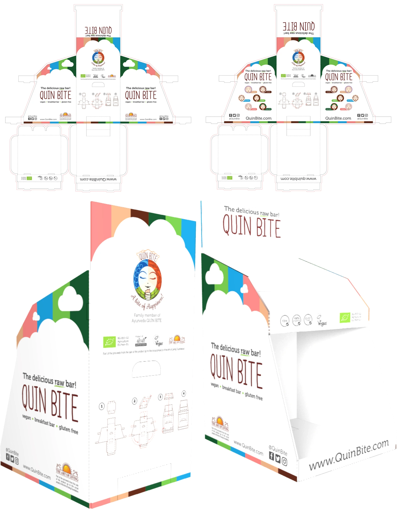
Quin Bite Stand flat & 3D views
Quin Bite Brochures (A3)
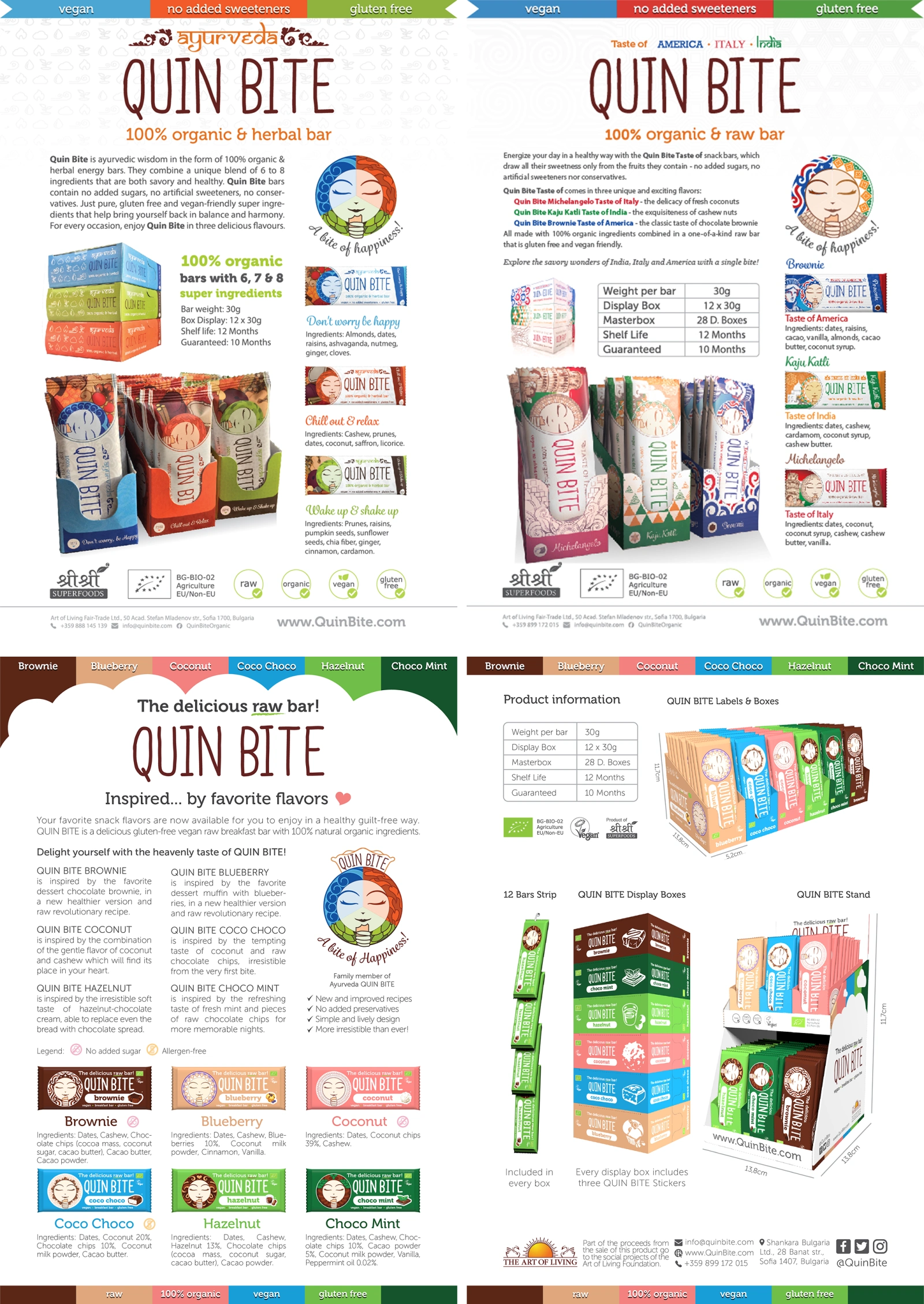
Flyers, stickers, brochures, and retail stands maintaining brand consistency
Results & Impact
Quin Bite’s products are now available in multiple countries, with a highly recognisable brand identity that has endured for a decade.
The mascot and packaging designs remain central to their branding, proving the longevity and adaptability of the original concept.
My work provided a visual blueprint for subsequent products, ensuring consistency and scalability as the brand grew.
Lessons Learned
Winning the initial contest was just the beginning. Sustained collaboration required adaptability and consistency.
Designing for both local Ayurvedic roots and global expansion taught me how to balance cultural specificity with universal appeal.
Packaging design is more than aesthetics; it’s about creating a recognisable identity that builds trust and loyalty across markets.
0 likes · 0 views · Nov 15, 2026
Project requiring general graphic design work, including label design, box cover design, stickers and product presenter for Ayurveda Quin Bite snack bars.


