DataPulse Website Design for Enhanced Conversion Rates
Shlok Negi
DataPulse, a data analytics SaaS platform, needed a website that clearly showcased its product while driving sign-ups. The design prioritizes a clean structure, smooth animations, and interactive elements to make information easy to absorb. Key sections highlight core features, integrations, and pricing, with a focus on conversion through clear CTAs and an intuitive layout.
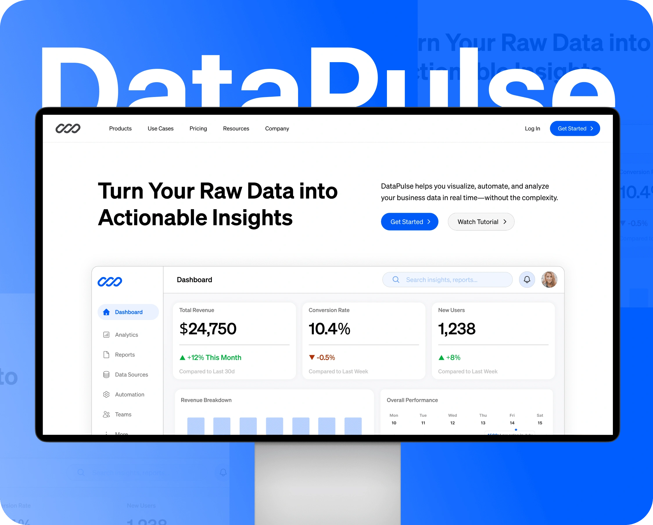
Full website
Objective
Highlight product features clearly without overwhelming users.
Enhance engagement through interactive elements.
Apply UI/UX best practices to improve usability and conversion rates.
Maintain a minimal yet aesthetically pleasing design.
Target Audience
SaaS startups seeking affordable analytics solutions.
Enterprises in need of scalable data analysis tools.
Decision-makers such as CEOs, CTOs, and product managers.
Design Approach
1. Research & Inspiration
Analyzed websites like Mixpanel, Tableau, and Datadog.
Focused on intuitive structure, trust-building visuals, and seamless interaction.
2. Wireframing & Structure
Hero section with an impactful tagline and subtle interactivity.
Tab-based feature layout to reduce information overload.
Trust section with testimonials and logos.
Strategically placed call-to-actions to drive sign-ups.
3. UI & UX Strategy
Tab-based content and guided cards to simplify complex features.
Smooth mockup animations to enhance engagement.
Applied Hick’s Law and the Von Restorff Effect to optimize decision-making.
Emphasized visual hierarchy through spacing, typography, and color.
4. Interactive & Motion Design
Animated hero section with fade-in tagline: “Unlock Your Data’s Potential”.
Hover-based tab interactions for exploring features.
Interactive walkthrough using guide cards.
Subtle scroll-triggered animations for a dynamic experience.
Card Animations
Tab annonations
5. Responsiveness & Adaptability
Fully fluid layouts for multi-device compatibility.
Mobile-optimized interactive elements.
Touch-friendly navigation and scalable design system.
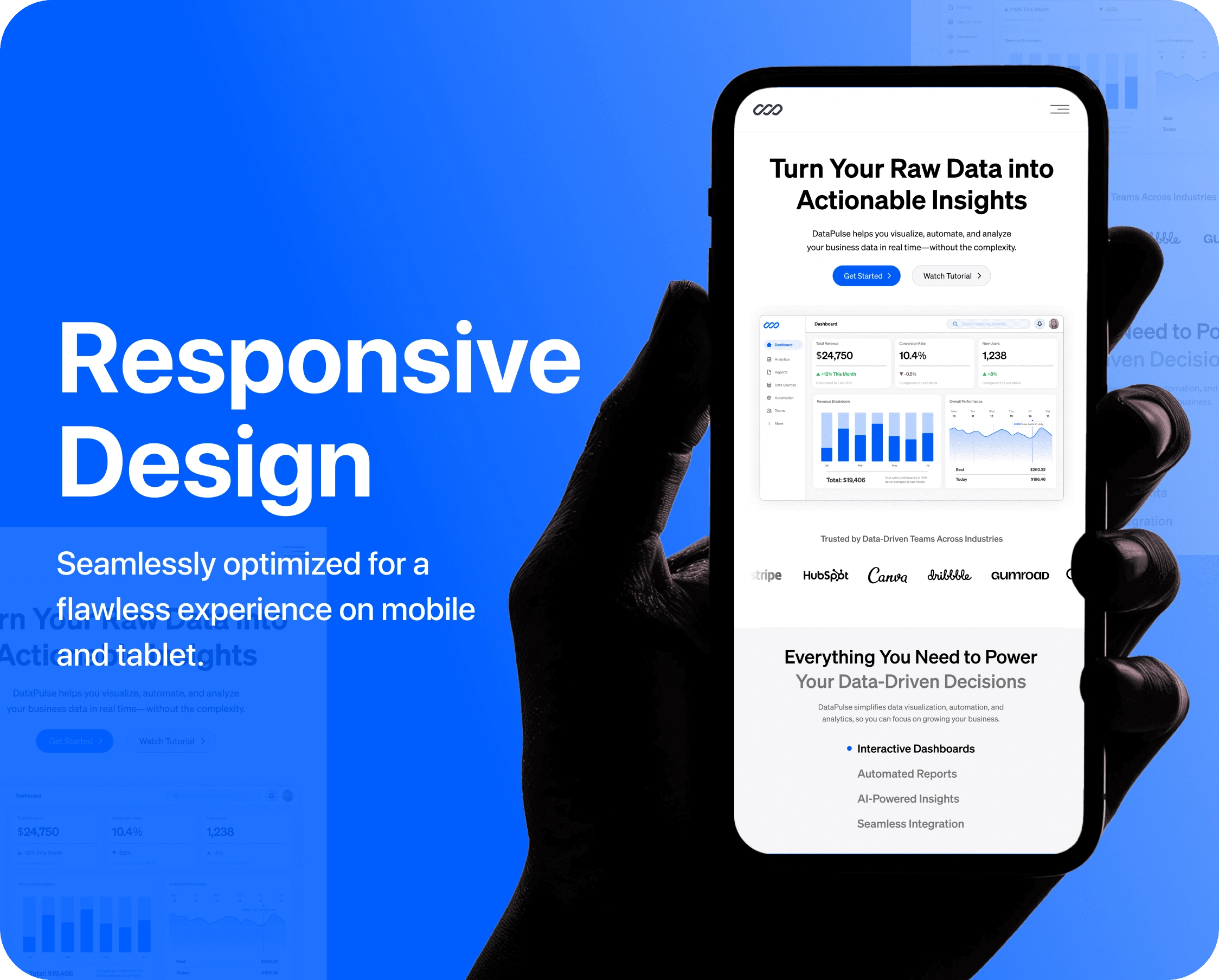
Responsive Design
Challenges
Keeping animations smooth while optimizing performance.
Balancing minimal design with meaningful engagement.
Communicating complex features in a simplified structure.
Key Takeaways
Micro-interactions and motion design can significantly boost user engagement.
Minimal design, when done right, enhances both function and aesthetics.
Strategic UI/UX principles are critical for trust, usability, and conversions.
Like this project
Posted Apr 25, 2025
Designed a website for DataPulse to enhance user engagement and conversions.
Likes
0
Views
0
Timeline
Jan 25, 2025 - Feb 5, 2025
Clients
DataPulse