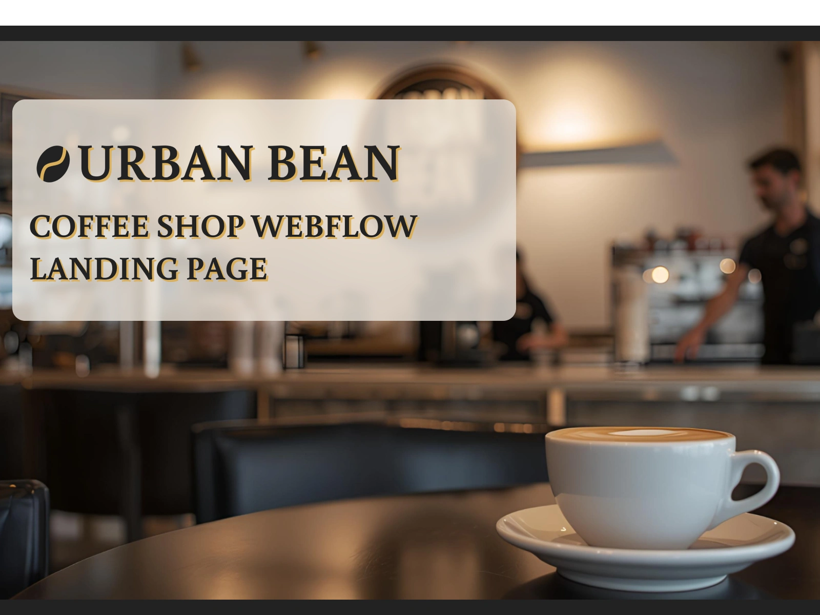
Urban Bean – Coffee Shop Webflow Landing Page
THE PROBLEM
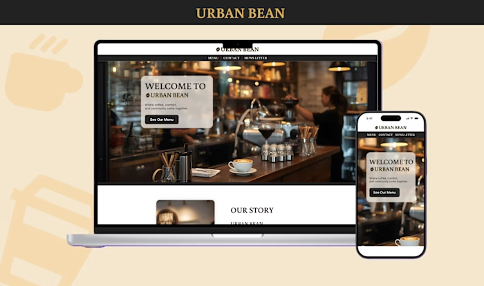
Urban Bean needed a website that could digitally recreate the cozy, warm atmosphere of the physical café.
The challenge was to communicate this feeling through visuals while also providing a simple, intuitive way for users to explore the full menu.
THE SOLUTION
I designed a two-page Webflow experience focused on both warmth and usability.
The homepage builds an emotional connection through storytelling and warm photography, while the dedicated “Menu” page offers a clean, structured product showcase.
The result is a website that feels inviting, atmospheric, and easy to navigate.
TYPOGRAPHY
My choice of typography was essential for capturing the brand’s warm personality.
I selected Buenard for headings to create a cozy, handcrafted tone that supports the café’s storytelling style.
To balance this, I paired it with Inter for body text—clean, modern, and highly readable—ensuring the website remains functional and easy to navigate.
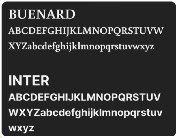
Urban Bean font
COLOR PALETTE
Urban Bean’s colors draw inspiration from real café elements: coffee beans, warm wood, and soft cream tones.
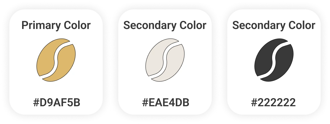
Color Palette
GRID SYSTEM
I implemented a precise 12-column grid, built within a 1192px max-width container, using 70px columns and 32px gutters.
This structure ensures clean alignment, balanced spacing, and a layout that scales perfectly from desktop to mobile.
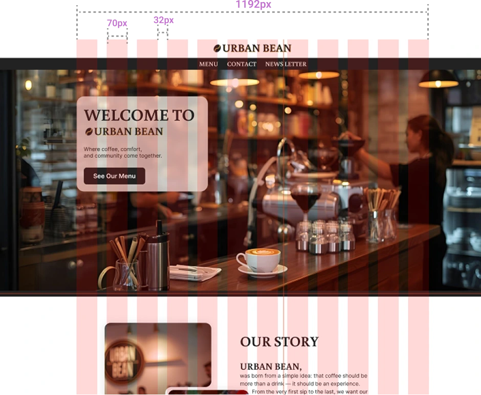
Urban Bean Grid System
FINAL RESULT
Urban Bean’s final design blends atmosphere with usability, capturing the café’s cozy personality while offering a smooth browsing experience.
Warm visuals, handcrafted typography, and a structured layout come together to create a digital space that feels authentic, inviting, and premium.
Like this project
Posted Dec 2, 2025
A warm and cozy place brought to life in Webflow. A premium coffee shop landing page with handcrafted typography, clean structure, and inviting visuals.

