Built with Framer
Youtuber's Website
Designing and developing a creative website for Azul Wells, a popular YouTuber.
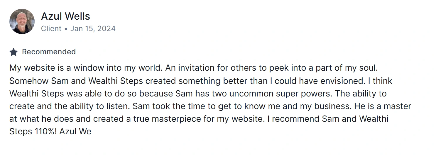
Testimonial
Services
Brand Guide
Brand Design
UI/UX Design
Custom Framer Development
Website Design
Maintenance
About
Azul Wells is a renowned YouTuber, cultivating an 80k-strong community, guiding individuals both financially and mentally on their journey to retirement.
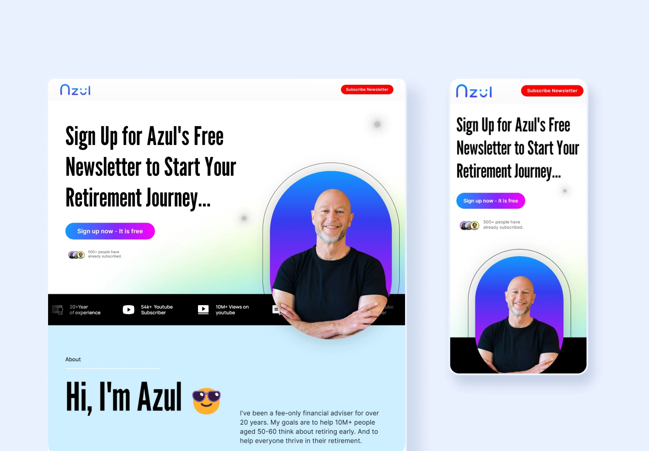
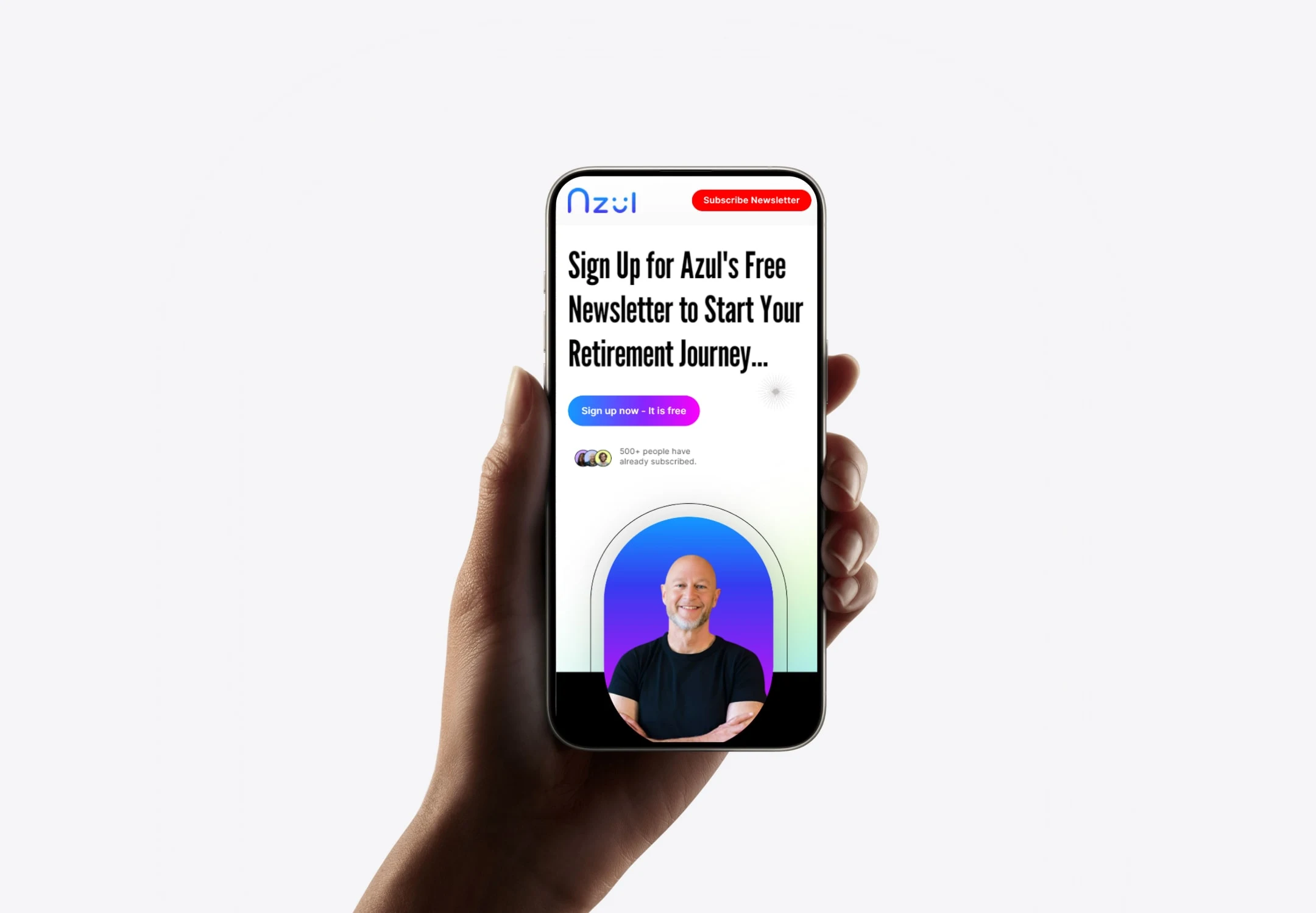
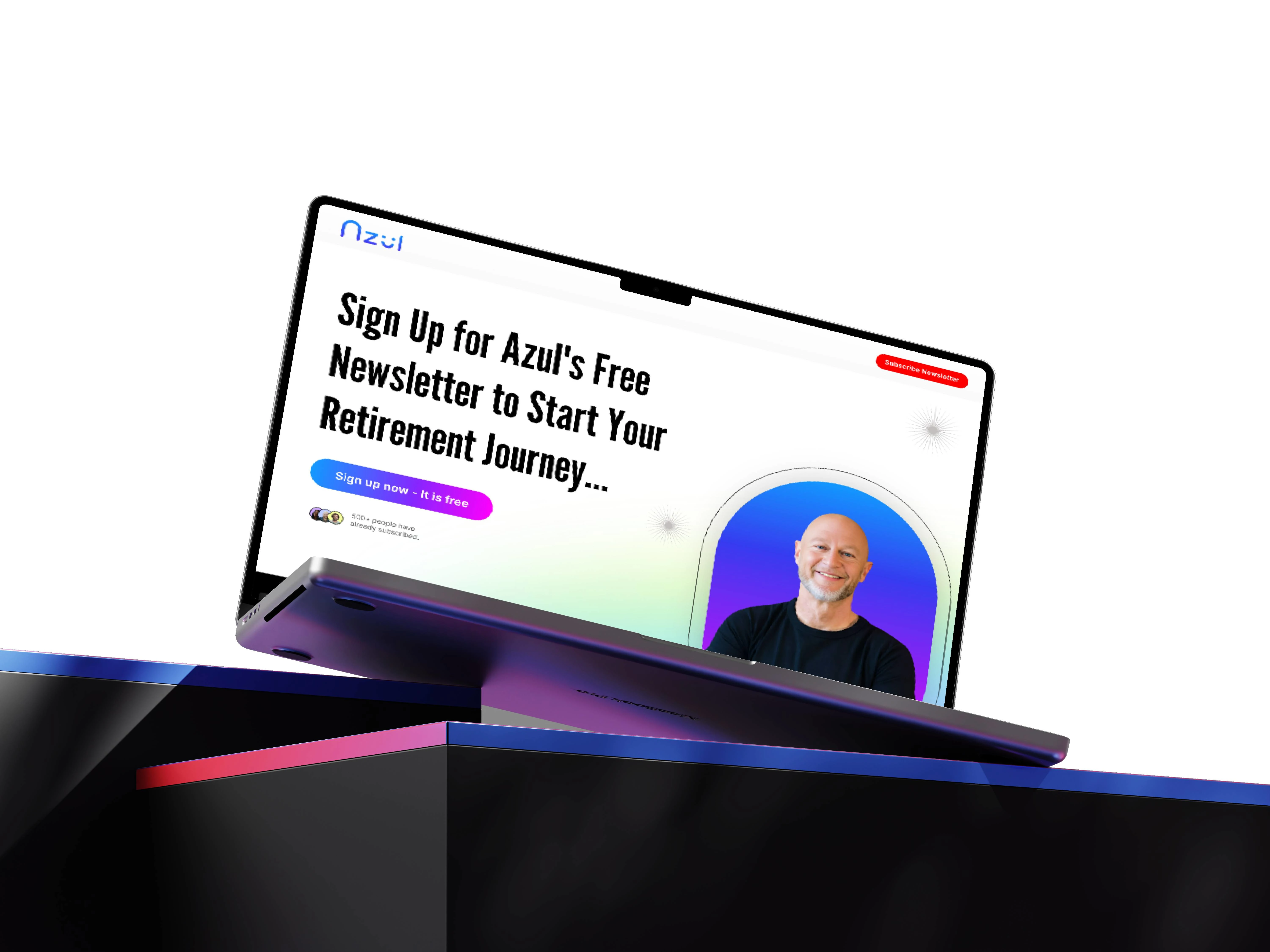
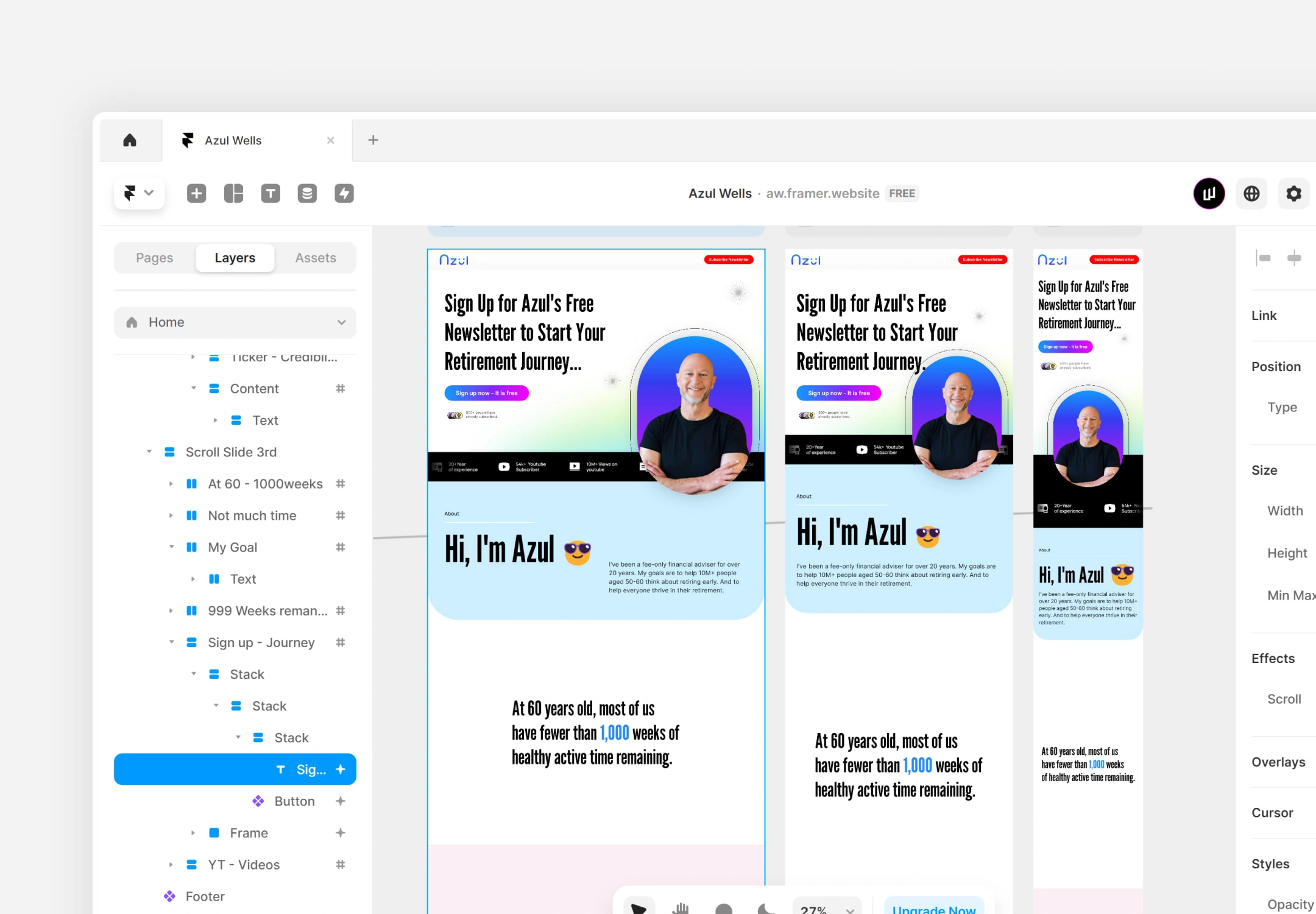
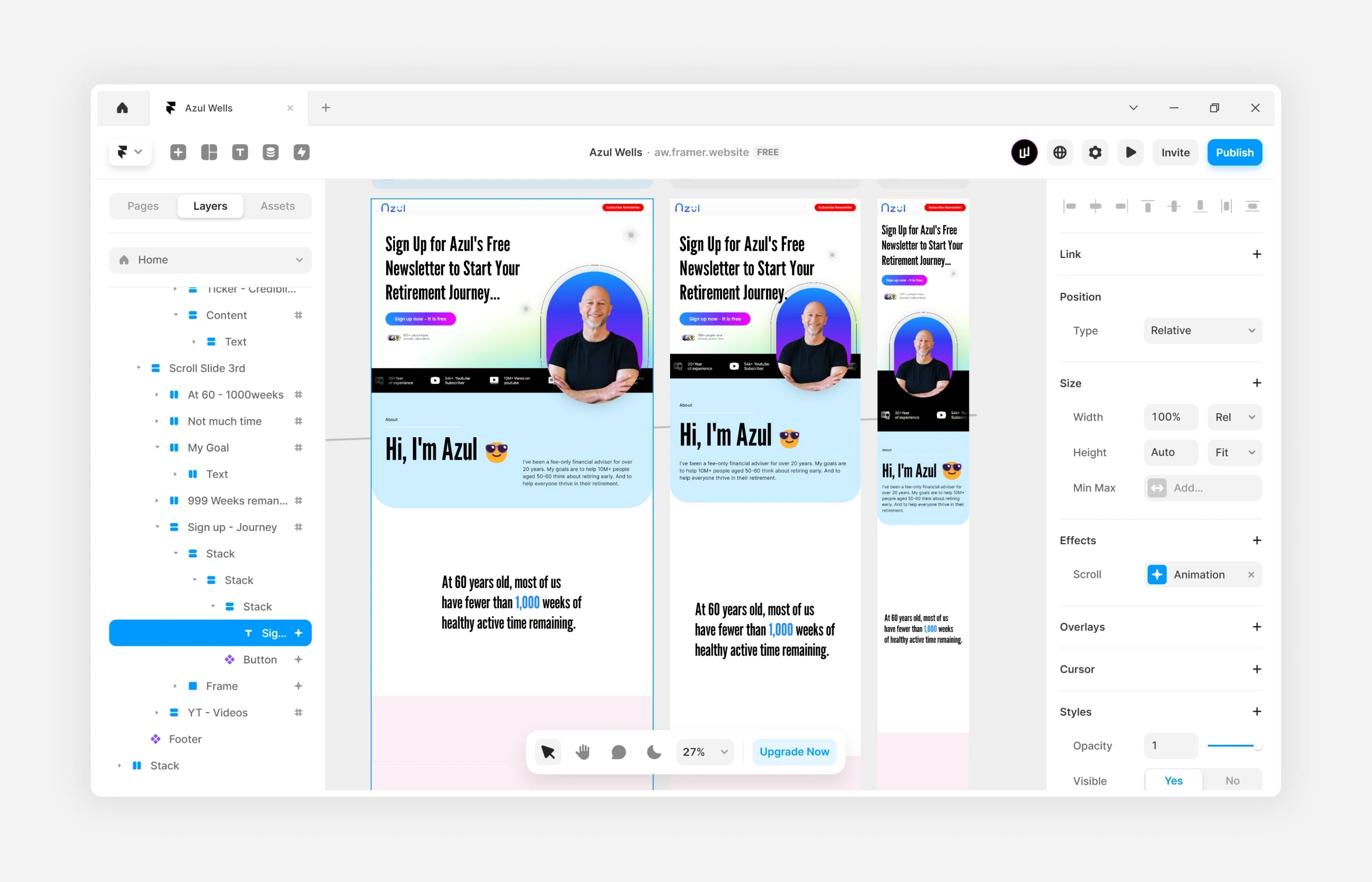
Framer development
Understanding the business
Business goals
Initially, Azul Wells had an early-stage basic website with no branding or proper UI/UX design, which he personally developed to establish an online presence. Since then, we have worked together to create a cool yet professional platform for targeted YouTube subscribers, offering insights into Azul's persona and encouraging them to join the newsletter.
A significant objective of their new website was to infuse a human touch into their brand and engage their ideal target audience.
Business challenges
The previous website was not built in a scalable way. Azul wanted a complete brand identity overhaul, including a new logo, YouTube banner, color palette, UX/UI design, and migration to Framer. He needed a partner to be involved in all areas. He had a strong vision for how the website should look and feel, requiring numerous micro-animations and creative ways to tell Azul's story
Objective
Align visual elements and storytelling with refreshed branding while improving user navigation
Improve overall aesthetic and user experience and make the site more engaging
Drive conversion of site visitors to sign up newsletters and watch Azul's YouTube videos
Showcase their updated branding with an emphasis on photography
Build on SEO foundations to increase search engine traffic and drive future growth
Our approach
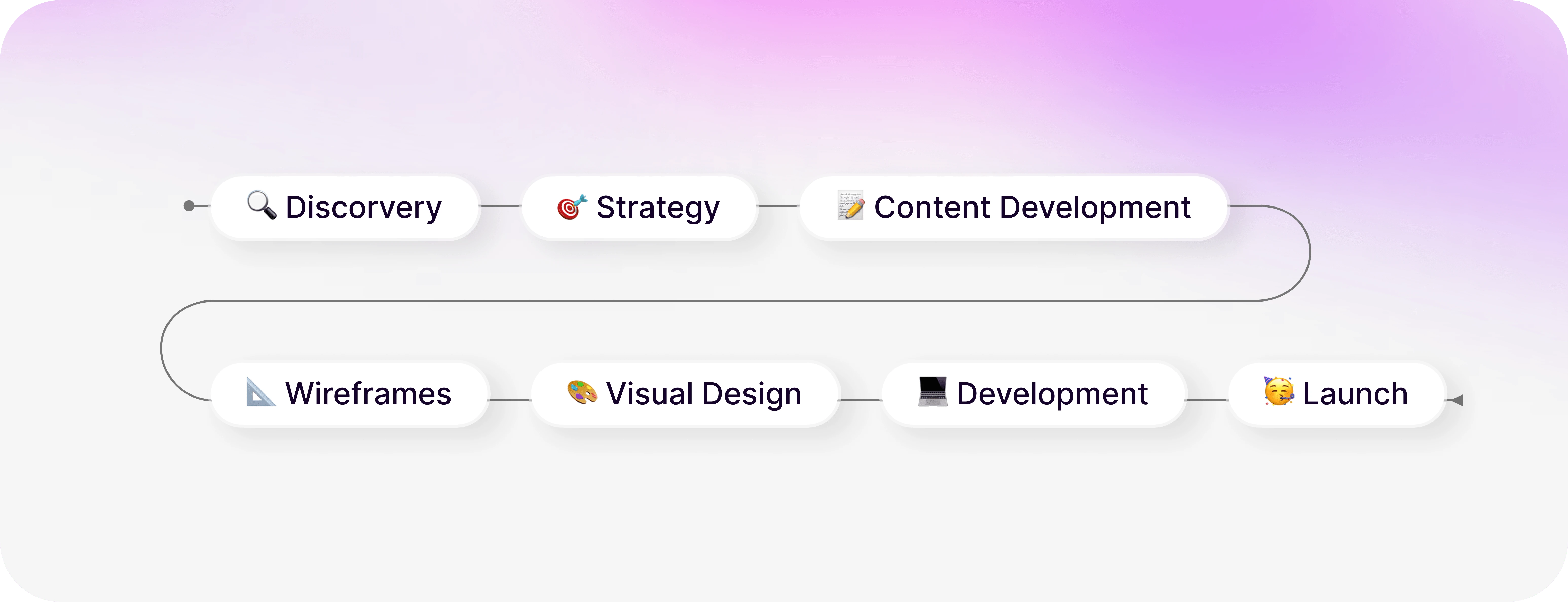
Asking the Right Questions
What are the primary goals for your website? (e.g., increasing subscribers, providing resources, promoting services, signup for newsletter)
What features should be highlighted to first-time users?
What is the most important thing to highlight on the website?
What is the biggest pain point for your customers?
What is the long-term Goal for Azul well?
Is there a particular message or feeling you want your brand to convey to your audience?
What types of content do you plan to feature on your YouTube channel and website?
Are there elements from their branding or websites that you find appealing or want to avoid?
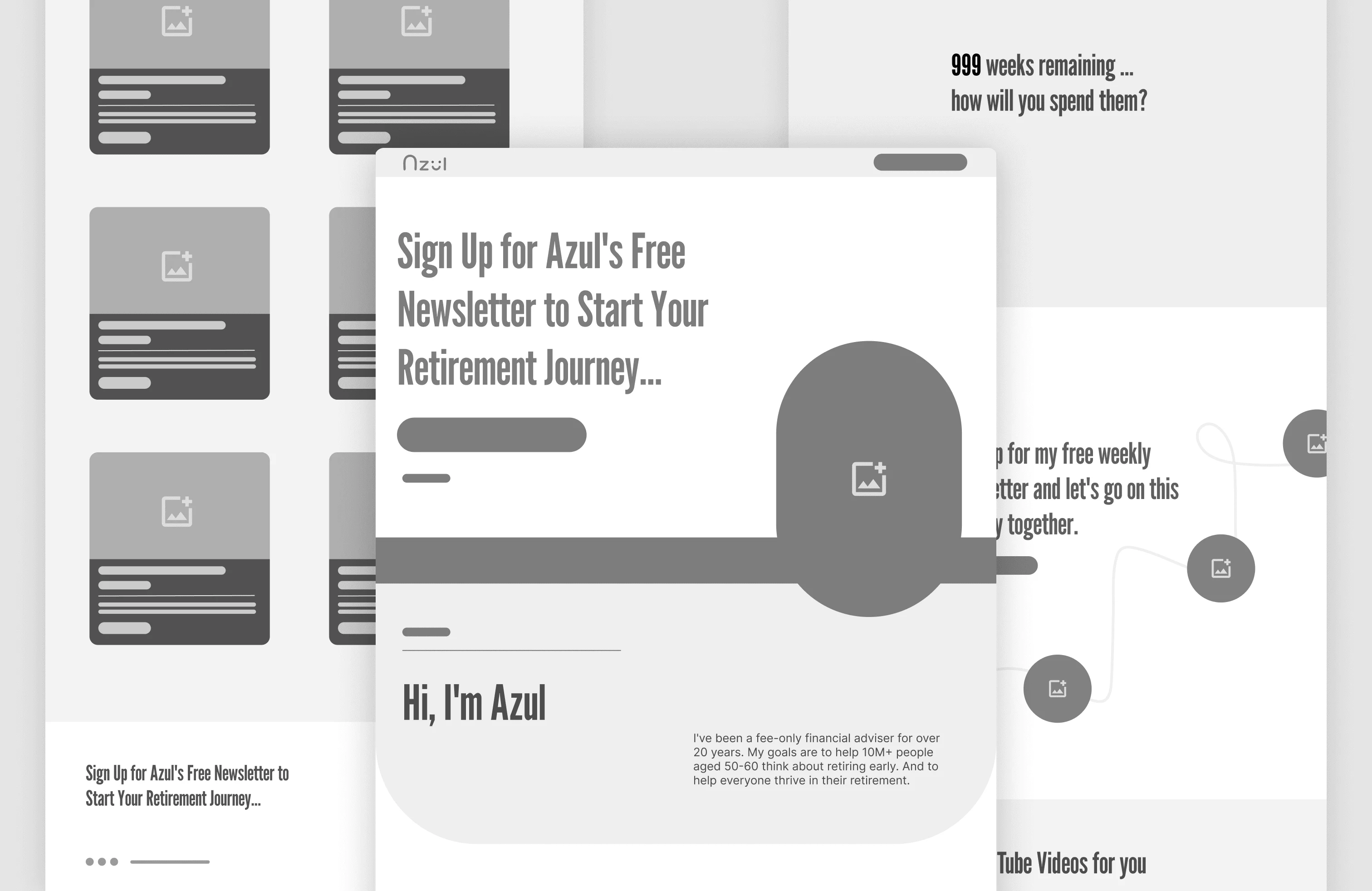
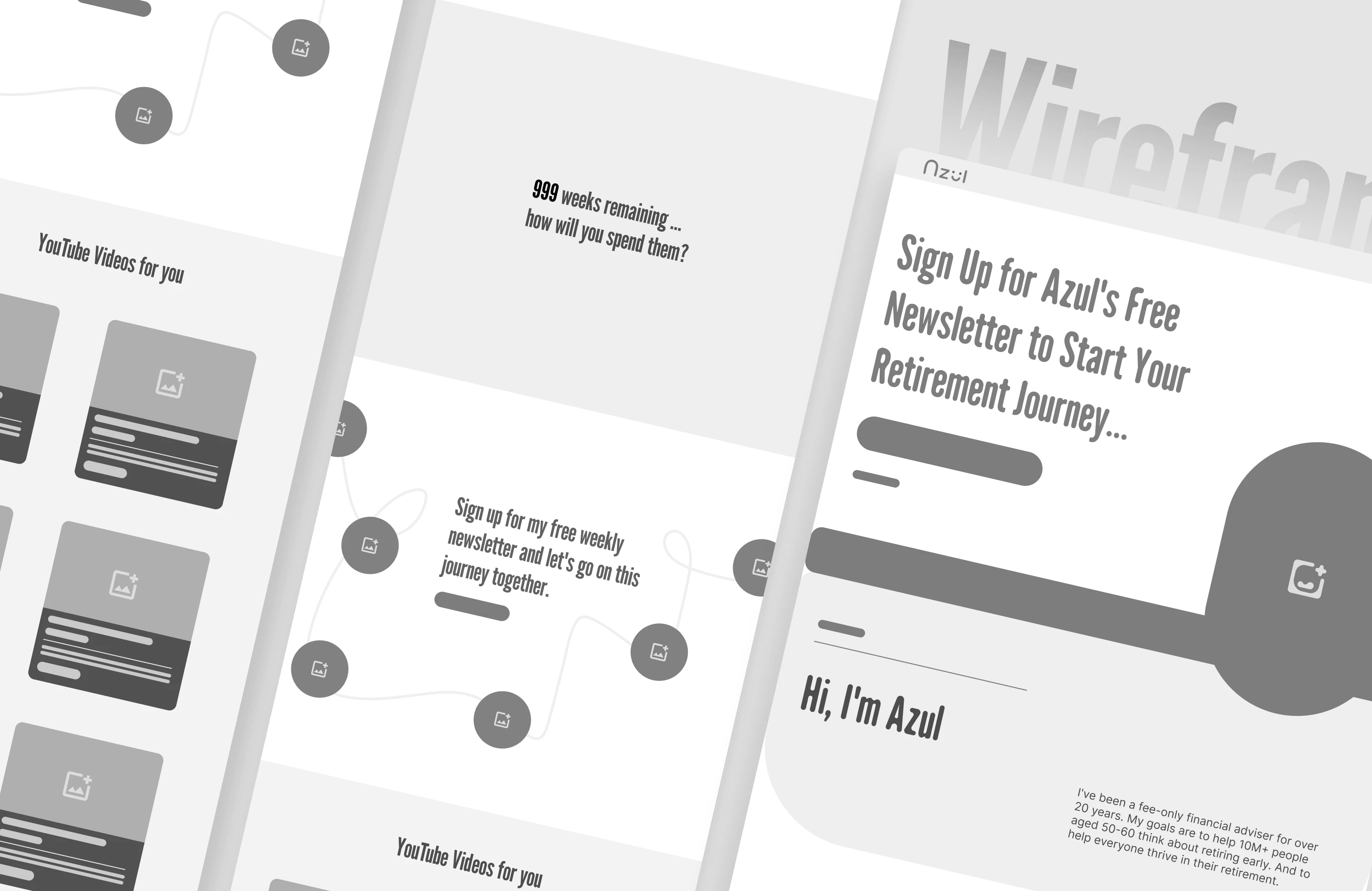
Wireframing/Prototyping
Visual Style Guide
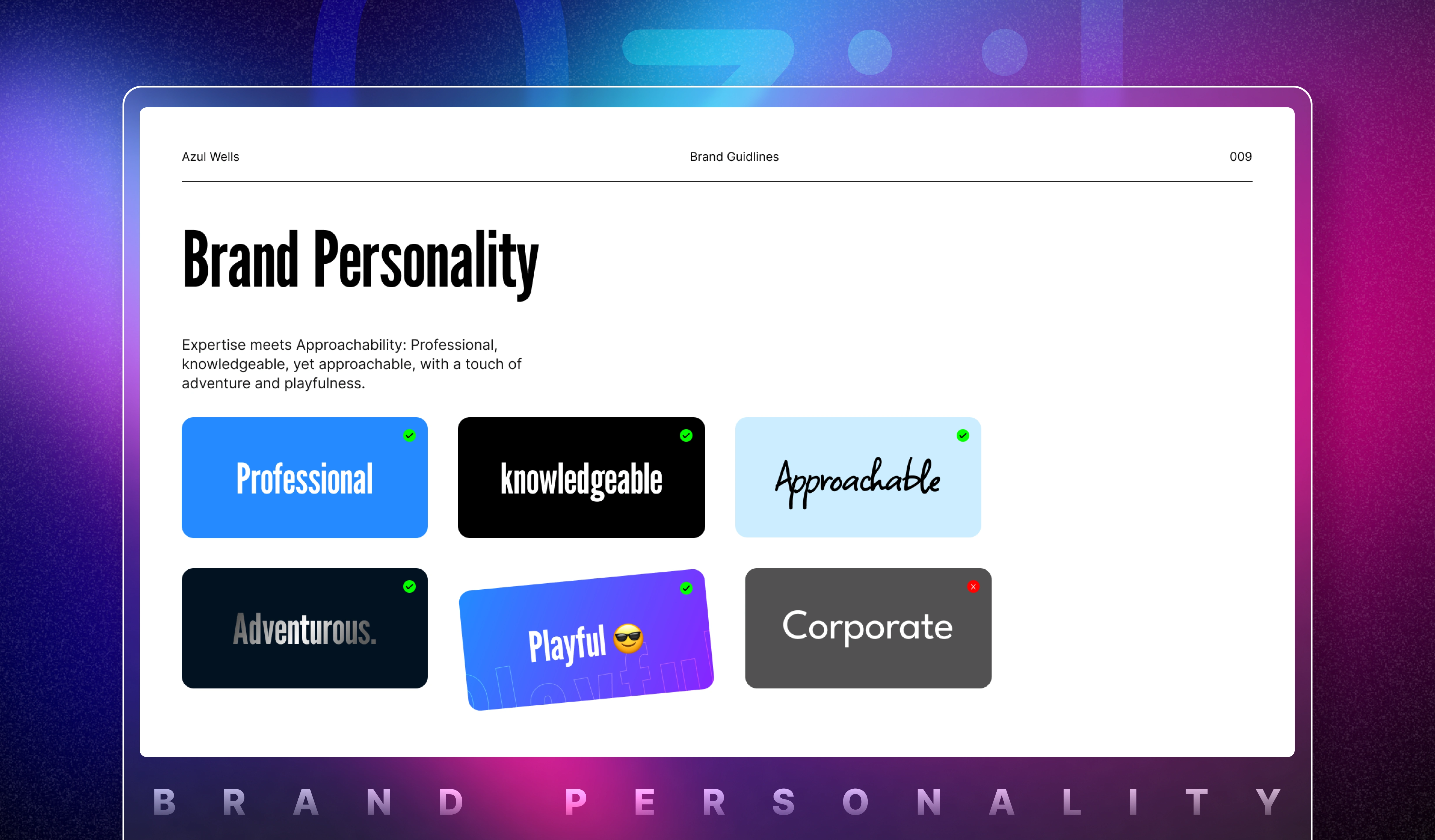
Brand Guide
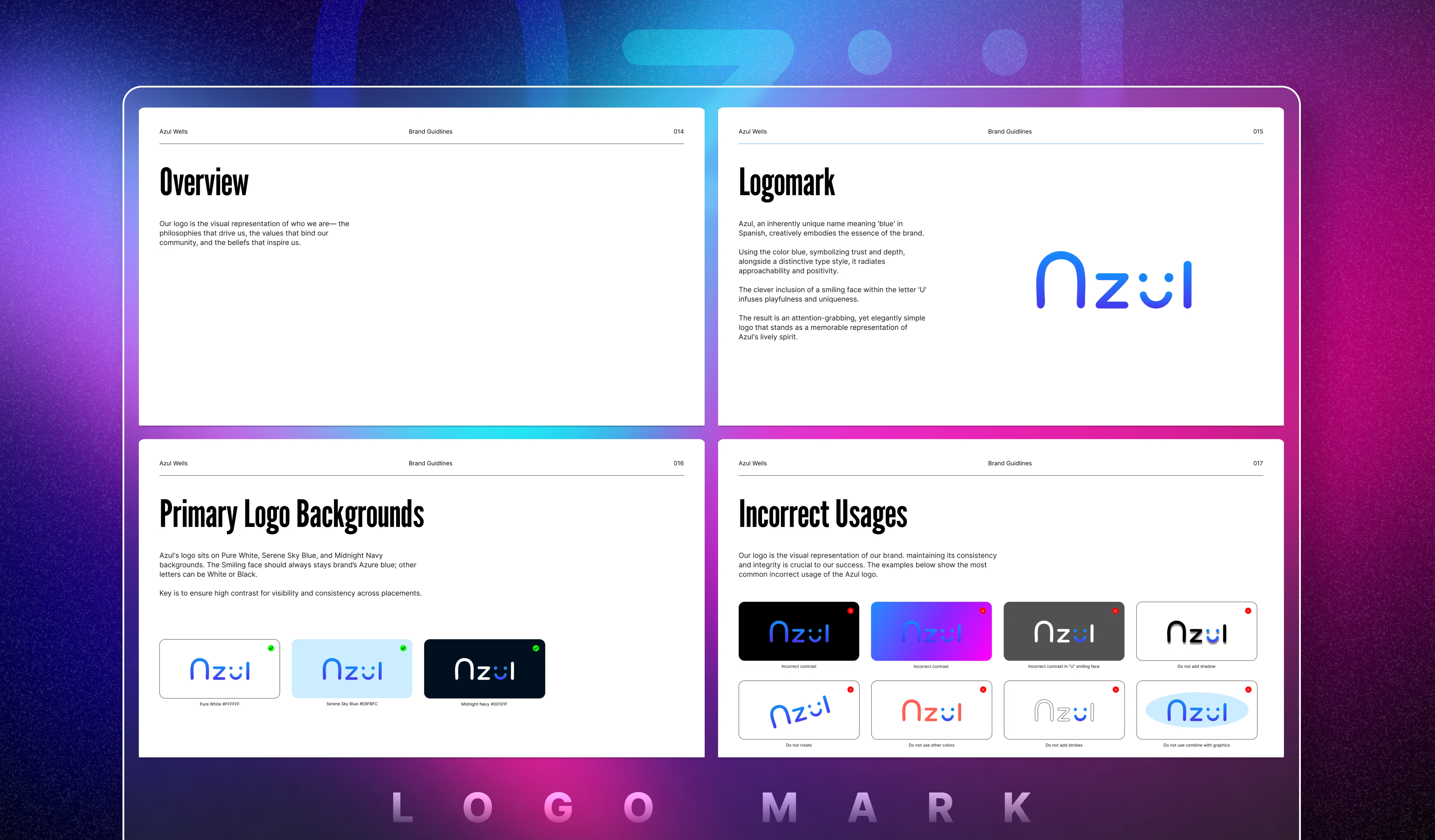
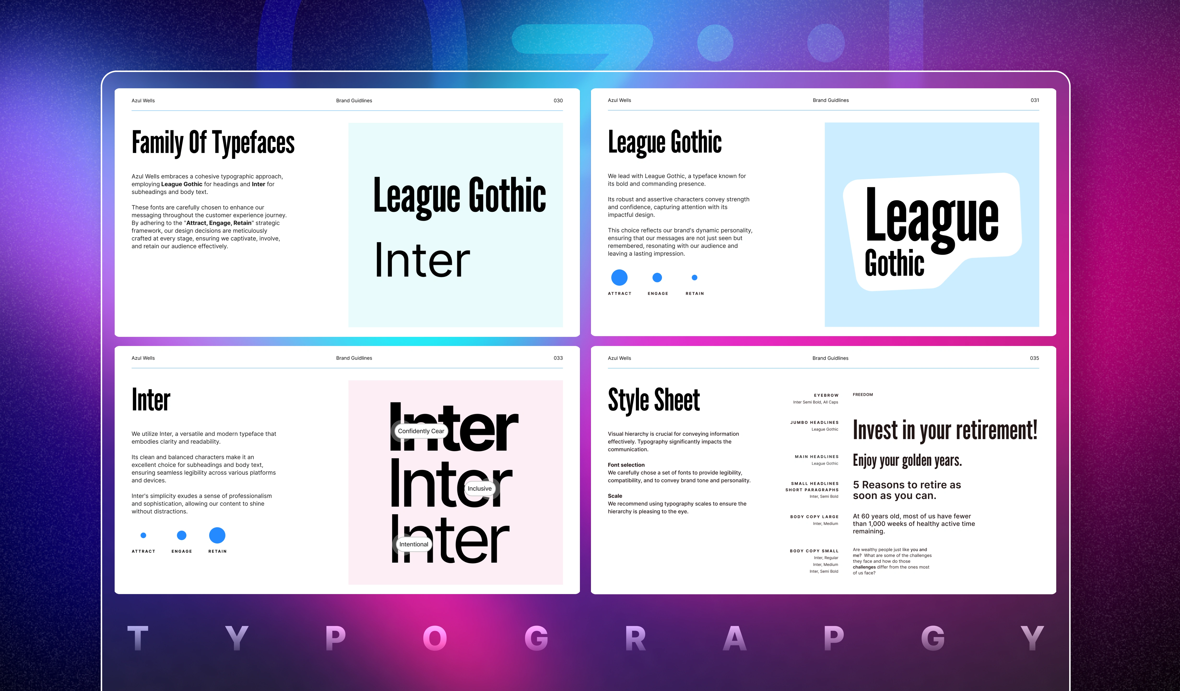
Typography
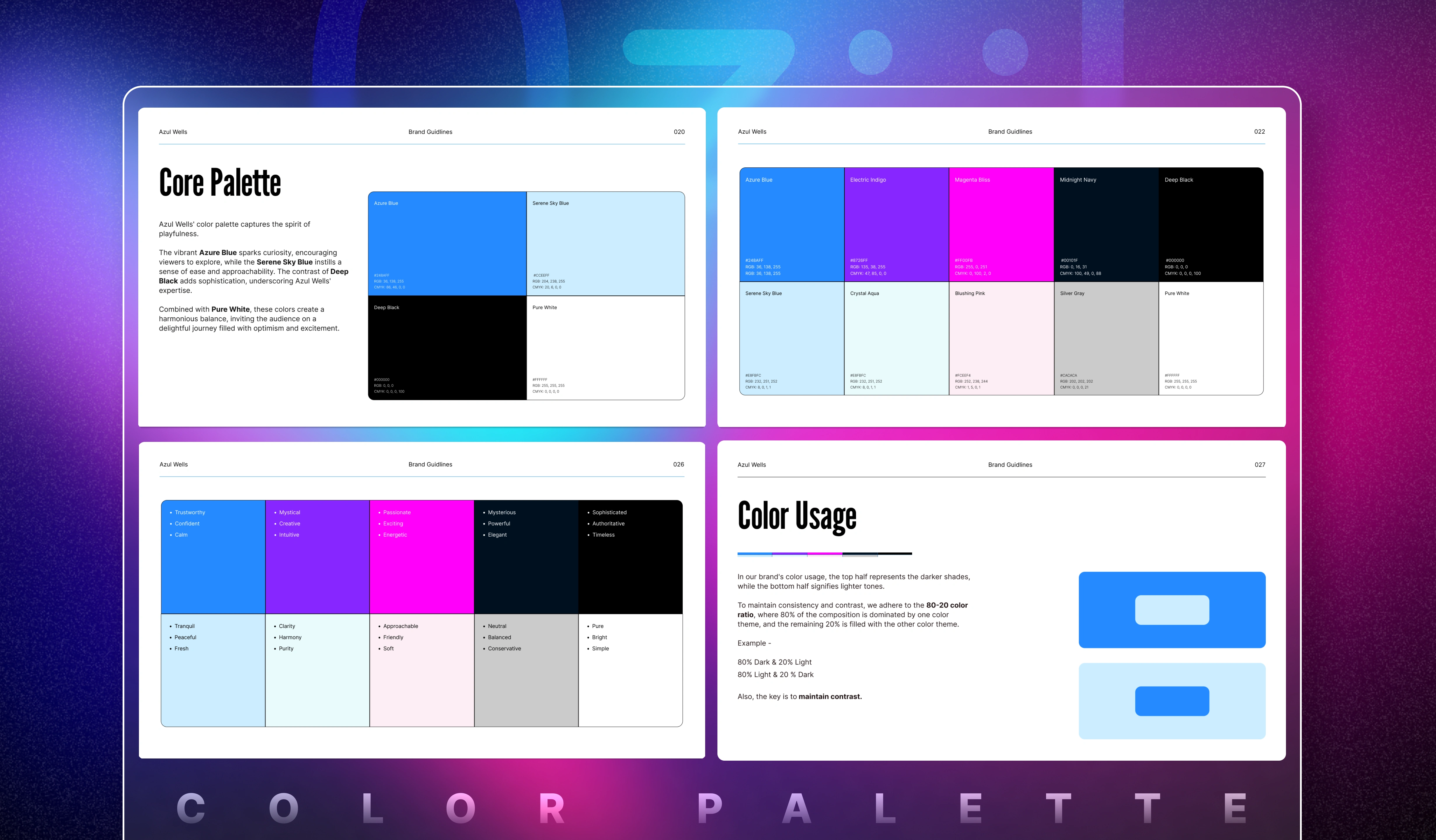
Color Palette
Experience
PC
Mobile
Bring it all together
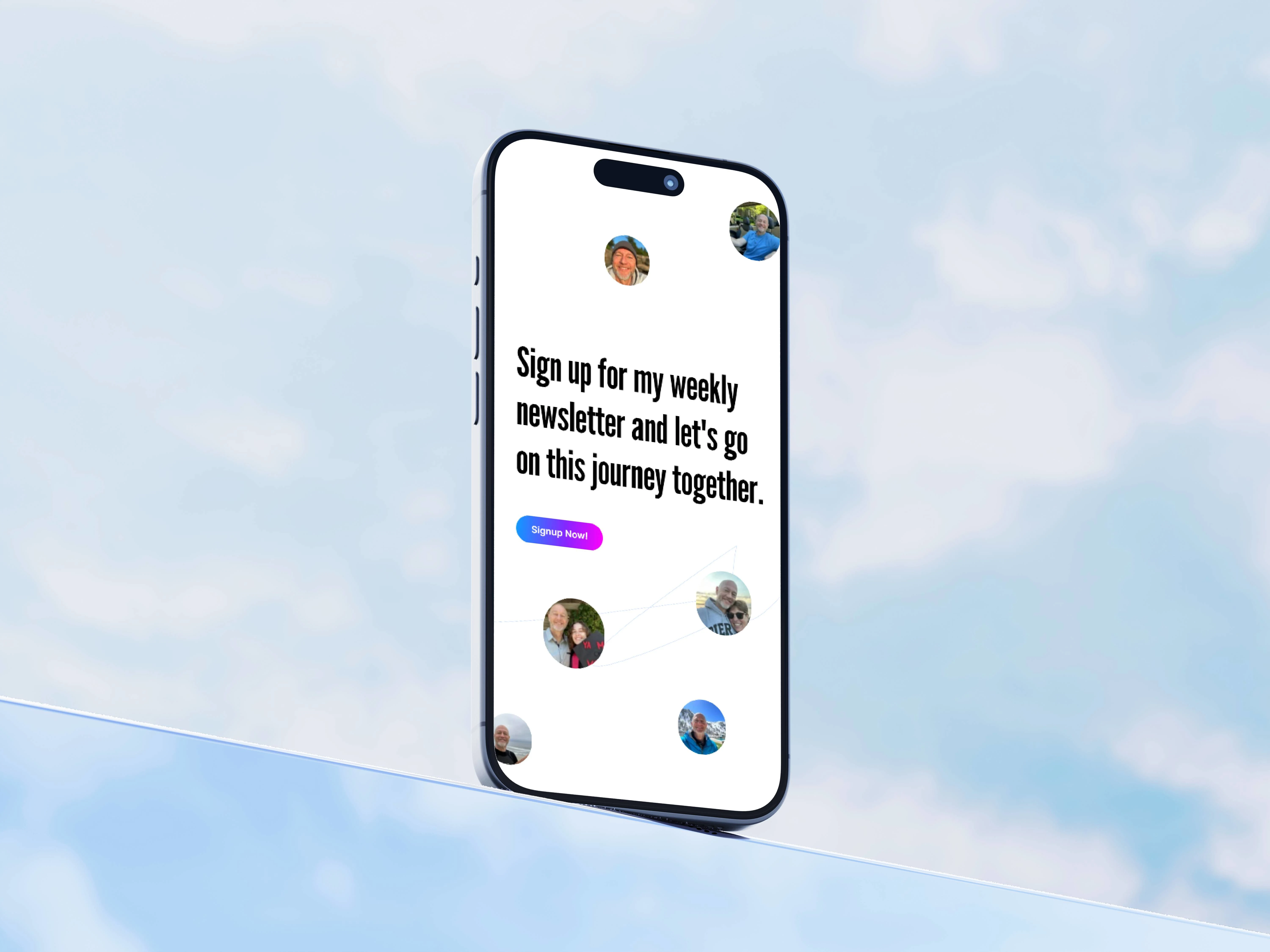
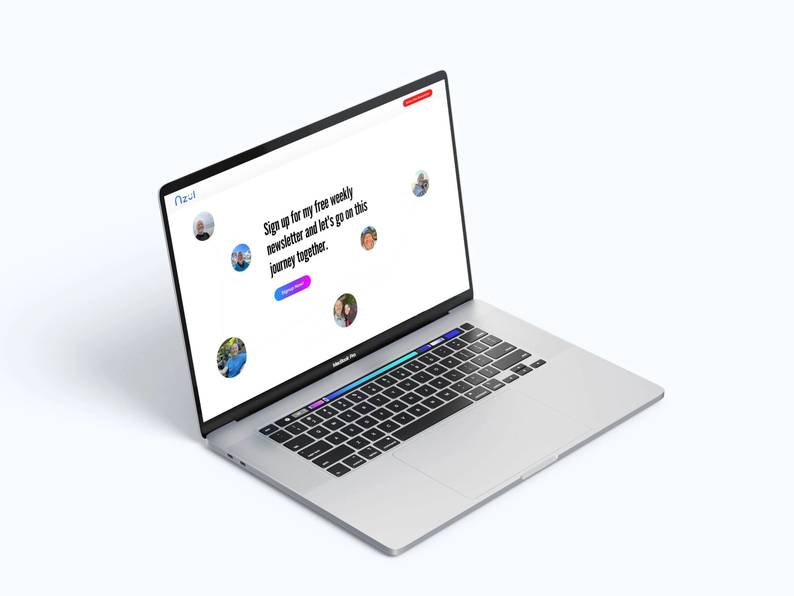
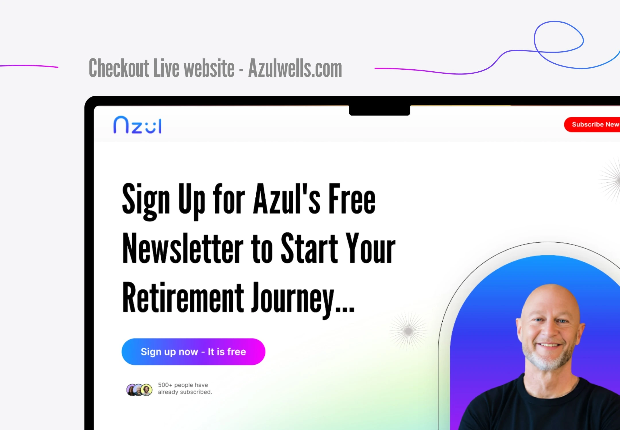
The new website stands as a vibrant showcase, bringing Azul's vision to life with a burst of colors. It clearly represents his core values, highlighted by a brand tagline and mission statement. The inclusion of newsletters in the hero section fulfills the main goal of the website, and personal photos add a warm touch, fostering a sense of community. Visitors can easily access a curated list of Azul's most-watched YouTube videos, enhancing user engagement. Micro animations sprinkle the website, adding that extra flair. In essence, it's not just a website; it's a visual journey that encapsulates Azul's essence and invites everyone to be a part of the experience.
Like this project
Posted May 4, 2024
The complete brand identity overhaul, including a new logo, YouTube banner, color palette, UX/UI design, and migration to Framer.
Likes
0
Views
32

