LiveTower App Icon
Haptic Software
Verified

LiveTower App Icon: From Concept to App Store
The Challenge
A venture-backed aviation tracking startup needed a premium app icon that would stand out in the App Store while maintaining versatility across iOS contexts. The client required multiple creative directions explored before committing to a final design system.
Role: Lead Icon Designer
Timeline: 2 Weeks
Client: Enhanced Radar
Deliverables: 4 concepts, 15 variants
Industry: Aviation/SaaS
Tools: Figma
Research & Strategy
• Analyzed 50+ aviation and travel apps for market positioning
• Identified opportunity for premium, lighting-focused differentiation
Concept Exploration
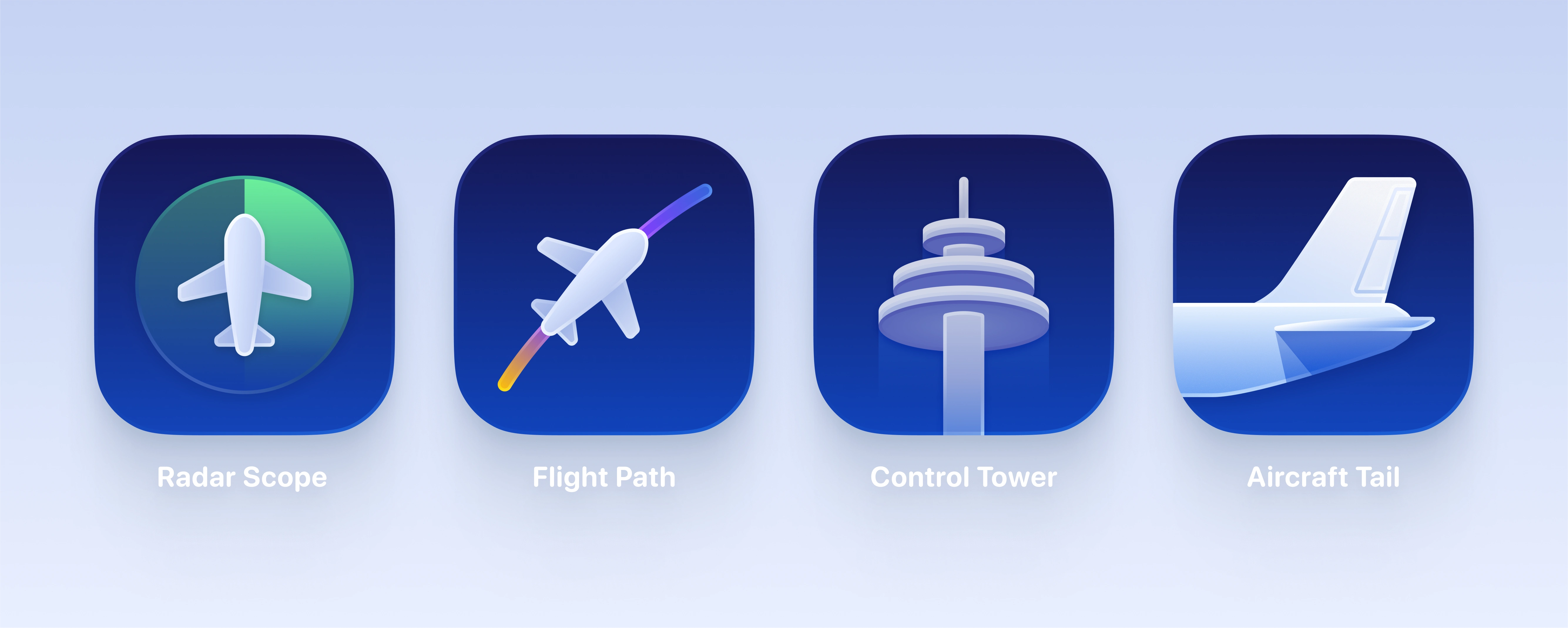
Four distinct creative directions were developed to give the client strategic choice in brand positioning.
The Winning Direction
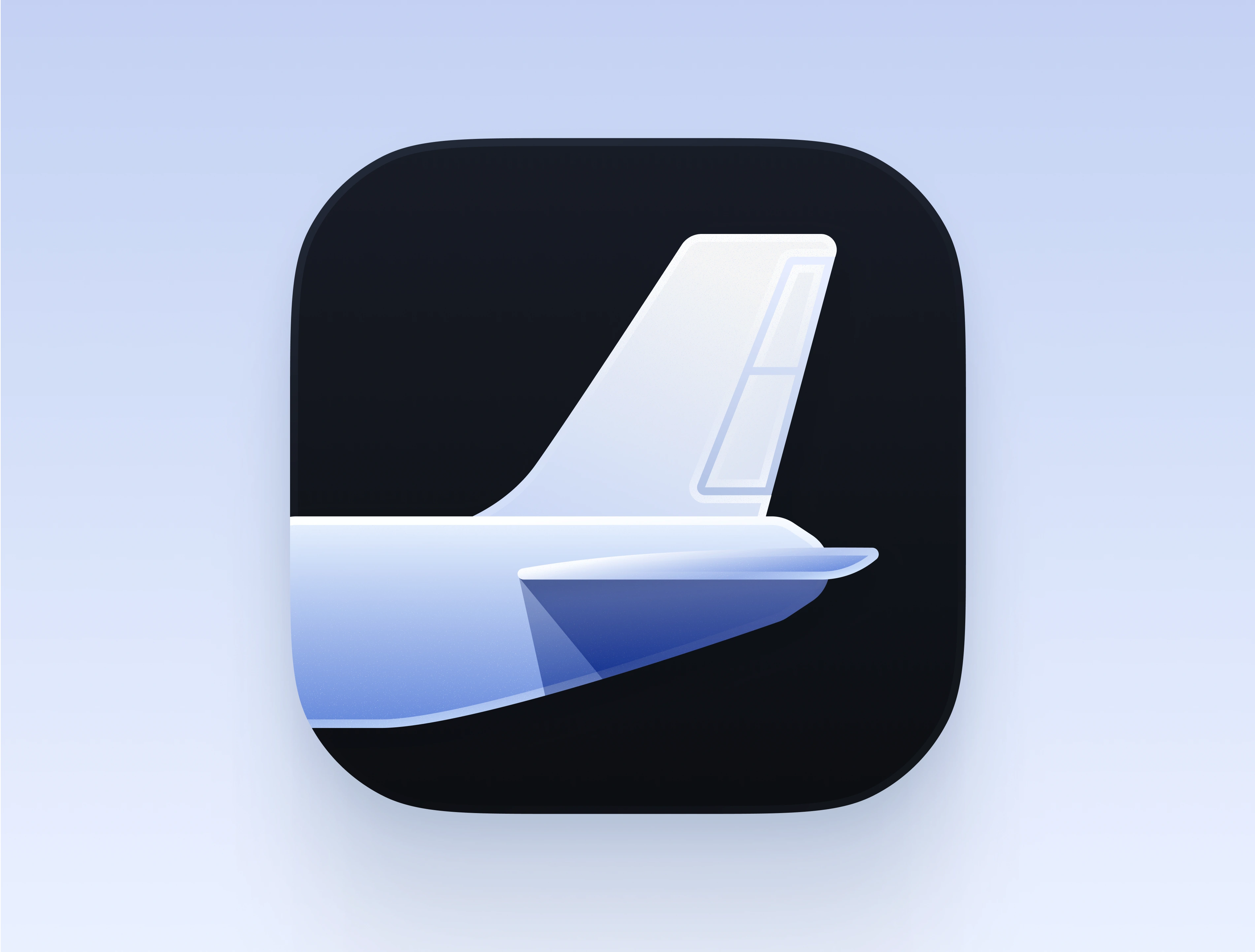
The client selected the Tail concept for its premium positioning, immediate aviation recognition, and versatility for lighting and livery explorations.
Why this direction won:
• Most recognizable aviation symbol with premium connotations
• Strongest dimensional form for showcasing lighting versatility
• Clean, scalable geometry that works at all icon sizes
• Unique positioning vs. competitor apps (less literal than whole planes/maps)
Lighting & Variant Exploration
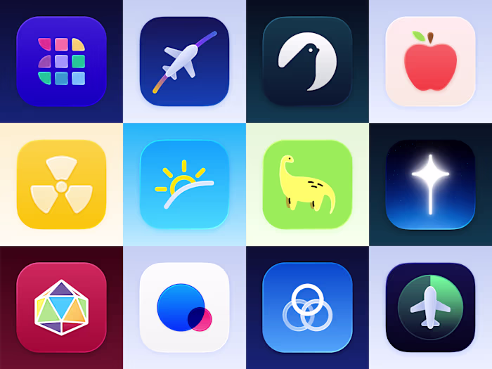
With the core form established, extensive lighting studies created seven distinct atmospheric variants for different contexts and times of day.
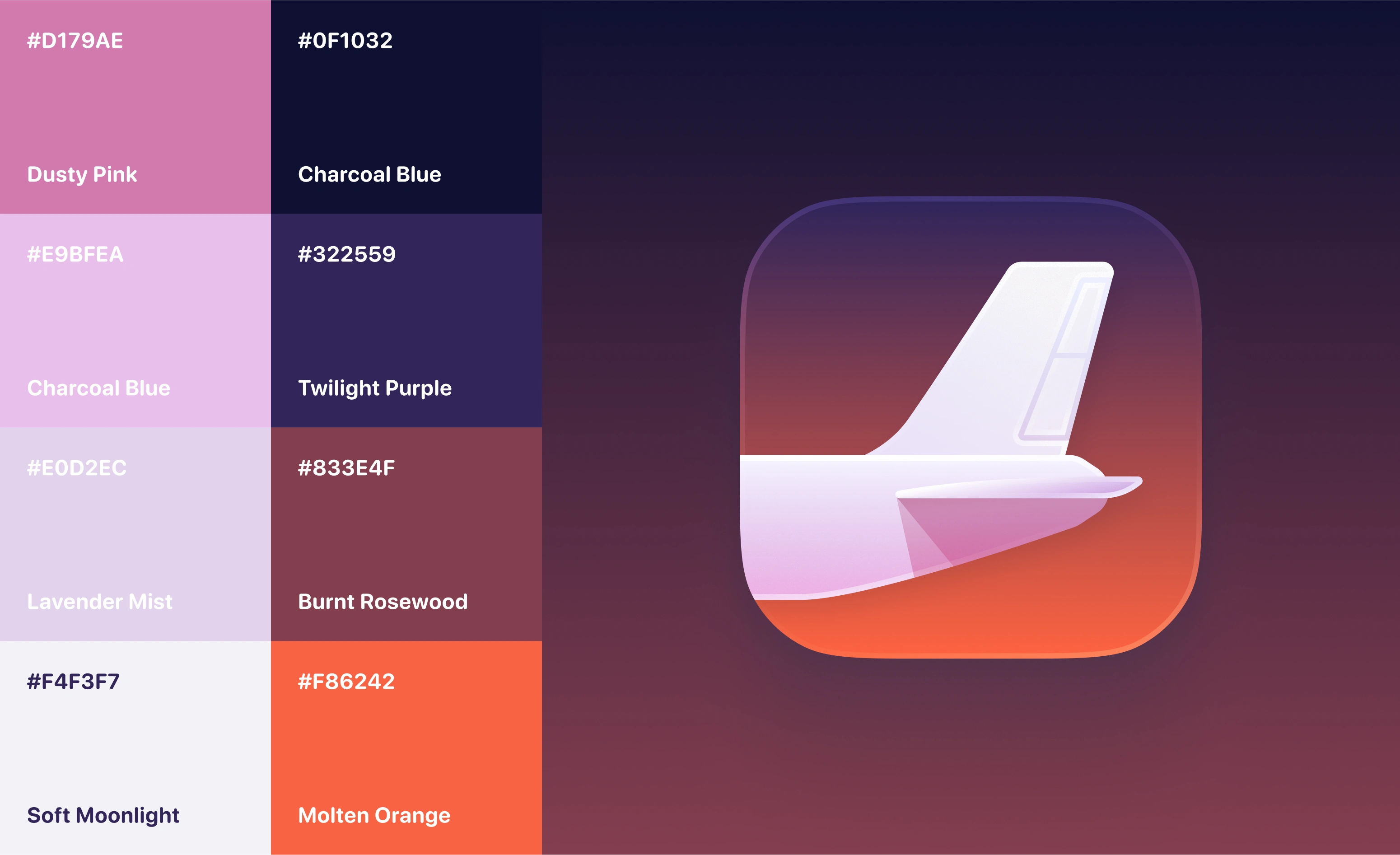
Careful attention was paid to atmosphere and lighting for each sky variant. The tail needed to be appropriately lit for each unique scene.
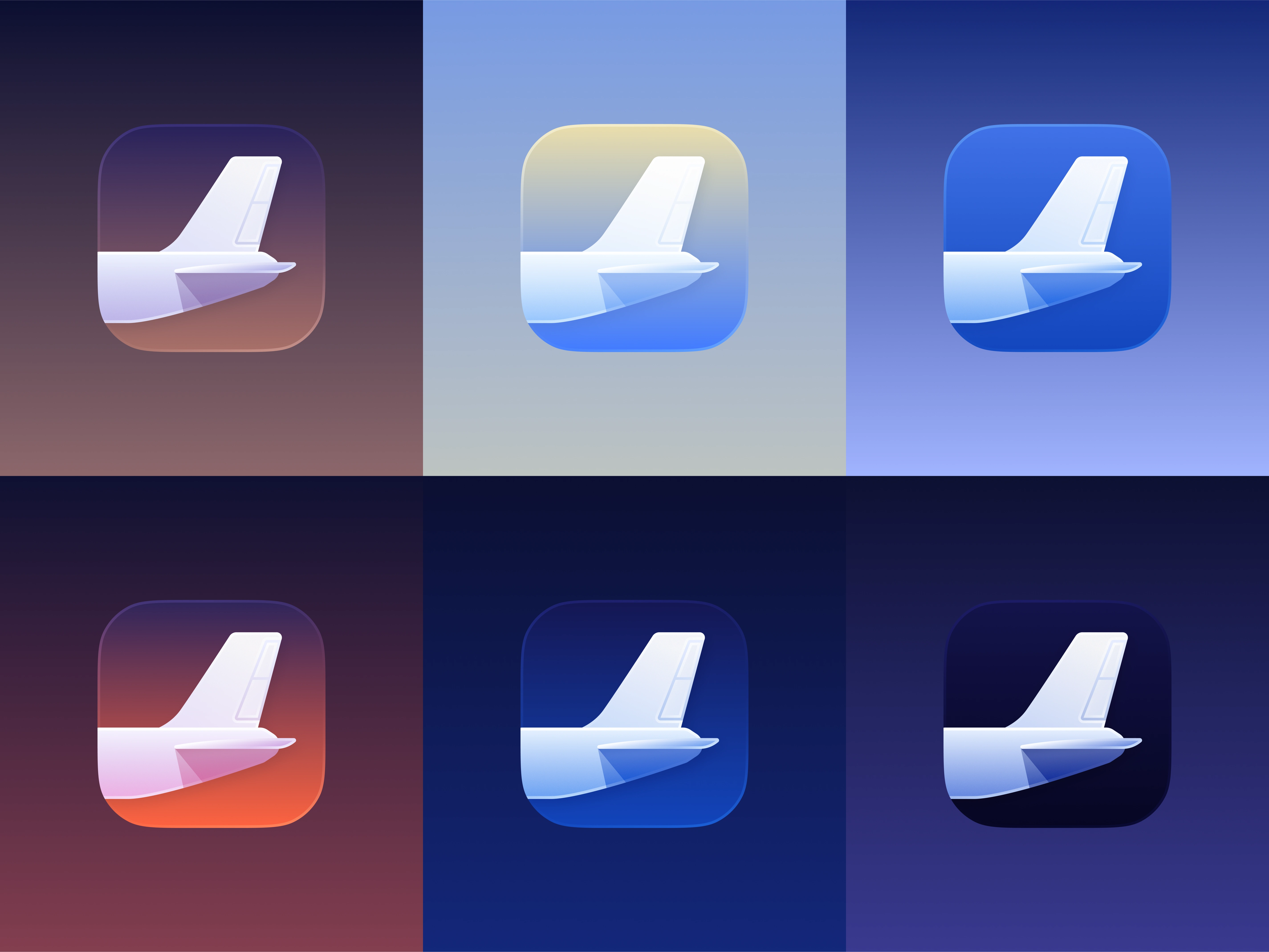
The final sky variants. Beginning at the top left- Sunrise, Morning, Daylight, Evening, Dusk, and Moonlight
Like this project
Posted Oct 14, 2025
A venture-backed aviation tracking startup needed a premium app icon that would stand out in the App Store while maintaining versatility across iOS contexts.
Likes
1
Views
14
Timeline
Sep 29, 2025 - Oct 17, 2025
Clients
Enhanced Radar