Data Visualization for Business Insights
Ripun Chaudhary
Data visualization for business insights involves using visual elements such as charts, graphs, maps, and dashboards to represent complex data sets, enabling businesses to extract meaningful insights, patterns, and trends from their data. Here's an explanation of how data visualization aids in obtaining business insights:
1. Simplifies Complex Data:** Businesses accumulate vast amounts of data from various sources. Data visualization simplifies this complexity by transforming raw data into easily understandable visuals. It allows stakeholders to comprehend large datasets quickly and grasp key points without diving into intricate details.
2. Identifies Trends and Patterns:** Visual representations like line charts, bar graphs, scatter plots, and heatmaps help in identifying trends and patterns within the data. For instance, sales trends over time, customer preferences, geographical sales distribution, or correlations between different variables.
3. Supports Decision-Making:** By presenting data visually, decision-makers can make informed decisions based on evidence and trends. For example, executives can analyze revenue trends, market share, or customer behavior to strategize and allocate resources effectively.
4. Enables Comparisons and Analysis:** Visualizations facilitate comparisons between different data sets or segments. Comparative charts like bar graphs or pie charts allow for quick analysis of performance metrics, market share, or product sales across different regions, time frames, or product categories.
5. Enhances Communication:** Visualizations are powerful tools for communicating insights to different stakeholders within an organization. Compelling visuals are more easily understood and remembered than raw data or lengthy reports, enabling better communication of insights across departments.
6. Real-Time Monitoring and Reporting:** Dashboards equipped with real-time data visualization capabilities enable continuous monitoring of key metrics and performance indicators. This real-time insight helps in agile decision-making and immediate responses to changes in the business environment.
7. Detects Anomalies and Issues:** Visualizations can highlight anomalies or outliers within datasets that might signify issues or opportunities. These outliers can indicate potential problems in operations, customer behavior, or areas for innovation.
8. Improves Data-Driven Culture:** By making data more accessible and understandable, visualization encourages a data-driven culture within an organization. It promotes the use of data in discussions, strategy development, and problem-solving.
Bar Charts and Column Charts: These are used to compare categorical data. Bar charts display data horizontally, while column charts show data vertically. They are effective for comparing sales figures, market share, or other discrete categories.
Line Charts: Ideal for showing trends and changes over time. They're useful for visualizing sales trends, stock prices, or any data that has a continuous progression.
Pie Charts: Display proportions or percentages of a whole. They're suitable for showcasing market share, budget allocations, or any data that represents parts of a whole.
Scatter Plots: Used to display relationships between two variables. They help identify correlations or patterns in data points and are useful for analyzing customer behavior, product performance, etc.
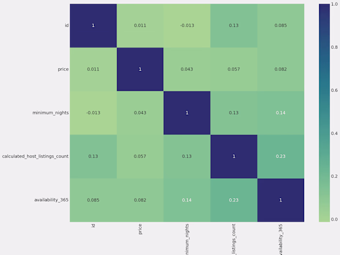
Heatmaps: Represent data with colors to show variations or concentrations. They're helpful for visualizing geographic data, website user interactions, or any data with spatial elements.
Treemaps: Display hierarchical data using nested rectangles. They're effective for illustrating the proportions within categories, such as budget breakdowns, organizational structures, or resource allocation.
Histograms: Show the distribution of numerical data. They're useful for understanding data distribution patterns, such as age distribution in a population or frequency of certain events.
Dashboard Visualizations: Combine multiple visualizations into a single interface. Dashboards offer an overview of various metrics and KPIs in one place, providing a comprehensive view of business performance.
Like this project
Posted Dec 23, 2023
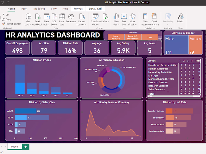
Power BI to visualize complex datasets enabling businesses to gain valuable insights into their operations Developed interactive dashboards.
Likes
0
Views
7
Tags