Movie Poster Passion Project


THE DESIGN
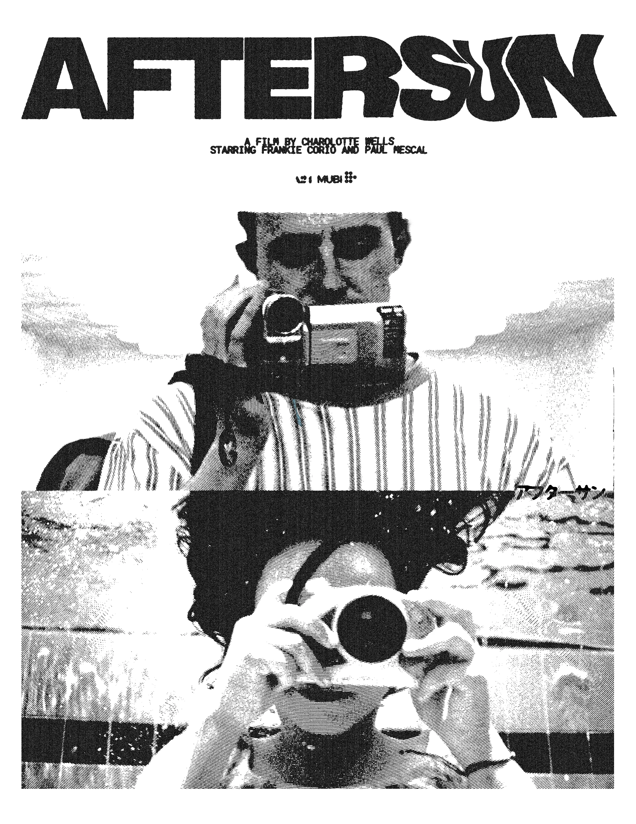
Each poster is designed with a slightly different approach. The AKIRA poster is a mixture of the film’s original marketing with elements of my design incorporated where it can fit. I also went for a blue theme rather than the usual red associated with AKIRA in order to sort of challenge myself. Much the same can be said for the C&S poster, which has pixelated design elements usually seen on designs for web3 startups etc. (not something that would really be expected out of a poster for this film). As for the Aftersun design, I’m still experimenting with half-tone techniques and wanted to highlight a nice visual parallel in the film. I own no rights to any of these films — though I do strongly recommend them :)
CONTEXT
This is very much a passion project dedicated to some films that I find to be both societally and individualistically important. Aftersun and Come and See are tragic in drastically different ways, and AKIRA is simply ahead of its time eye candy.
Like this project
Posted Jan 12, 2024
A set of movie posters.
Likes
0
Views
5


