Built with Framer
Kindnest - Framer Development
Raymond A.
Can a website feel like care?
Now, after a month of quiet work, testing, and iteration — Kindnest is live.
And open to future development/ideas.
The goal is simple:
making support feel human again. Follow along...
⚠️ Now, The Challenge
The original challenge still stands:
How do you make a caregiving website feel warm, trustworthy, and calm — without losing clarity?
This, unlike traditional design briefs, this wasn’t measured by conversions or client KPIs. The goal was more emotional:
✅ Reduce friction
✅ Build trust fast with clarity
✅ Feel like home, a safe space.
Every interaction, from headline to hover state, needed to echo that intention — especially for the users navigating care options for the people they love.
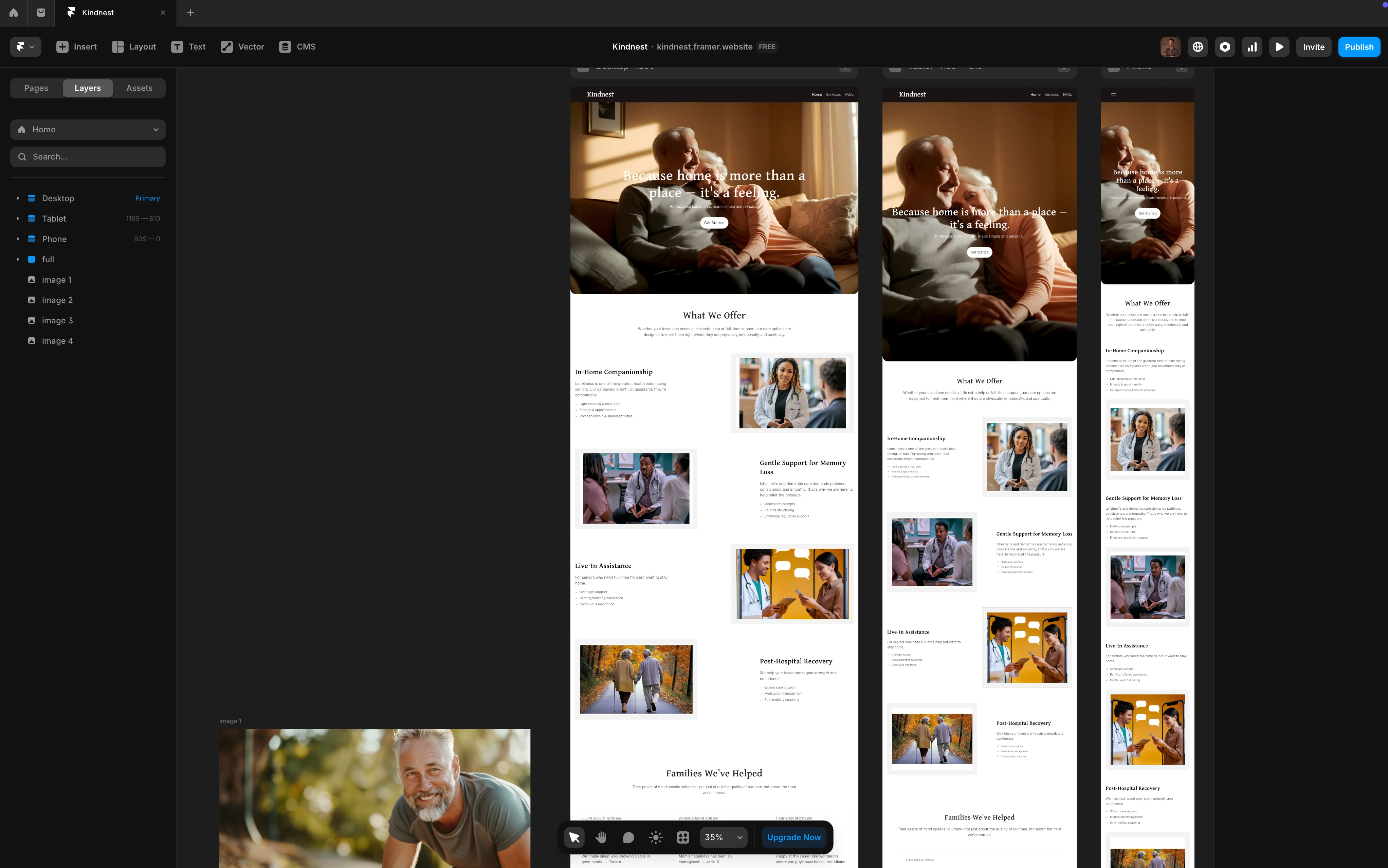
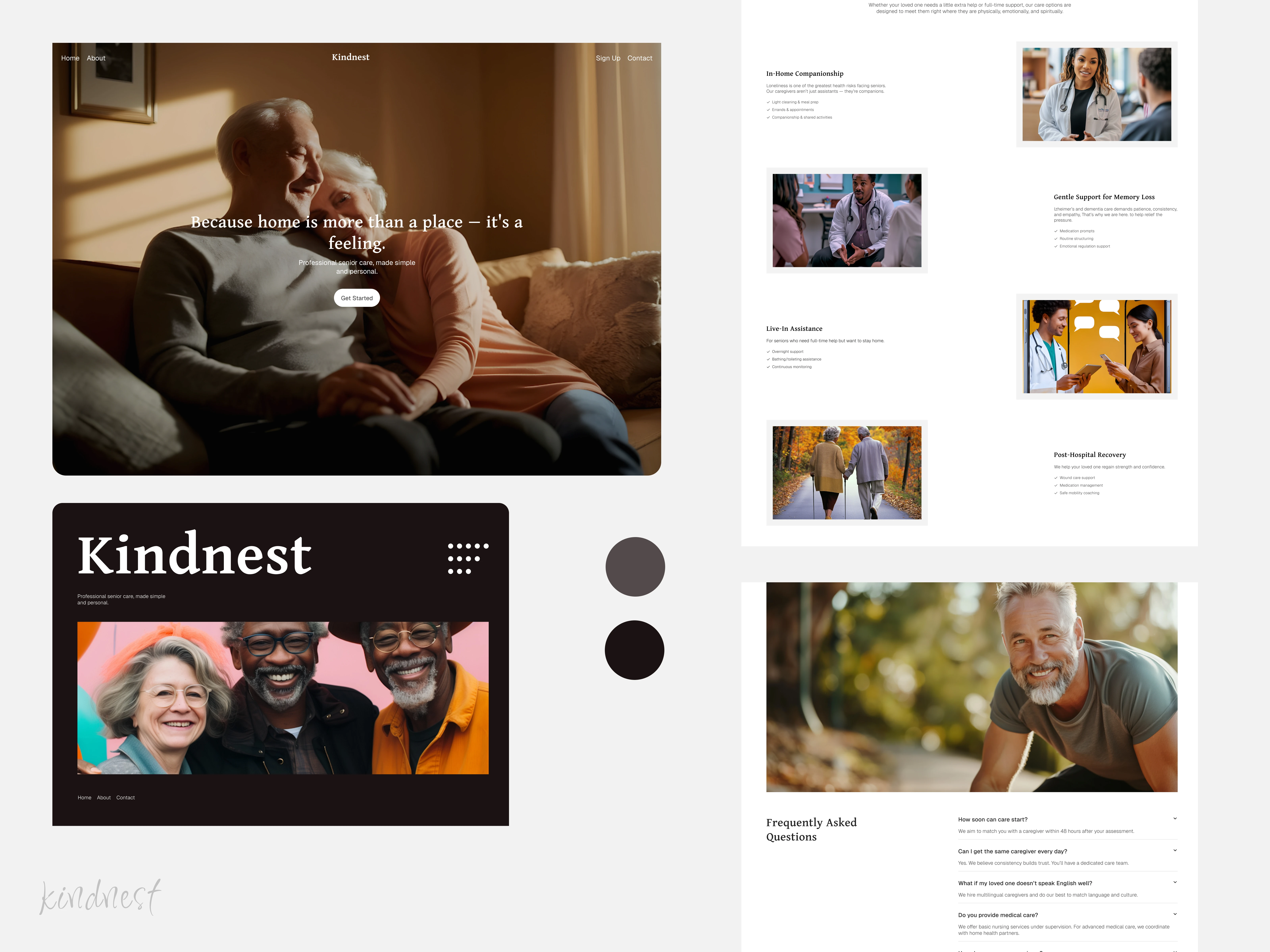
Framer Build & Responsiveness
I originally set out to create a sleek, scrollable one-page website that moved smoothly from start to finish.
However, I soon discovered a key flaw in that approach, the landing page couldn’t just look polished; it had to immediately convey the main message before visitors even had a chance to scroll through.
That realisation pushed me to rethink the layout entirely, focusing instead on delivering instant clarity and impact the moment the page loads. I needed to priortise clarity and not confuse the visitors.
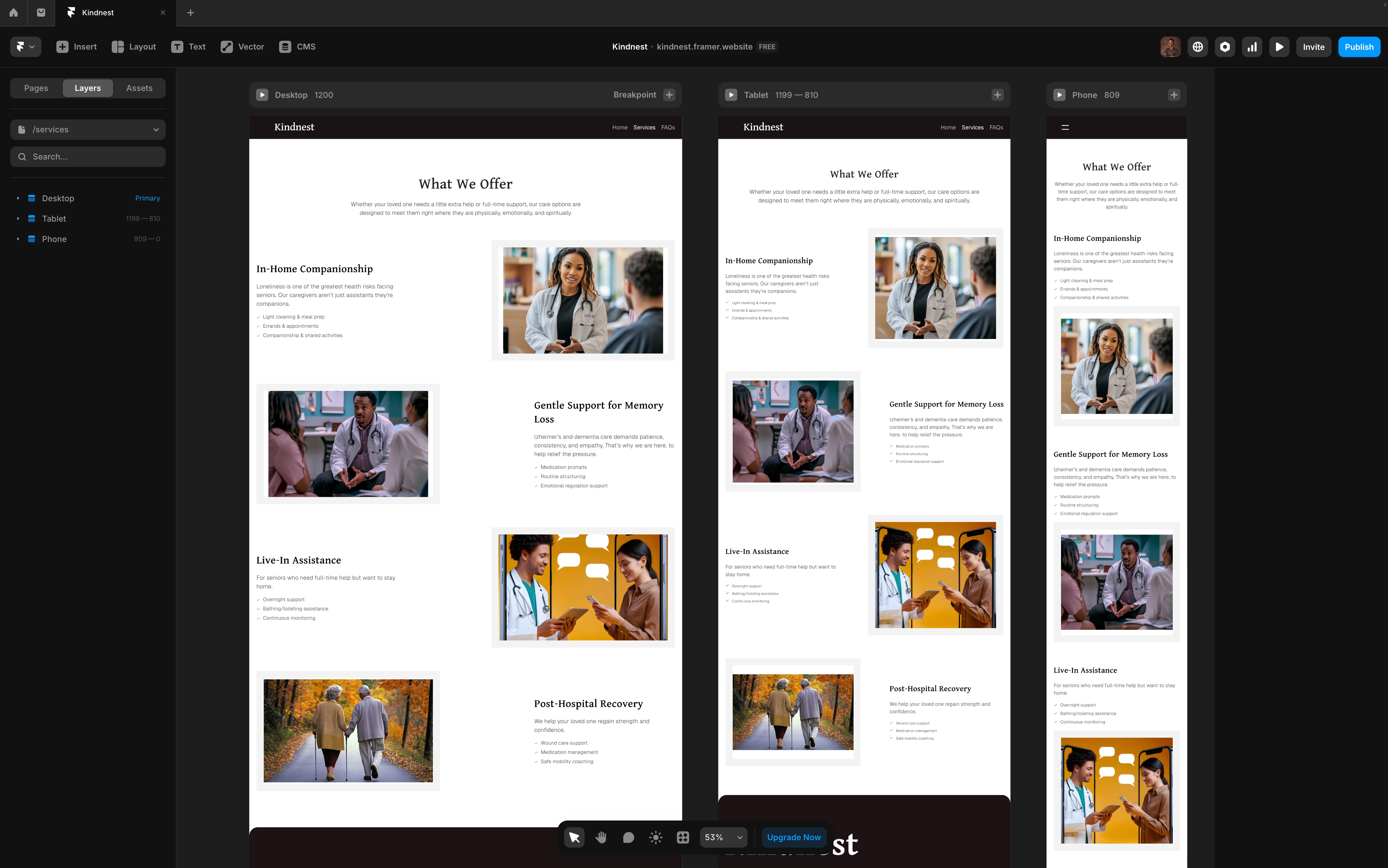
The Service Page
🛠️ What’s Been Done Since
Now that it’s live, I have pushed the site further with subtle but intentional improvements like:
Tone Refinement
Headlines and microcopy were softened even more, making every word feel like a helping hand.
Mobile Accessibility
Optimised layouts and scaling for older visitors or those searching on-the-go.
Trust-Driven UX
Added subtle testimonial blocks and Time-based reassurance cues to help families feel safe.
Optimized SEO and fast load times to minimise cognitive load... particularly for users under stress.
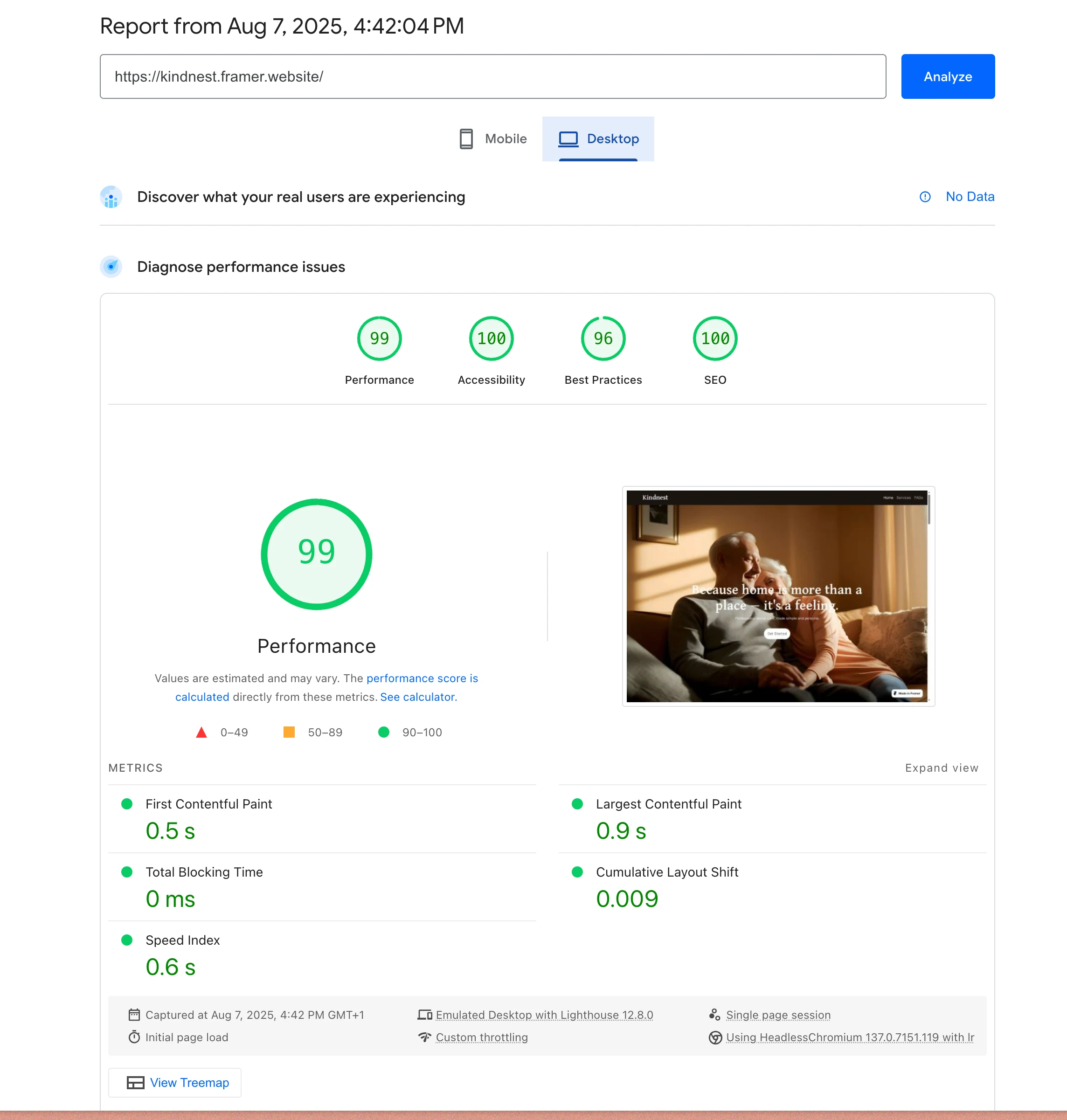
Pagespeed analyses and performance Desktop
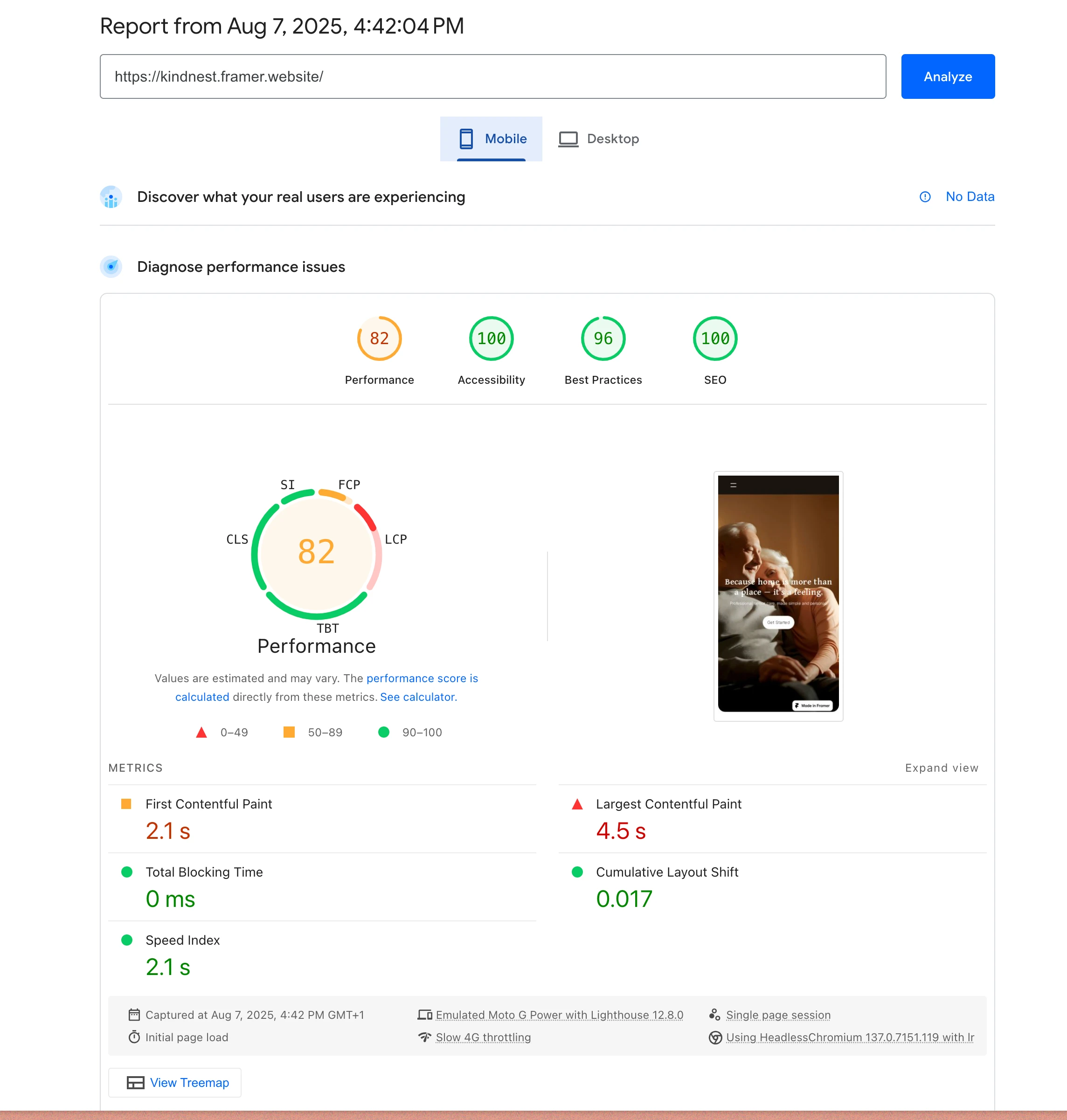
SEO optimised for mobile/desktop
✅ The Outcome
What started as a self-initiated exploration now lives online as a full experience —
and the future of kindnest is looking brighter.
Some observations;
The navigation flow feels natural.
Testgroup say it “just feels different.”
🌱 What’s Next
Now that Kindnest is live, the focus shifts to how iterate further and carefully, with consistency.
🧠 Reflection
Some of the most fulfilling work doesn’t begin with a brief... it actually starts with a feeling.
Kindnest was built on a belief that design can feel like care.
Now, it’s proving that belief true — one scroll at a time.
Like this project
Posted Aug 7, 2025
Landing page for Kindnest – a senior care website built around warmth, trust, and dedicated in-home support services
Likes
2
Views
14
Timeline
Jul 17, 2025 - Aug 7, 2025