Website Design and Development for SB Cardetailing
Muhammad Salman
Overview:
This project showcases a complete website design and development for SB Cardetailing, a premium car care provider based in Belgium. The goal was to create a trustworthy, conversion-oriented digital presence that resonates with car owners looking for high-quality detailing services.
The final product is a modern, structured, and informative website that establishes credibility, promotes services clearly, and simplifies customer inquiries and bookings.
🧱 Core Deliverables:
Fully responsive and mobile-friendly website
Clean visual hierarchy for easy scanning
Custom-designed testimonial section for trust-building
FAQ block with expandable answers for clarity
Integrated inquiry form for lead generation
Blog-style content section to support long-term SEO
Google Review integration to highlight authentic feedback
📌 Key Features:
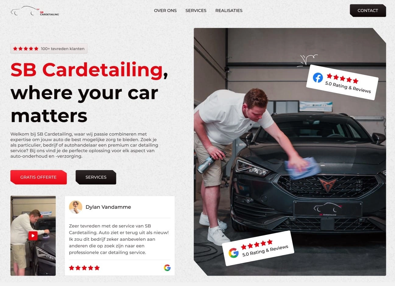
1. Hero Section With Immediate Impact
A clear headline ("SB Cardetailing, where your car matters") and CTA buttons ("Get a Quote" & "Contact") placed above the fold grab attention and drive action from the first glance.
2. Customer-Centric Layout
Real photos of the business owner at work help humanize the brand. Google Reviews are integrated prominently to show real feedback from customers, helping build immediate trust.
3. Service Showcase With Visual Clarity
The services section uses a grid layout with real imagery, short descriptions, and direct CTAs under each card. This structure allows visitors to understand offerings quickly and act without friction.
4. About Section With a Storytelling Angle
The "Over ons" (About Us) section balances text and visuals, introducing the company's mission, values, and personal approach—highlighting professionalism and passion.
5. Visual Storytelling Through Imagery & Video
The "Onze ambitie en groei in beeld" section uses behind-the-scenes photography and a video walkthrough to visually communicate growth and expertise in action.
6. Expandable FAQ Section
A modern accordion-style FAQ layout provides quick answers without overwhelming the page—offering clarity and improving SEO.
7. Lead Generation Focus
The quote form (“Vrijblijvende offerte”) is concise and purpose-driven. Strategically placed just before the blog section to capture leads while users are still engaged.
8. Blog & SEO Strategy
A dedicated blog area ("Lidwoord") includes articles on car maintenance tips to inform users and drive organic search traffic over time.
💡 Design Strategy & Thinking:
This website was designed with user confidence and clarity as the primary focus. Real photos, strategic use of red (to represent energy and attention), and consistent layout help retain user focus and create a reliable first impression. The approach leans on transparency, simplicity, and strong call-to-actions—perfect for a local service business looking to stand out.
🛠 Tech Stack:
Framer – Design and interactive development
Figma – UX wireframing and early stage layout
Google Maps & Reviews Embed – Trust signals
Custom Forms – Built-in form for inquiries
Responsive layout – Optimized for all screen sizes
📈 Outcome:
Professional web presence aligned with SB Cardetailing’s brand values
Improved lead generation through the quote form
Better engagement and information flow, especially for first-time visitors
SEO-optimized structure ready for long-term growth
Like this project
Posted May 5, 2025
Designed and developed a conversion-oriented website for SB Cardetailing.
Likes
0
Views
4