Custom Responsive Web Design
Bernie Carpio
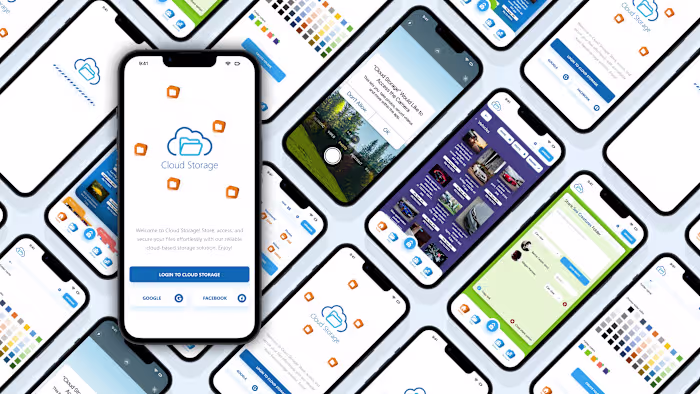
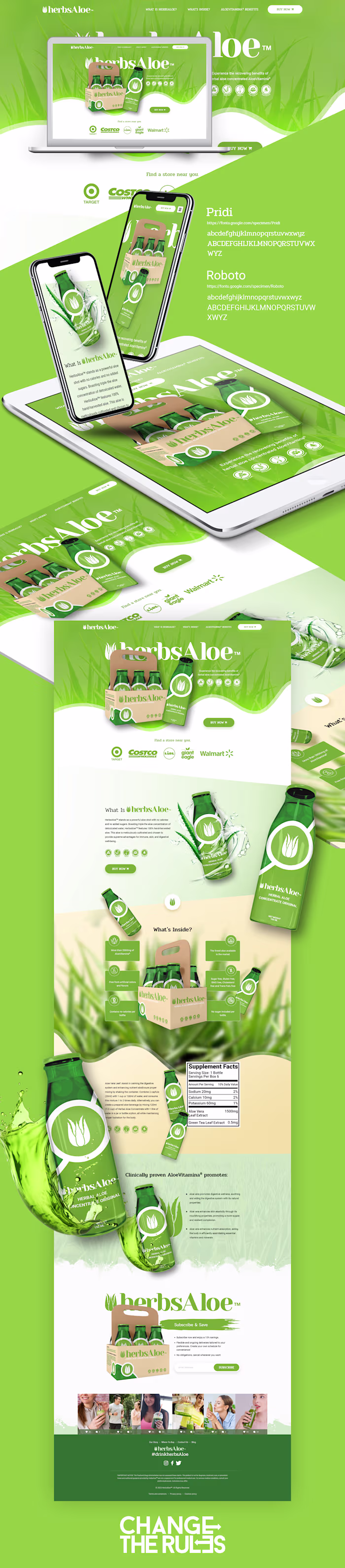
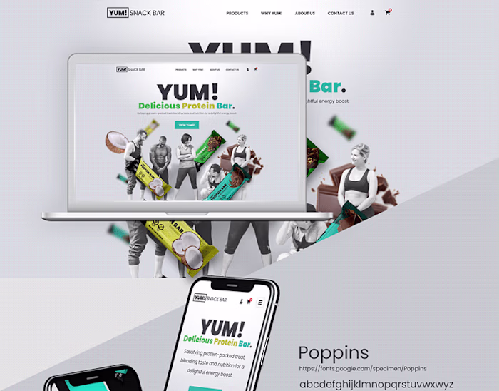
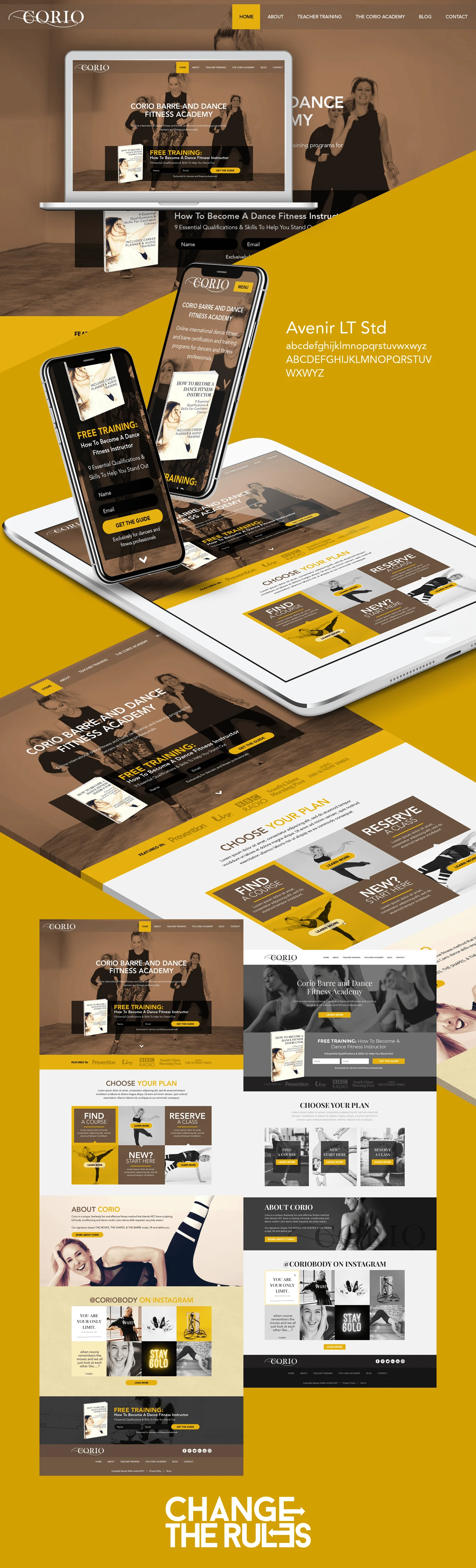
Responsive web design utilizing the Bootstrap Grid System empowers developers to craft dynamic and adaptable layouts. By implementing a fluid grid structure, content seamlessly adjusts to various screen sizes and devices. This system employs a 12-column layout, permitting efficient distribution of content, ensuring a balanced and visually appealing design. With predefined classes for different breakpoints, such as mobile, tablet, and desktop, Bootstrap simplifies the creation of responsive interfaces. By harnessing this framework, developers can expedite the process of crafting responsive websites that offer optimal user experiences across a diverse range of devices, enhancing accessibility and user engagement.
Like this project
Posted Mar 28, 2023
Responsive web design using Bootstrap Grid System. Bootstrap's grid enables seamless responsive web design.
Likes
0
Views
8