Branding for Brida School

I'm excited to share the work I did for Brida International Boarding School in Jakarta. The goal was to create a brand that reflects the school's inclusive and joyful atmosphere where students from all over the world come to learn and make friends.
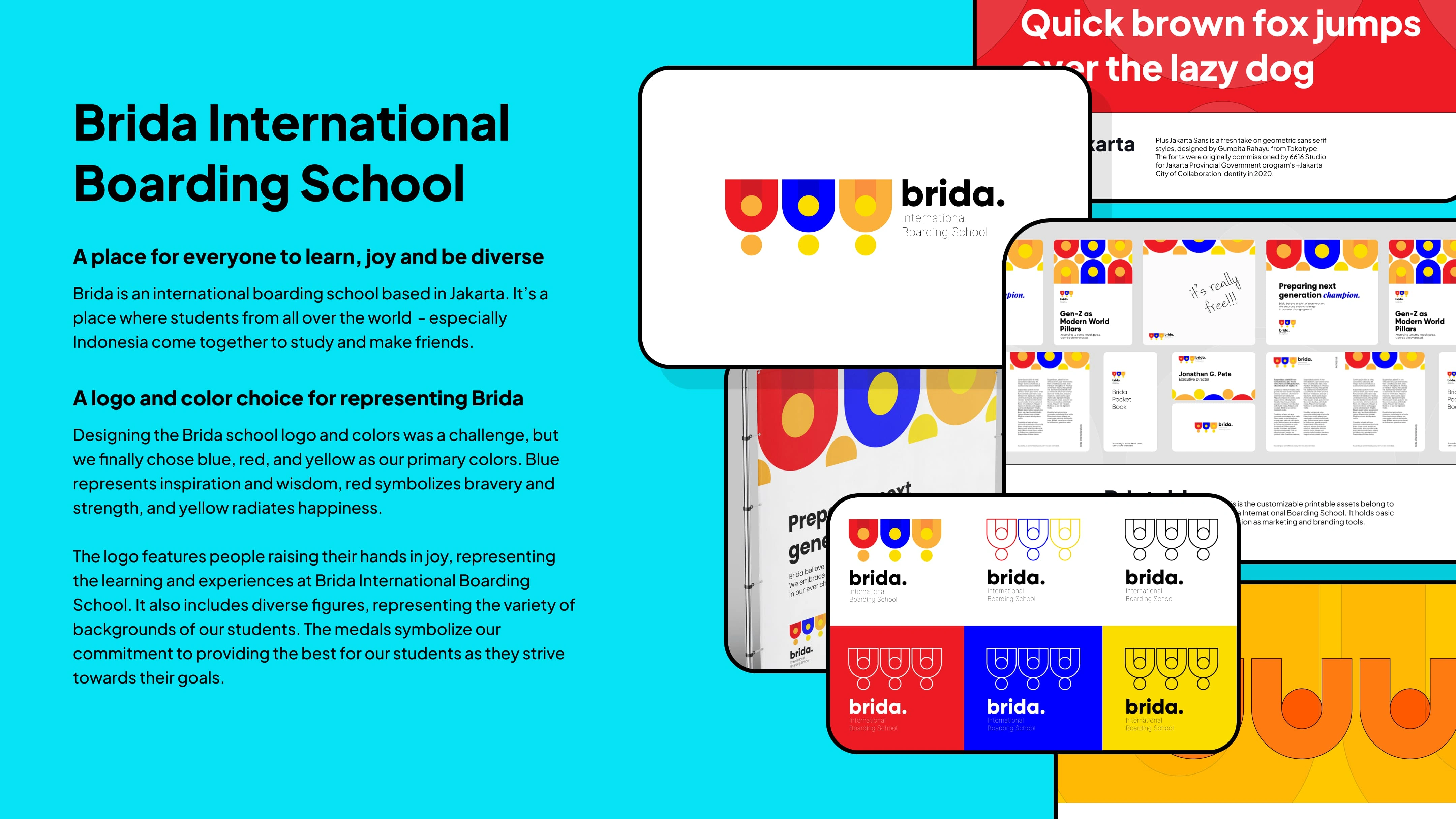
When choosing the school's colors, I went on a journey to find the right ones. After trying out different options, I settled on three main colors: blue, red, and yellow. These colors represent the diverse community at Brida. Blue stands for inspiration and wisdom, like the sea and sky. Red represents courage, hoping the school can give students strength. Yellow is vibrant and cheerful, reflecting Brida's commitment to making learning fun and happy.
Designing the school logo was a bit tricky. After a lot of thinking, I came up with the logo you see now. It shows people raising their hands in a happy way, symbolizing Brida's unique way of teaching and the joyful experiences students have. The logo also represents the diverse backgrounds of the students who come to Brida. The medal images in the logo show that Brida School always aims for excellence to help students reach their goals.
I made sure the logo and colors were everywhere in the school, from books and banners to trash cans. This way, Brida International Boarding School stands out, with an identity that matches its values of diversity, enjoyment, and fun.
Brida International Boarding School is a result of my work, a lively place where students from different backgrounds not only learn but also enjoy an environment I carefully created.

Like this project
Posted Dec 13, 2023
I crafted Brida School's vibrant brand identity, choosing lively colors and designing a distinctive logo that reflects the school's unique approach to learning.
