
NOM
The Shape of Silent Authority
NOM is not a perfume brand. It is a position.
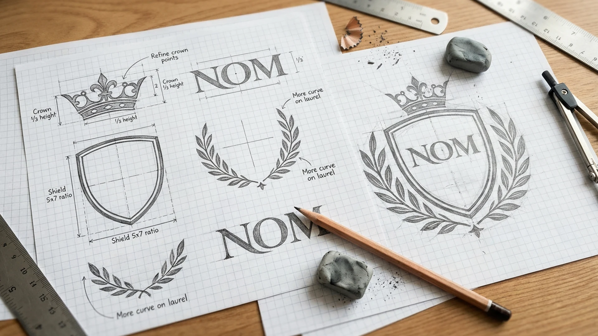
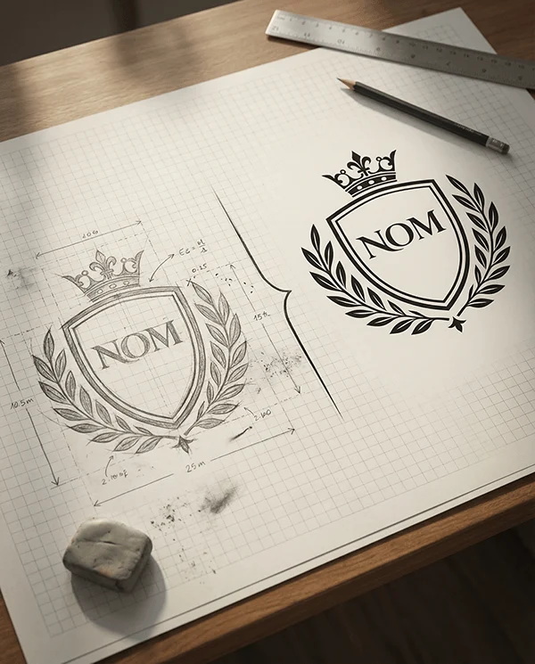
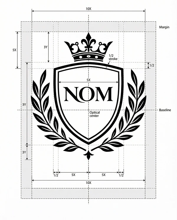
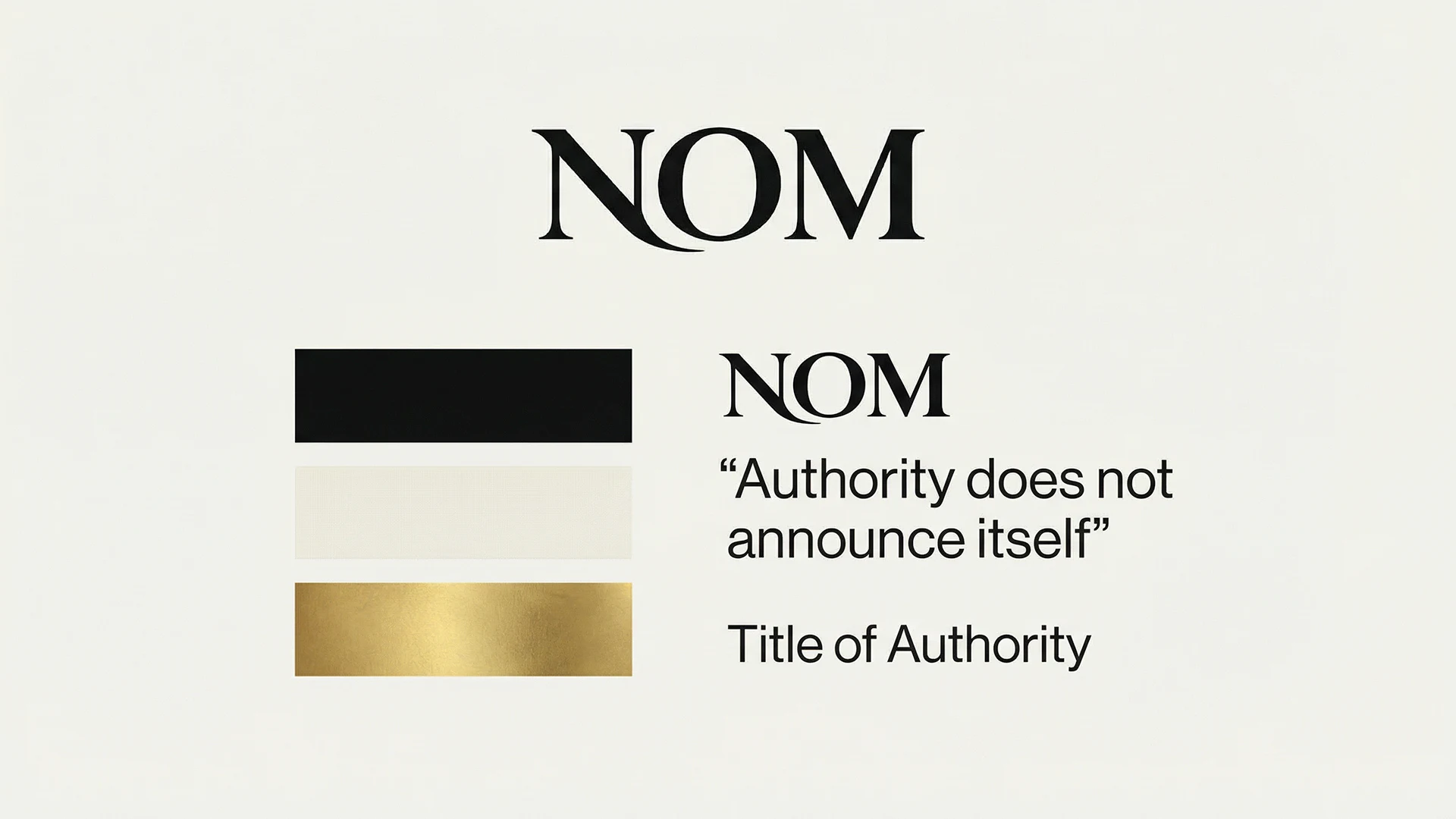
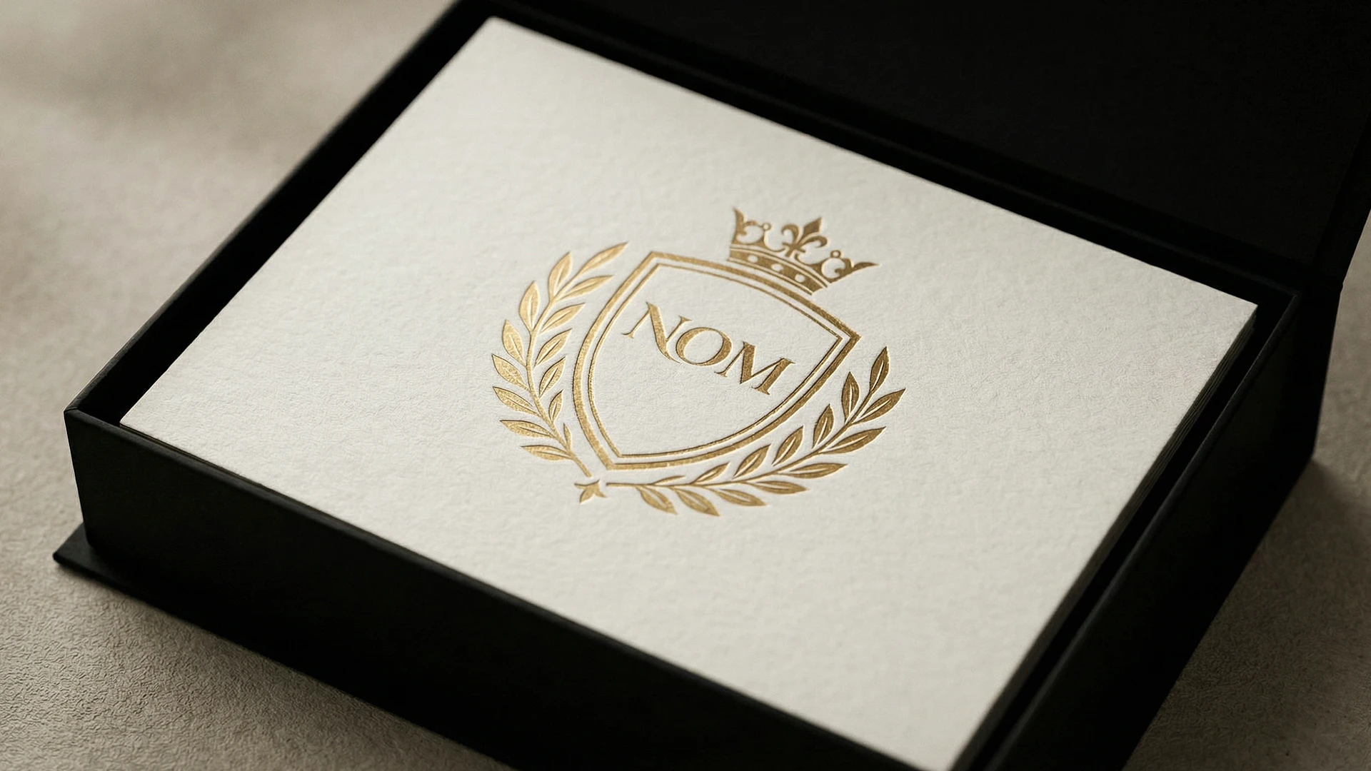
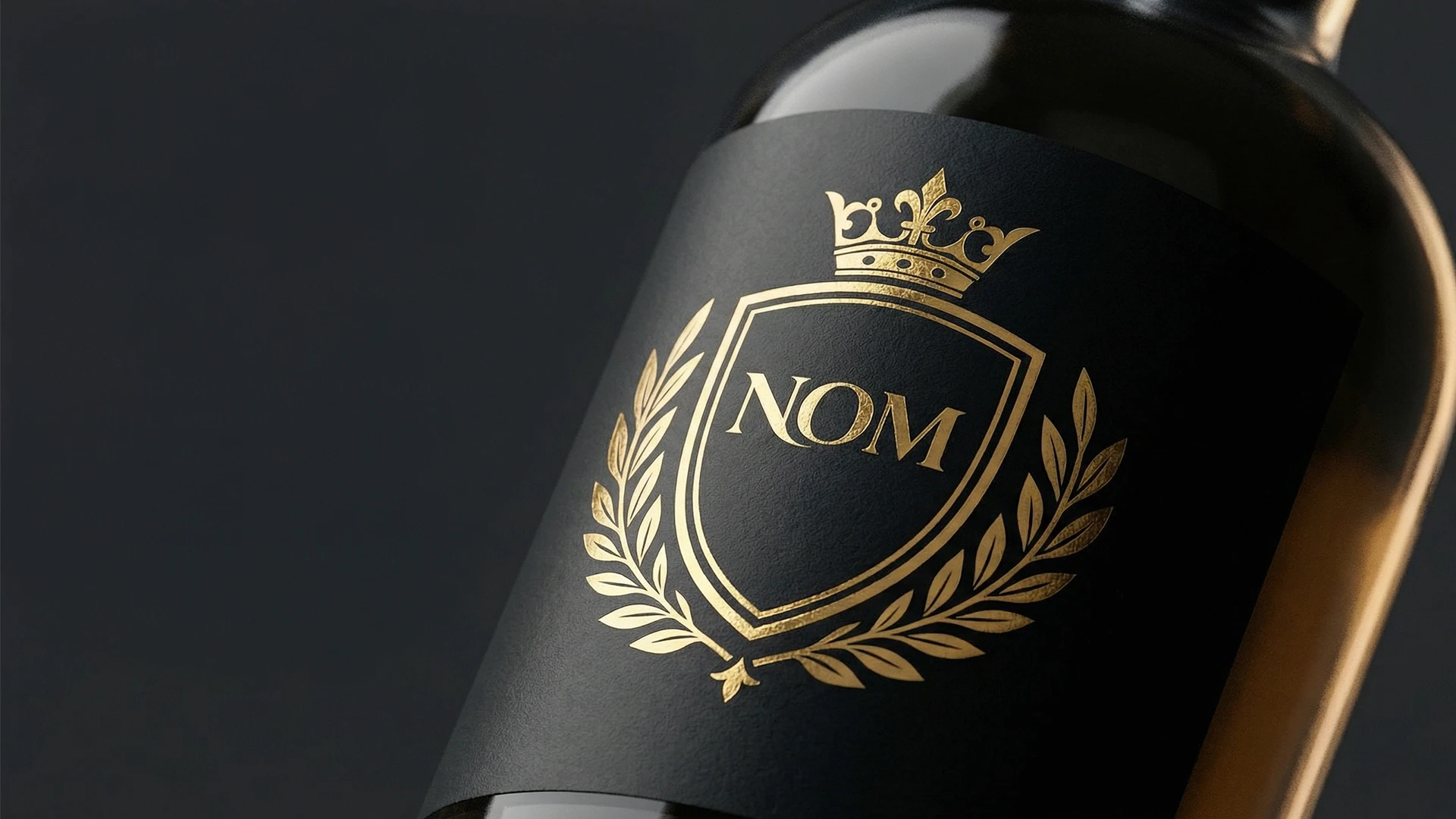
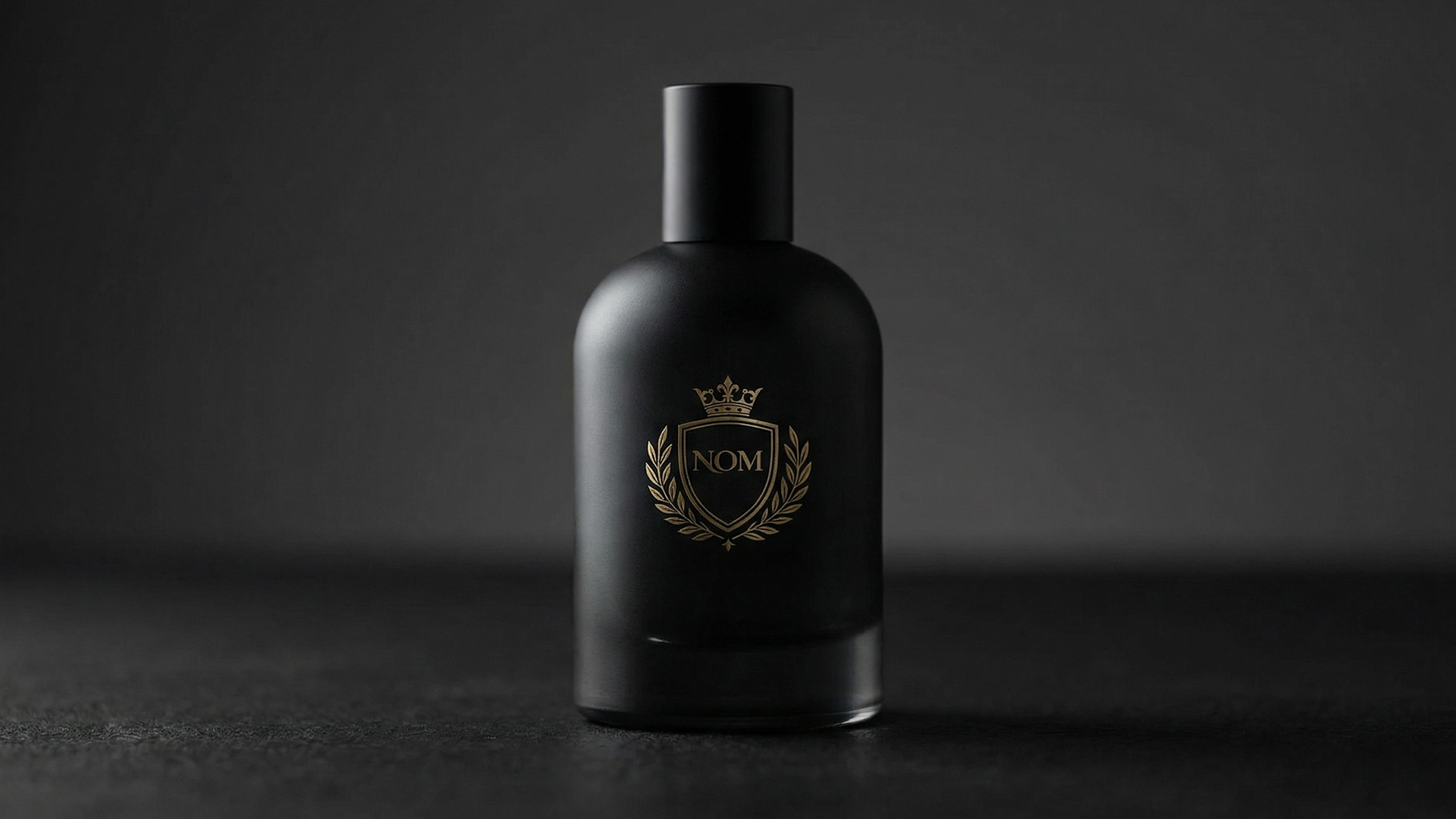
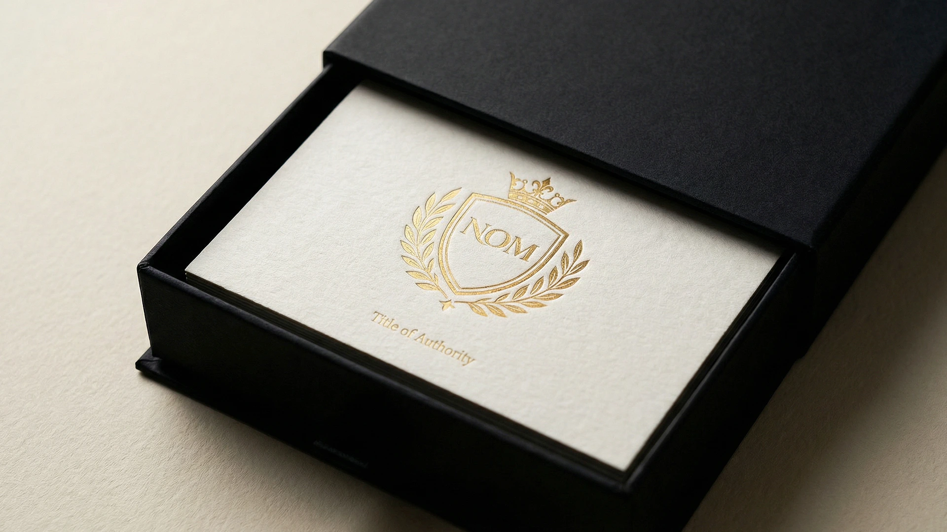
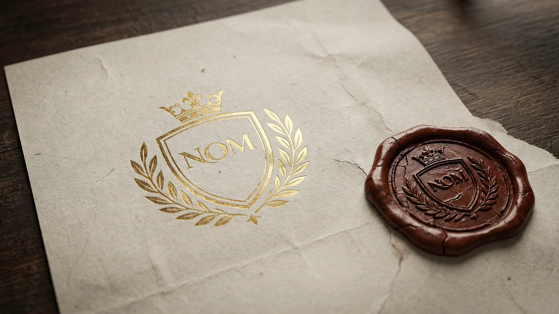
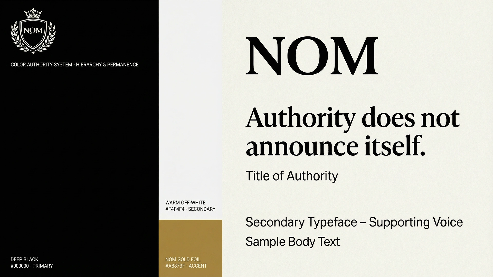
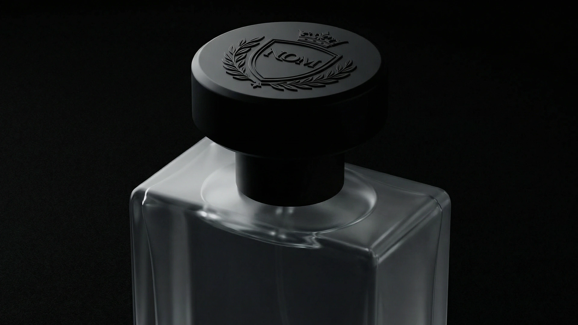
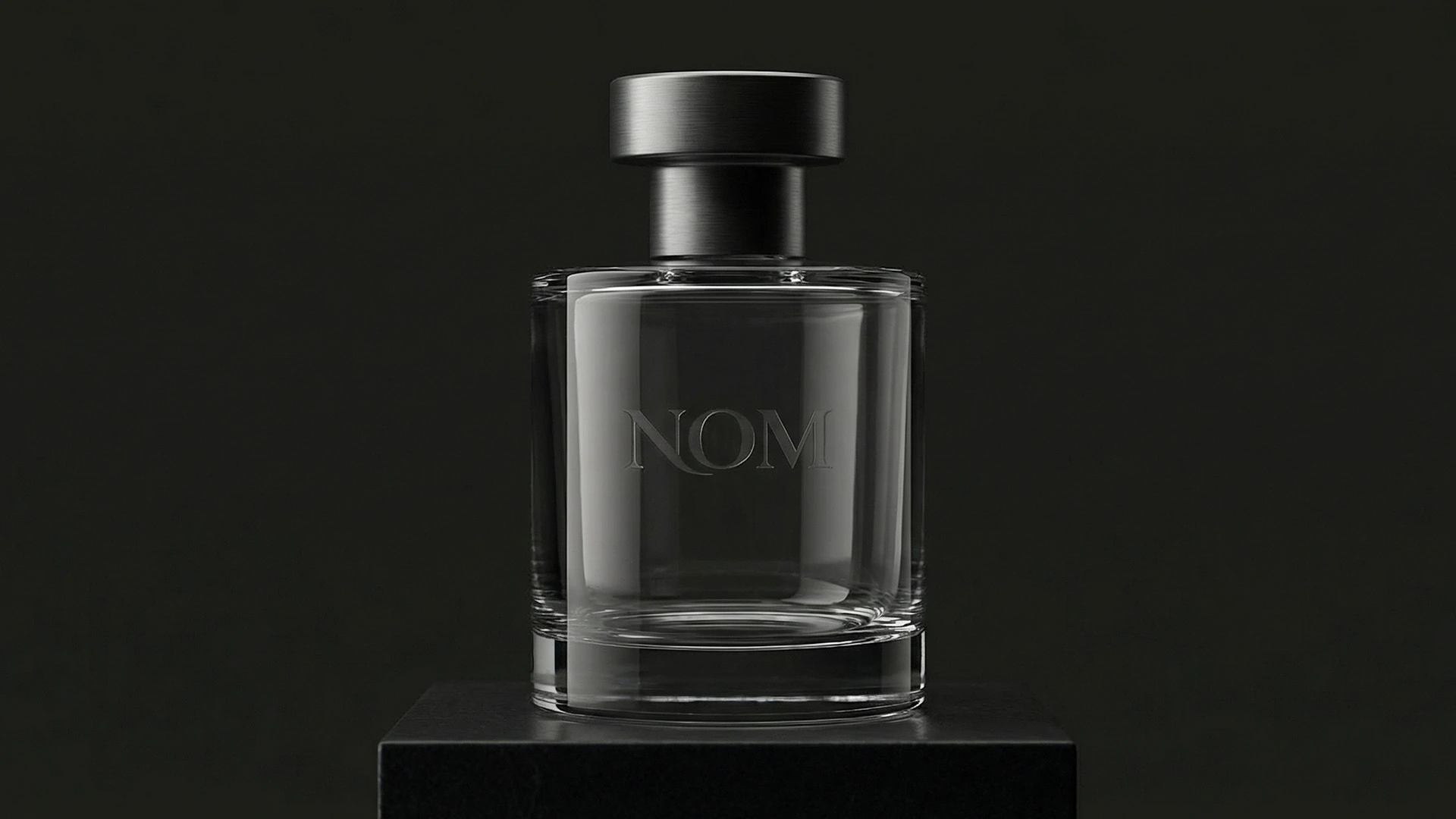
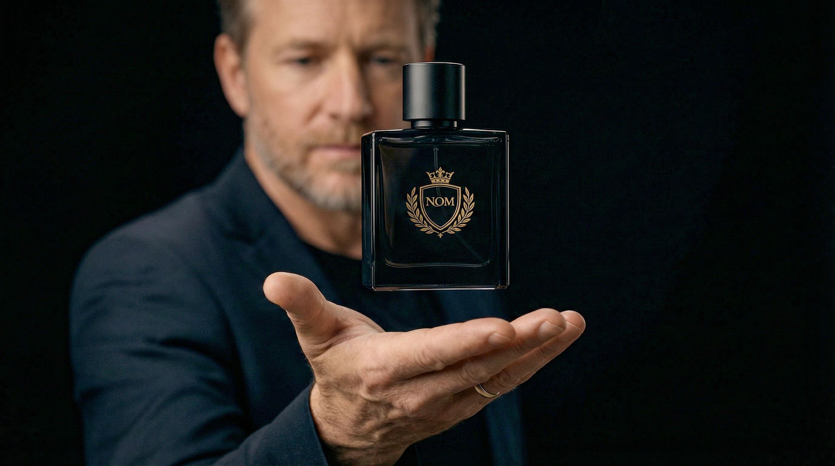
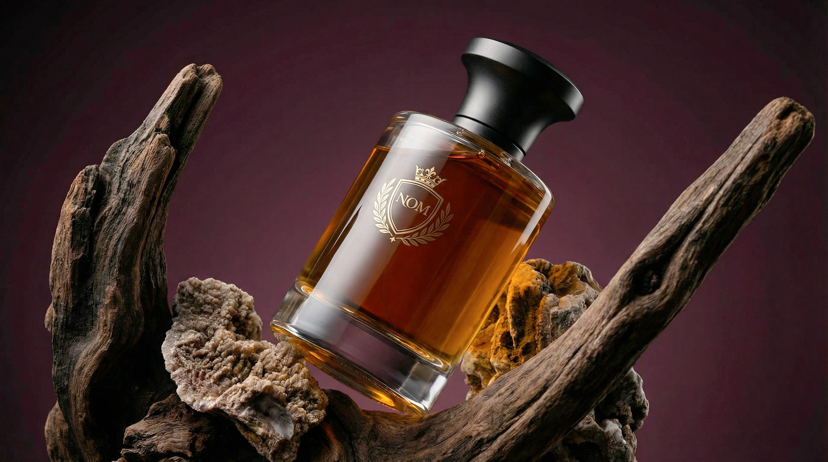
This project explores the idea of luxury as behavior, not as spectacle. In a market saturated by noise, trends, and visual excess, NOM was designed as an object of contained authority, something that does not ask to be noticed, but is immediately recognized by those who understand.
The core concept treats fragrance as a title, not an accessory. Each visual decision reinforces permanence, gravity, and restraint. The bottle is designed as an artifact, not a decorative object. Thick glass, stable proportions, and a solid cap establish physical presence and weight. Nothing is seductive. Nothing is fashionable. Everything is deliberate.
The visual language avoids lifestyle clichés and aspirational narratives. Instead, it operates in silence. Natural materials, sculptural compositions, and controlled lighting are used to communicate time, pressure, and endurance. The environments are abstract and timeless, removing any sense of trend or season.
Motion is minimal. Camera movement is slow and intentional, allowing form, material, and proportion to speak for themselves. The brand does not perform. It simply exists.
NOM is for those who no longer need validation.
It is worn as alignment, not as display.
Luxury, here, is silence.
Authority does not announce itself.
Project Focus
Brand Concept & Positioning - Bottle Design as Symbol
Cinematic Key Visuals - Editorial & Motion Direction
Quiet Luxury Visual System
0 likes · 1 view · Nov 4, 2026
A quiet luxury perfume concept exploring authority, permanence, and restrained visual language through cinematic art direction and product design.