96 Creative Studio Website Design & Creation

Osinubi Ayomide



96 Creative Studio Website Design & Creation I created the 96 Creative Studio website and brought it live.
MY ROLE: Website design, visual direction and website creation.
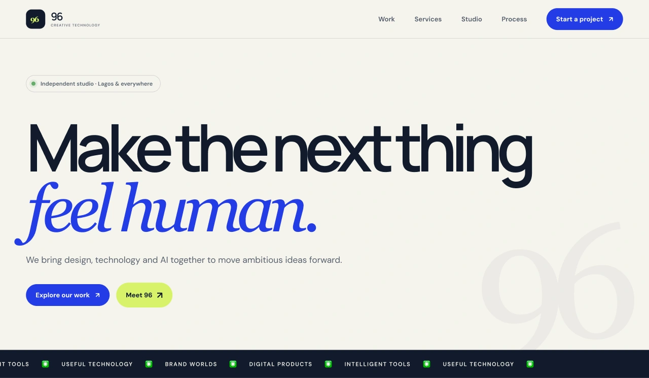
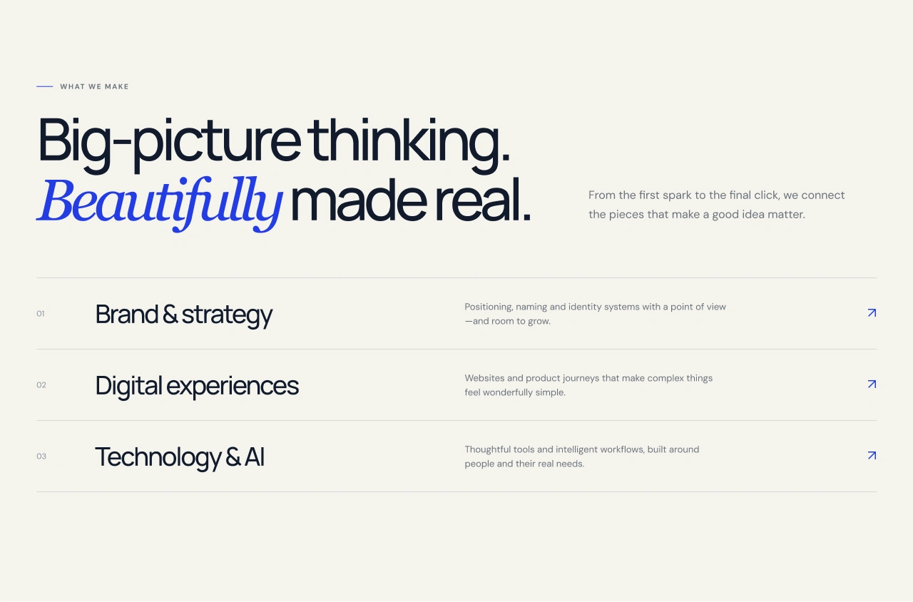
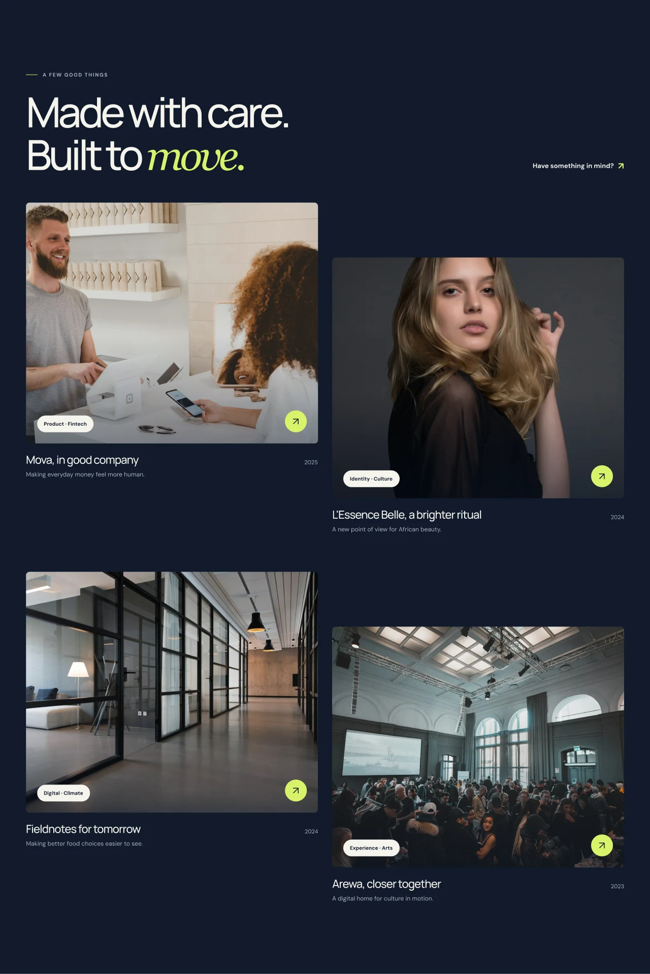
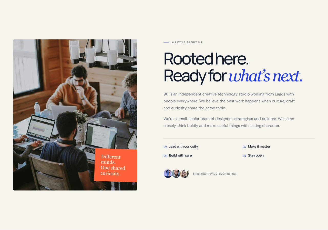
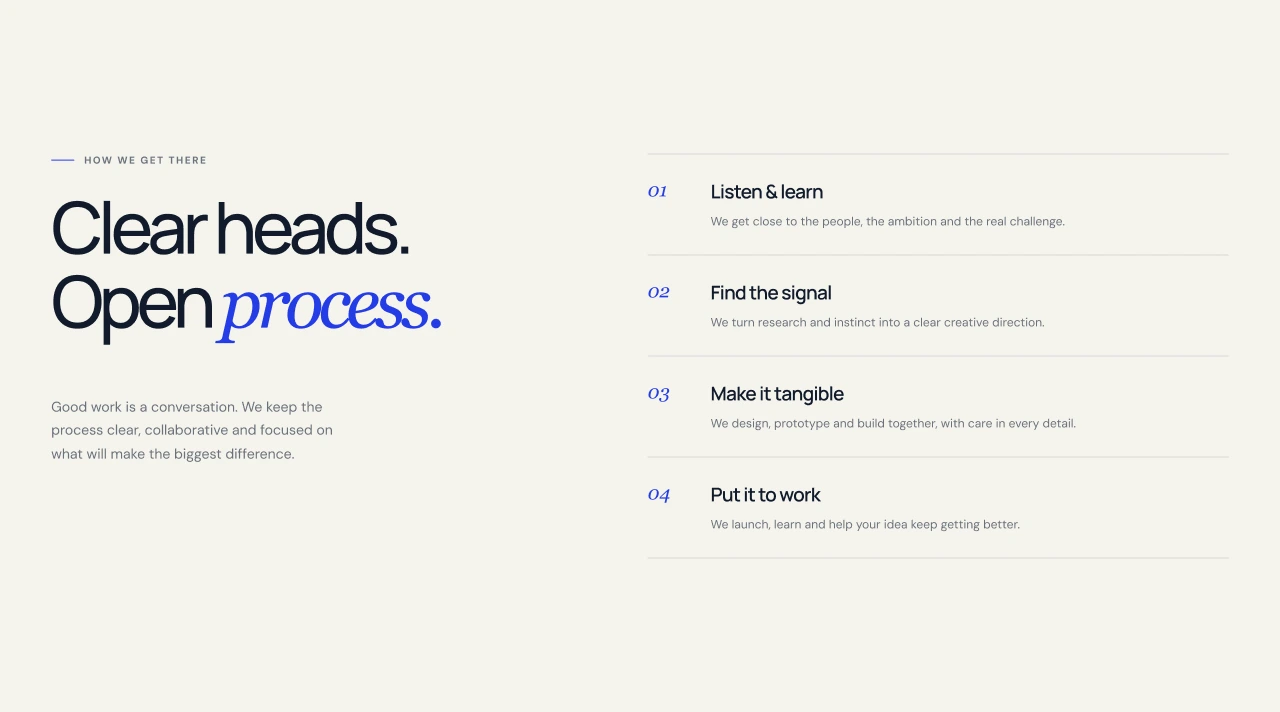
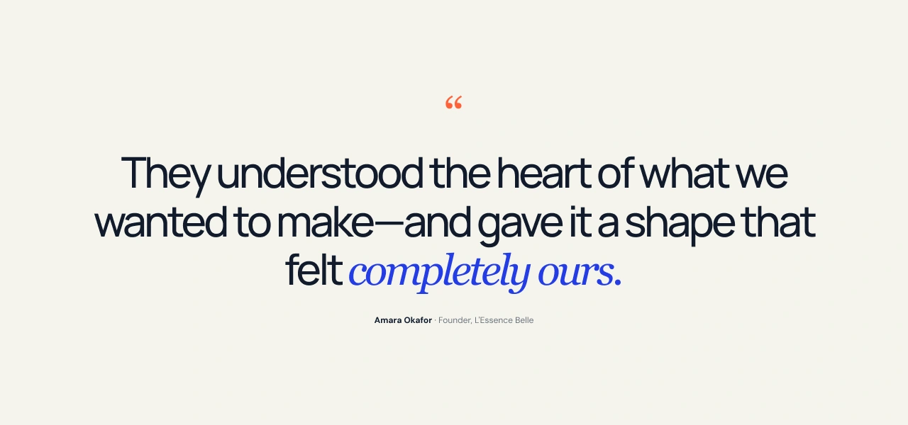
THE APPROACH: I paired warm off-white with black typography, cobalt italic accents and lime calls to action. The selected-work section uses a dark navy background and staggered image cards, giving the projects a different setting from the surrounding page. The site introduces services, selected work, the studio and a four-step process, then closes with a blue enquiry section. The emphasis is on a clear route through the content with a recognisable visual personality.
DELIVERABLE: A completed live website and its visual presentation. Need a website that feels considered from the opening line to the contact section? Message me about your project, audience and timeline.
Explore the live website: https://96-creative-studio.vercel.app/
Quick grab of the screens below 👇
Like this project
Posted Oct 25, 2026
Designed and created a live website for 96 Creative Studio, focusing on clear content pathways and visual uniqueness.
Likes
0
Views
0