Packaging design for "FortMan"
Irina Golub

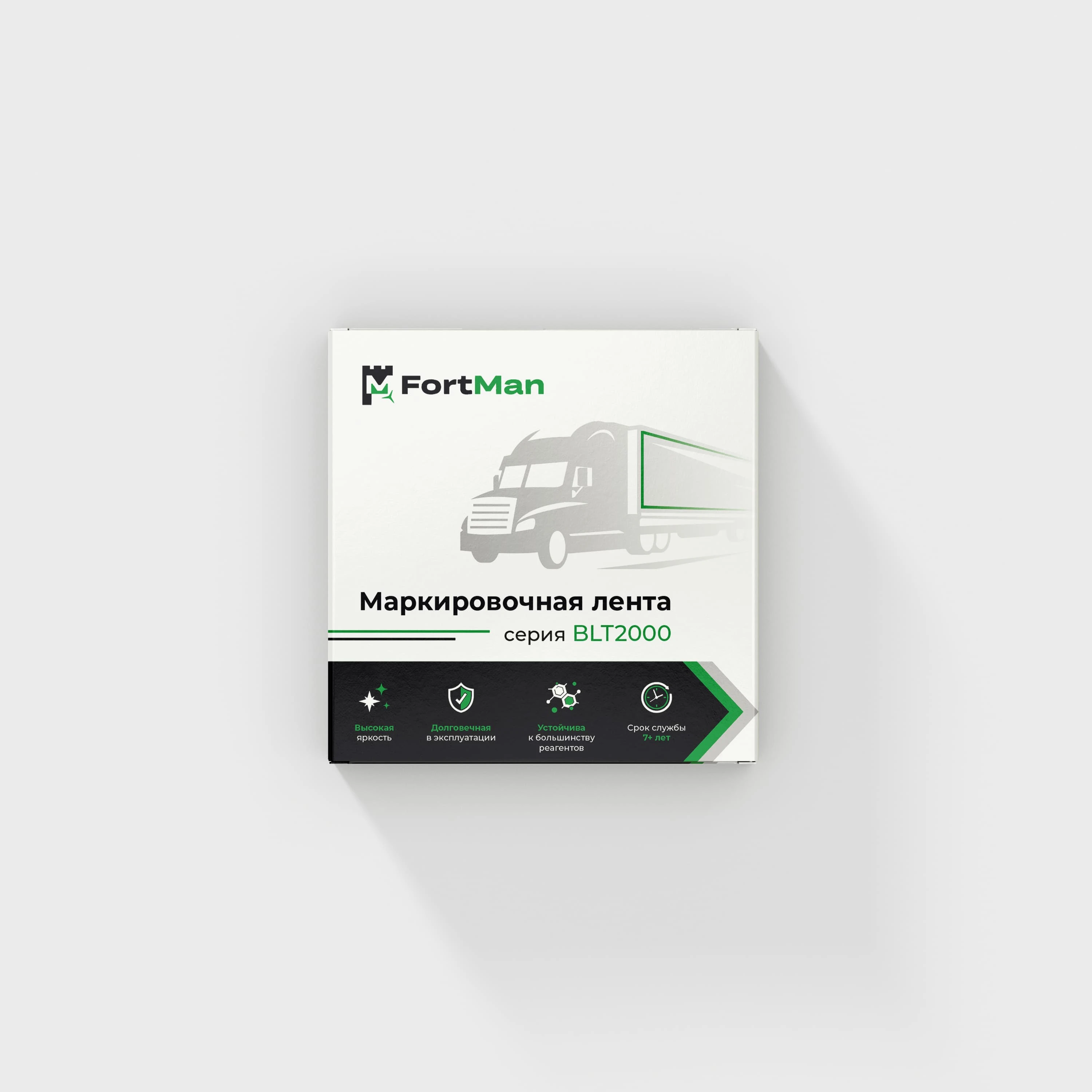
• Minimalist Aesthetic: A simple yet sophisticated design ensures easy readability and a professional appearance.
• Brand Recognition: The FortMan logo is prominently placed for strong brand identity.
• Product Clarity: The technical illustration of the tape in use helps customers quickly understand the product’s purpose.
• Premium Feel: The combination of a sleek color palette, geometric elements, and high-contrast typography enhances the perception of quality.
• Functional Layout: Important product details are clearly displayed for easy identification. This design effectively balances aesthetics and functionality, making it appealing to a professional audience while reinforcing trust in the brand
Like this project
Posted Feb 16, 2025
This packaging design was created to convey a sense of professionalism, reliability, and high-quality standards for the FortMan brand.
Likes
1
Views
3