Paper Avatars: an avatar creator rebuilt on one canvas

Peeyush Singh


Paper Avatars: an avatar creator rebuilt on one canvas
The project
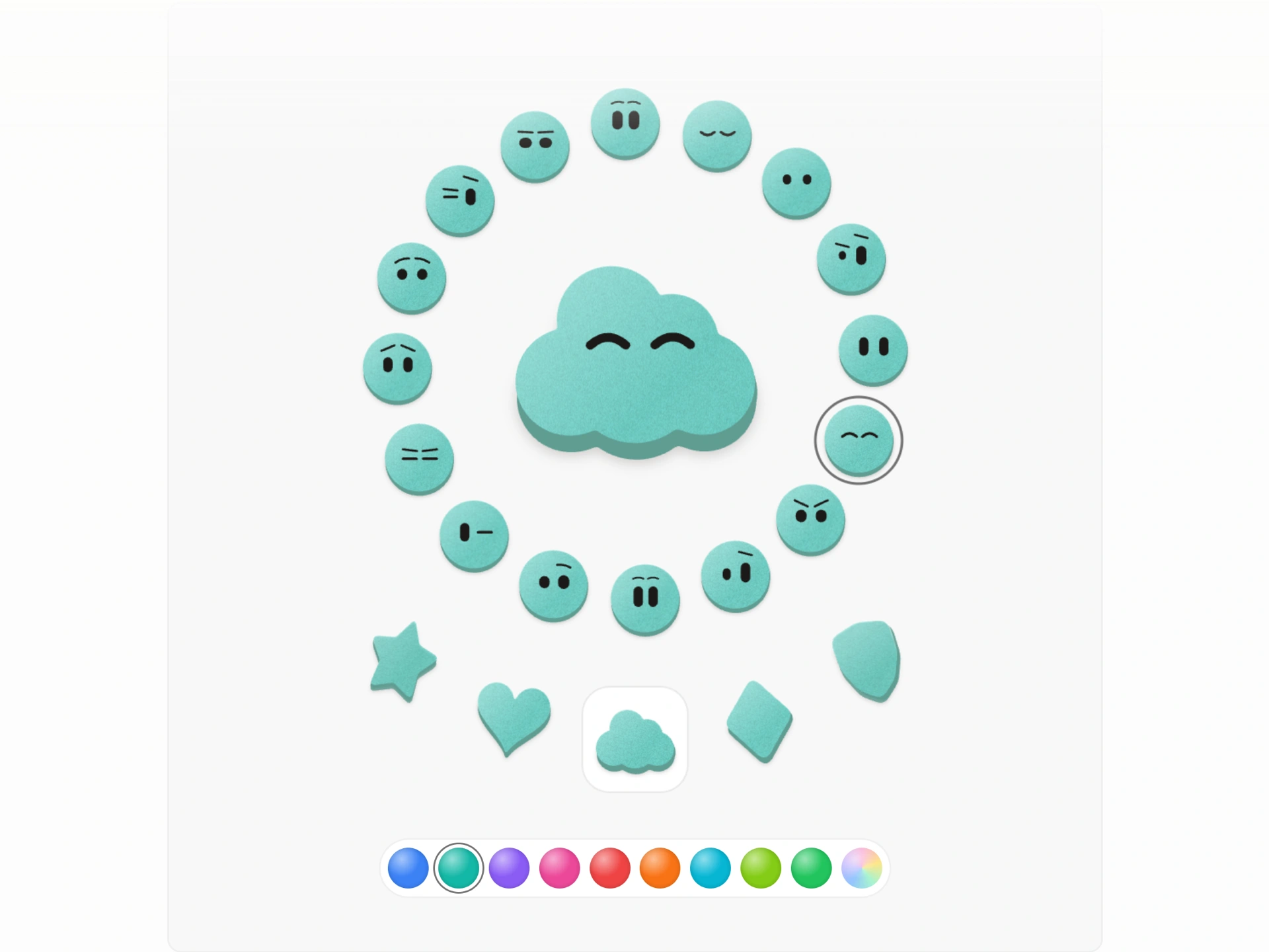
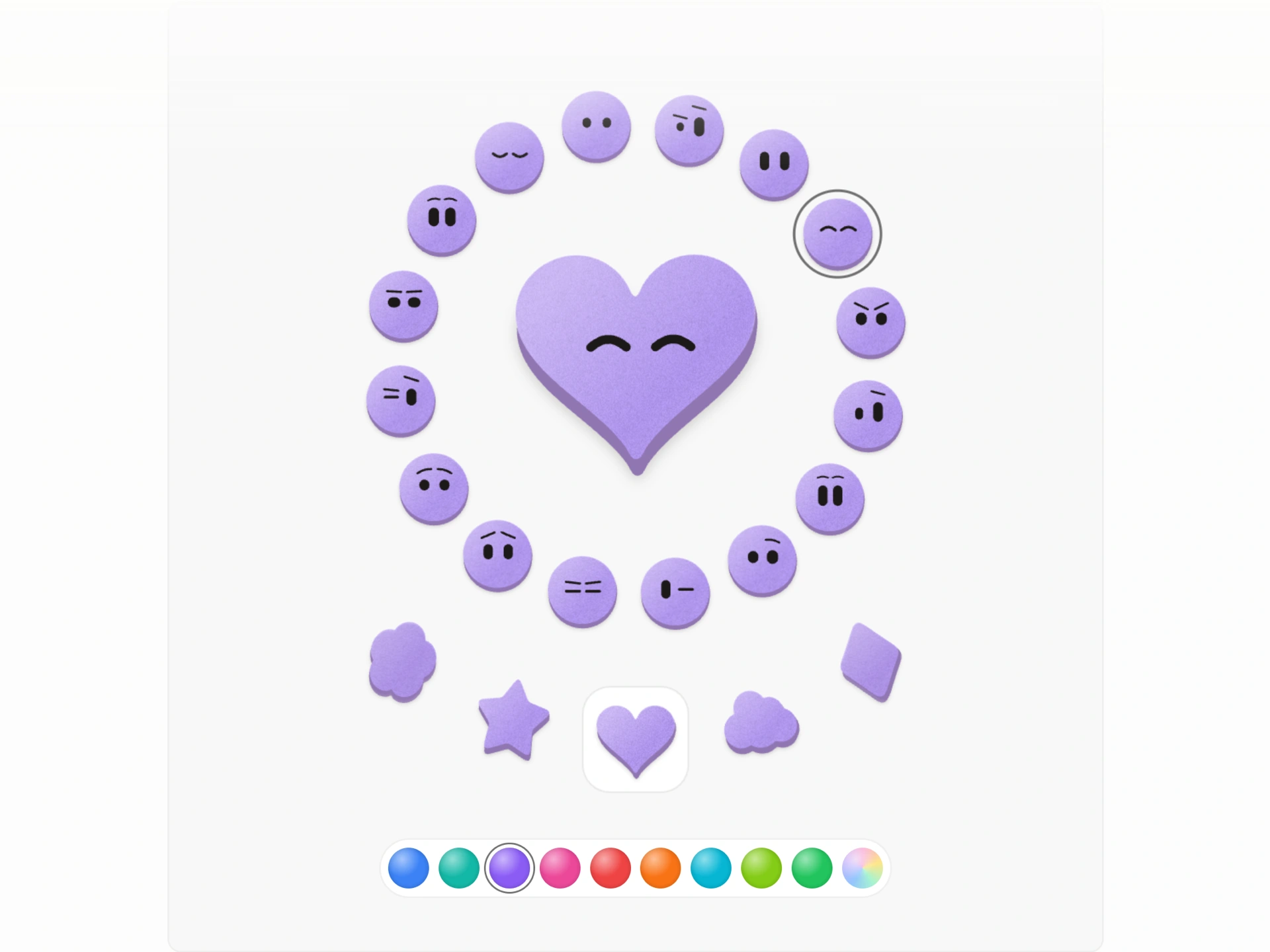
BoardUI has a paid block called Agent Creator. You pick a face from a ring of sixteen expressions, drag a shape in from an arc, choose a colour, and the avatar looks like it was cut out of card: a bit of grain, a thick edge, a soft shadow.
I liked it enough to want to know how it worked. The source isn't public, so I opened it in Chrome DevTools, studied how it was drawn, and then built my own version from scratch with a different architecture. The result is live on my site with a full write-up.
Drag a shape, tap a face, pick a colour. That's the whole interface. Everything else is in the details.
What I found
The first thing DevTools showed me was the canvas count: twenty-six. One for the main avatar, one for each of the nine shapes, one for each expression disc. Each one held its own WebGL context.
That's a tidy way to build a component library, since every avatar is self-contained. It's an expensive way to draw one screen. Browsers cap how many live WebGL contexts a page can hold, and twenty-six is a lot for a single widget.
What I built instead
One canvas, one loop. The whole stage is a single 2D canvas with one
requestAnimationFrame loop that draws every avatar in turn.Real buttons on top. The controls are still real, transparent buttons laid over the canvas, and the loop moves them every frame so they stay on the faces they belong to. A screen reader sees sixteen expression buttons and a listbox of nine shapes. The canvas is only the picture.
Shapes as numbers, not paths. Each silhouette is a list of distances from the centre to the edge, one per angle, 128 of them. A star's point and a heart's notch stay sharp, and finding the edge at any angle is one array lookup.
Five passes to make paper. A soft shadow, a darker restamped edge that gives the card its thickness and swings with the tilt, the face colour, a grain texture multiplied on top, then light from the upper left. The 3D turn is faked by narrowing the card as it rotates away.
Faces that stay on the card. Before drawing a face, the code checks every outer corner of the eyes and brows against the shape's edge and scales the face down until it fits inside 78% of the radius. A star gets a smaller face tucked between its points. A cloud keeps a full-size one.
Motion with a reason. Switching faces is a blink. Clicking plays a short gesture: a hop, a spin, a droop. The card and eyes turn toward your cursor. Changing shape flips the card to reveal the new one on its back. Every gesture settles back to rest.
Why it matters for client work
This is the kind of detail I bring to landing pages and product UI:
- Performance as a design decision. One canvas instead of twenty-six means a lighter page and no context limits, without losing anything visually.
- Accessible by default. Custom visuals don't have to mean a black box for screen readers and keyboards.
- Motion that feels physical. Small, purposeful animation is what makes an interface feel crafted instead of templated.
- Reading other products closely. I study how good interfaces are built before I design my own, so the result is my own work, not a copy.
Credits
Original idea and design: BoardUI's Agent Creator block. Everything in this version, including the renderer, shapes, faces, motion and accessibility layer, is my own rebuild.
Role: Design and front-end development
Tools: Chrome DevTools, Canvas 2D, JavaScript, Next.js
Like this project
Posted Oct 13, 2026
Paper-cut avatars that blink, flip and watch your cursor. 16 faces, 9 shapes, all on one canvas instead of 26. Lighter, accessible and live to play with.