Built with Webflow
Kopernica: Designing Emotionally Intelligent AI
Charly Agency
Client Overview & Goals
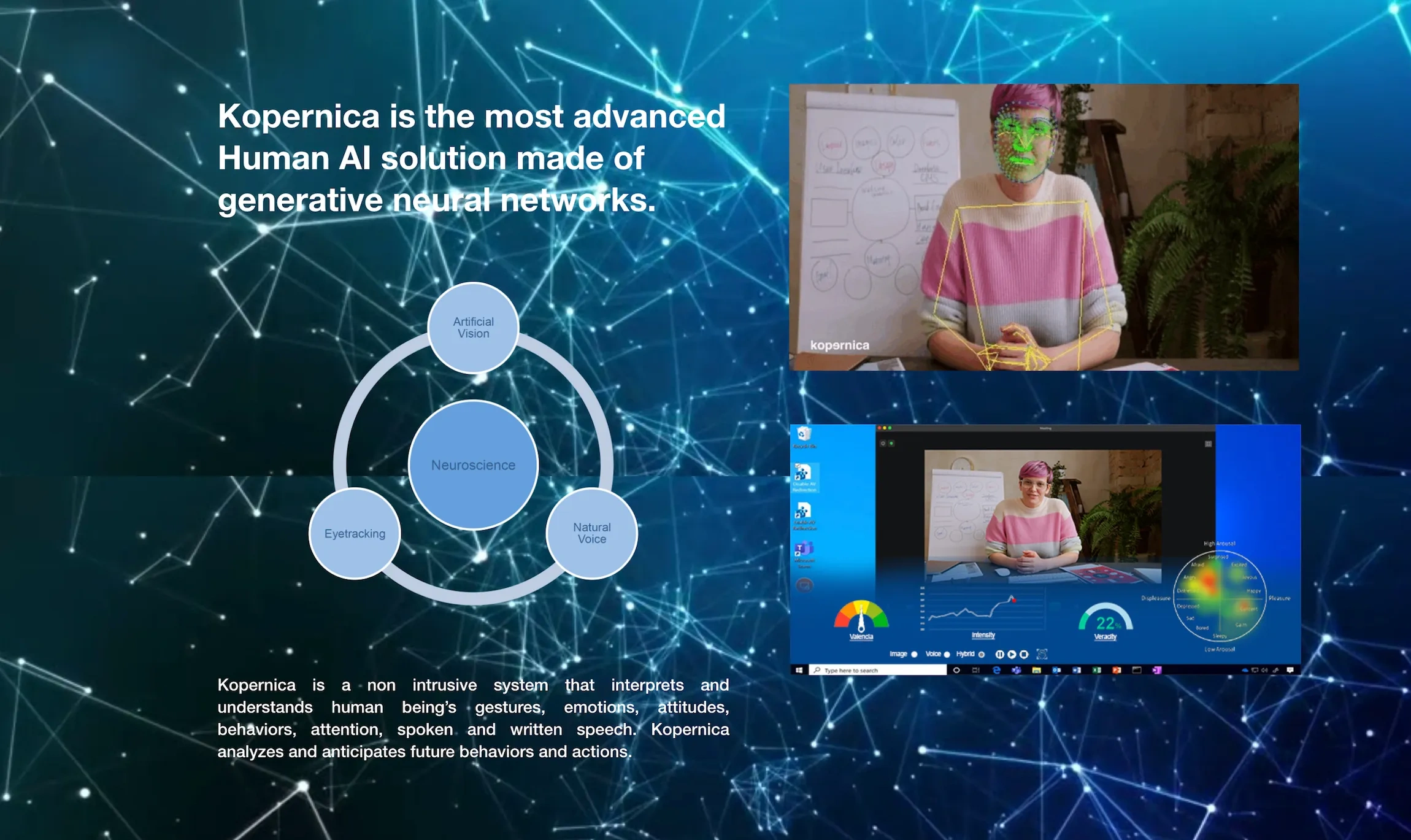
Kopernica is an Emotion AI platform that decodes human behavior in real time. It uses multimodal inputs such as facial expressions, voice, gestures, and language to translate emotional signals into actionable insights. As the technology matured, the brand needed a digital presence matching its ambition: compelling, emotionally intelligent, and easy to understand.
The previous website struggled to convey this message effectively. It was too dense, too technical, and too visually inconsistent to build trust with enterprise audiences. Our task was to redesign the site to reflect the intelligence behind the product while making the experience feel human, cohesive, and credible.
Our Approach & Strategy
We began with a full audit of the original website and identified key areas of friction. The structure lacked hierarchy, the messaging leaned too technical, and the visual identity didn’t support the idea of emotionally intelligent technology.
Our strategy focused on:
Reducing friction by cutting back the number of sections from 15+ to 10 strategic blocks
Clarifying the brand’s story and value through clear, benefit-driven messaging
Building trust with a clean, dark interface and subtle design details that reinforce emotional nuance
Structuring the experience for skimmability and enterprise decision-making
Landing Page Overhaul
Hero Section: Establishing Focus and Emotional Depth
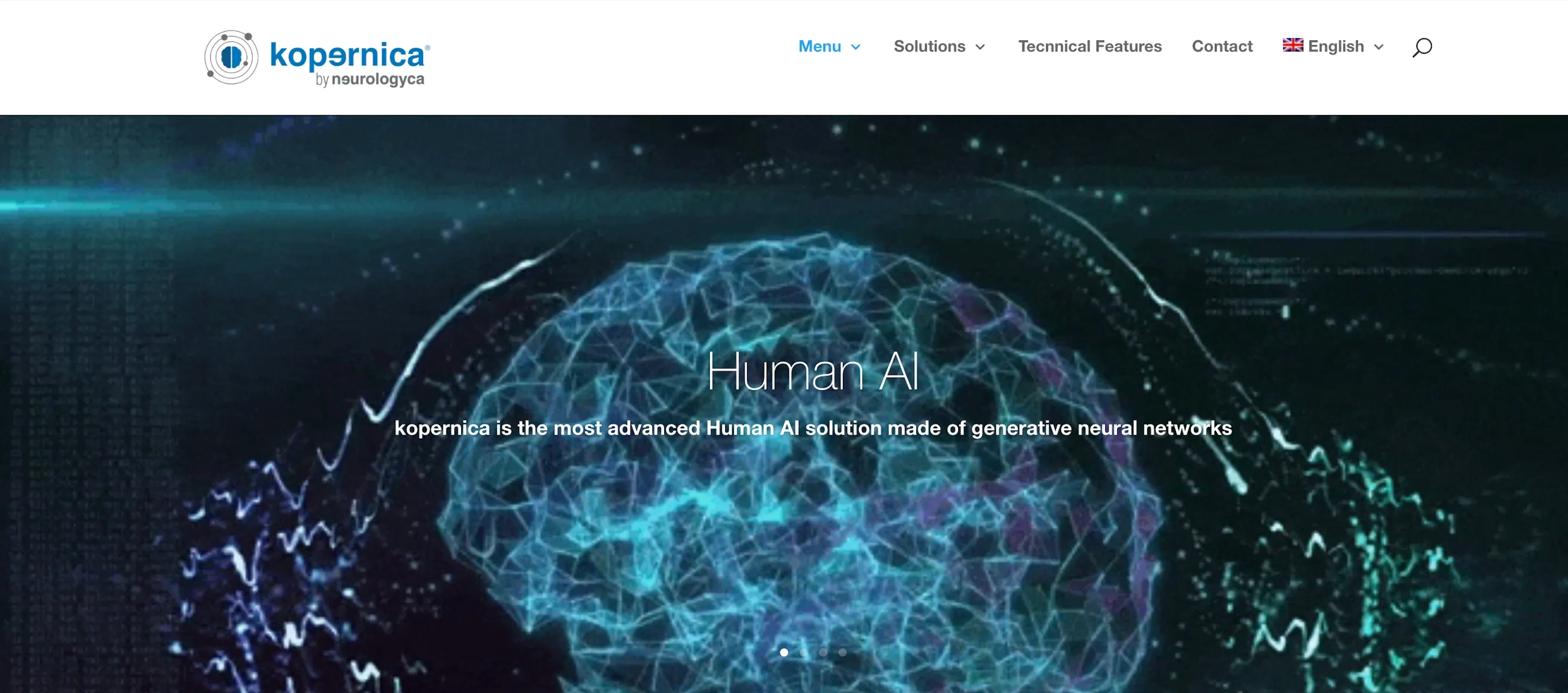
Before
The original hero section lacked clarity and emotional relevance. A globe animation paired with a vague headline failed to communicate what the product actually did. There was no call to action above the fold, and the visuals didn’t support trust or comprehension.
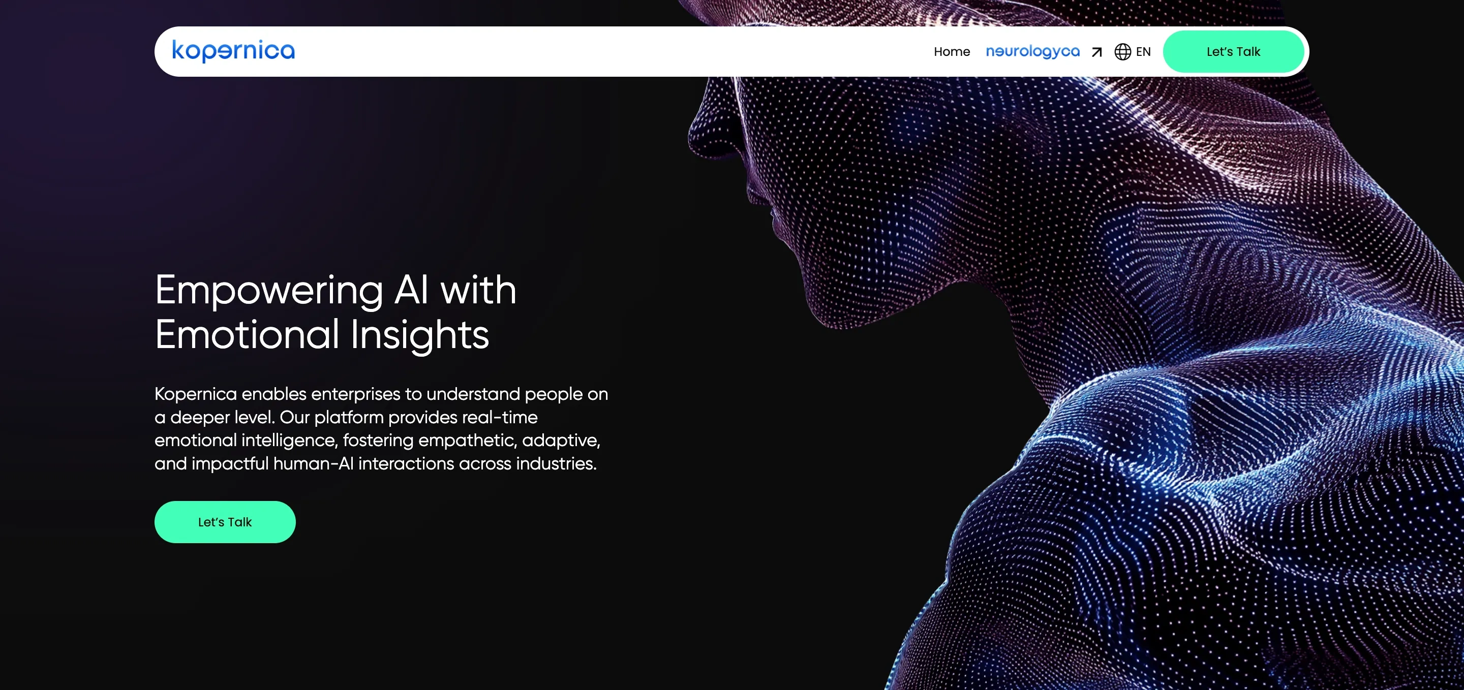
After
The new hero introduces the headline “Empowering AI with Emotional Insights”, supported by clear subtext that explains how Kopernica enables enterprises to understand people on a deeper level. The design features a digital human form composed of data points, symbolizing the intersection of emotion and machine learning. A bold “Let’s Talk” CTA is placed directly under the message, creating a clear and immediate path for engagement. The visual tone is polished and confident, with a dark background and minimal distractions that focus the user’s attention.
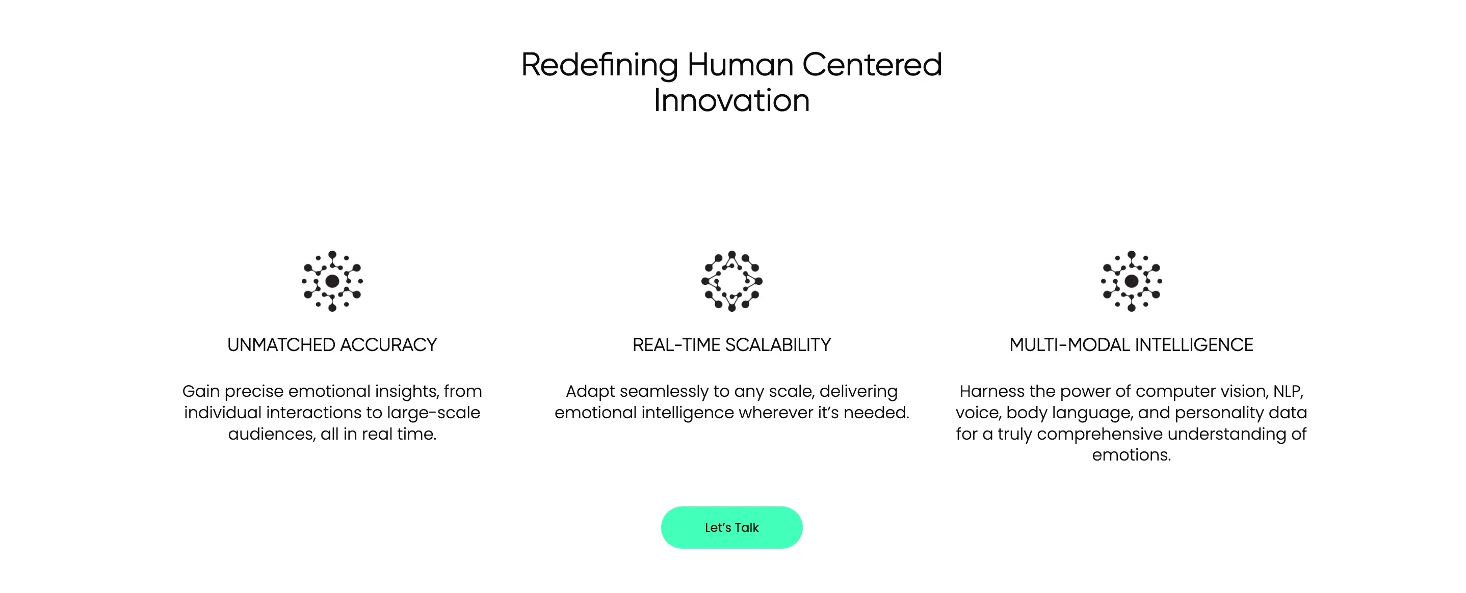
Three Core Benefits
Before
The benefits section was fragmented and hard to follow. Key advantages were repeated or diluted across multiple blocks. Visually, the design felt outdated and cluttered, with inconsistent icon styles, imbalanced spacing, and weak typography that made the section feel unpolished and difficult to trust.
After
Under the heading “Redefining Human-Centered Innovation,” we clearly present three foundational benefits:
Unmatched Accuracy
Gain precise emotional insights, from individual interactions to large-scale audiences, all in real time.
Real-Time Scalability
Adapt seamlessly to any scale, delivering emotional intelligence wherever it’s needed.
Multi-Modal Intelligence
Harness the power of computer vision, NLP, voice, body language, and personality data for a comprehensive understanding of emotions.
Each benefit is supported by a consistent icon and concise, benefit-led copy. The centered, minimalist layout, supported by white space and balanced typography, improves readability and helps enterprise users quickly grasp Kopernica’s key value propositions.
Real-World Applications: Turning Insights into Action
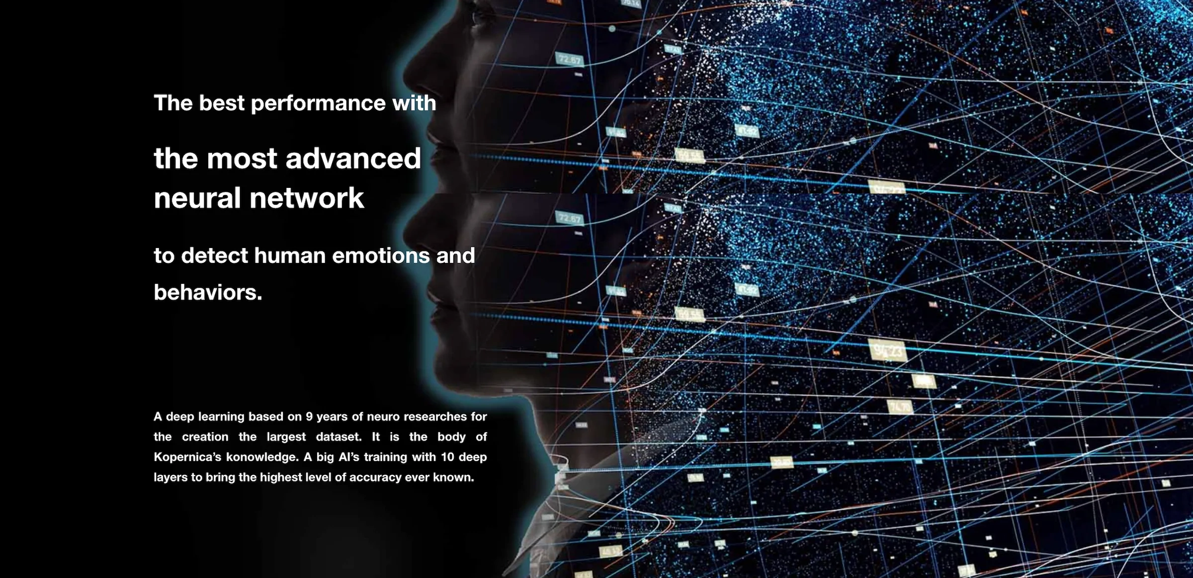
Before
The original section focused on technical claims, describing the platform as “the most advanced neural network to detect human emotions and behaviors". The messaging relied heavily on abstract statements and vague promises. It lacked practical relevance, and grammatical issues in the copy further weakened trust. The layout was static and overloaded with technical visuals, without showing how the technology creates value in real-world scenarios.
After
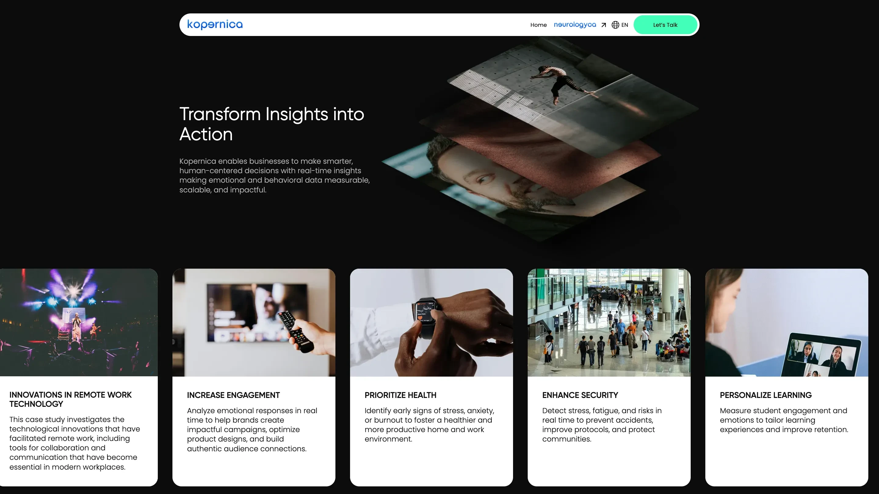
The redesigned section, titled “Transform Insights into Action,” moves away from theory and places the spotlight on practical use. At the top, a layered image loop animation (a dynamic 3D-style carousel) cycles through visuals representing diverse human experiences. This motion element adds depth and energy to the page, drawing users in while subtly reinforcing the platform’s emotional intelligence focus.
Below, five concise use cases are presented with clear titles, explanatory copy, and industry-relevant imagery:
Innovations in Remote Work Technology
Tools that support collaboration and communication in distributed teams.
Increase Engagement
Real-time emotional data to improve campaigns and connect with audiences.
Prioritize Health
Early detection of stress or burnout to support well-being.
Enhance Security
Behavioral signals that help prevent risks in public and workplace environments.
Personalize Learning
Emotion data to improve student experience and educational outcomes.
This section raises the bar by showing how Kopernica’s technology applies across verticals. The animated hero, modern layout, and relatable use cases create a clearer connection between the product’s intelligence and its business value.
New Sections: Adding Structure, Depth, and Usability
Before
The original landing page lacked key structural components that help users understand how the platform works and what makes it technically strong. There was no section dedicated to core platform capabilities or a step-by-step product walkthrough. As a result, users were left guessing about both implementation and outcomes. These missing pieces created friction for decision-makers evaluating the product, especially in enterprise contexts.
After
The redesigned site introduces two essential sections — both completely new — that clarify what Kopernica offers and how it operates:
1. “Our Platform” Accordion Section
This expandable interface gives users a high-level overview of Kopernica’s foundational capabilities, each framed for enterprise relevance:
Real-Time, and Scalable
Privacy by Design and Ethical Compliance
Seamless Integration
Tailored Solutions and Expert Support
Each item is revealed on click, helping reduce cognitive load while offering detail to those who want it. The accordion format introduces a more interactive, user-controlled experience — improving clarity without overwhelming the page. Visually, it uses a dark gradient background and clean typography to stay on brand and maintain a sleek, modern tone.
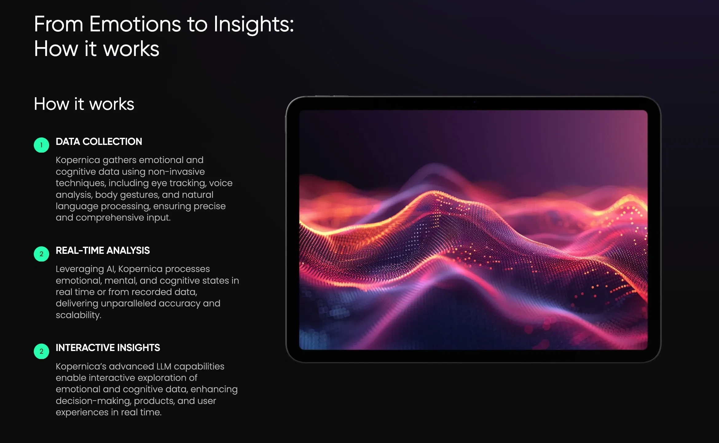
2. “From Emotions to Insights: How It Works”
This section walks users through Kopernica’s operational flow using a three-step model:
Data Collection – Involving voice, gestures, NLP, and other non-invasive inputs
Real-Time Analysis – Processing mental and emotional signals in real time
Interactive Insights – Delivering actionable data via LLMs to support user decisions
A central product visual (a vibrant digital waveform) reinforces the concept of live analysis. The structure helps technical and non-technical users alike understand how the platform works, why it’s different, and how it delivers measurable results.
Industry Use: From Overload to Organized Relevance
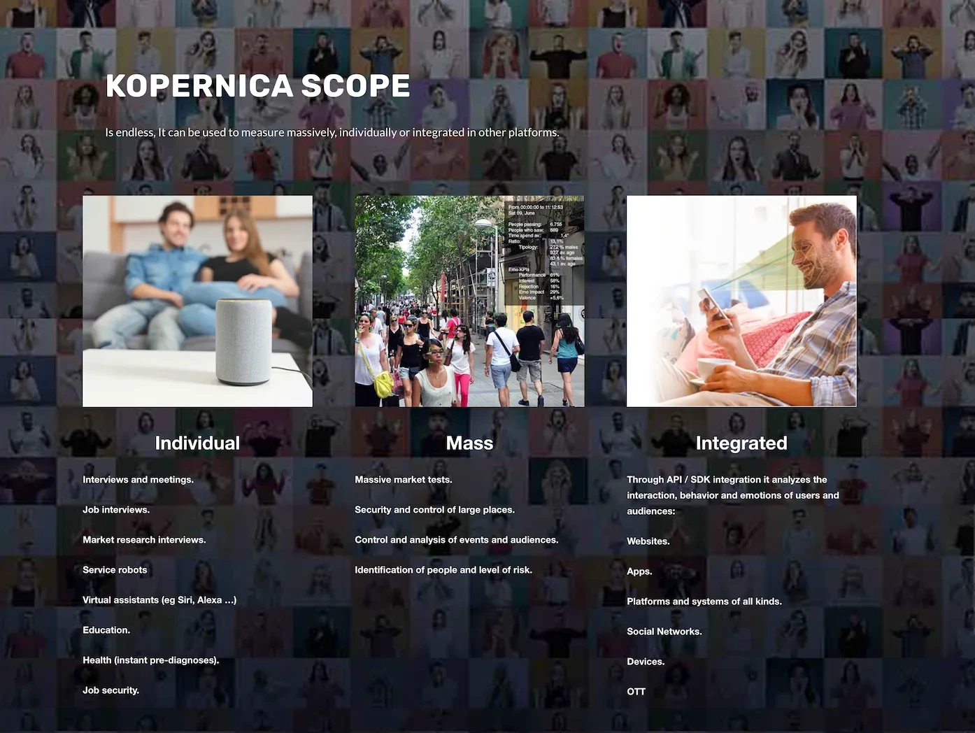
Before
The original section, titled “Kopernica Scope,” attempted to convey the platform's flexibility by listing a wide range of scenarios: individual, mass, and integrated use cases. However, the execution lacked clarity. The visual background was a noisy mosaic of human faces, competing with text that was small, inconsistently formatted, and hard to read. Categories were mixed with bullet points and loosely organized examples, which made it difficult for users to find what was relevant to them. Despite the ambition, the section came off as chaotic and visually overwhelming — more confusing than helpful.
After
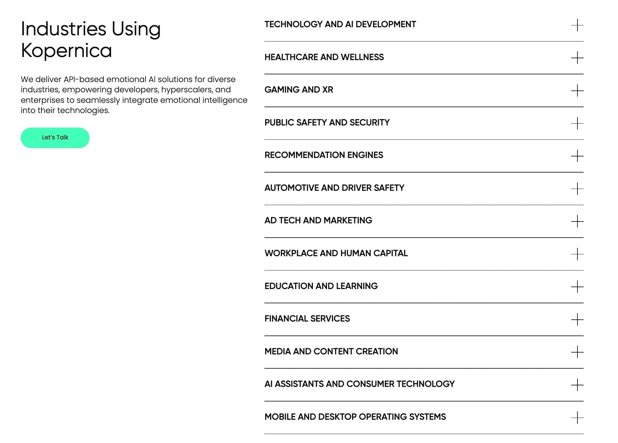
The new “Industries Using Kopernica” section replaces the clutter with structure. Presented as a vertical accordion, this section lists 14 clearly defined industries where Kopernica’s Emotion AI can be applied, including:
Healthcare and Wellness
Automotive and Driver Safety
Education and Learning
Gaming and XR
Public Safety and Security
Financial Services
Ad Tech and Marketing
AI Assistants and Consumer Technology
…and more.
The accordion format allows users to explore categories at their own pace, reducing visual clutter while offering depth when needed. On the left, a summary and CTA ("Let’s Talk") ground the section with clear intent. The design is clean, white, and modern; a stark contrast to the crowded background of the previous version.
Showcasing Industry Leaders: Bringing Real-World Impact to the Forefront
Before
The original Kopernica website lacked a dedicated section to highlight the platform's impact across prominent industries and notable clients. While Kopernica had collaborated with major players and achieved significant success, these achievements weren’t showcased, leaving visitors without a clear sense of the platform's credibility and the real-world value it delivered.
After
The new website introduces a dynamic, rotating testimonial section titled “Industry Leaders”. This feature highlights Kopernica's success stories and partnerships with well-known organizations like Telefónica, PepsiCo, Lactalis, the University of Salamanca, and Deusto Business School. Each logo appears in a carousel that rotates every few seconds, accompanied by a testimonial quote that speaks to the tangible benefits Kopernica delivered. Below each testimonial, the name and title of the individual providing the feedback reinforce authenticity and trust.
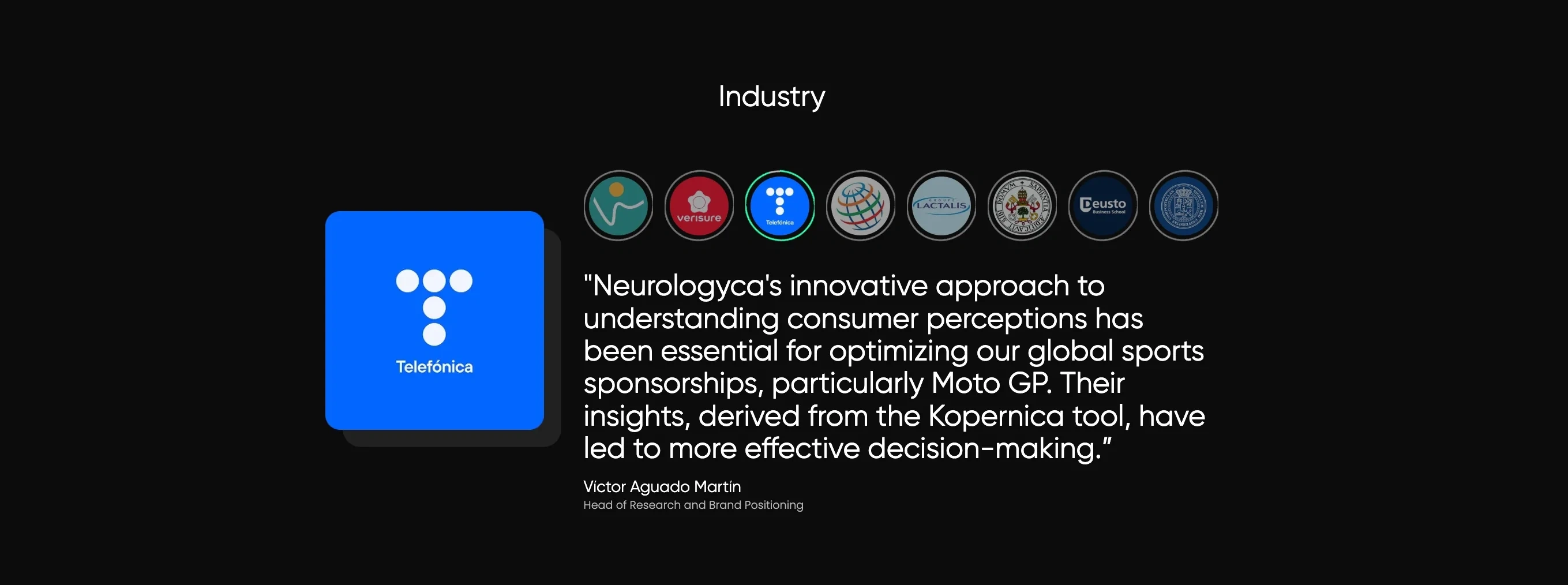
Users can click through to explore all testimonials or simply watch the rotation, with a subtle green progress bar indicating the transition timing. This new section not only adds credibility and social proof but also showcases Kopernica’s broad impact in fields like marketing and academia, aligning with the company’s goals and target audience.
Powered by Neurologyca: Highlighting the Innovators Behind Kopernica
In the redesigned Kopernica website, the final section before the footer is dedicated to Neurologyca, the pioneering company behind Kopernica. This section introduces Neurologyca as a global authority in emotion AI, emphasizing its decade-long legacy of groundbreaking research and technological innovation. The copy explains that Neurologyca’s advanced technologies are the backbone of Kopernica, enabling innovative and scalable emotional intelligence solutions.
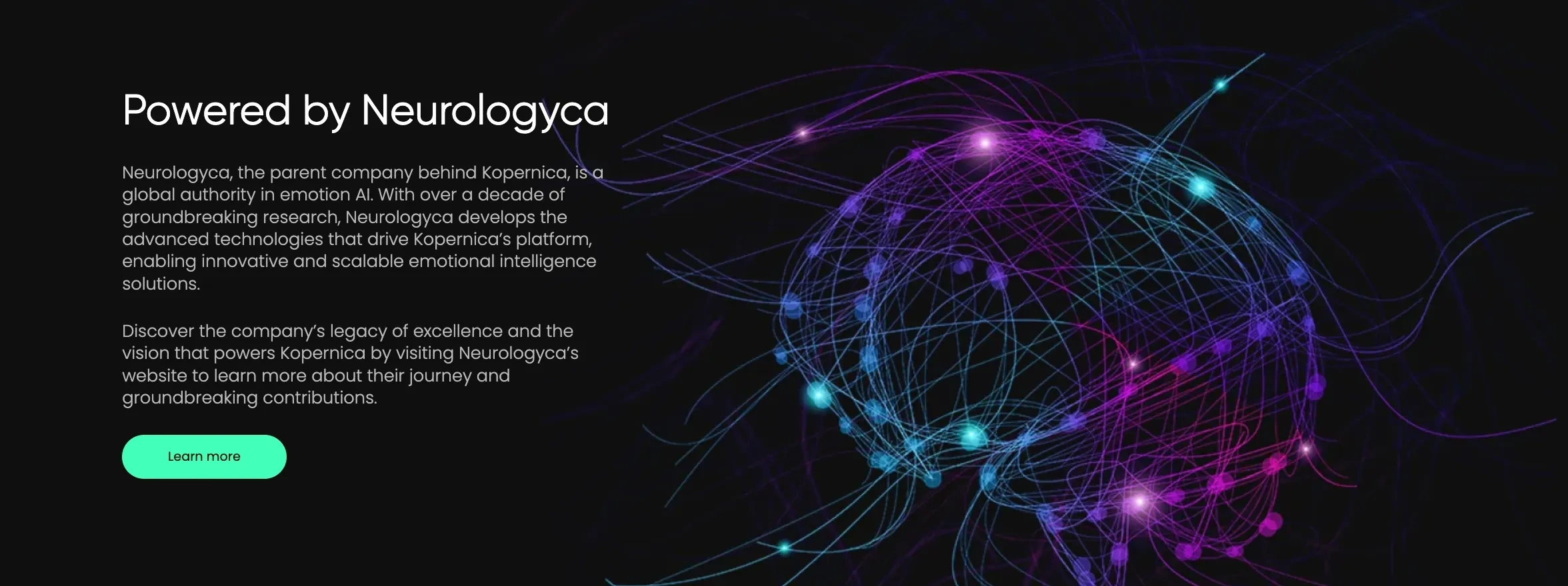
The section also invites visitors to learn more about Neurologyca’s journey and contributions through a "Learn More" call-to-action button. The visual design features a vibrant digital brain graphic. This new addition not only builds credibility by spotlighting the expertise behind the product but also reinforces the trust and authority of the Kopernica brand.
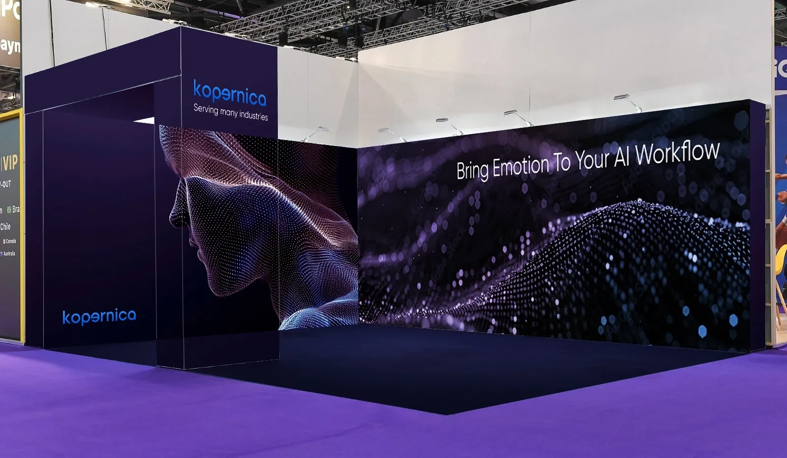
Exhibition Stand Design
In addition to the website redesign, we also supported Kopernica with the design of their exhibition stand. We used the same visual asset featured in the website's hero banner, a stylized digital human form composed of data points. The booth’s design blended sharp visual elements, interactive features, and a modern design language, creating a striking and memorable presence that resonated with both technical and non-technical audiences.
Conclusion: A Transformation Rooted in Innovation
The redesign of Kopernica’s website successfully aligns its digital presence with the sophistication and emotional intelligence of its product. By streamlining the user experience, introducing a modern, visually cohesive design, and emphasizing clear, benefit-driven messaging, the new website effectively communicates Kopernica’s value to enterprise audiences. The addition of new sections, such as the industry testimonials and the spotlight on Neurologyca, enhances credibility and engagement, showcasing the real-world impact and expertise behind the brand.
Ready to Elevate Your Digital Presence?
If you’re looking to transform your own website into a visually appealing, user-friendly experience that clearly communicates your value, we’re here to help. Let us bring your brand’s vision to life with innovative design, intuitive navigation, and compelling content that captivates your audience. Reach out today and let’s create a digital experience that stands out.
Like this project
Posted May 27, 2025
Transformed Kopernica’s complex Emotion AI into a sleek, human-focused site with clearer messaging, stronger trust, and an optimized user journey.
Likes
0
Views
17
Timeline
Dec 9, 2024 - Mar 24, 2025
Clients
Neurologyca