Built with Replo
Figma to Replo Landing Page Conversion for Rebel Pouches
Rahul Meghani
Verified
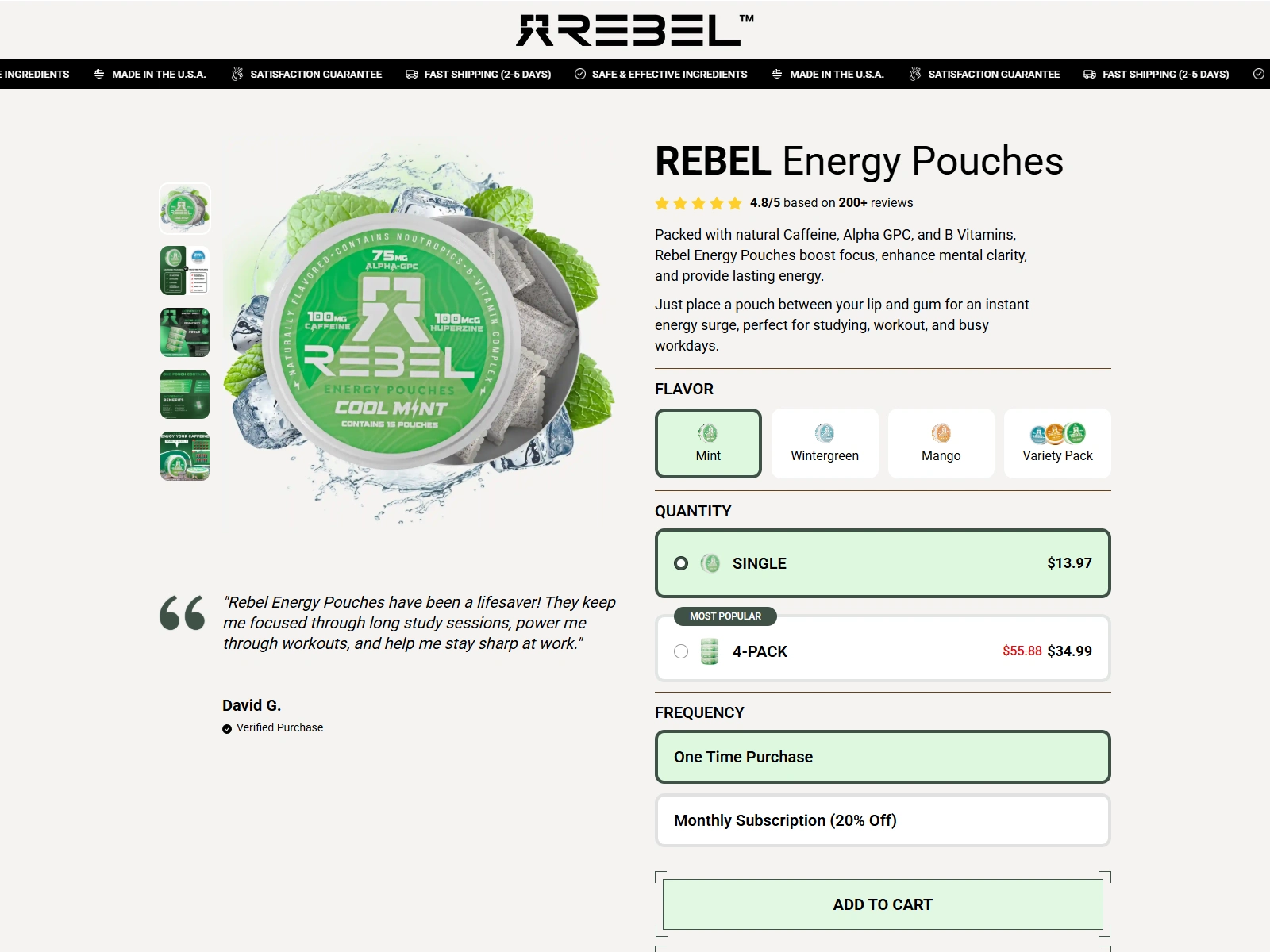
For Rebel Pouches, I was responsible for converting their custom-designed landing page from Figma to a live, fully responsive page on Replo, built for Shopify. The primary goal was to deliver a pixel-perfect match to the original Figma design while ensuring the page performs seamlessly across all devices — desktop, tablet, and mobile.
Scope of Work:
Figma to Replo Conversion: I transformed the approved Figma file into a high-converting Replo page, maintaining exact alignment with the design specifications. Every section, element, font, and spacing was carefully matched to deliver a true pixel-perfect outcome.
Responsive Design: I optimized the page layout for mobile and tablet views, ensuring a smooth browsing experience across all screen sizes. Special attention was given to spacing, font scaling, and interactive elements on smaller devices to maintain usability and aesthetics.
Shopify Integration: As Replo is integrated with Shopify, I ensured that all dynamic elements (like product sections and CTA buttons) were linked properly to the Shopify backend, creating a cohesive e-commerce experience.
Performance Optimization: The page was built using best practices for loading speed and performance, ensuring that users experience fast load times without design compromise.
Key Highlights:
Delivered a pixel-perfect conversion from Figma to Replo
Built with fully responsive design for desktop, tablet, and mobile
Optimized for both user experience and conversion on all devices
Seamlessly integrated with Shopify’s ecosystem
Maintained brand consistency across all breakpoints
Tools & Tech Used:
Figma
Replo (Shopify Page Builder)
Shopify CMS
Responsive Web Design Best Practices
This project demonstrates my expertise in bridging design and development, using Replo to bring creative concepts into functional, high-performing landing pages that align with brand standards and business goals.
Like this project
Posted May 12, 2025
Converted Rebel Pouches’ Figma design to a pixel-perfect, responsive Replo page, optimized for Shopify, mobile, tablet, and desktop views.
Likes
8
Views
85
Timeline
Mar 7, 2025 - Ongoing