SaaS AI Tool Concept Design

acream

Concept Piece
A motion design exploration focused on the experience of using AI tools to organize and synthesize thoughts. This piece visualizes the moment when scattered ideas in a user's mind come together through an intelligent interface.
Inspiration
AI tools are becoming a thinking partner for creative professionals. But the experience of using them still often feels mechanical: type a prompt, wait for output. This concept reimagines that interaction as something more fluid and organic, visualizing the process of ideas consolidating inside the user's mind as the AI works.
The central question: what does it look and feel like when a tool helps you think?
Design Approach
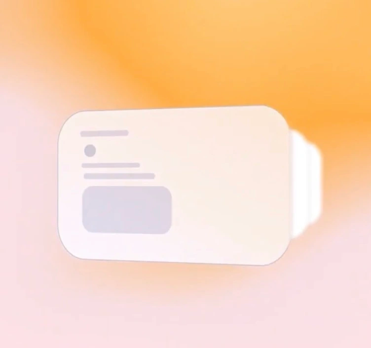
Gradient animation as content loading. Instead of conventional loading indicators, the piece uses smooth gradient transitions to simulate content materializing. The gradients shift and resolve progressively, creating the impression that information is forming rather than simply appearing. This approach makes the loading state feel like part of the creative process itself, not an interruption.
Color and pacing. The palette and motion tempo are designed to feel calm and focused, matching the mental state of someone deep in thought. Transitions are unhurried but purposeful, reinforcing the sense that the AI is working with the user, not making them wait.
Creative Highlight
The signature technique in this piece: using a gradient map as a depth reference for time displacement, producing a parallax-based paper page-turn effect.
Here's how it works: a grayscale gradient serves as a depth map, where lighter and darker values represent different distances from the viewer. This gradient drives a time displacement effect, causing different areas of the composition to animate at slightly different moments. The result is a page-turn motion where the surface appears to bend and fold with realistic depth, as if a physical sheet of paper is curling through three-dimensional space.
The parallax quality comes from the depth map's continuous tonal range. Rather than a hard fold line, the displacement creates a smooth wave of motion across the surface, with foreground areas leading and background areas following. This gives the transition a tactile, paper-like quality that feels handcrafted rather than digitally generated.
Takeaway
AI tools work best when they feel like an extension of the user's thinking process, not a separate system to operate. This concept uses motion design to bridge that gap, turning interface transitions into visual metaphors for the act of organizing ideas.
Like this project
Posted Jul 19, 2026
Concept motion piece visualizing how users consolidate scattered ideas through an AI-powered SaaS interface.
Likes
2
Views
11