Usability Study for The Met website's Perspectives Section

Sayali Nikumbh


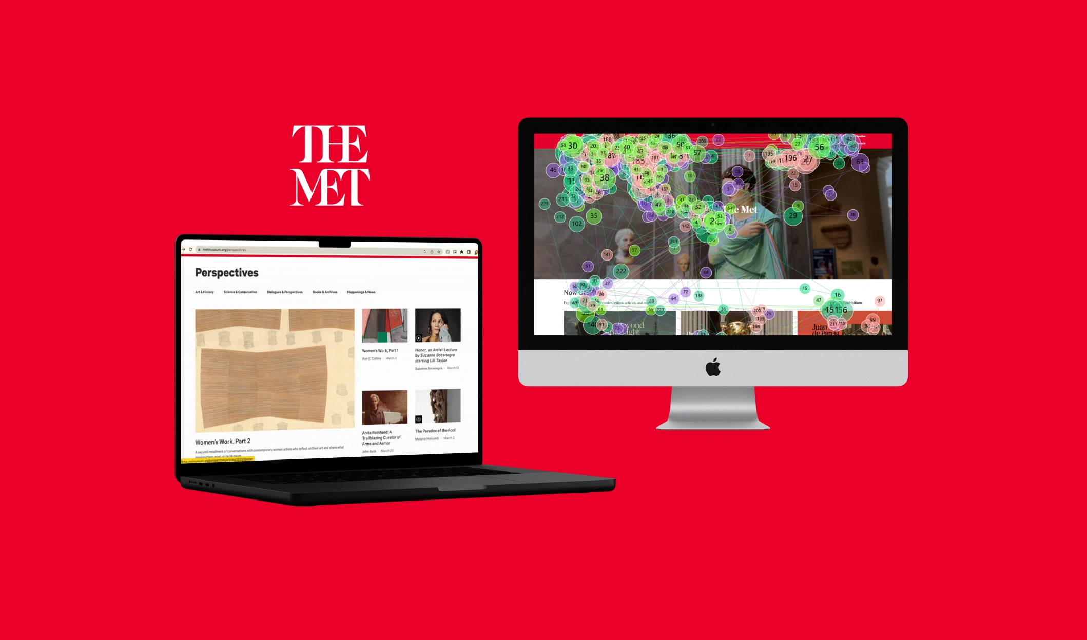
Developing Perspectives with The Met for Art History students
PROBLEM STATEMENT
How might we increase engagement on the perspectives page on the met's desktop website ?
The Met Museum which has a global reputation for their fine art collection in the united states reached out to the center for digital experiences in order to improve UX on the perspectives section of the website. The Met usually has high traffic on their website which helps audiences like art history students gain crucial information. However, it was observed that the perspectives section of the met website had comparatively lower engagement than their other pages. The Met was interested in learning the interactions and user journeys users go through in the perspectives section to improve the usability of the perspectives section.
Eye- tracking studies were conducted in the Pratt Manhattan Campus to provide visual data with solid proofs explaining how their visitors browse the content with different media types and interact with it. We synthesized this data further with the help of google analytics and noticed some similarities.
After triangulating all the data from our eye-tracking studies and google analytics, our team constructed recommendations that we hope will help The Met in their redesign decisions.
RESEARCH QUESTIONS
1. How do users navigate the Met’s desktop website and approach the Perspectives section?
2. How intuitive and indicative is the Perspectives section for a first time user?
3. How effective and efficient is the Perspectives section’s Information Architecture and content hierarchy on desktop?
4. How easy the search-ability and sub-navigation through the different content types within the Perspectives section on desktop?
GOALS AND OBJECTIVES
1. Understanding users’ pain points while navigating the site to help them find Perspectives section of the Met’s desktop website efficiently and accurately.
2. Provide data to the stakeholders of the Perspectives section to support the findings.
3. Recommend necessary changes/developments to improve the overall experience for the users
OUR HYPOTHESES
1. Low discoverability of the Perspectives section from the Home Page
2. Many types of content within the Perspectives section together
3.Features not clearly indicated in articles
EYE-TRACKING PROCESS
Eye-tracking is a research methodology conducted with the help of a tool called as Tobii pro which detects the eye-movement of the user on the screen. It gives us the data of where user is looking on the screen and generates heat maps of the entire screen.
We recruited 8 participants who are interested in art history who doesn't necessarily have any expertise in art with the help of research ops team.
Why we used eye-tracking?
To analyze the user journey and eye-movement of the user on the navigation bar of The Met website's homepage while searching for the Perspectives Page
To observe how the user interact with the media content on the perspectives page
How we conducted eye-tracking?
We called the participants in person at the Usability lab in Pratt Manhattan Campus to conduct the eye-tracking study.
We asked them to perform 4 tasks on The Met's website and recorded their eye-movement with the help of Tobii pro.
After performing tasks, we asked showed them their recording and asked them to think out loud.
We asked them some post-task questions to understand their journey.
Finding 1 : Discoverability
Users experienced difficulty discovering the perspectives page through navigation bar
When users were presented with the task to find the Perspectives page by browsing on the homepage, their first instinct was to raffle through the navigation bar looking for the name 'Perspectives'.
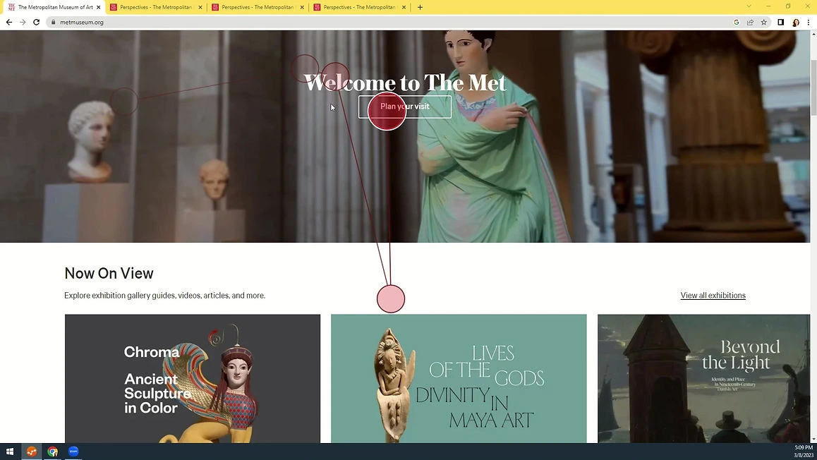
Eye-tracking snippets of a participant while navigating the homepage to find the perspectives page
In the above image, it was observed that, when the participant couldn't find the perspectives page through the navigation menu, they directly tried to use the search functionality.
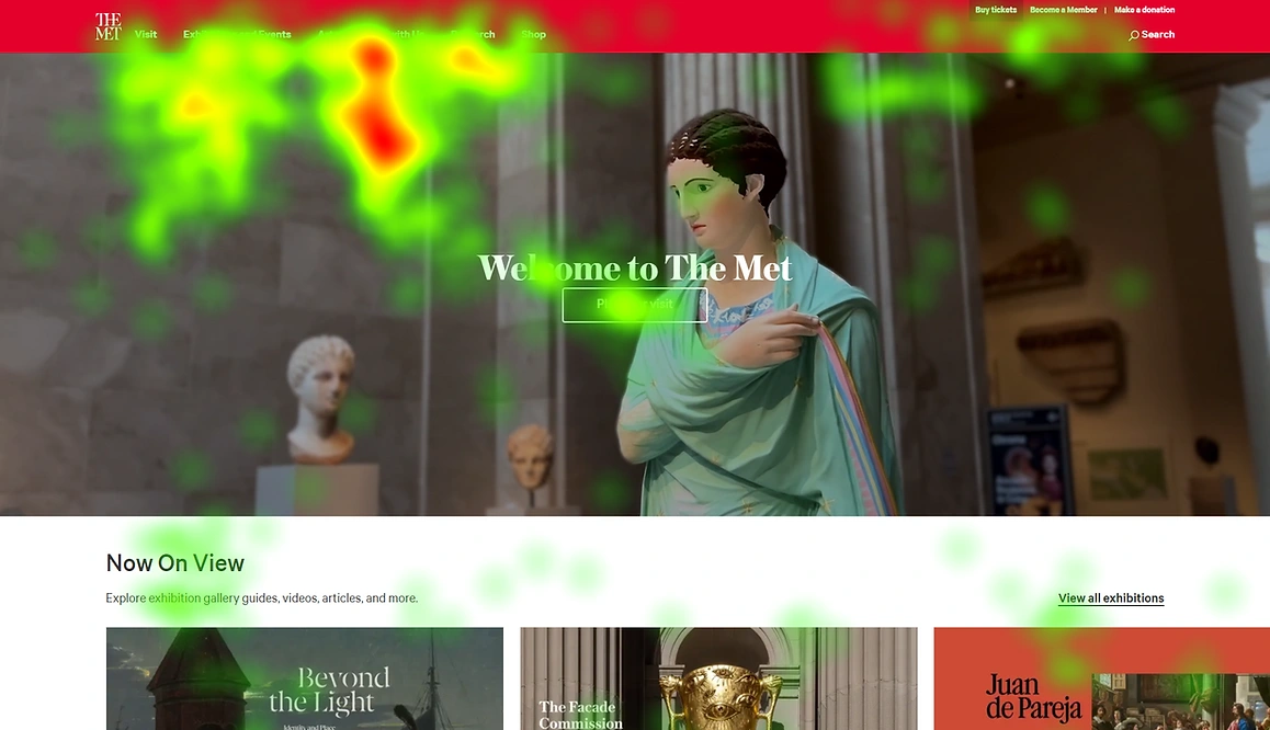
Aggregated heatmap of the met home page
The above image shows the aggregated heatmap generated of all our participants which is showing strong activity in the navigation menu during our first task.
Recommendation 1
Option 1
Renaming the header in the navigation bar
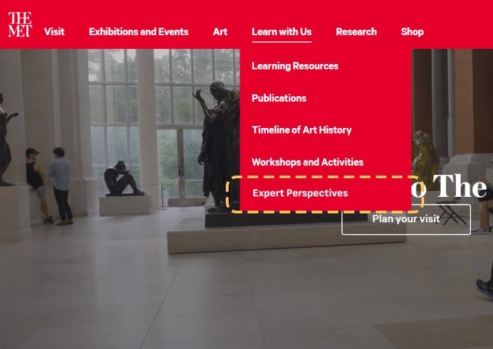
Mockup 1 of Recommendation 1
As shown in the above mockup, we thought it would be best to include the name 'Perspectives' in the navigation menu for it to be noticeable. To give more context to users, we added the adjective 'expert', such that the users would know that the page contains learning sources from experts.
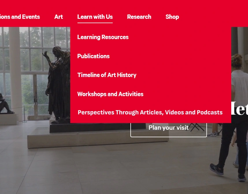
Mockup 2 of Recommendation 1
Option 2
Perspectives Through Articles, Videos and Podcasts
Implementing the name ‘Perspectives’ in the navigation bar without deviating from it’s original name ‘articles, videos and podcasts’ increases the chance of the user noticing the Perspectives page and helps in its branding.
Keeping the words ‘articles, videos and podcasts’ in the navigation bar, gives the user an idea on what type of media is used to deliver these perspectives.
Finding 2 : Mental Model
Users couldn't get the grasp on what exactly the perspectives page is about
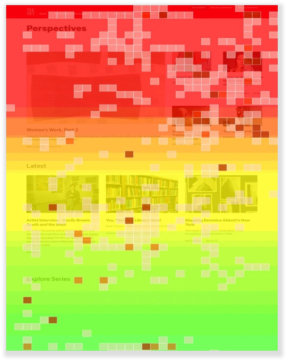
Scroll Map of the Perspectives Main Page indicates that the users were mostly reading information on the first part of the page (highest engagement shown in red)
We asked our user's about their overall perception of the perspectives page. Some of the notable quotes are given below.
"Probably as art critiques. I would expect famous persons' critique of art and their viewpoints. I had no clue what it would contain. I thought it would be Met's own opinions or people like me's opinion, or SME's opinions or newsletters."
"Aesthetically pleasing with well-chosen images but perhaps unclear symbols."
Most of the users were confused about the different types of content available on the perspectives page and couldn't understand the purpose of the page.
Recommendation 2
Adding a description introducing the section and what it contains
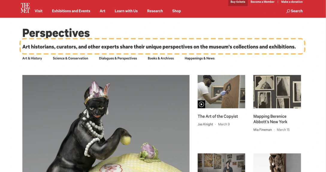
Mockup of Recommendation 2
Putting description below the main heading, stating the content of the page would give user an idea of what content they can expect from this page.
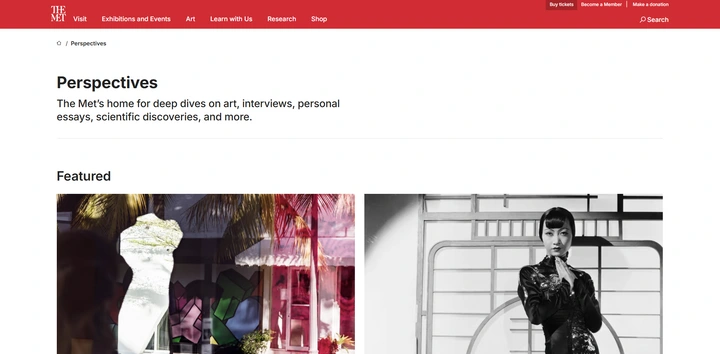
Screenshot from 'The Met's' current live website with the implemented recommendation
Finding 3 : Cognitive Overload
Users couldn't pinpoint the difference between multiple media types because of lack of clear distinction between them
The perspectives page contains articles with various media types like videos and podcasts. Only after opening the article and clicking into the media type, they were able to recognize through what media they access the information.
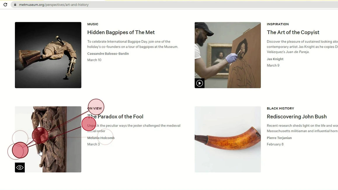
Eye-tracking snippet of a participant while navigating the perspectives page to find the close look feature
We noticed in our eye-tracking sessions that the 'close look' feature icon on the main perspectives page and the tooltip present on the article page assisted the users in completing the task.
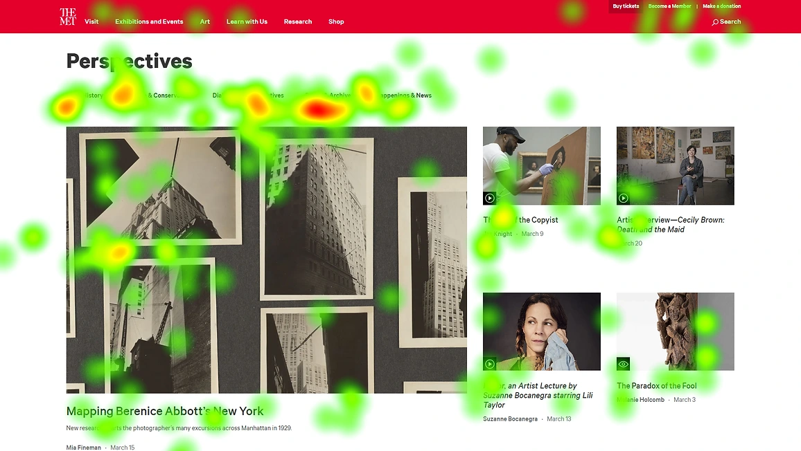
Aggregated heatmap of the perspectives main page
After observing the heatmap of the perspectives page, it also came to our attention that users were drawn the sub-headings on the perspectives page while completing the tasks as if they were seeking for direction on what they should do next.
Recommendation 3a :
Renaming the sub-headers and segregating the content types on the main page

Mockup of Recommendation 3a
Relabeling the sub-headers in accordance to their media type will ease out the user journey as they can directly seek out the media content as per their wants
Recommendation 3b
Putting media type icons and tooltips to each article thumbnail on the main page
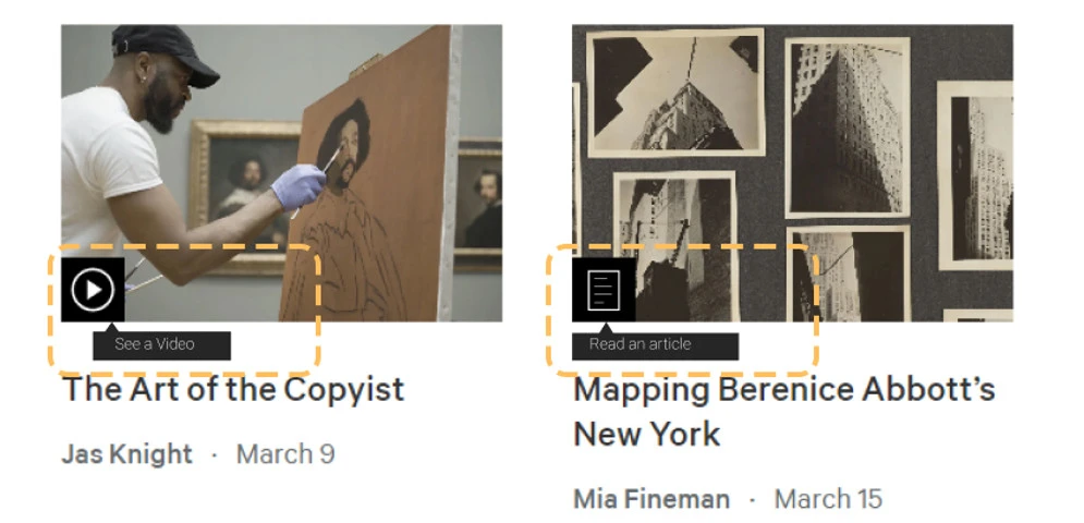
Mockup of Recommendation 3b
Only some articles on the main perspectives page had an icon in their thumbnail of their media type, to make the results consistent, we recommend attaching icons to each article thumbnail.
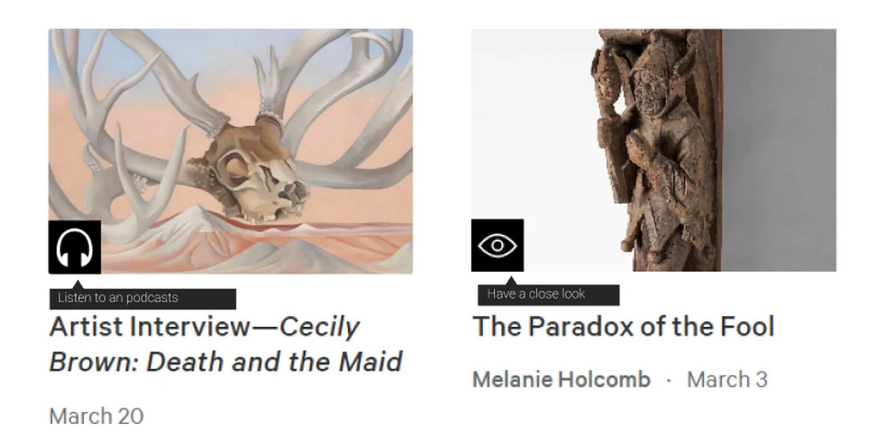
Mockup of Recommendation 3b
To give clearer context to the users, we recommend putting an explanatory tooltip when the user hovers over the icon.
Client's Reaction
After delivering the presentation to the design team at the met, a discussion followed about why certain tasks were framed the way they are. They were interested in knowing the inspiration behind the decisions we made as a team to set up the test the way we did. The discussion ended with them acknowledging our team's efforts as our thoughts and struggles with the perspectives section resonated with their internal team as well.
"Kudos for tackling a part of the website which is particularly challenging even to us to try to get a grasp on, what kind of information people are looking on this part of the website , who's using it , a lot of this big questions we grapple with as well"
-Julie Turgeon, Product Designer at The Met
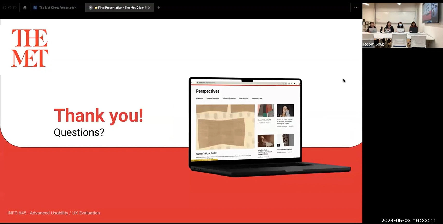
Client Meeting for the Final Presentation
Key Takeaways
At first the eye-tracking studies seemed intense and the technical issues were not helping either. But as we got the hang of it , the process became fun. The data we gathered from eye-tracking provides us with visual proofs along with the user quotes which establishes our strong findings.
We appreciate the fact that we were able to work with such renowned museum and hope that our study helped them understand the usability issues on the perspectives section of the website.
Like this project
Posted Jul 21, 2026
Conducted eye-tracking and analytics studies to enhance usability of The Met's Perspectives webpage.