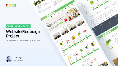
UX Case Study: Designing Tasty Green — Grocery Store App 🥦
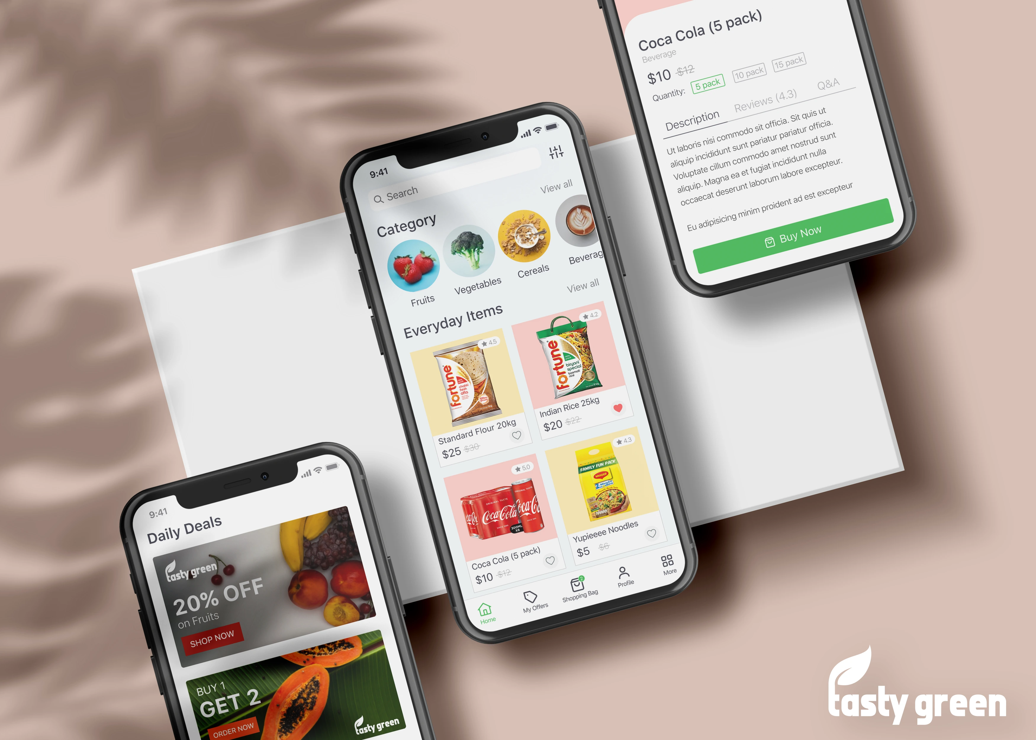
In this UI/UX Case Study, I will explain how I designed an 🥬 e-grocery app from scratch and I will talk about my process and the decisions I took during the journey. 🚀
☹️ The Problem
Being a shopper, I enjoy shopping in the local grocery stores and noticed some problems faced by the common people while shopping. I noticed different age groups faced different types of problems while shopping. Some don’t have much time, some of them are not getting offers, many of them forgot some of the items on the way and much more. I did a survey and highlighted some pain points down below.
I thought why not try to solve the problems with Grocery App. While designing a whole new app to serve such a wide variety of people sounds like an overwhelming task, conducting user research served as an effective way to narrow down on what is truly important to the people who would be using the product.
📝 Defining the goals
I started to think if out there, users are experiencing the same problem. This curiosity inspired me to validate my assumption, and ultimately produce a solution to solve the problem.

Target Audience 🎯
The target audience of the project is the people aged between 18–45 who do Grocery shopping on a daily basis. Most people of this age use smartphones and have knowledge of Online Shopping.
Research Goals
to find out the pain points and hurdles faced by a certain demographic range of people while doing grocery shopping in local stores.
Research 🚴🏼♂️
In order to obtain useful information about how the app should be designed, both surveys and non-direct interviews were conducted.
Five non-direct interviews were completed in which a casual conversation was had with the target demographic. Since it was difficult to find stay-at-home parents, we decided to ask five parents in general. The results were extremely beneficial in understanding both the shopping habits and the tendency to try the new online app. A few very important key points were derived from these interviews that would play a crucial role in helping to shape the app:
People Enjoy 🤩
All have different lifestyles and life goals and scenarios.
Some of them enjoy shopping, meeting friends in their spare time and some felt it hectic due to their busy schedules and personal problems.
They also get fresh fruits and vegetables from the market. Being regular shoppers, they are also benefited from many deals.
Frustrations 😟
They don’t have much time to shop and spend quality time choosing fresh fruits and vegetables.
It’s difficult to find the location of the items that consumed a lot of time of people having busy schedules.
Household ladies don’t have online payment availability so they can’t get the cashback deals. It’s difficult to know what’s on sale or about to be on sale.
It’s difficult to keep track of how much the items in my cart cost before checking out at the counter. Sometimes they also forget the items to buy.
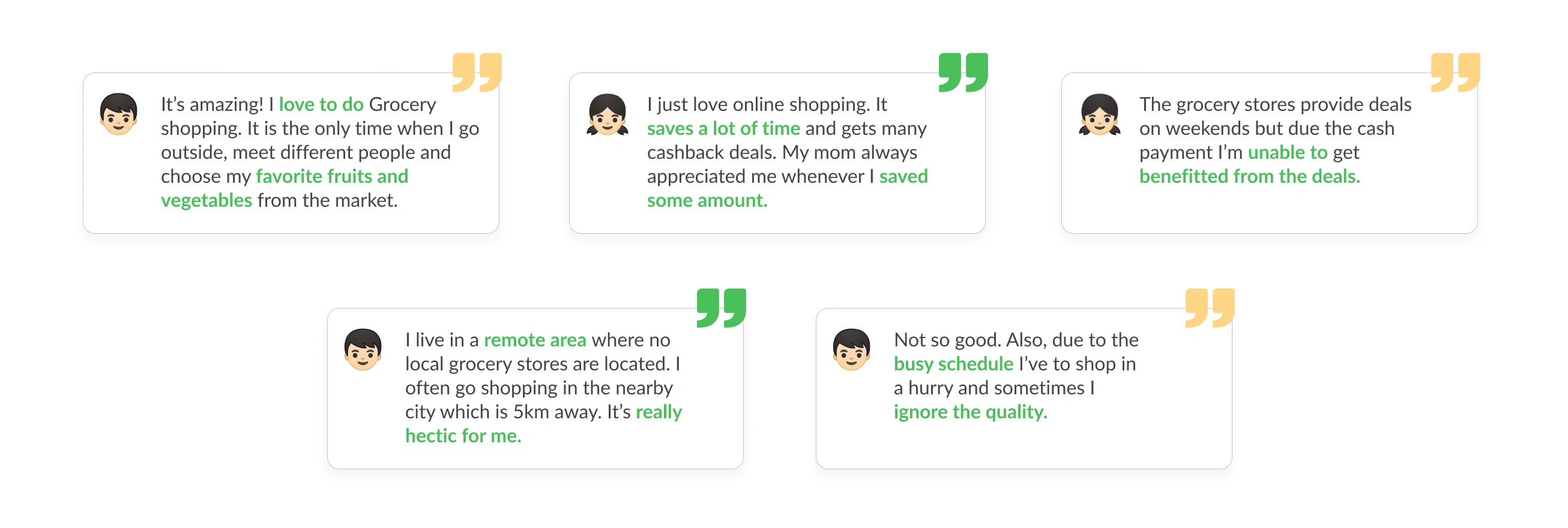
While surveys are a quick and easy method to gather user data, qualitative research methods like user interviews let me dive deep to ‘what’ the users are actually thinking and also their current process of Grocery shopping. Here are some direct quotes from users:
Planning ⛳️
The first step of my planning phase was to analyze my research findings and then group them through similar patterns and commonalities with an exercise called the Affinity Diagram. It has helped me categorize insights that stood out and focus on their pain points to turn them into design opportunities.
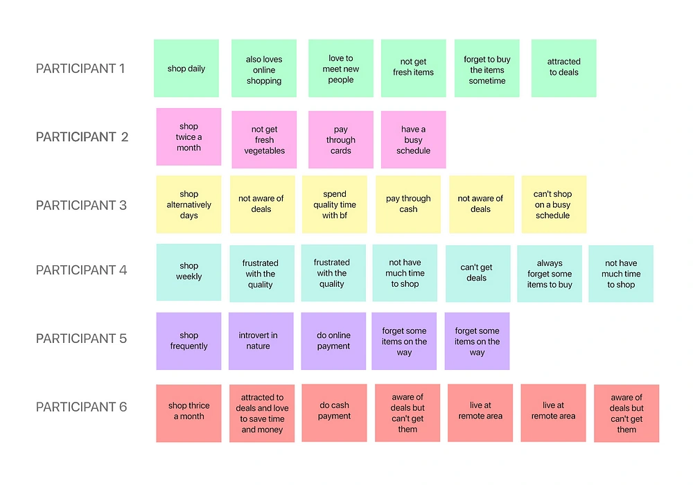
Analyze the Research Points
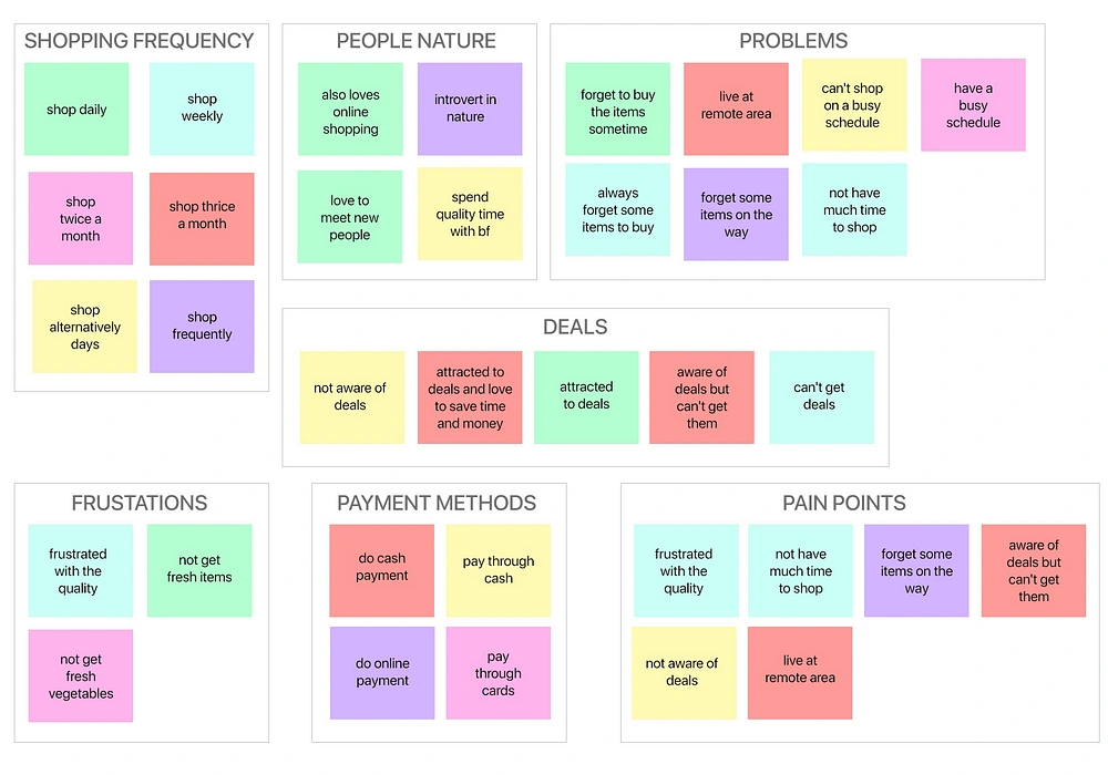
Categorize the Researched points
To summarize here are the major pain points the users’ experience:
Frustrated with the fruits and veg quality due to lack of prior shopping experience.
People with busy schedules find shopping hectic for them.
People living in remote areas have no local grocery shop. They’ve to come to the city for shopping.
They don’t get any notifications or prior information about deals and offers going to the supermarket.
The pain points that a grocery shopping app can solve based on my interviews are listed below:
The most common problem is a waste of time while shopping. Grocery shopping apps can easily resolve them and schedule their delivery. Also, now they don’t have to waste their time on finding the location of items.
People can get deals, cashback offers, sales, etc. on the app which can also solve the pain point of the middle-class family.
The quality of fruits and vegetables is also a major concern. We can solve this problem by delivering online fresh ones to the customers’ homes and also the reviews and ratings of each item are listed in the product description.
They can also get to know about the cart value before checkout. They can also save the items in their wishlist to shop it later.
Sitemap 🛸
Next, I planned out a series of steps to how a user would flow through the app. It would consist of three different categories — Onboarding, Main Activity, and Miscellaneous.
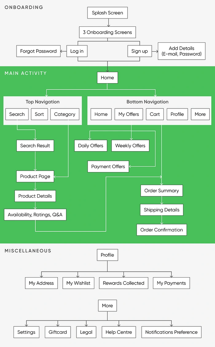
Sitemap of Tasty Green
Design 🎨
Low Fidelity Sketches
Before diving into digital wireframing, the first step I did was creating hand-drawn sketches. Hand sketching allows me to visually design how the app would look like. It also allows me to do layout iterations quickly and effectively.

Lo-Fi Sketches
Low Fidelity Wireframes
Next step, I translated my initial sketches to digital wireframes using Figma. I then prototyped our Lo-Fi wireframes using Figma and did usability tests with my users.
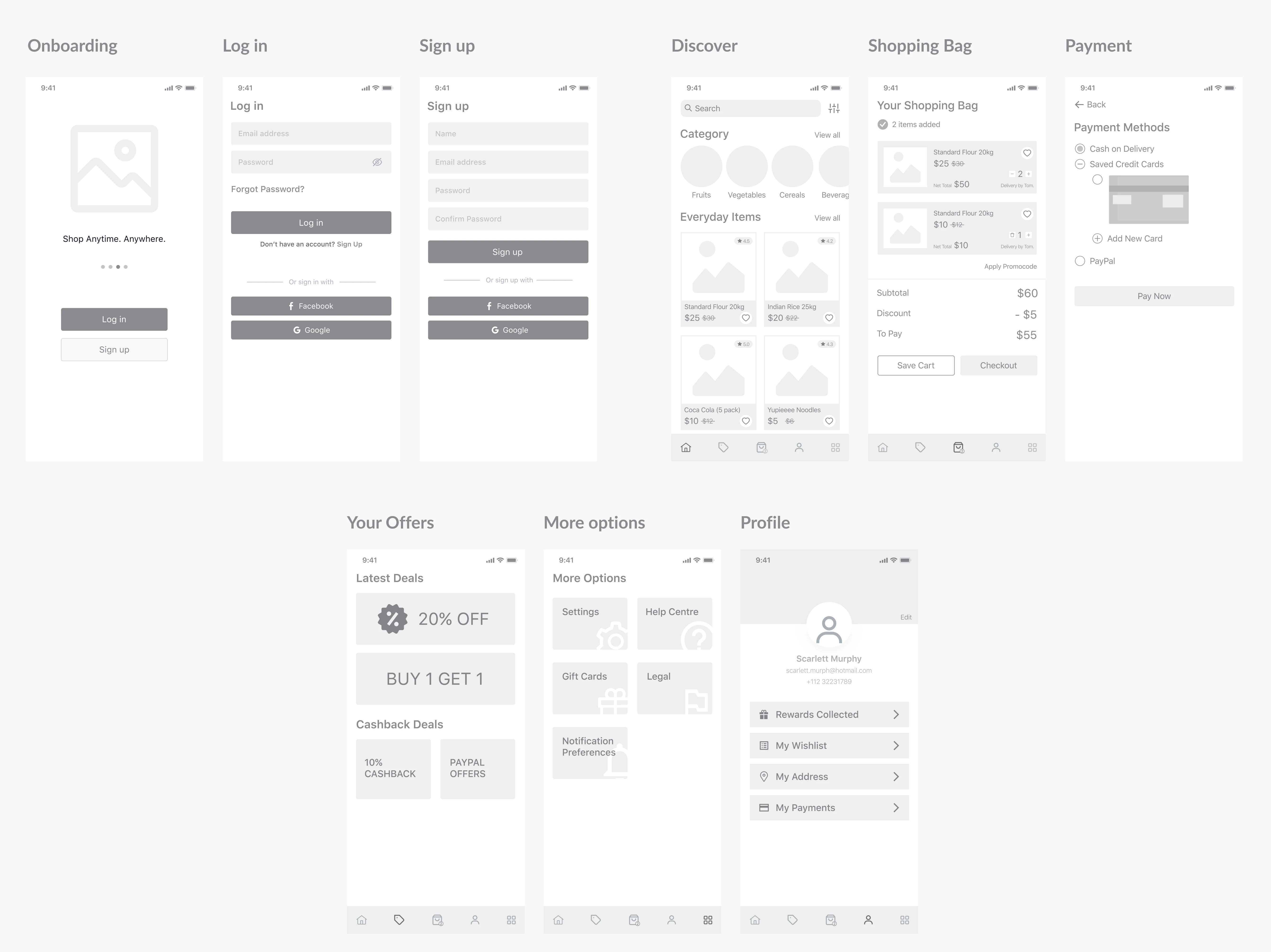
LoFi Wireframes
Branding 🤹🏻♀️
The first step to the branding consisted of choosing colours. The first colour thought of was Green. We felt that it resembled energy and nature. Green is the colour of hope, harmony, and growth. Green also represents purity and cleanliness.
Now it’s time for the logo. I chose the ‘Front Page News’ font for the logo and try to add some nature taste to it by putting a leaf above the letter ‘t’.
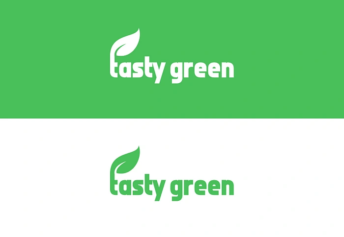
Overall, I feel that the logo matches the style we are developing, works for all audiences, and promotes the idea of the app: a helpful online grocery app available at the tip of the finger. Just Click and Order.
Visual Design
Moving on to the Visual design of the app. The primary colour I used for the Tasty Green is Green. I want users to feel harmony and joy when using the app. The App will also signify that the products are pure and clean.
As for the Typography, I used SF Pro Text as the main and the only typeface to strive for simplicity. I wanted the app to have a modern and clean look to complement the look and feel of other grocery apps.
Usability Testing 💁🏻♂️
After creating low-fidelity wireframes, I conducted some usability tests to validate my designs. I get to observe users’ frustrations and discover which area of design works and which need improvements.
Here are some feedbacks that I received:
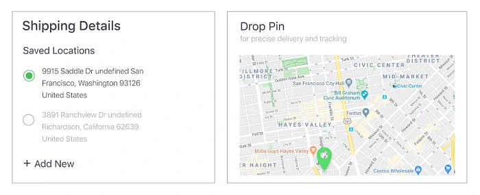
Feedback #1: Add a Shipping Address Screen while Checkout
A feature that helps the user to select their different address and also can drop a pin for the exact location on the map.
Feedback #2: Label the icons in the Tab bar
‘Labeling icons is a good UX’. I came to know about this quote while doing User Testing. It’s strange. Labeling icons make the users identify the purpose of the icon clearly even without any further thoughts.
Feedback #3: Categorize the ‘My Offers’ Section
Users are not able to identify the offers are applicable to them only or to all. Categorizing them helps them to easily know their deals.
Lo-Fi to Hi-Fi Mockups
After deciding the Brand identity and Visual design, I wrapped up in converting the wireframes into prototypes.
The Final Design Solutions
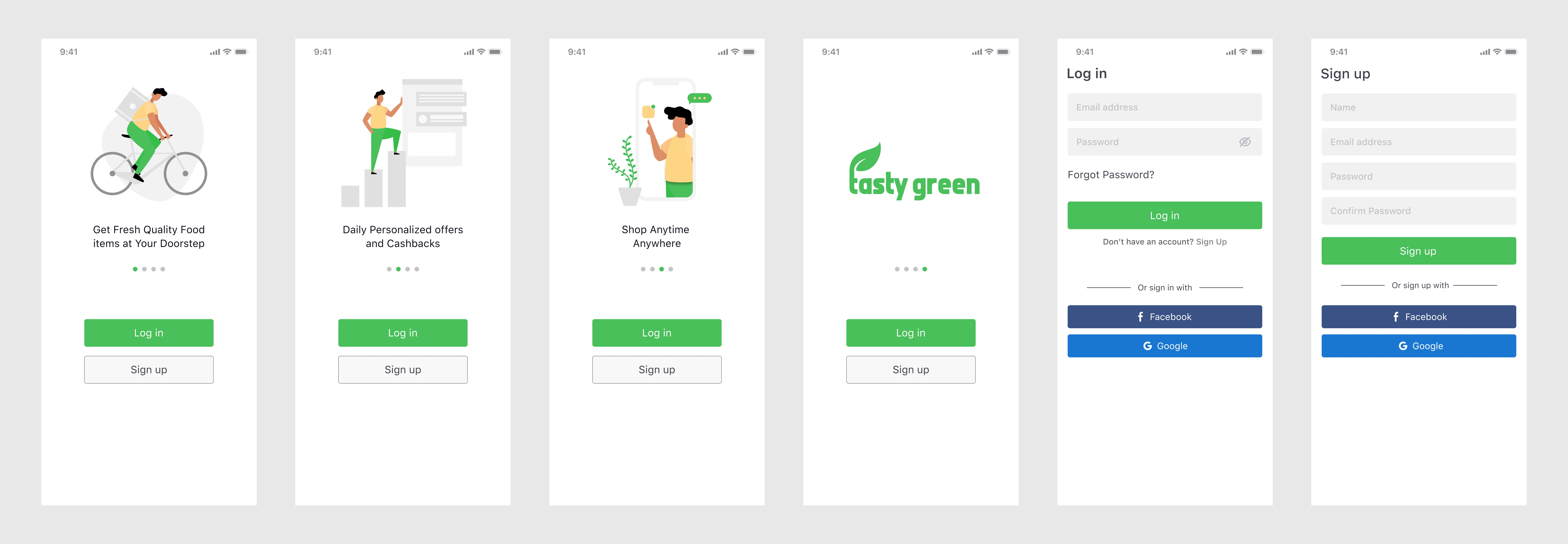
Onboarding Screens
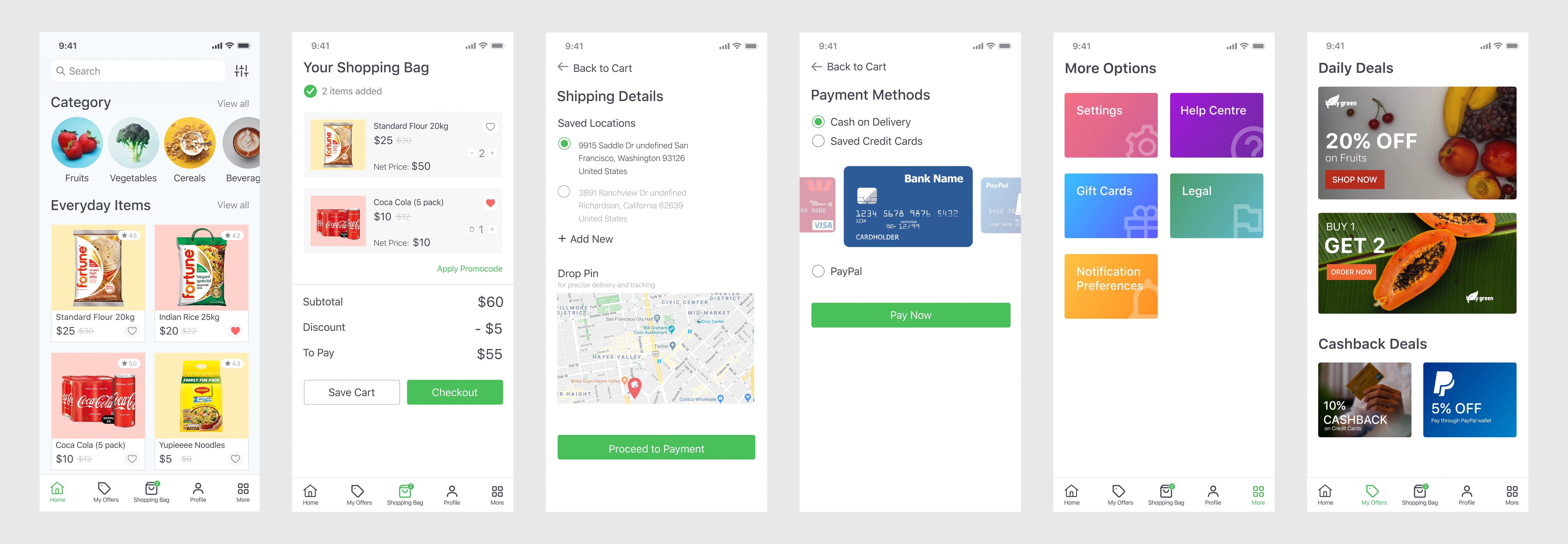
Main Activity
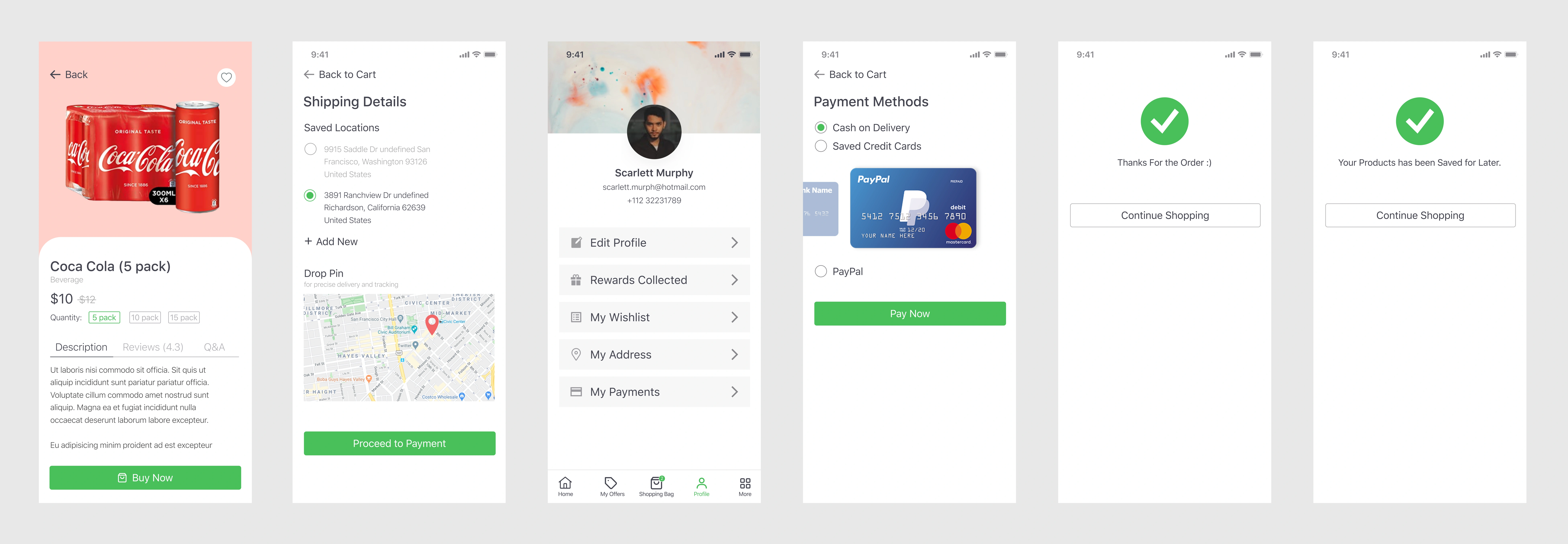
Miscellaneous
Prototype 📱
My Learnings & Reflections 🏆
I really enjoyed working on Tasty Green as the project idea sparked from a personal pain point I experience. However, being given the freedom of choosing your own subject and setting up your own scope; the scope ended up being really huge and you feel the need to add all kinds of features that would cover all user’s pain points. Here developed a greater understanding of why businesses use an MVP approach, and then add more features as they get user feedback. I was also excited to be working on the UI design for Tasty Green, I was able to understand deeper the importance of using and implementing a design system, as it helped me a lot on productivity and effectiveness.
And… That’s a wrap!
So that’s pretty much it. This was my entire process of redesigning the website. Hopefully, you found this article very helpful and insightful. Do reach out to me if you would like to share anything with me. I’d gladly accept it.
🤯 Did you know?
You can give up to 50 Claps for this article? Just hold the clap button for a few seconds and bam. Try it out! 😋
Thanks for the 50 clap 👏🏻 if you enjoyed this article. This will tell me to write more of it! Also, leave your valuable feedback to improve.
If you love what I’m doing, please consider 📚 Buying me a Book. Thank you!
⭐️ My featured articles on Medium
🍓 Hit me up on social media
Like this project
Posted Dec 7, 2023
Being a shopper, I enjoy shopping in the local grocery stores and noticed some problems faced by the common people while shopping. I noticed different age grou…


