Fox (Kitsune) - Logo and Brand
Keys
and illustrationZ
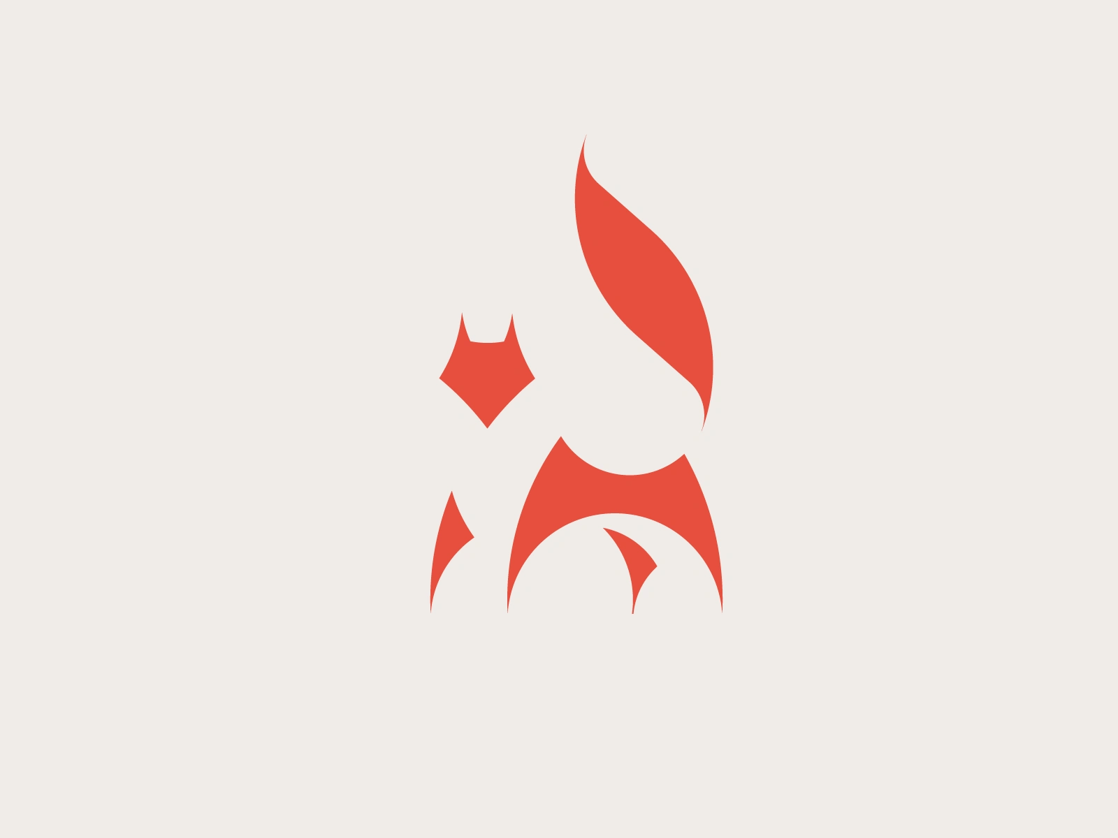
A logo and illustration constructed out of circles (19 to be exact) and two lines - all meant to communicate the figure of a fox somehow aware and alert of its observer - all rendered with the help of the beautiful Pantone 179.
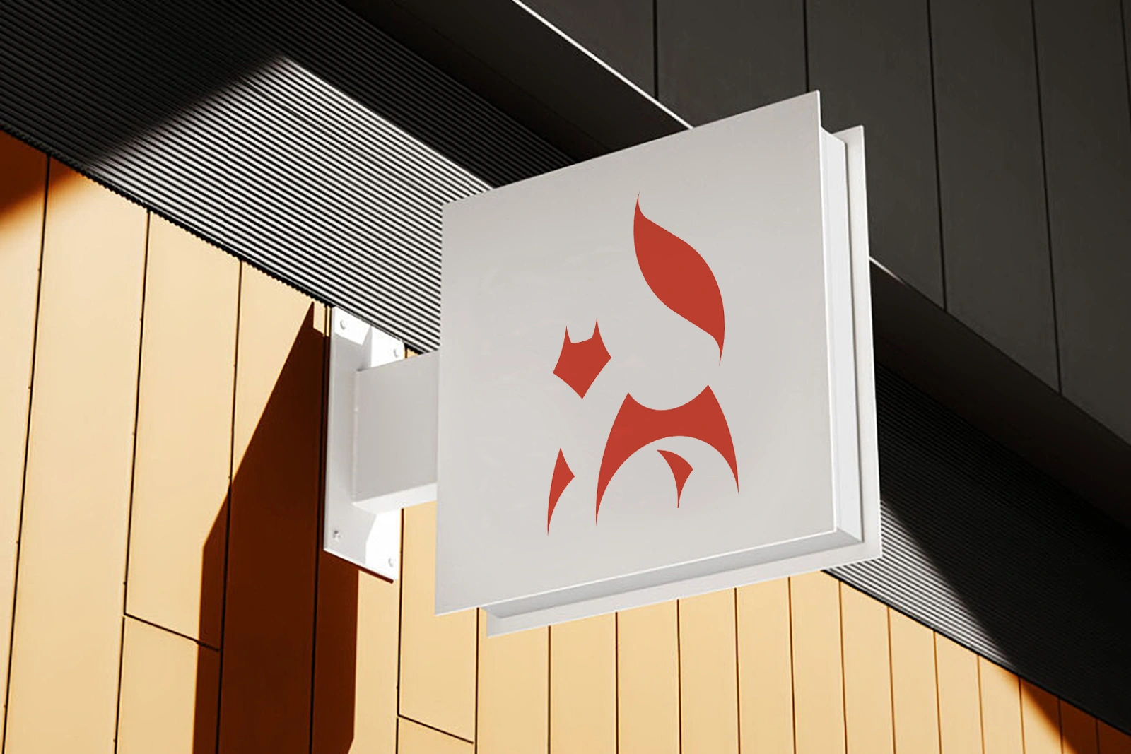
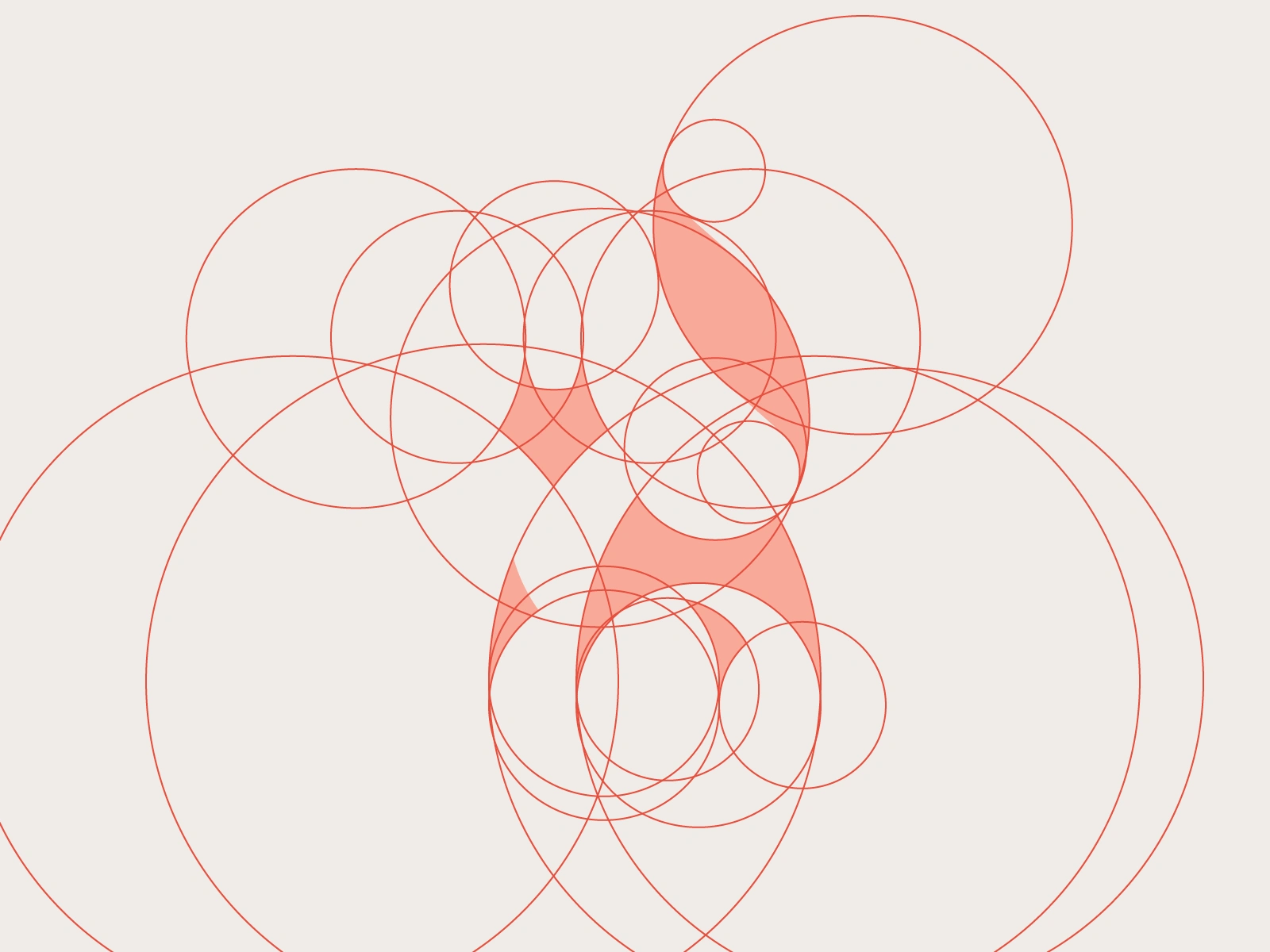
Stylistically, the logo is meant to resemble the character 狐 - kitsune, japanese word for the fox, in the way there are bilateral stems that outline the head and the first leg and the body with a tail.
Hope you enjoy and show this your ❤!
Like this project
Posted May 9, 2025
A minimal logo constructed out of circles and meant to communicate the figure of a fox somehow aware and alert of its observer.
Likes
1
Views
7