ResApp lungs motif & brand concepts

David Affran



Brand research
Iconography
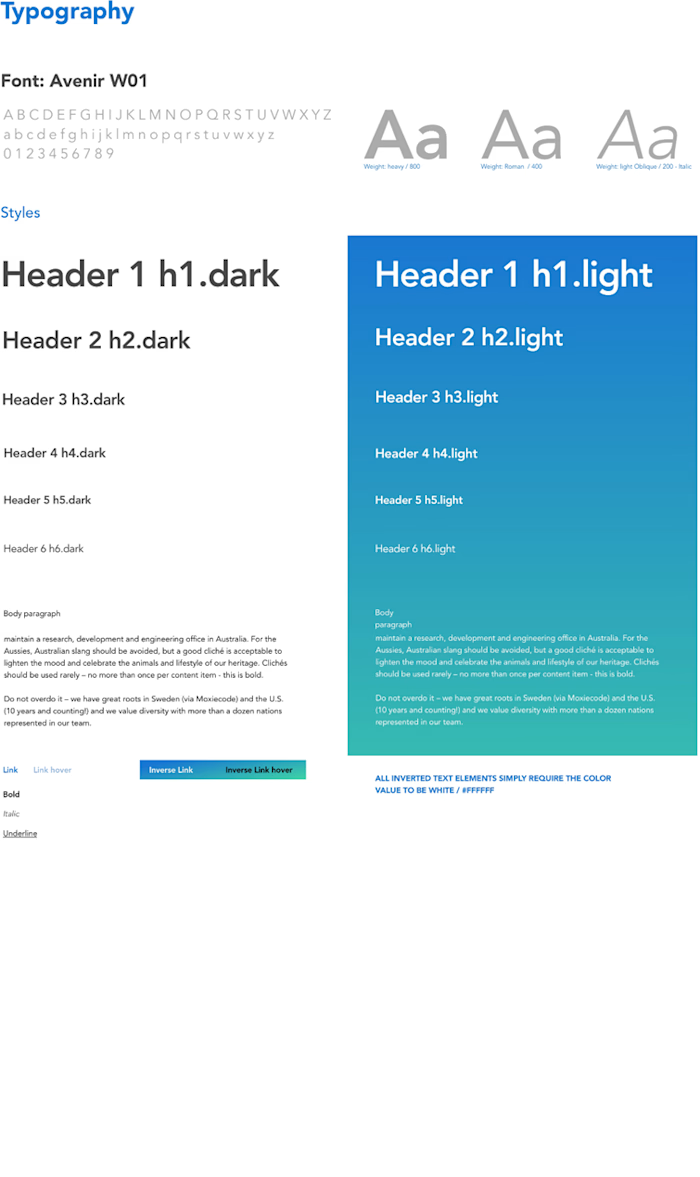
Typography
New concepts
Contextual mockups
Brand research
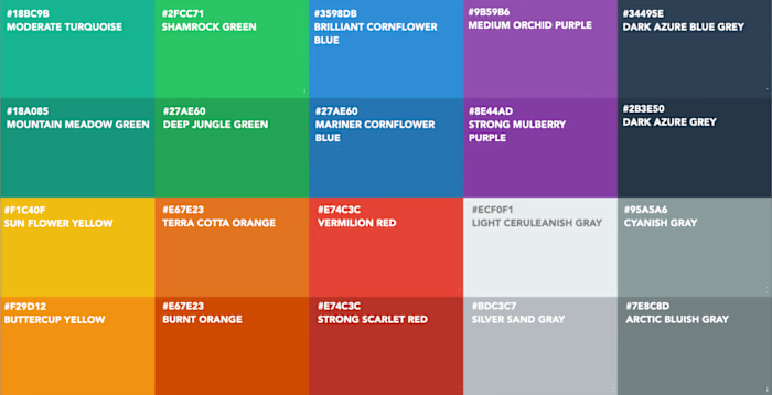
In the discovery phase I researched a collection of new brands in the arena of digital health. This helps to understand the colour, typography and iconography choices. Every brand is distinctive and focus on a very specific area of digital health and the service provided.

Iconography
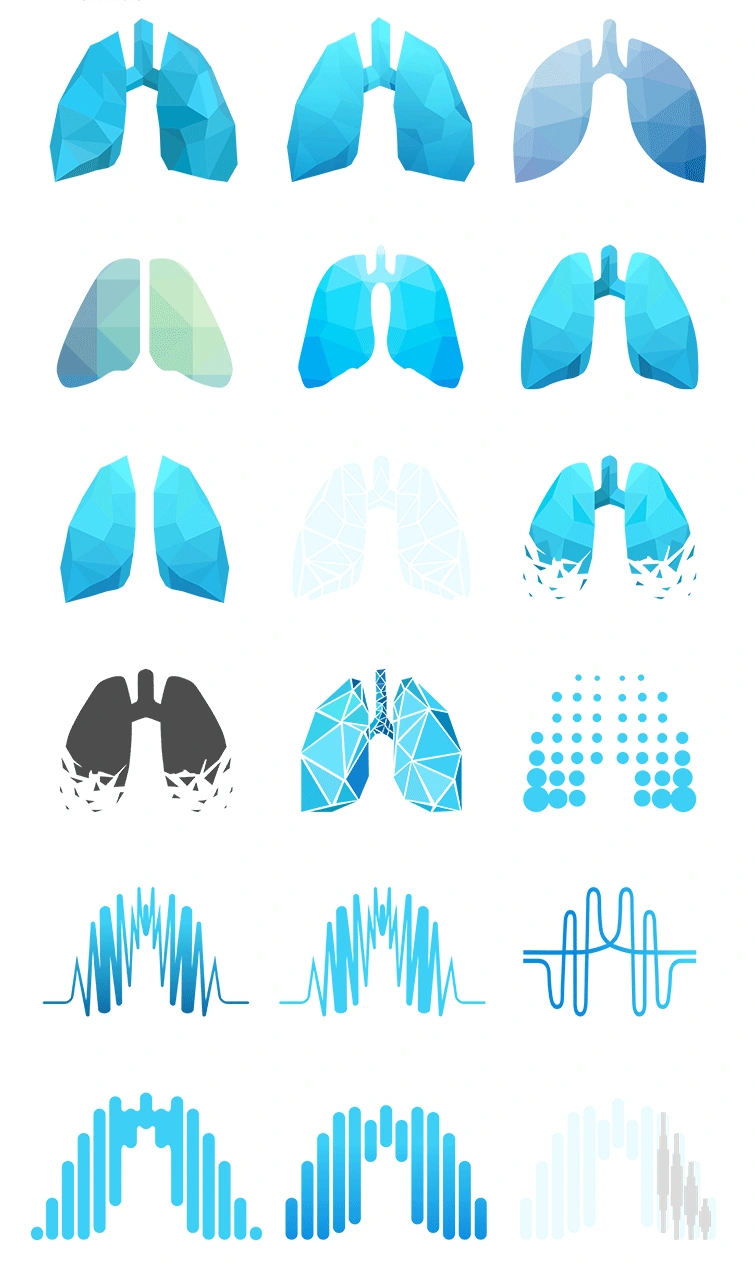
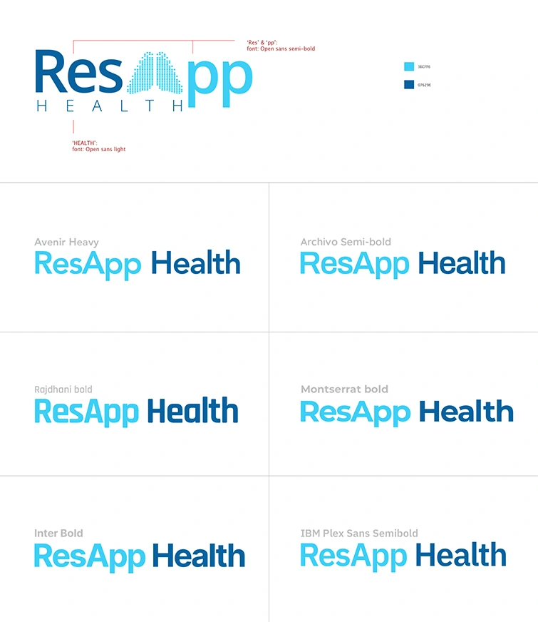
The concepts below are a collection of variants that are based on the current lung motif. It is an exploration in different ways the lungs can be reinterpreted.
Typography
New concepts
The following concepts were part of an ongoing creative process and should not be considered as final artwork.
Each set of variations is based on a series of experiments on lungs shape motif. The lungs are an important part of the ResApp Health brand. The lungs ( healthy lungs ) are an iconic visual that represents the source of ReApp’s care diagnostic solution for Telehealth.
Set 1
Set 2

Set 3

Contextual mockups
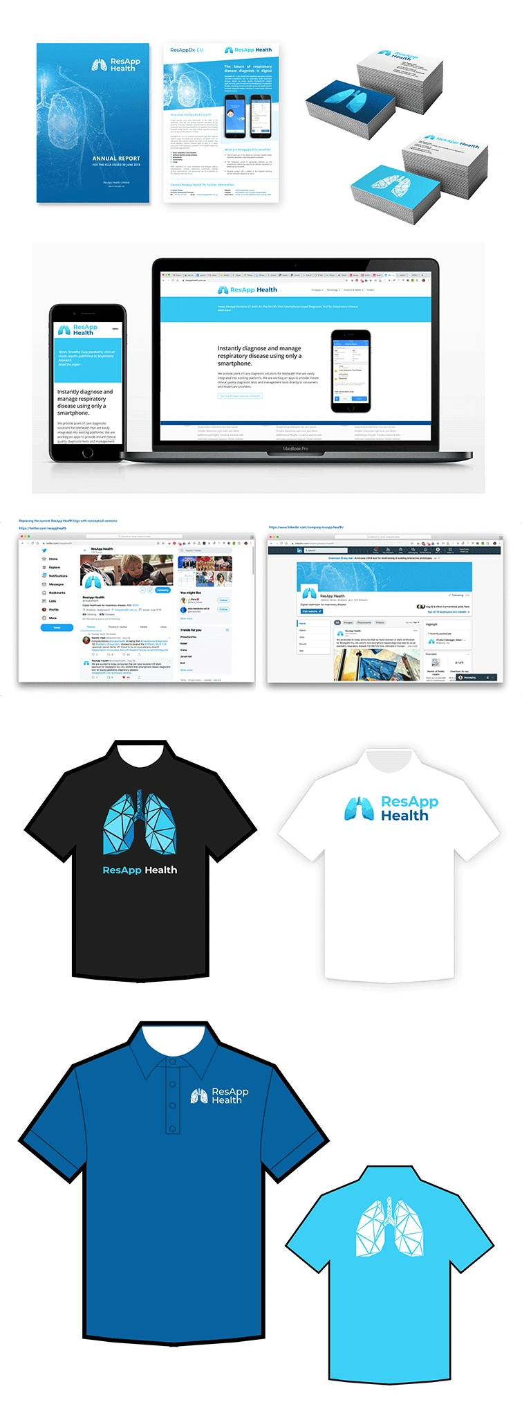
The concept images below are to help provide a contextual view of the concept logo across different formats.

Date: 2019 – 2020
Client: ResApp Health
Skills: Sketch , Illustrator
Summary: As product designer at ResApp health one of the key tasks was to enhance the brand identity by complimenting the existing logotype, enhancing the ResApp Health ‘lungs’ motif as a central icon of the business focus.
This project required significant brand research. Looking at competitor brands in a niche digital health market and becoming aware of the conventions in that industry in terms of colour, iconography and typography.
The project is broken down in the following areas:
Brand research
Iconography
Typography
New concepts
Contextual Mockups
Please note: All digital design work produced by me was done as an employee of ResApp Health Limited.
Like this project
Posted Aug 18, 2026
Brand research and concept work to evolve ResApp’s lungs motif across iconography, typography and contextual mockups.
Likes
0
Views
2