Ministry Info Trifold
Makenna Davis

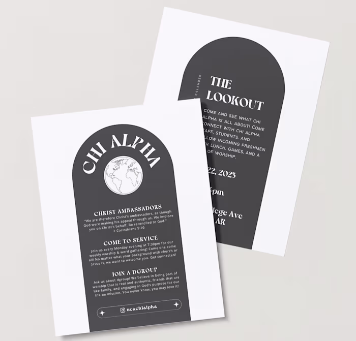
The choice of neutral colors for the ministry's informational trifold was a deliberate decision aimed at fostering a sense of calmness, clarity, and inclusivity. By opting for muted tones such as soft dark grey, warm beiges, and subtle creams, the design exuded a timeless elegance and sophistication while ensuring that the focus remained on the content itself. These neutral hues provided a versatile backdrop that complemented a variety of images and text, allowing the information to take center stage without distraction. Additionally, the understated nature of the color palette helped to convey a sense of approachability and inclusivity, making the trifold accessible to a wide range of individuals regardless of personal preferences or backgrounds. Overall, the neutral colors served to enhance the effectiveness of the ministry's message by creating a visually harmonious and welcoming presentation.
Like this project
Posted May 24, 2024
By opting for muted tones, the design exuded a timeless elegance and sophistication while ensuring that the focus remained on the content itself.
Likes
0
Views
9
Tags