Food & Beverage Landing Page | UI Design + WIX Website

Anush N
Wix Studio Designer
Frontend Engineer
UI Designer
Figma
Relume
Wix
Case Study: Restaurant Website Landing Page UI Design
### Project Overview
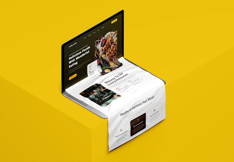
This case study focuses on the UI design of a landing page for a restaurant website, aimed at creating an engaging and visually appealing experience that draws in customers. The design prioritizes aesthetics, usability, and brand identity, ensuring that users can easily navigate and access essential information about the restaurant.
### Objectives
The primary objectives for the restaurant landing page UI design included:
- To create a visually striking landing page that reflects the restaurant's brand and ambiance.
- To enhance user experience by providing intuitive navigation and easy access to key information such as the menu, location, and reservation options.
- To incorporate engaging visuals that entice users to visit the restaurant.
- To ensure mobile responsiveness for an optimal experience across all devices.

Wireframe

Color Pallet

Typography


## Design Process
1. Research and Inspiration
- Conducted thorough research on competitor websites to identify trending design patterns and gather inspiration specific to restaurant branding.
- Reviewed a variety of successful restaurant landing pages to understand effective layouts, visual elements, and UX flow that resonate with audiences.
2. Wireframing
- Created wireframes to establish the foundational structure of the landing page, incorporating essential sections such as:
- A prominent hero section with a captivating image of the restaurant or a signature dish to draw immediate attention.
- A concise introduction highlighting the restaurant's unique offerings and ambiance.
- Menu highlights showcasing popular dishes with enticing visuals and descriptions.
- Clear, strategically placed call-to-action buttons for reservations and contact.
3. Visual Design
- Crafted a warm, inviting color palette that aligns with the restaurant's brand, evoking a sense of comfort and hospitality.
- Chose modern, readable typography to complement the aesthetic while ensuring clarity.
- Integrated high-quality images that showcase the restaurant's ambiance, food, and dining experience, enhancing the visual storytelling and creating an inviting first impression.
4. Interactive Elements
- Designed interactive features like hover effects on buttons and images to boost user engagement.
- Implemented smooth transitions between sections to provide a seamless and enjoyable browsing experience.
5. Mobile Responsiveness
- Ensured the UI design is fully responsive to deliver a high-quality experience across smartphones, tablets, and desktop devices.
- Adjusted layouts and elements as needed to maintain usability and visual appeal on smaller screens.
6. Transition to Wix Development
- Following the completion of the UI design, the project will transition to Wix development, where each design element will be carefully implemented for consistency and functionality. This phase will include customizations to maintain the intended look, feel, and interactivity of the design on the Wix platform.
## Outcomes
The final UI design for the restaurant landing page successfully achieved the following:
- Visual Appeal: Created a visually compelling experience that effectively represents the restaurant's brand and ambiance, helping to attract and engage visitors.
- User-Friendly Navigation: Simplified navigation paths to enable visitors to easily explore the menu, location details, and reservation options.
- Increased Engagement: Interactive elements and inviting visuals encourage visitors to delve deeper and make reservations, enhancing user engagement.
- Mobile Compatibility: A responsive design provides a consistent, enjoyable experience for users across various devices.
## Conclusion
The UI design for the restaurant website landing page captures the essence of the dining experience, combining aesthetic appeal with ease of use. By focusing on visual storytelling and an intuitive user journey, the design aims to attract potential diners, foster engagement, and ultimately drive reservations. This project emphasizes the importance of thoughtful design in the competitive restaurant industry, where a compelling first impression is key. With Wix development underway, the design vision will soon come to life as a fully functional, engaging landing page that meets the restaurant's goals.


