Reimagining a Mobile Learning App's Information Architecture
Overview
Extending an auxiliary mobile app to match the robust functionality of its parent LMS (Learning Management System) required a complete reimagining of its information architecture and navigation.
Background
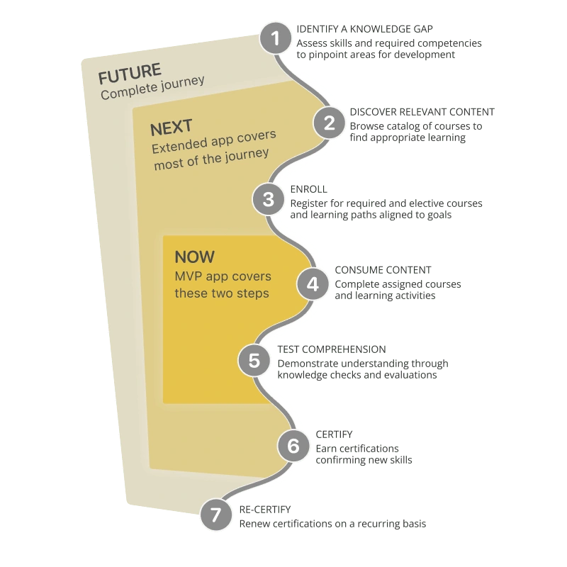
The vision was a frictionless mobile experience spanning the full learning journey - from content discovery through course completion. However, the released MVP (Minimum Viable Product) only allowed accessing assigned learning. Its IA (information architecture) posed scalability limitations that bottlenecked future enhancement plans. Any roadmap had to start by resolving the MVP’s IA constraints.
A typical learning journey in enterprise LMS, and the limited reach of the MVP app

Research
My analysis uncovered multiple IA (Information Architecture) and navigation issues. The MVP design had flaws that would hinder future growth. While needing to be scalable, the app wasn't built for scale.
Design Process
I identified several changes required in order to future-proof the app and streamline its UX with unlimited content. Questioning the existing app IA was key. Given the radical nature of my ideas, I first needed to validate feasibility and demonstrate value to stakeholders. I created a 'quick and dirty' prototype without pixel perfection, focusing on usability over polish. It helped me validate my assumption and demonstrate the proposed changes to the team. It received a resounding positive response. Once I had buy-in from everyone we could add these changes to the development roadmap.
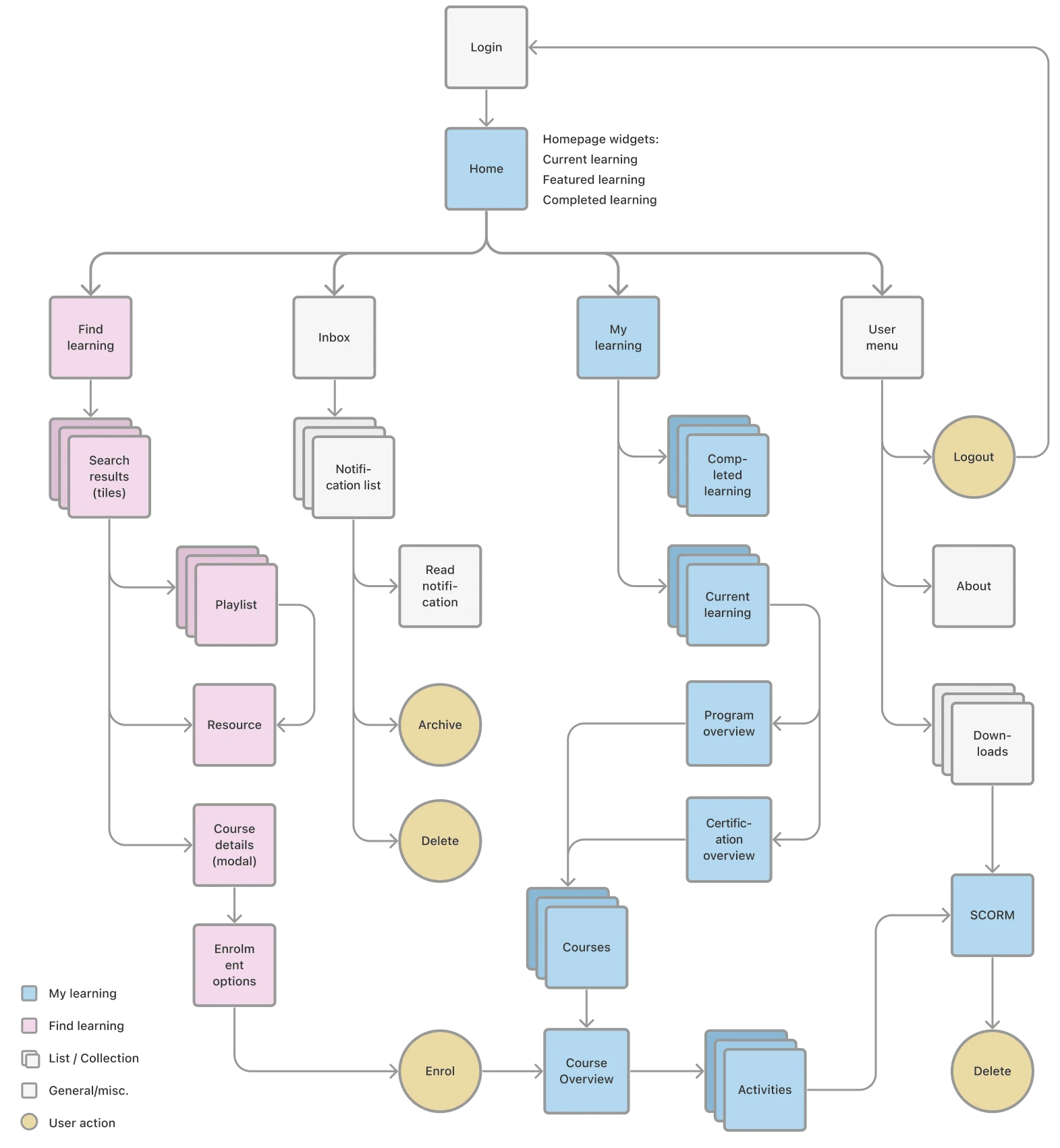
Information architecture: Proposed changes

Final Design
A clickable prototype demonstrating the app with a new homepage, a searchable large-scale catalog, self-enrolment flow, and a learner section for tracking learning status, downloaded content, and grades.
Results
The prototype effectively proved the value of my proposed changes over the MVP, leading to stakeholders approving the complete IA overhaul.
Like this project
Posted Jan 2, 2024
How I extended an auxiliary mobile app to match the robust functionality of its parent LMS by reimagining its information architecture and navigation.
Likes
0
Views
5


