Sleek & Refreshing Logo Design for a Hydration Brand
Radhe Verma
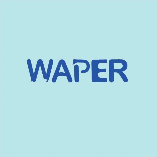
I designed this logo for WAPER, a hydration water brand focused on promoting wellness through pure, refreshing water.
"WAPER" means "WATER" itself.
The design uses fluid letterforms and soft curves to mimic the natural flow of water, while maintaining a bold, modern presence. The subtle negative space in the letter P creates a droplet-like curve, reinforcing the brand's core value: hydration with purity.
🔹 Concept Focus:
Minimalism + Fluidity
Brand-centric typography
Smooth edges inspired by water flow
Versatile for digital & packaging use
🔹 Tools Used:
Adobe Illustrator
🔹 What I Delivered:
Main logo in color & monochrome
Logo mockups (bottle label, digital banner)
Brand-friendly color palette and font pairing
💼 Want a Logo Like This?
Whether you're starting a beverage brand, wellness product, or anything that needs a clean identity—I can bring your vision to life with smart, minimalist logo design.
Let’s work together—message me to get started!
Like this project
Posted Apr 8, 2025
I created this logo for WAPER, a premium hydration water brand focused on health, wellness, and sustainability.