Email Design
Piotr Jarkowski
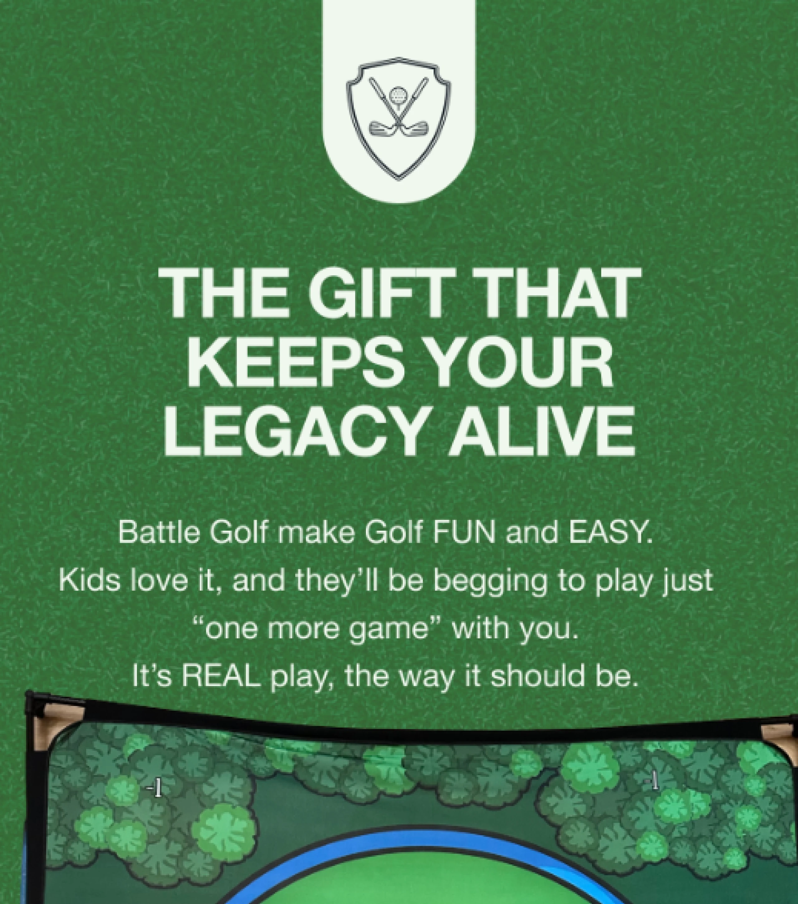
This email was designed for Battle Golf as a cart-abandonment and low-inventory reminder, with a clear focus on usability, hierarchy, and conversion.
The layout is intentionally mobile-first, using a strong vertical flow and clear sectioning to make the message easy to scan. A bold opening headline establishes context immediately, followed by product visuals and concise copy that reinforce urgency without feeling aggressive. The green color palette and rounded UI elements stay aligned with Battle Golf’s outdoor, family-friendly brand.
Design highlights:
Clear visual hierarchy that guides the reader from problem to action
Card-based sections to improve readability and pacing
High-contrast CTAs placed at natural decision points
Social proof integrated seamlessly without disrupting the flow
Responsive design optimized for mobile and desktop email clients
Like this project
Posted Jan 12, 2026
Designed a mobile-first cart-abandonment email for Battle Golf.
Likes
0
Views
3