The Official VibeCheck Funnel Site
Steve Wachira
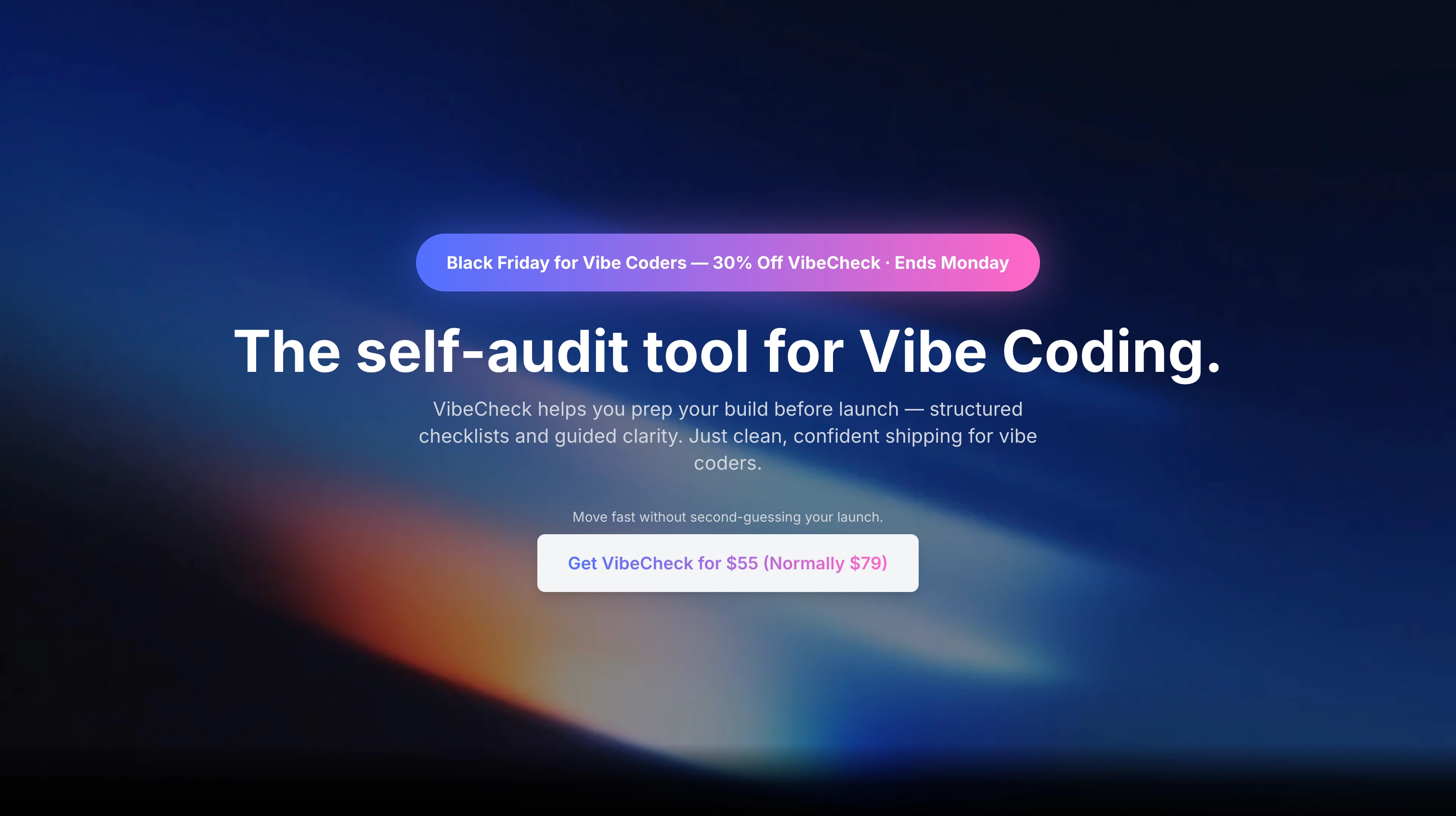
I designed the VibeCheck funnel site to turn curious builders into buyers in under 30 seconds. The old approach relied on scattered explanations; the new site focuses on clarity, speed, and a direct path to action.
The Goal
Create a landing experience that explains VibeCheck instantly, reduces confusion, and increases conversions during the launch window.
What I Did
Simplified the message so builders understand the value in one scroll.
Reworked the structure into a true funnel: problem → solution → proof → action.
Optimized the layout for fast loading and mobile viewing.
Added clear visuals and examples that show what VibeCheck does without paragraphs of text.
Streamlined the CTA to guide users directly to the launch offer.
The Result
A clean, fast funnel site that communicates the product’s value immediately and creates a smoother buying experience for vibe coders, indie builders, and AI/no-code creators.
Like this project
Posted Dec 1, 2025
VibeCheck’s new site shows how the app audits your AI/no-code projects, catches risks, and helps you launch safely. Fast, simple, and built for vibe coders.