OneTouch.com: Improved Conversion
Thea Cooke
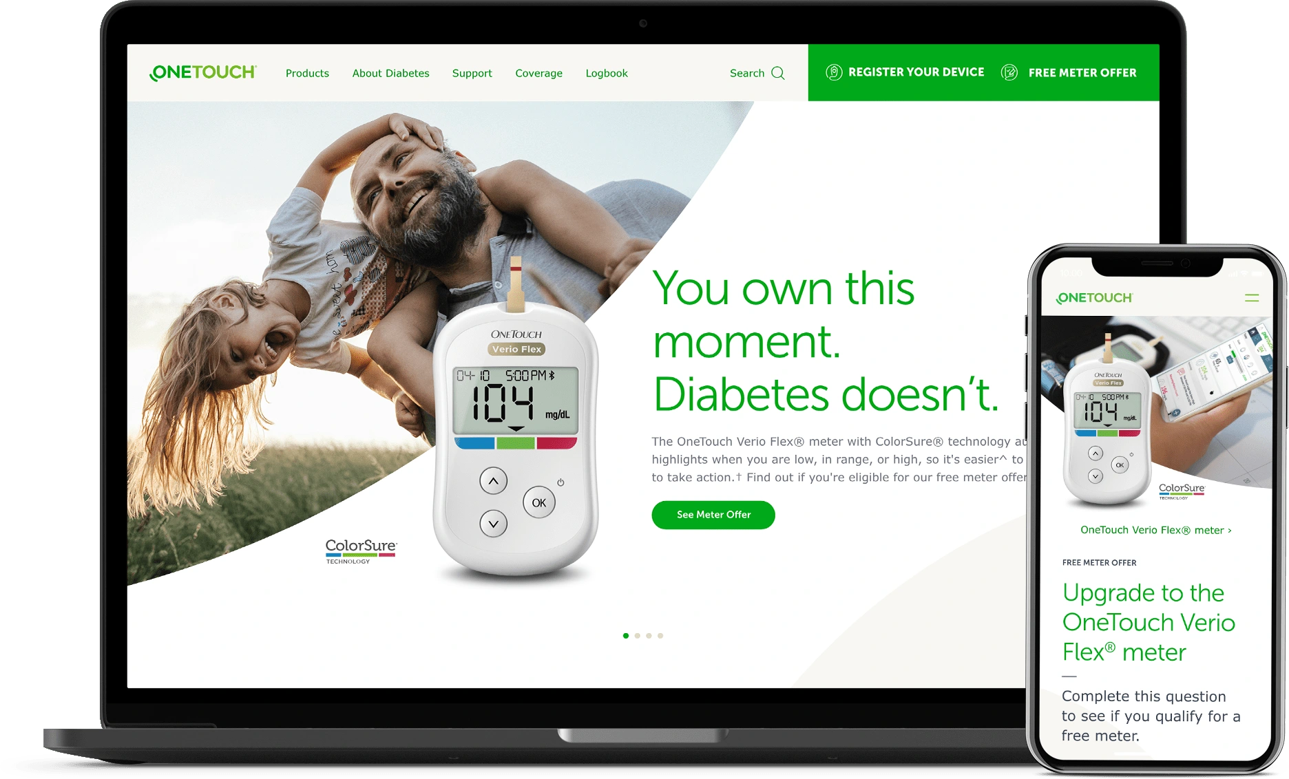
The Challenge
LifeStance wanted to refresh the design of their OneTouch.com website, increase app downloads, and improve ROI. Their website gave away high-quality blood glucose meters for free to new patients, yet their conversion rate for accepting this offer was quite low. We needed to get more free meters into the hands of more diabetes patients.
The Solution
I streamlined a cumbersome offer flow that put up too many barriers for visitors while simplifying the navigation and removing dead ends.
The Impact
In just one month after the redesign launched:
The conversion rate more than doubled, from 18% to 40%.
Meter offer recipients rose by 135%.
App installations attributed to the website rose by 400%.
Process and Deliverables
Site Audit: A comprehensive model of legacy pages, categorized and mapped to existing metrics to understand where and how visitors were engaging with the promotional offer.
Requirements Gathering: List of templates needed for the Drupal content management system, stakeholder interviews, and business requirements.
Requirements Documentation: A list of functional requirements for each component and template, designed as a reference for the development team.
Information Architecture: A new content structure and sitemap that streamlined the user journey toward the primary CTA while optimizing access to high-performing SEO content.
Wireframes and Clickable Prototype: Mobile-first wireframes and an interactive prototype to test the new offer flow and get stakeholder alignment.
Like this project
Posted Jan 24, 2024
Redesigned a medical eCommerce site, implementing UX best practices and data-driven insights to optimize the user journey and more than double conversion rates.
Likes
0
Views
26
Clients
LifeStance Health