SOMA: Creating an Autonomous Interface Ecosystem
KIRILL M.

SOMA
What happens when you art-direct an AI like it owes you a pixel-perfect comp.
Most AI-generated interfaces have a tell. The spacing is close enough. The hierarchy is almost there. The grid holds until it doesn't. You can feel the machine guessing.
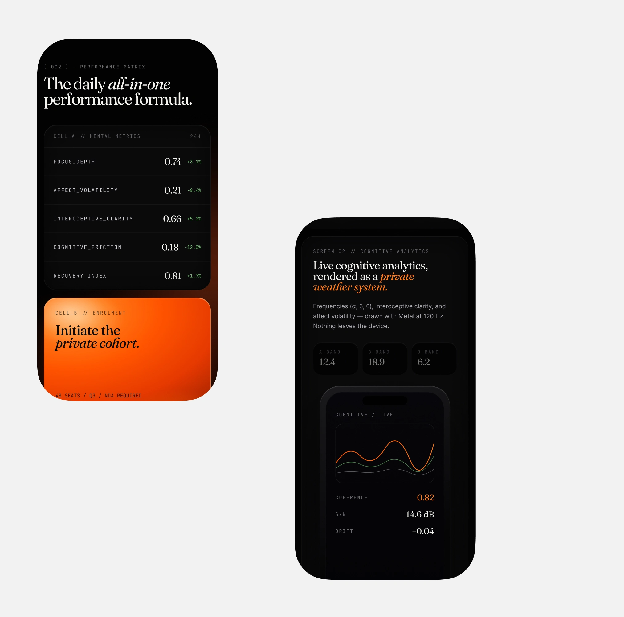
SOMA started as a question I couldn't stop thinking about: can you force an LLM to output production-ready React code that actually respects a strict modular grid? Not "pretty close." Not "good for AI." Architecturally precise, the way you'd build it by hand in Figma and then hand off to a senior dev.
So I treated Claude and Lovable the way I'd treat any junior developer. Rigid briefs. Exact spacing tokens. Typographic hierarchy defined down to the baseline. Every component locked to a mathematical grid before a single line of code was generated.


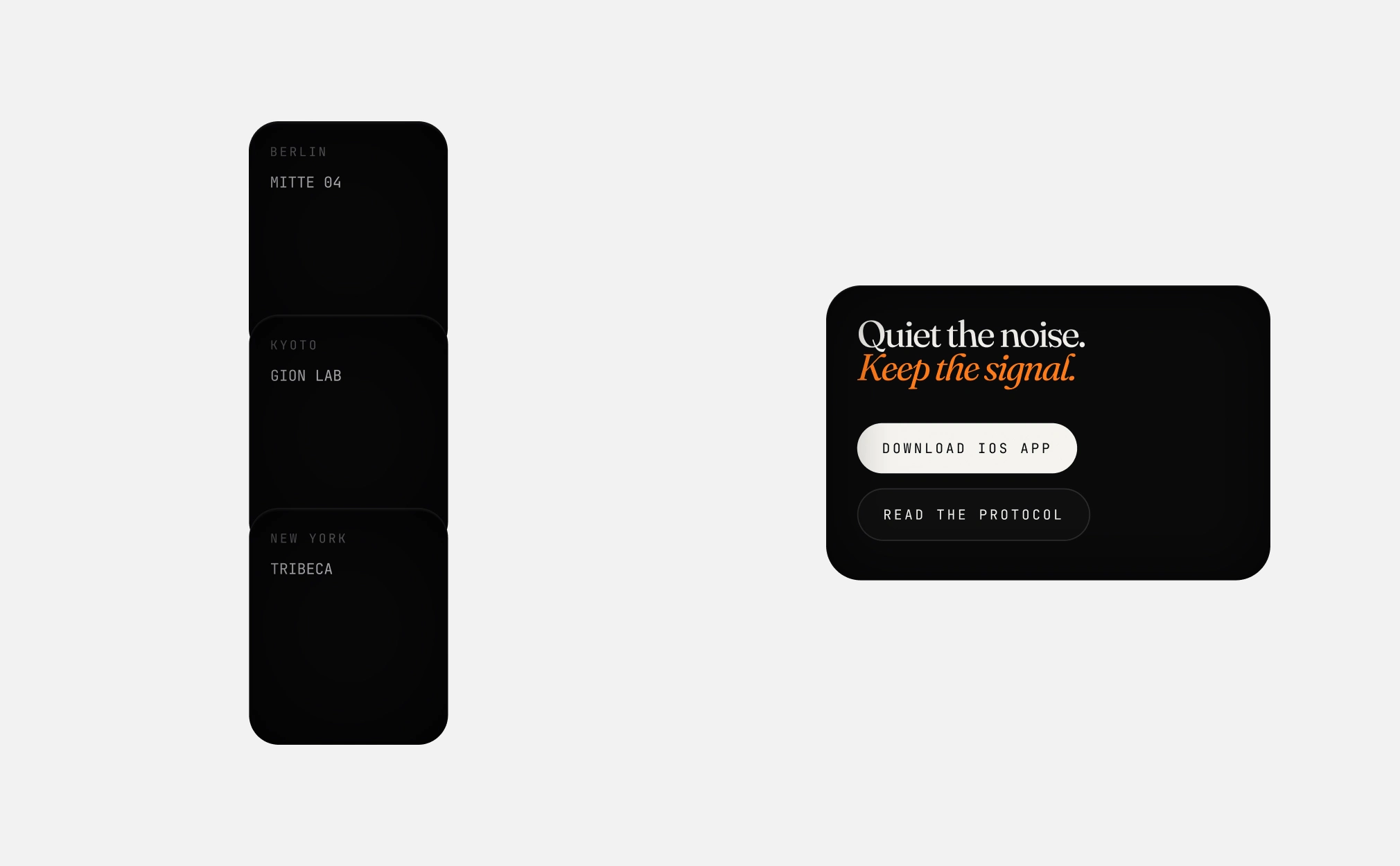
The Grid
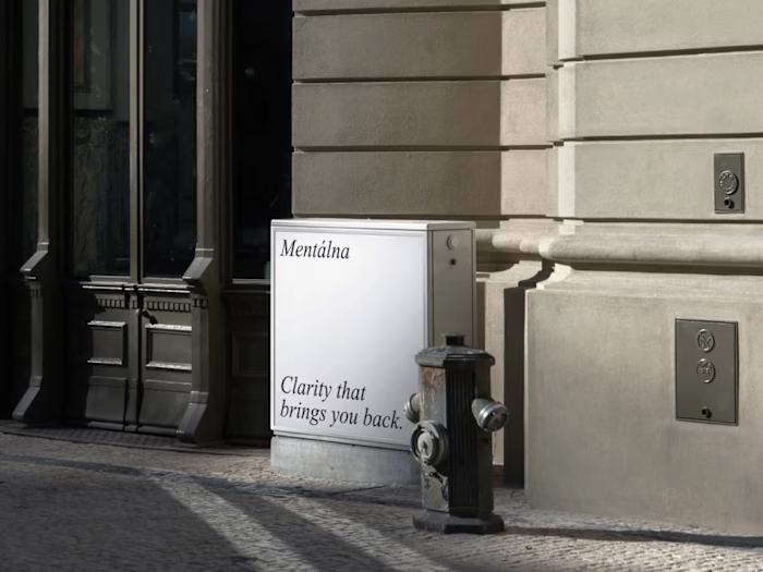
The system runs on spatial tension. Dark base, controlled negative space, Swiss typographic discipline. No decorative elements. No gradients for the sake of gradients. The layout reads through structure alone: proportion, rhythm, scale.

The Negotiation
The interesting part: the AI kept trying to "help." Adding padding where it wasn't needed. Rounding corners I wanted sharp. Softening contrast I wanted brutal. Every prompt was a negotiation between what the model thought looked good and what the grid actually demanded.


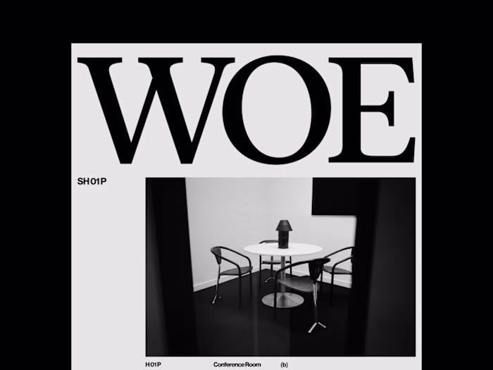
The System
Every screen follows the same structural logic. Navigation, content blocks, data displays, empty states. The components don't just look consistent; they share the same spatial DNA. Change one token and the entire system responds.


Takeaway
The result is a fully responsive interface ecosystem. Every screen, every component, every state: built by AI, art-directed by a human who refused to let it improvise.
SOMA isn't a product. It's proof that the gap between AI-generated and human-directed is a direction problem, not a technology problem. Point the machine at the right grid, and it builds what you tell it to.
Like this project
Posted Jun 16, 2026
Can you force an AI to produce pixel-perfect React under a strict grid? SOMA was the test. Every component art-directed, not generated.
Likes
1
Views
5