FamCal
Alec Peay
FamCal
Personal Pain Points
I decided to design FamCal because I was tired of the constant "when are you free" texts from my parents. This manual coordination creates an annoying mental load for everyone involved. To see if I could fix it, I audited Google and Apple Calendar and found that while they are powerful, they feel like corporate spreadsheets. They lack the visual allure and customization that makes a younger user actually want to engage with a schedule and return to the app/site. I realized there was a major opportunity to build a tool that feels more like a shared family dashboard than a professional planner.
User Persona
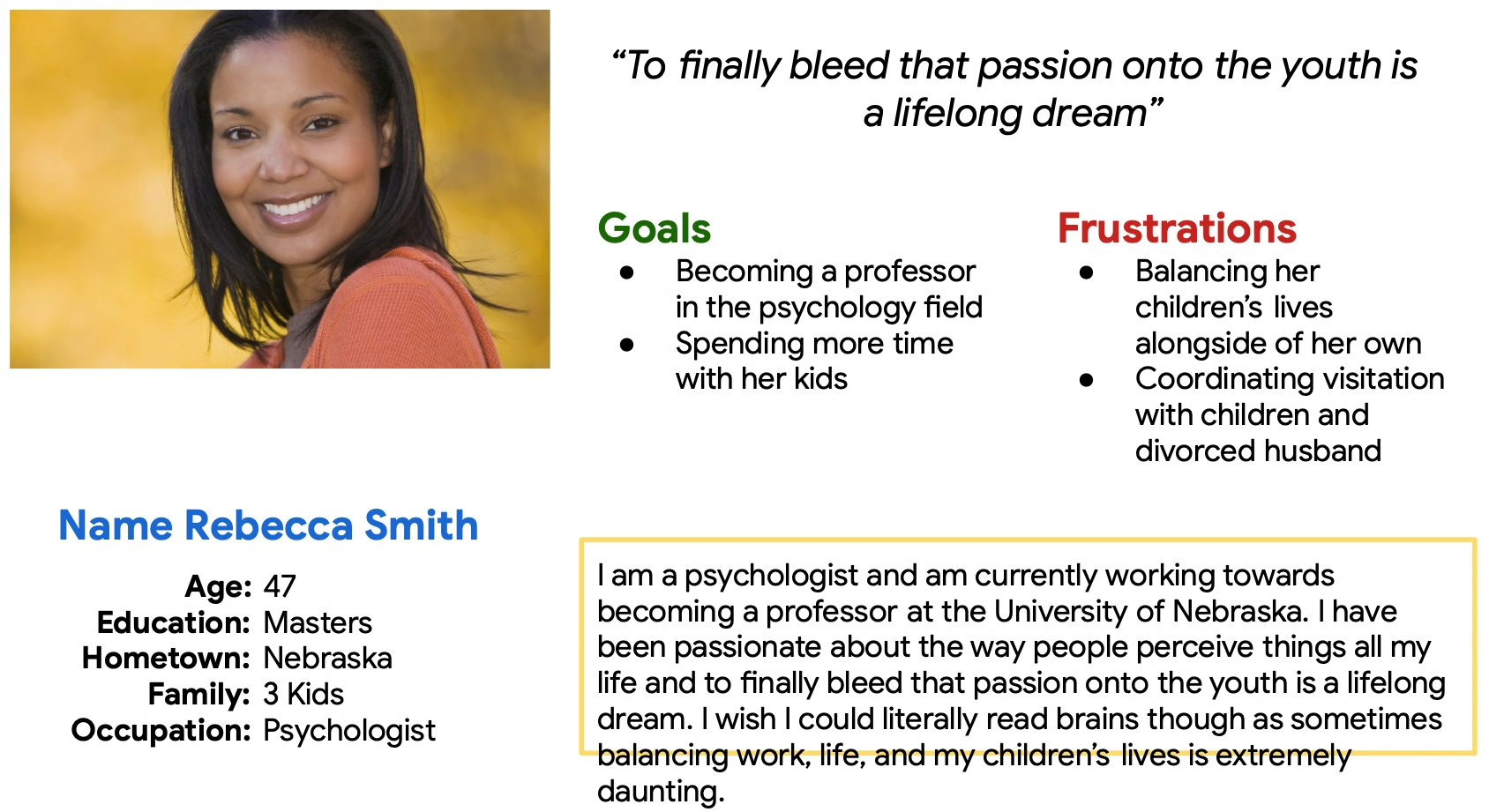
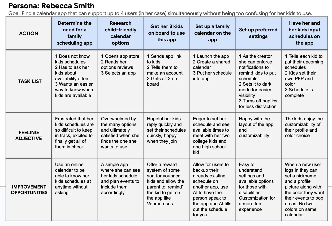
To keep the design grounded in real needs, I developed a persona named Rebecca Smith. As a busy parent, her main user story was simple: she needs a way to view her kids' changing schedules without having to constantly nag them for updates. This helped me focus on the "sync" aspect of the app rather than just the individual calendar.
Research Insights
My research and early testing proved that users were understandably so frustrated with the basic look of typical low-fidelity wireframes. During the first round of testing, the Key Performance Indicators focused on were Time on Task, User Error Rates, and Conversion Rates. Honing in on those KPI’s allowed me to better find insights to improve the design based off of real users input. Participants were vocal about wanting more color and better icons because the lack of direction caused constant navigation stumbles.
Design Evolution
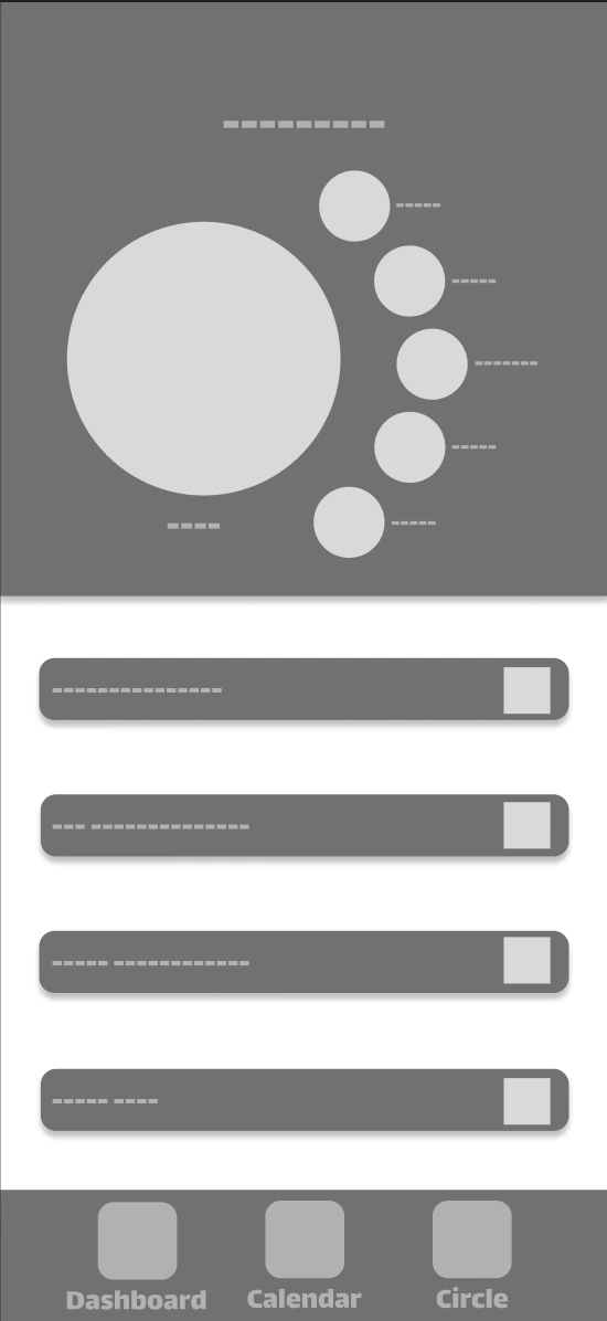
I kept the family circle management simple since that was the one area where users felt confident. The final result focuses on making scheduling feel less like a chore and more like a synchronized family habit.
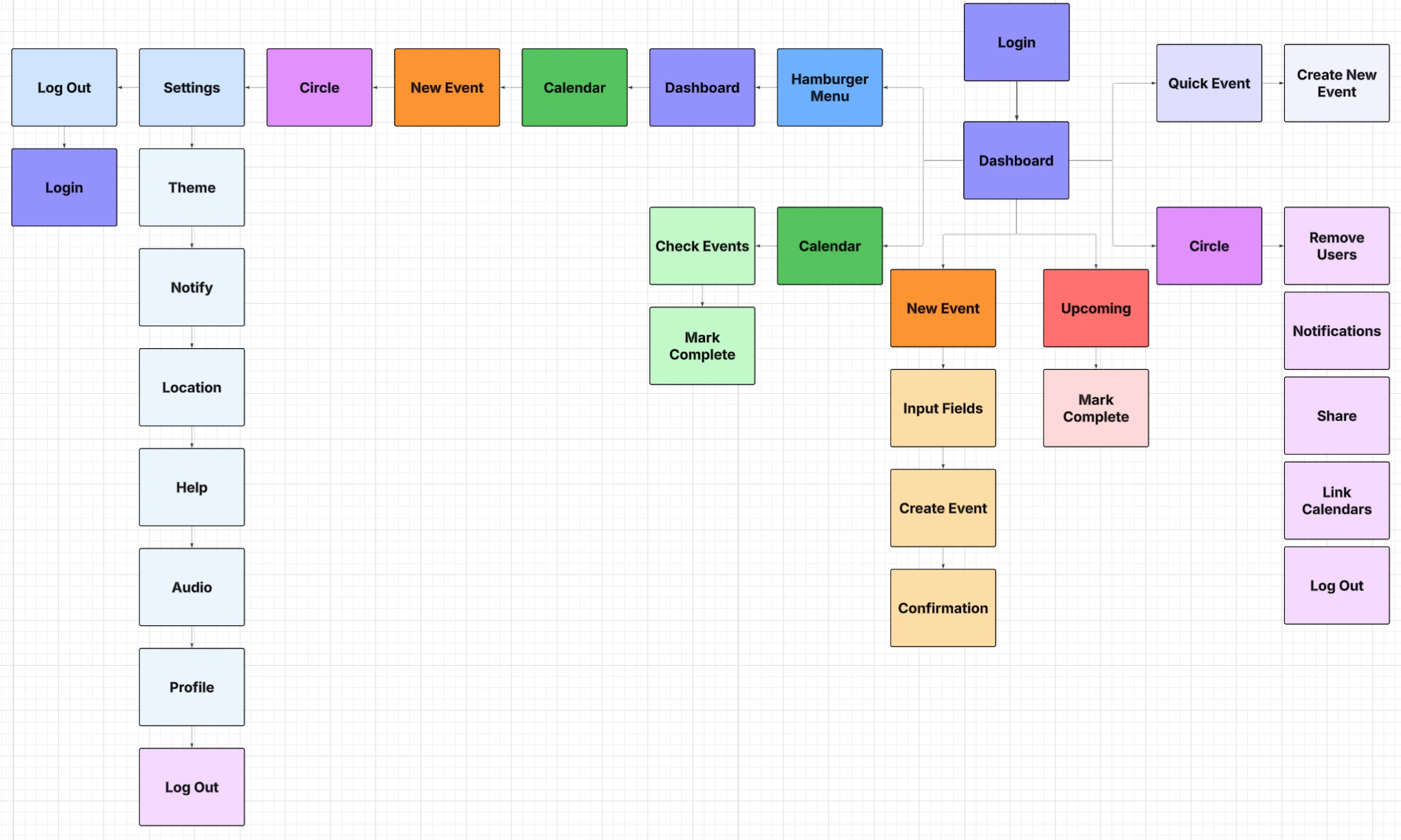
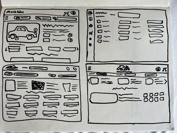
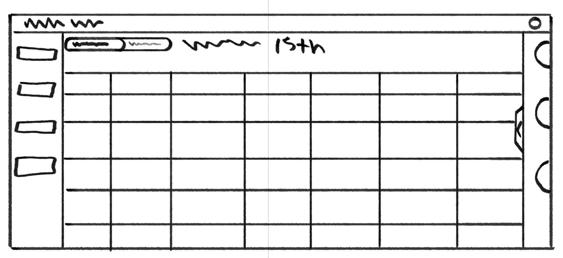
Sketching & Iterating - Web Version
For the web version, I approached the sketching phase by focusing on how to use the extra screen real estate to make every action as efficient as possible. My initial sketches explored ways to keep the calendar somewhat visible at all times, even when checking the dashboard, so users never lose their sense of context.
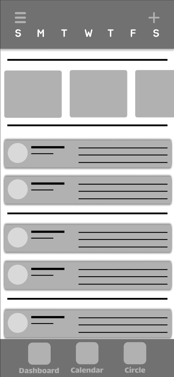
User Testing and Iteration
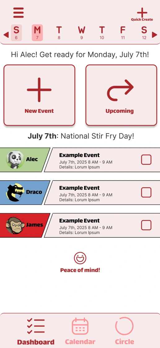
The mobile transition was where I really had to address the friction found in my early research. Since every single tester struggled to find the "New Event" feature in the low-fidelity version, I knew the mobile homepage needed a complete overhaul of its visual hierarchy.
Adding the Messaging System
One of the biggest features I overlooked was a messaging system for parents and children alike to keep each other up to date in real time without having to use a 3rd party messaging system.
Project Overview
My Role: Designer, Researcher, Prototyper, Manager.
I served as the designer, researcher, and project manager for this project. Since this was an independent course project, I carried the design process from start to finish.
FamCal is a cross-platform scheduling solution designed to provide low effort coordination between parents and children. Design System: Unified design across both platforms with high-contrast touch targets to eliminate redundant steps and reduce the mental load for the family.
Empathize & Define
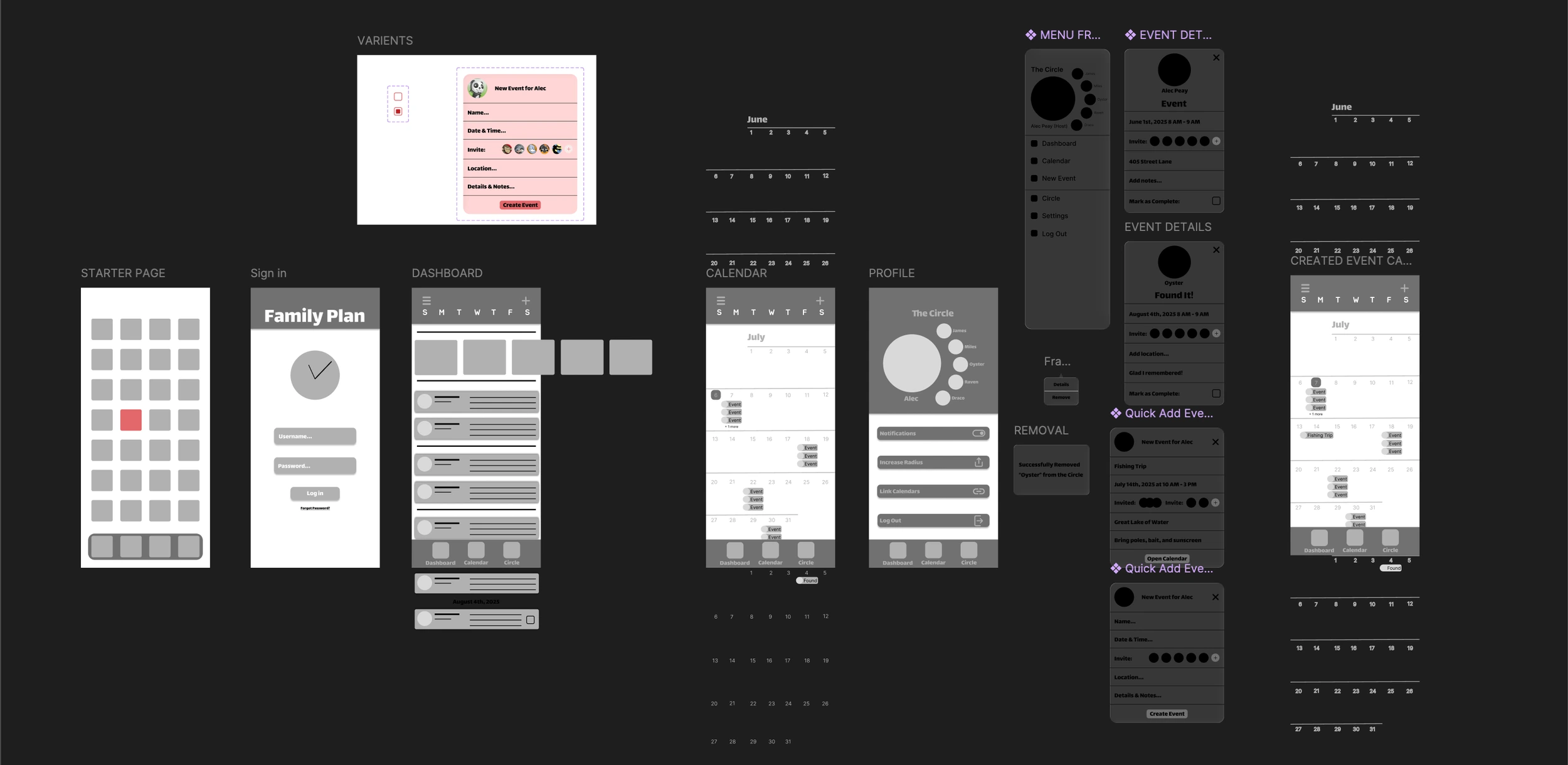
Early Ideation & Prototyping
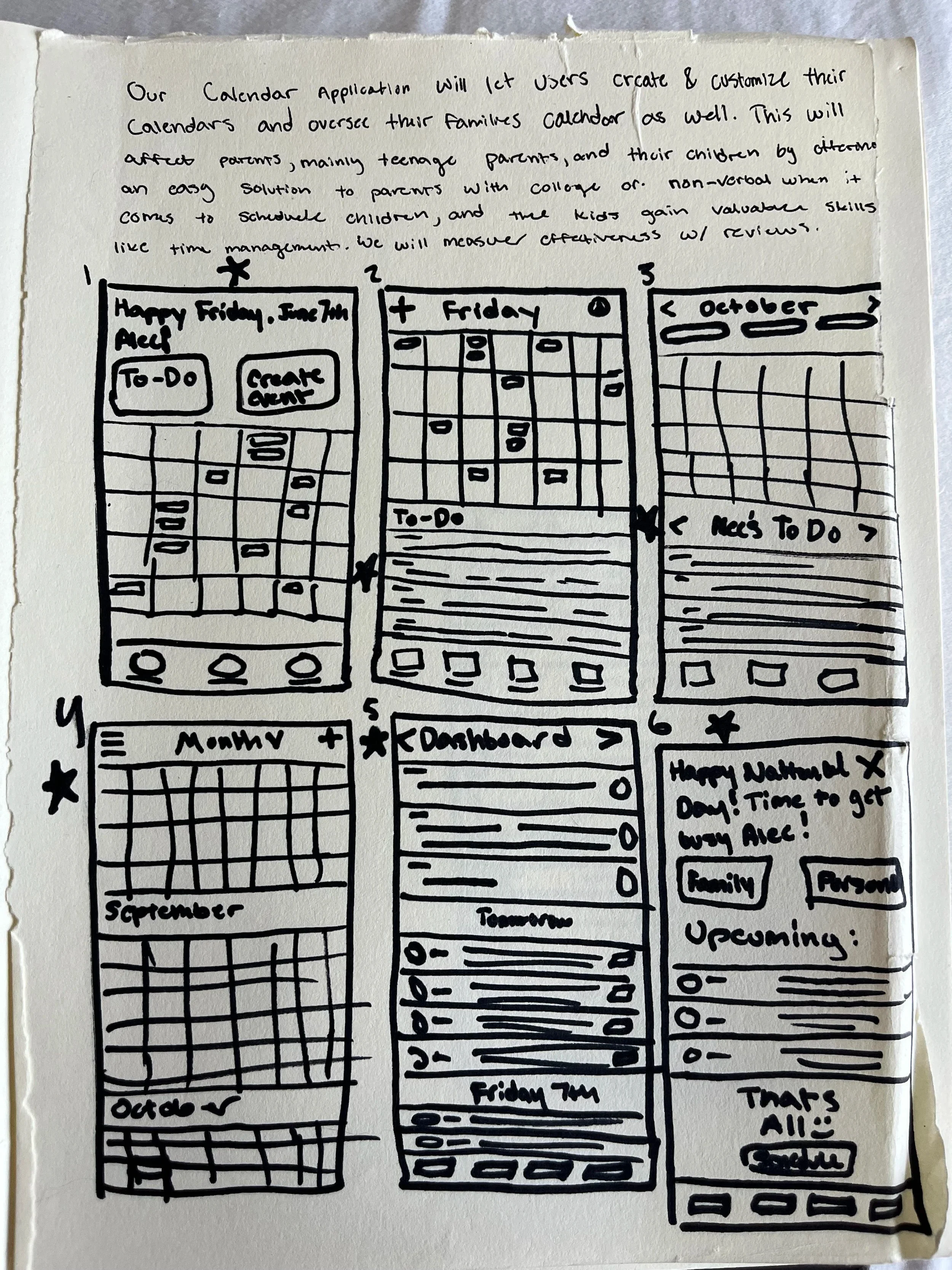
I started the sketching process in a bottom-up design mindset by rapid prototyping across six different phone screen frames to explore as many layout ideas as possible.
Design Influences & Concluding Thoughts
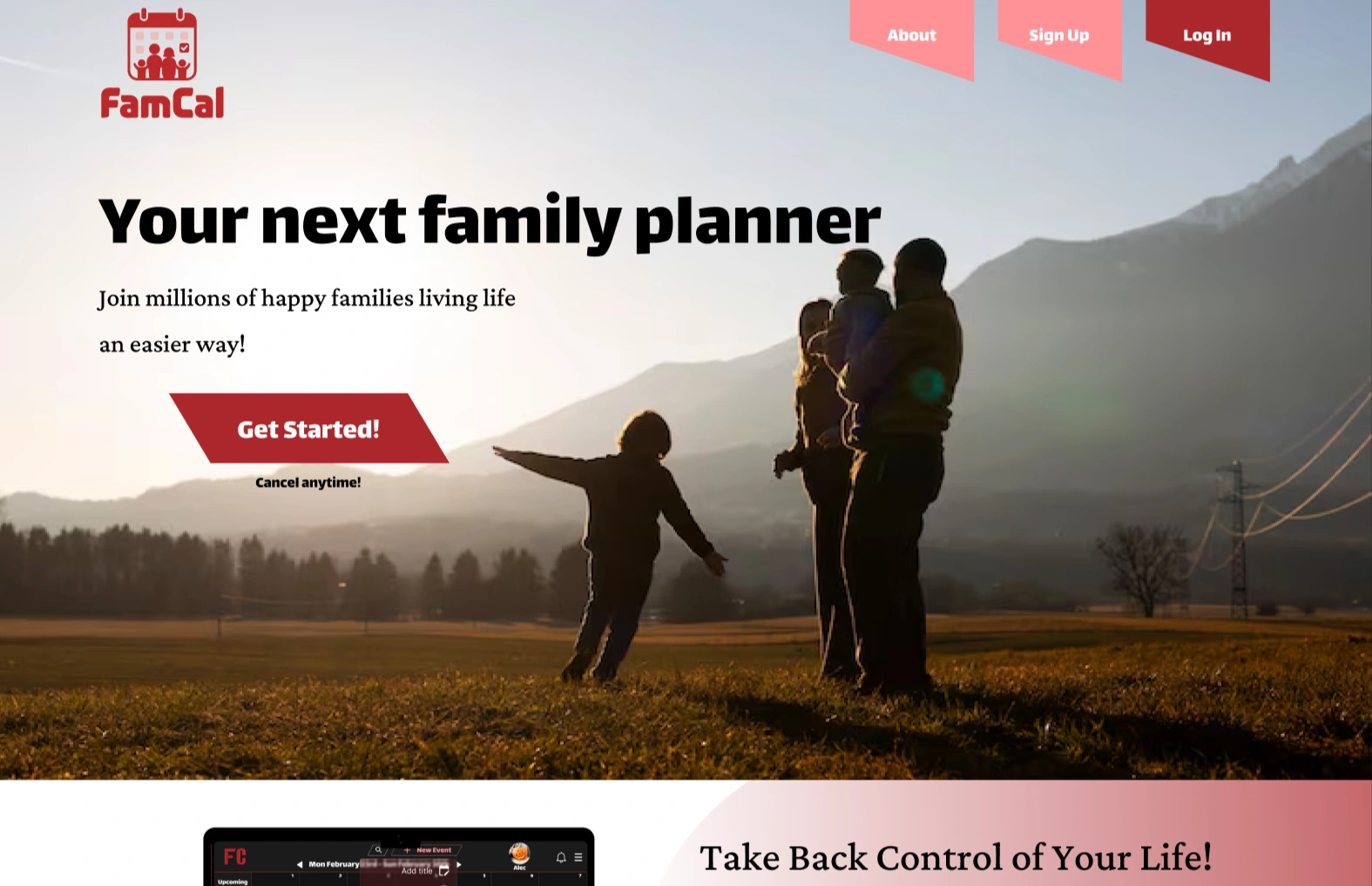
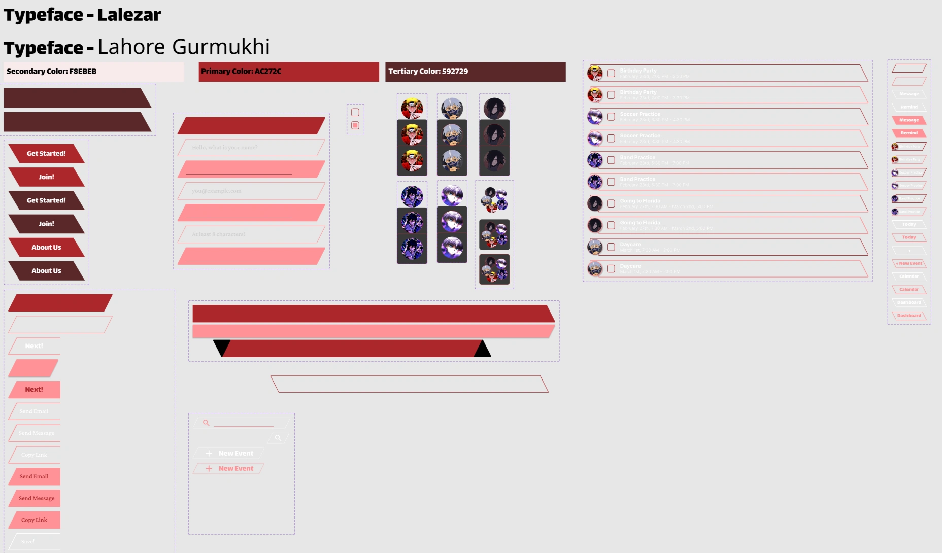
To make FamCal stand out against the sea of standard, boxy calendars, I set a personal design challenge to move away from traditional rectangles to unique trapezoid shapes.
Prototypes
Figma Link (Mobile Version): FamCal_Mobile
Figma Link (Web Version): FamCal_Website
Like this project
Posted Jun 2, 2026
A cross-platform scheduling solution to simplify coordination between parents and children.
Likes
0
Views
3