Ottohaul - Brand Story

Razvan Vezeteu
Brand Designer
Graphic Designer
Brand Strategist
Adobe Illustrator
Figma
Spline
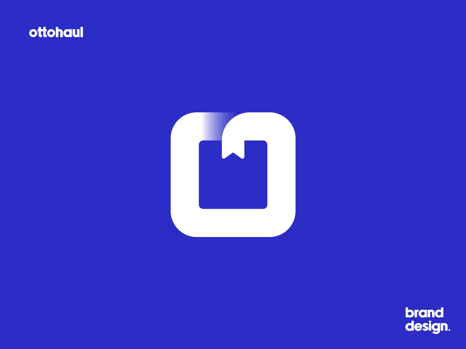
The Concept
What is Ottohaul? It is a fictional brand that offers self-driving trucks to people that want to forget about the hassle of driving across country and just want to make sure their valuables reach the destination on time and in one piece.
Ottohaul is a brand I conceived from scratch, illustrating the process of crafting a brand from inception to presentation. From defining its identity to designing its visual elements, Ottohaul serves as a demonstration of my design capabilities and brand development skills. The resulting presentation encapsulates Ottohaul's story and potential impact, showcasing my ability to bring a brand to life and communicate its essence effectively.
The Moodboard & Sketching
Every project begins with a moodboard, setting the tone for the brand's future direction. This ensures a cohesive vision throughout the project. In this case, I had a clear vision for the fictional brand from the outset.
Sketching was an intriguing process, as depicted in the screenshot below.
I approached multiple directions for this one.
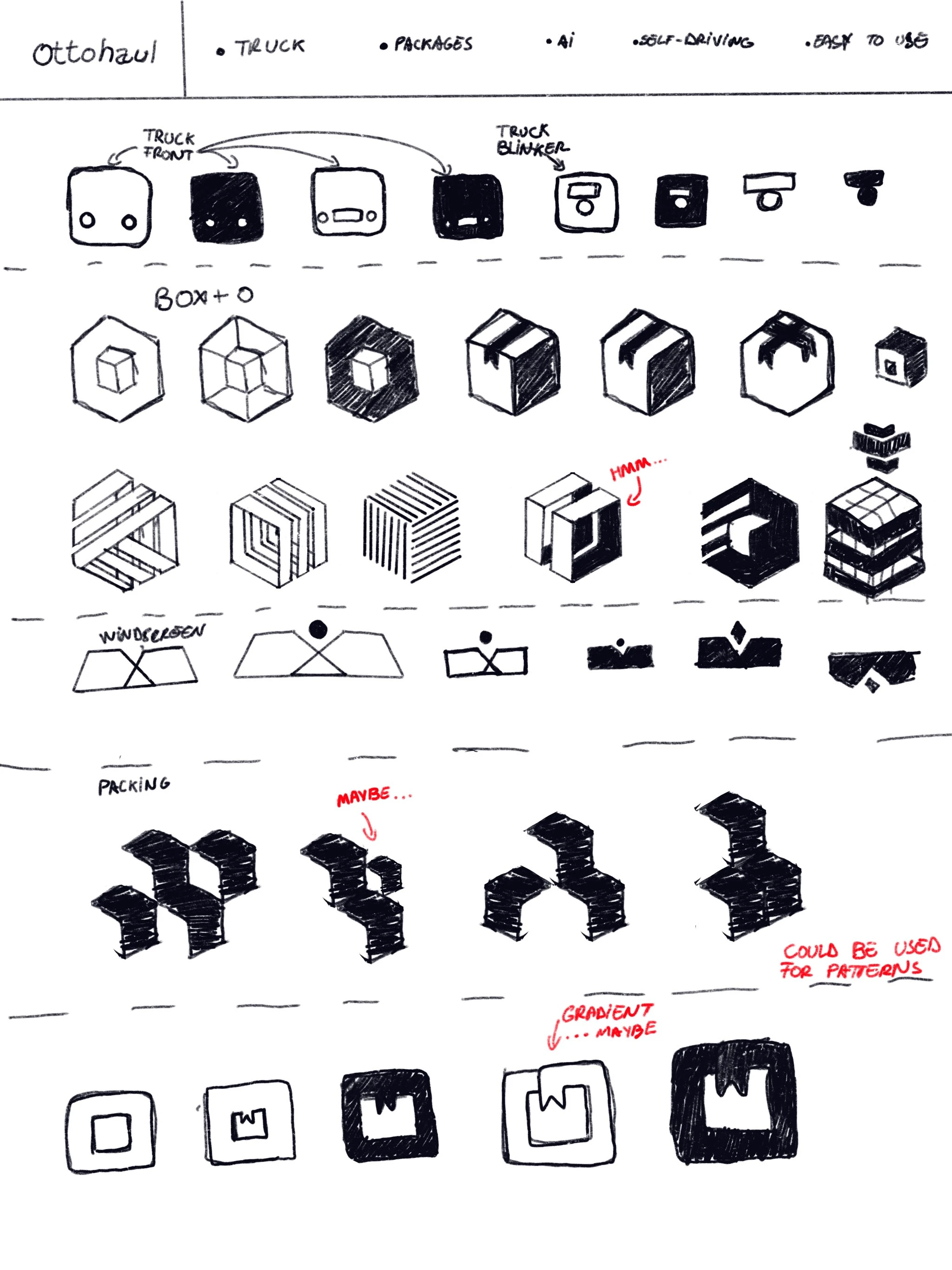
Sketch Progression
But in the end only one approach was picked and it was the one that made the most sense.
The Colors
The brands colors are vibrant and this is seen in the palette that was picked.
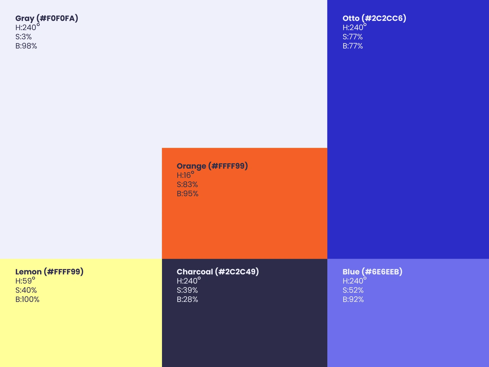
It aims at an energetic feeling.
The Typography
Given the dynamic feeling of the brand two fonts have been chosen to work with.
The Logo Font
This font is called Newake Demo and it was picked specifically because it is easy to understand, it is bold and it is the type of font that can be seen from afar. But it is not the type of font that can be used for paragraphs of text.
The Brand Type
For the overall brand we went with Supreme Font Family which is a more readable font that also feels energetic and fresh and completes the overall look of the brand.
The Visual Language Guide
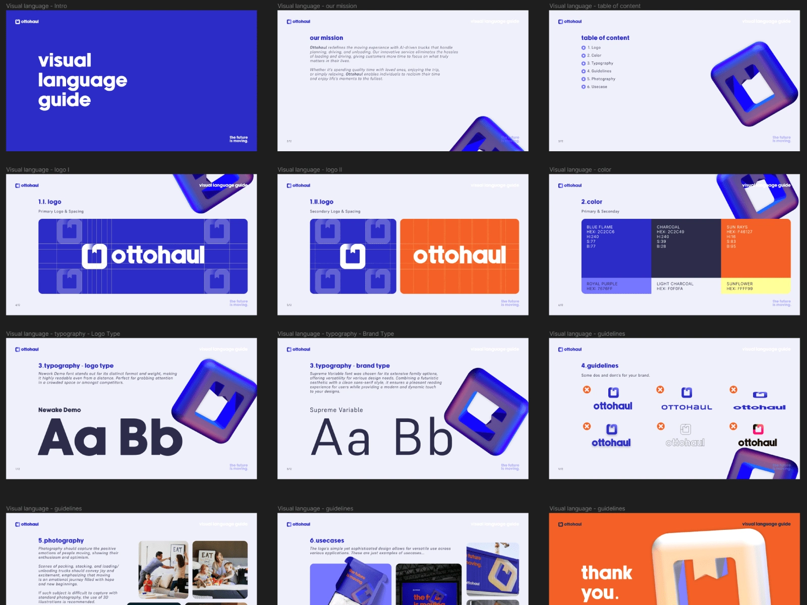
Once all the main components were in place, I began crafting the Visual Language Guide. This document ensures consistency in the brand's message and overall aesthetic once the project is handed over to the client. Opting for Figma as the platform enables seamless access to the file post-delivery. (Example attached)
The Pitch Deck
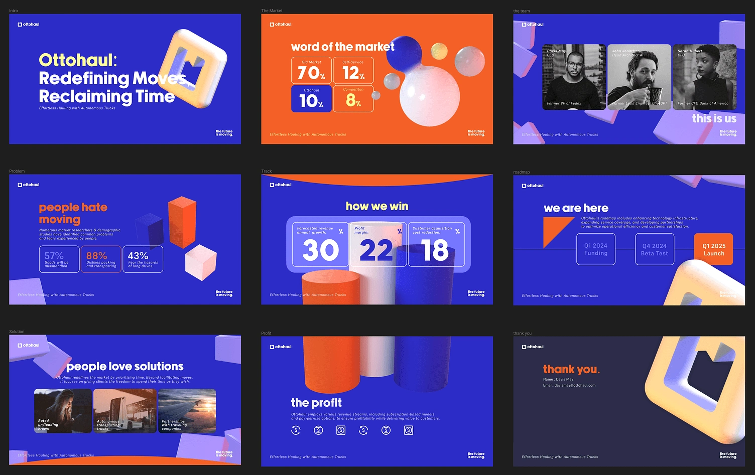
For Ottohaul, creating a compelling pitch deck for potential investors was crucial, especially given the innovative yet untested nature of the technology. Securing funds to refine the concept was a priority.
With the brand radiating energy, the pitch deck aimed to resemble a seamless infographic, ensuring visual captivation and maintaining a consistent pace throughout the presentation. Just like the Visual Guide, the pitch deck is also build in Figma.
Closing Statement
This project has been an exercise and does not represent a real brand.


