Experimental Typography | Magazine Covers
Daria Honcharuk

Experimental Typography | Magazine Covers
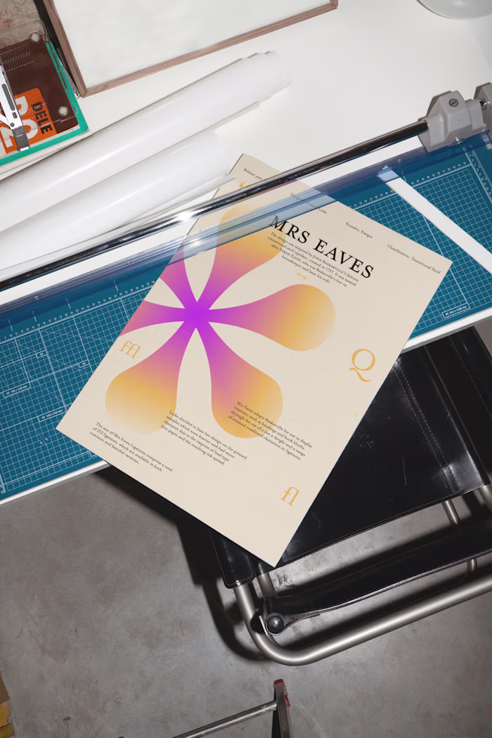
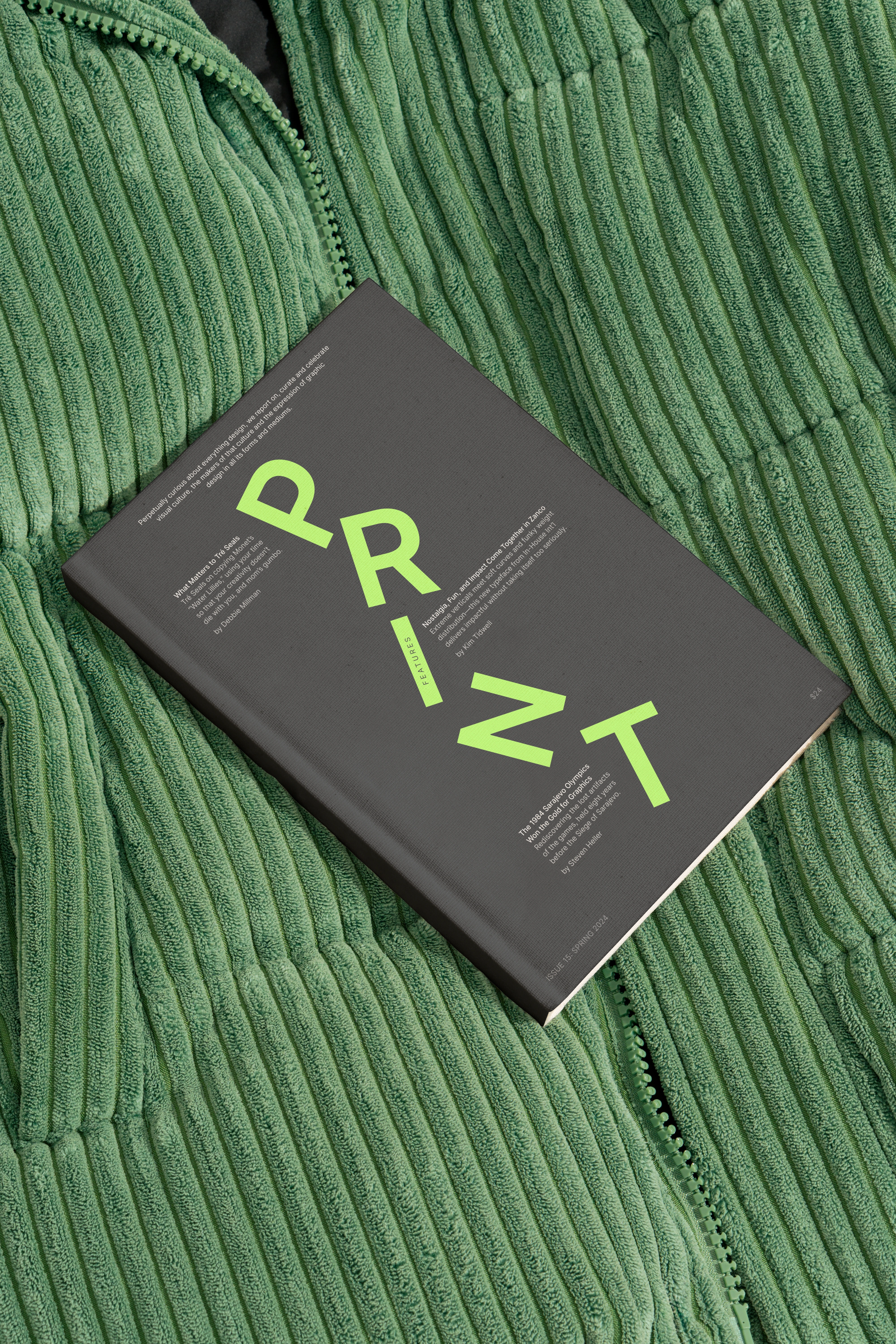
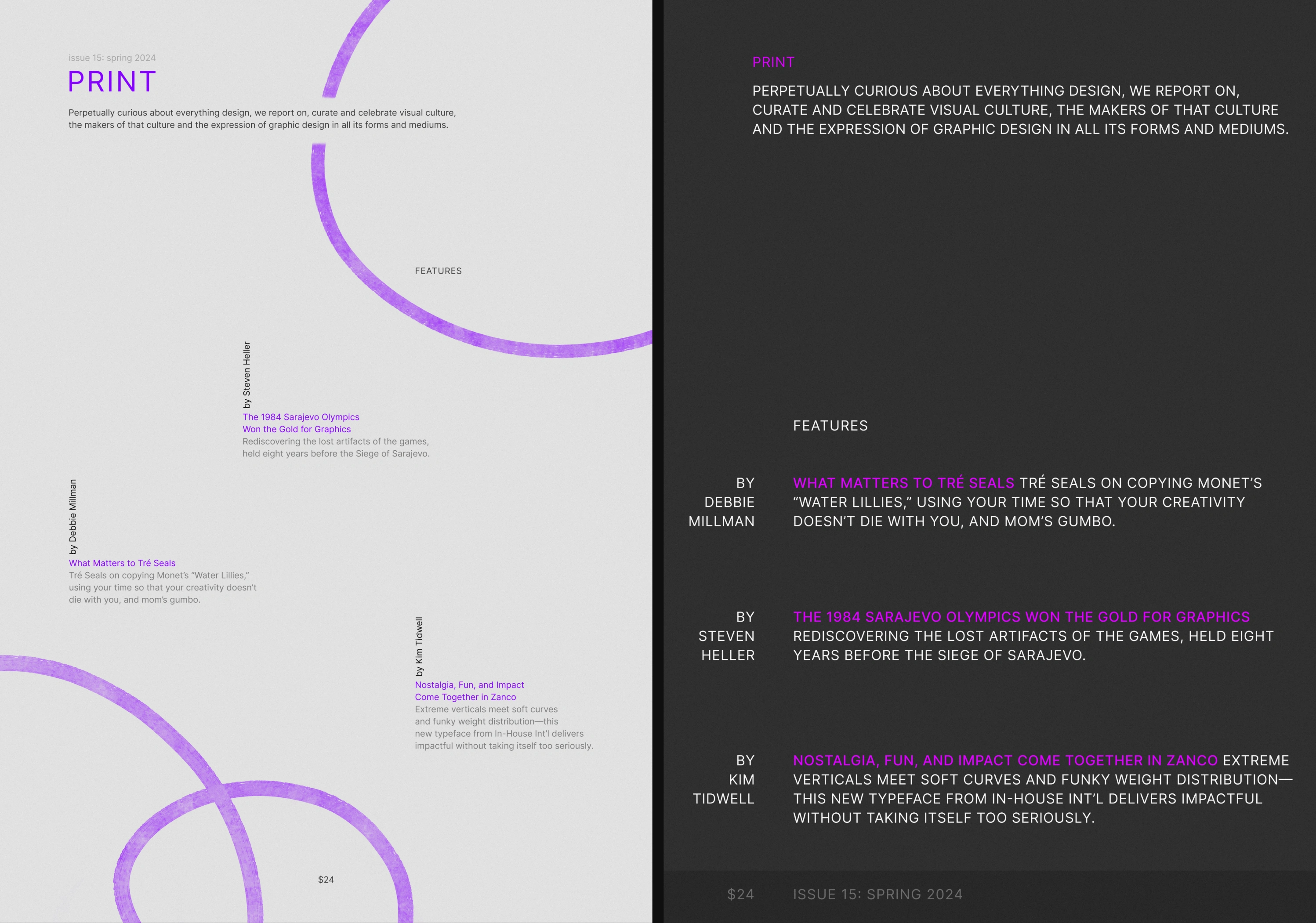
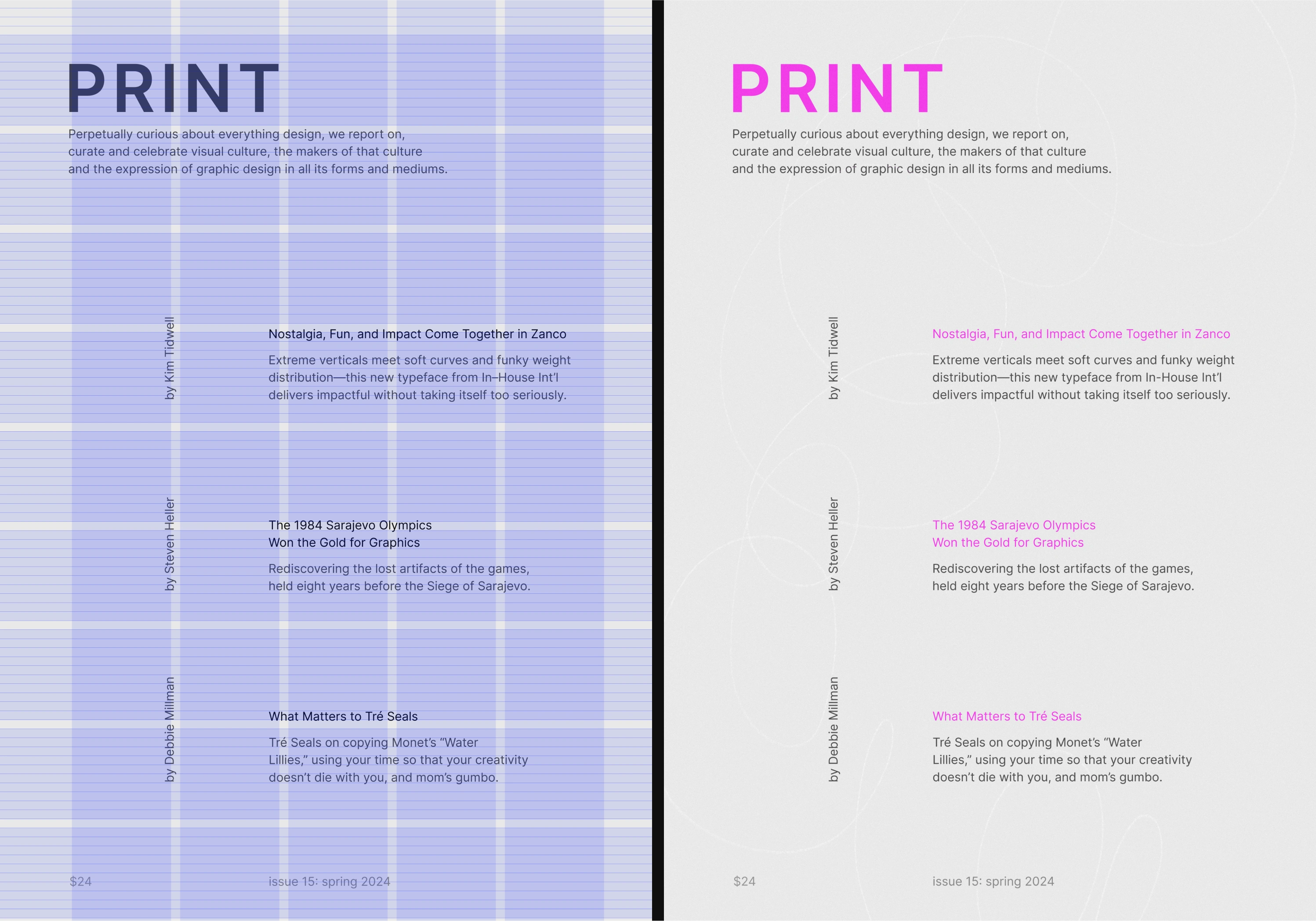
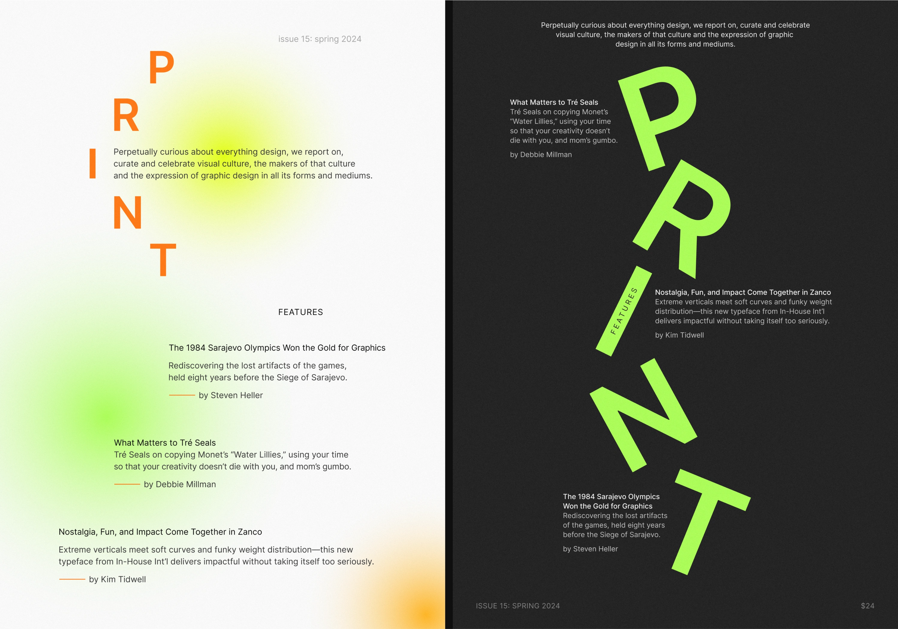
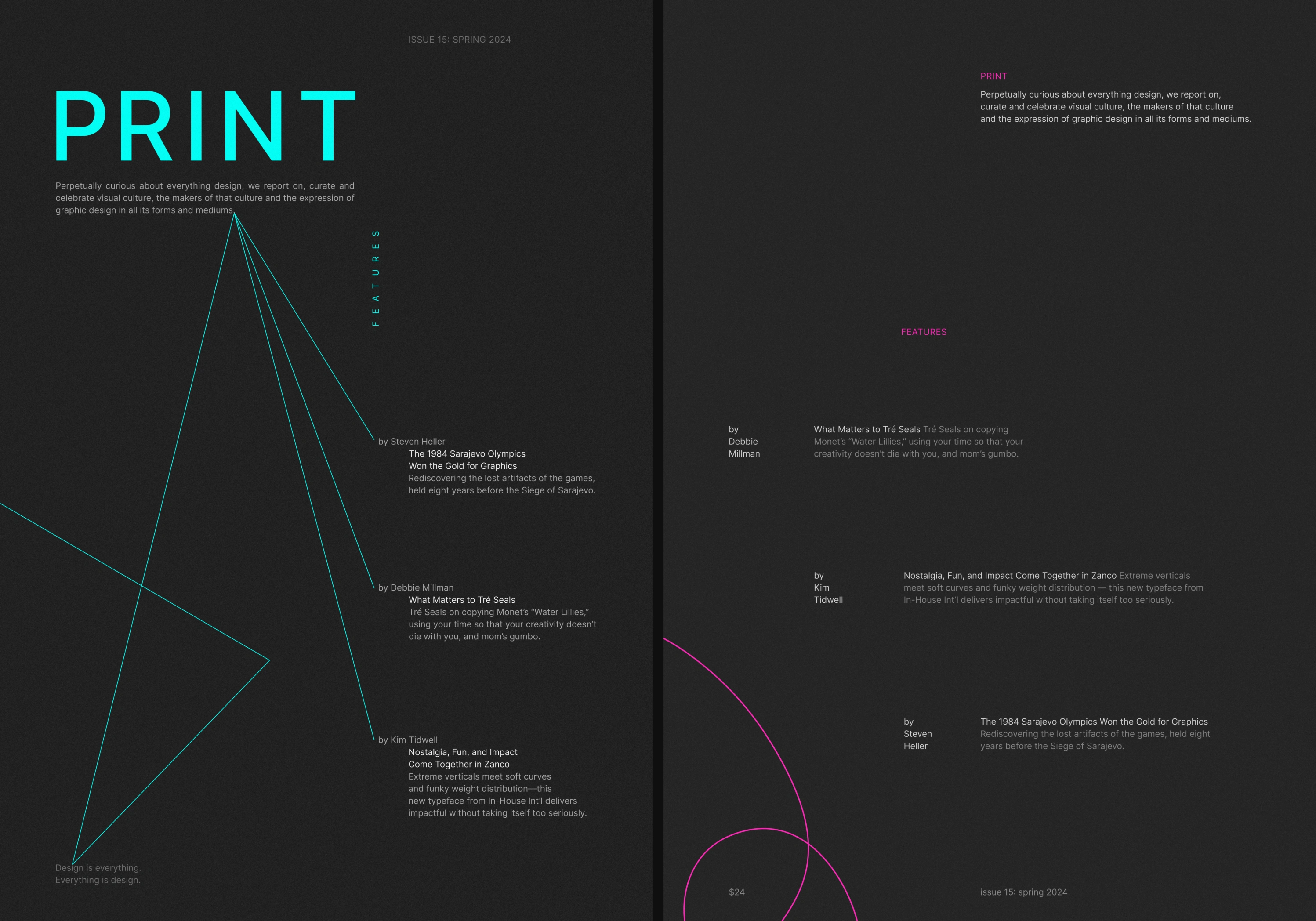
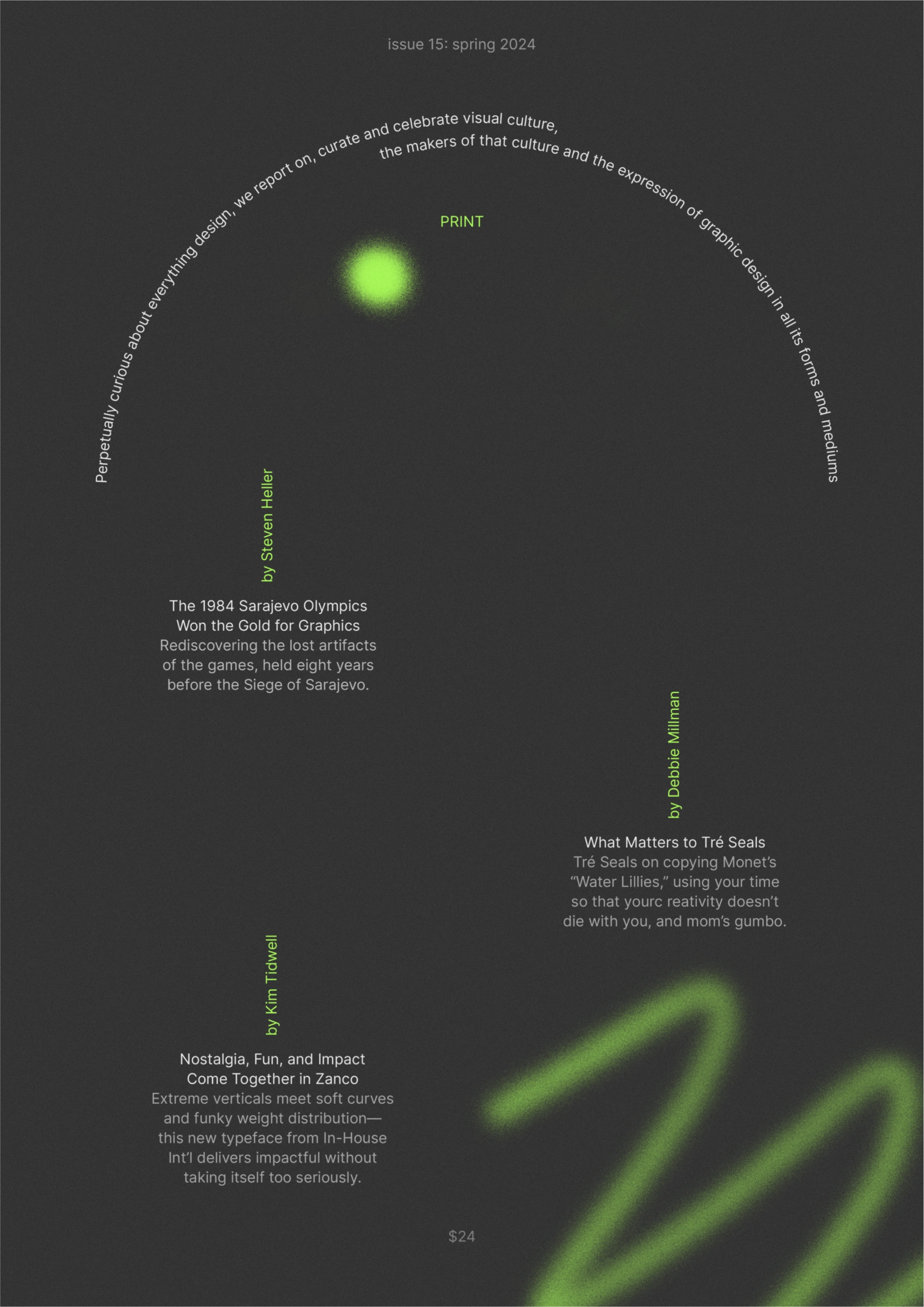
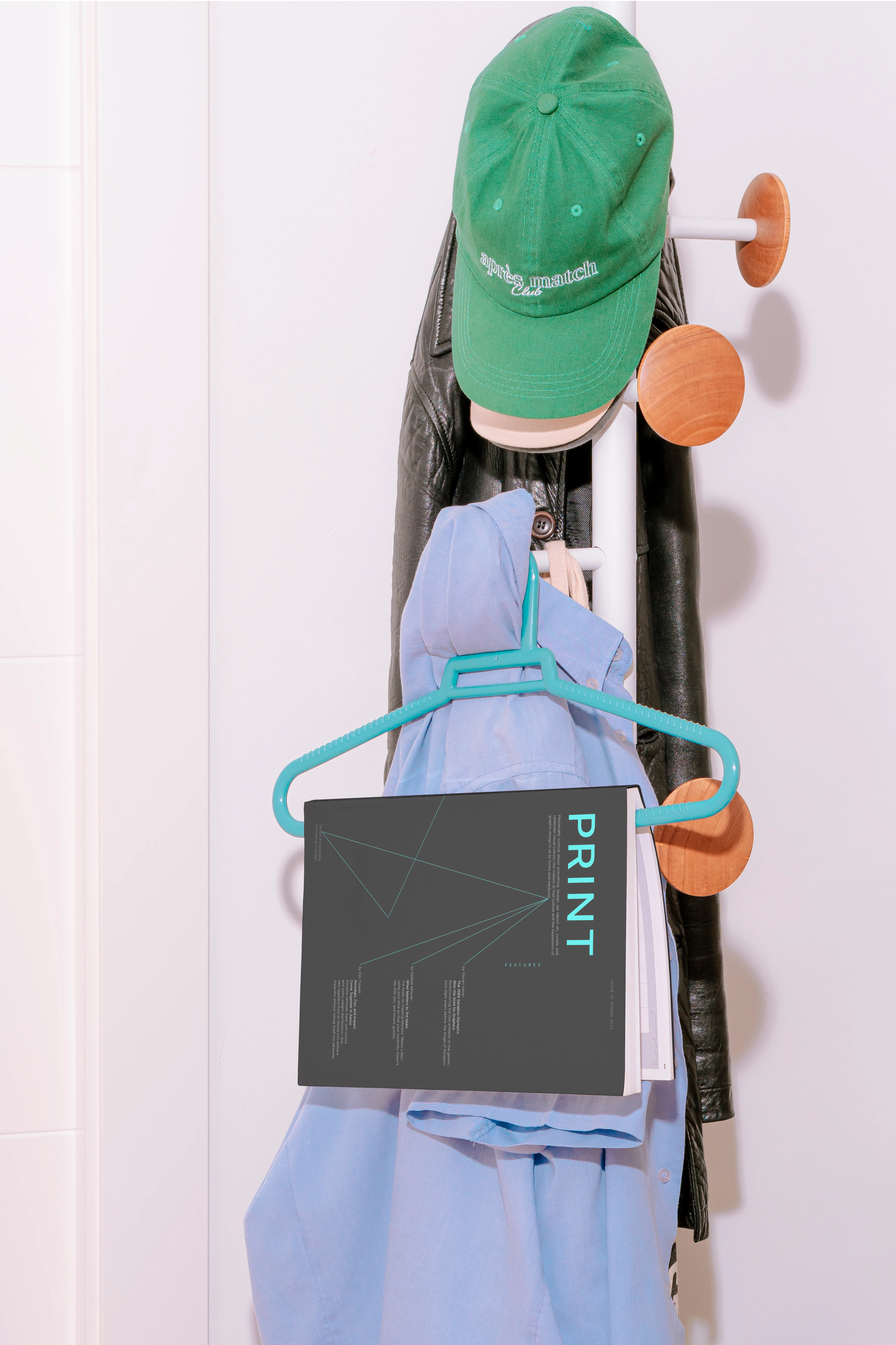
In this project, I embraced the challenge of creating magazine covers using the exact text and typeface. A unique aspect of this project was the "One Weight, One Point Size" concept for some covers, pushing the boundaries of creative expression within strict limitations. The main task was to maintain readability and hierarchy, adhere to compositional rules, and effectively apply typographic principles despite the constraints.
Typeface Used: Inter
Like this project
Posted Jun 4, 2025
In this project, I embraced the challenge of creating magazine covers using the same text and typeface.