Poof: Real Skin, Real Stories, Real Light
Omar Qureshi
Poof: Real Skin, Real Stories, Real Light
The Collaboration
Poof is a local skincare brand that celebrates real, imperfect, and healing skin. When I discovered their mission — normalising acne and scars — I felt an instant connection. I collaborated with them as a creative director to create stunning, real-like content that Poof could use across their social and digital platforms without needing to hire influencers, UGC creators, or external agencies.
The result? High-quality visuals that elevated their brand feed, communicated authenticity, and delivered agency-level polish on a lean budget.
The Idea
The concept revolved around “real light on real skin.”
Acne-friendly products often hide behind over-retouched imagery. I wanted to flip that — showing skin as it truly is, under soft natural light, alive and textured.
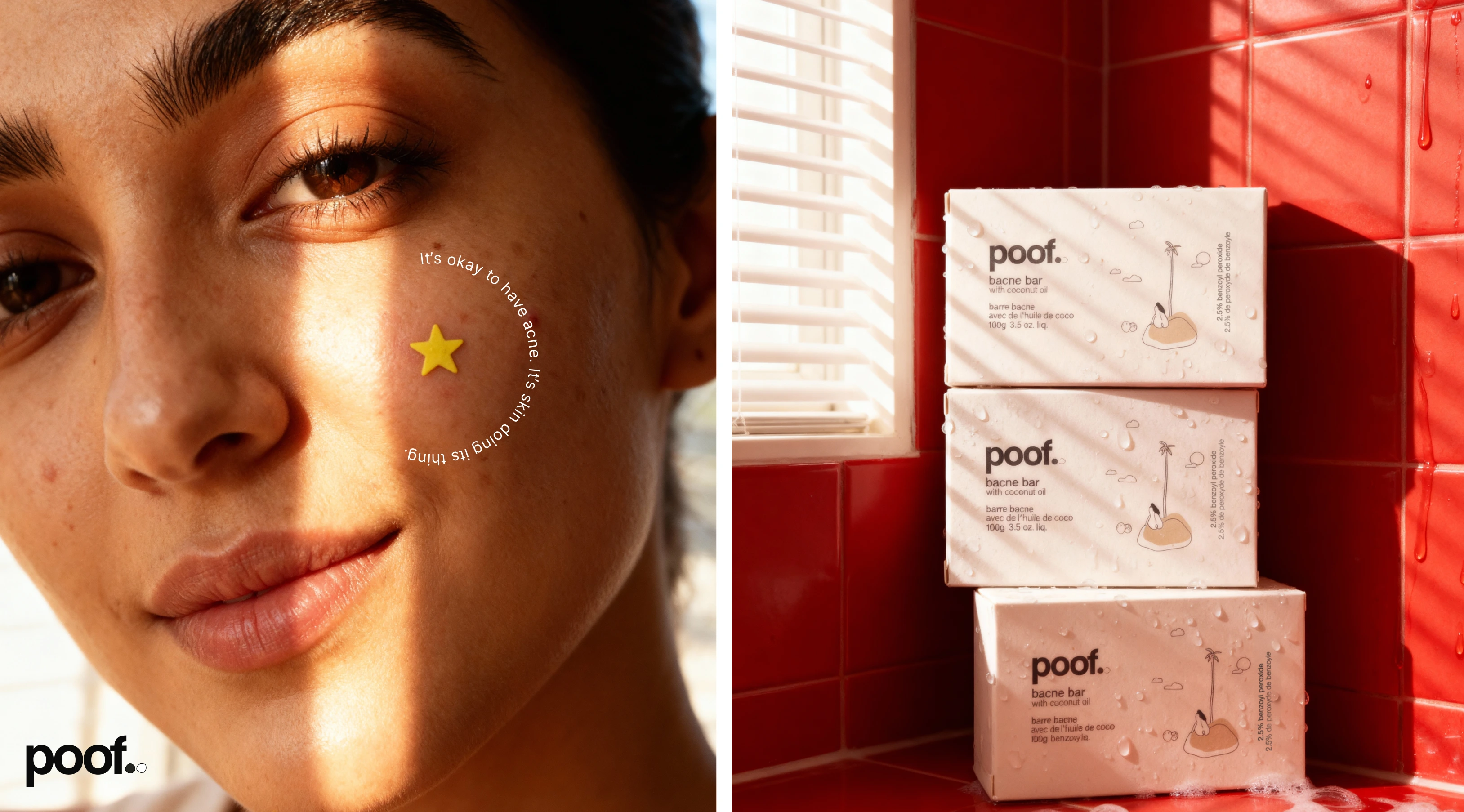
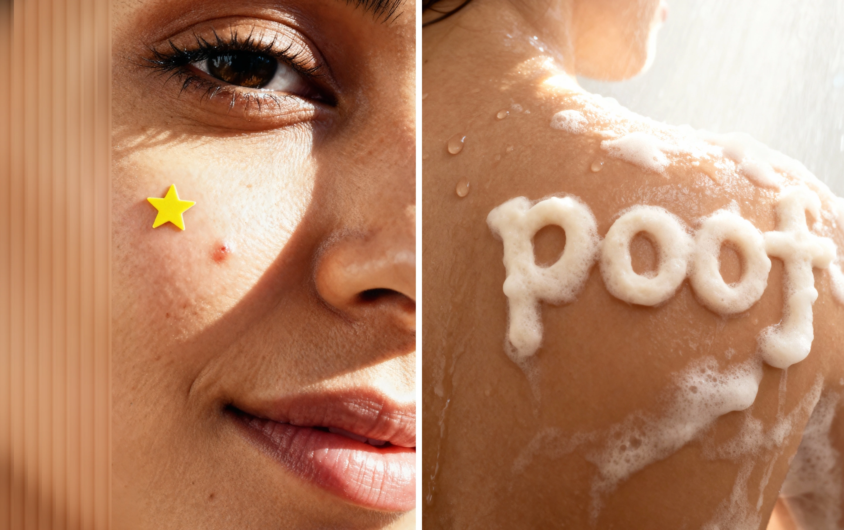
The creative direction took inspiration from morning light streaming through windows — warm, imperfect, and human. Each image had to feel like a quiet, confident exhale: the kind that says “it’s okay to have acne — it’s just skin doing its thing.”
The Process
I combined AI visualization & style prompting with basic product photography to build a cohesive visual world that felt both aspirational and attainable.
Workflow:
References & Style Guide: I started by collecting mood-boards from Poof’s existing identity and socials, and built a visual direction that balanced clinical calm with sunlight warmth.
AI Tools: Used ChatGPT & Nano Banana to generate a model that served as the face of the brand. Thereafter, using Seedream 4.4k by ByteDance, I generated renders that established composition, texture, and tone.
Photography: Then, I captured real product shots with my iPhone — focusing on natural light, condensation, and skin texture that served as product references which I fed back to AI. These grounded the AI renders in real-world tactility.
Post-Production: Finally, I used PS and LR to unify the color palette, retouch gently, and polish the compositions while retaining the honest feel of skin.
The Design System
The Poof packaging (as seen in the flat file) was a guiding anchor. Its minimal illustrations and friendly tone — “Did someone say SOS (Save Our Skin?)” — informed the playful realism of the visuals.

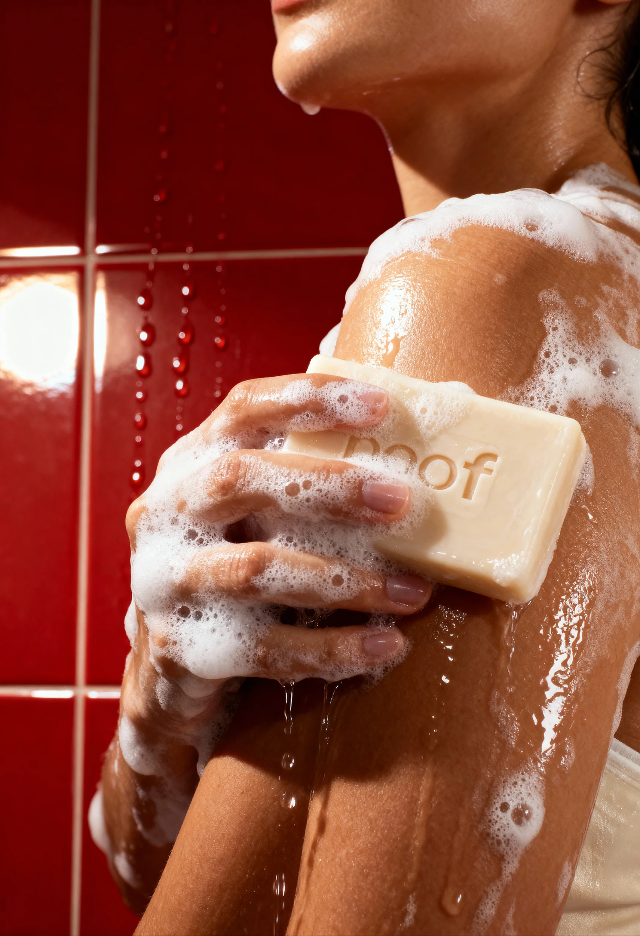
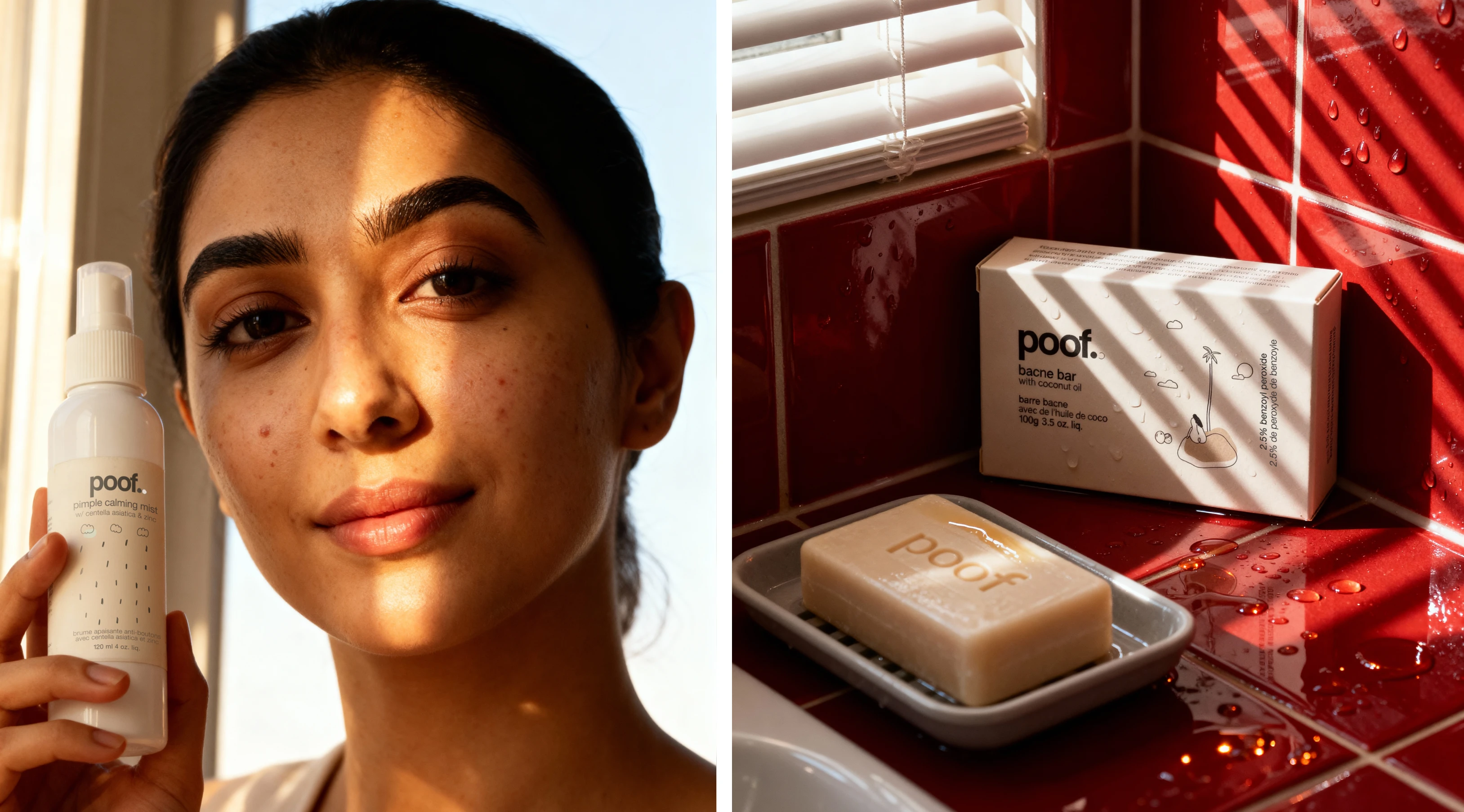
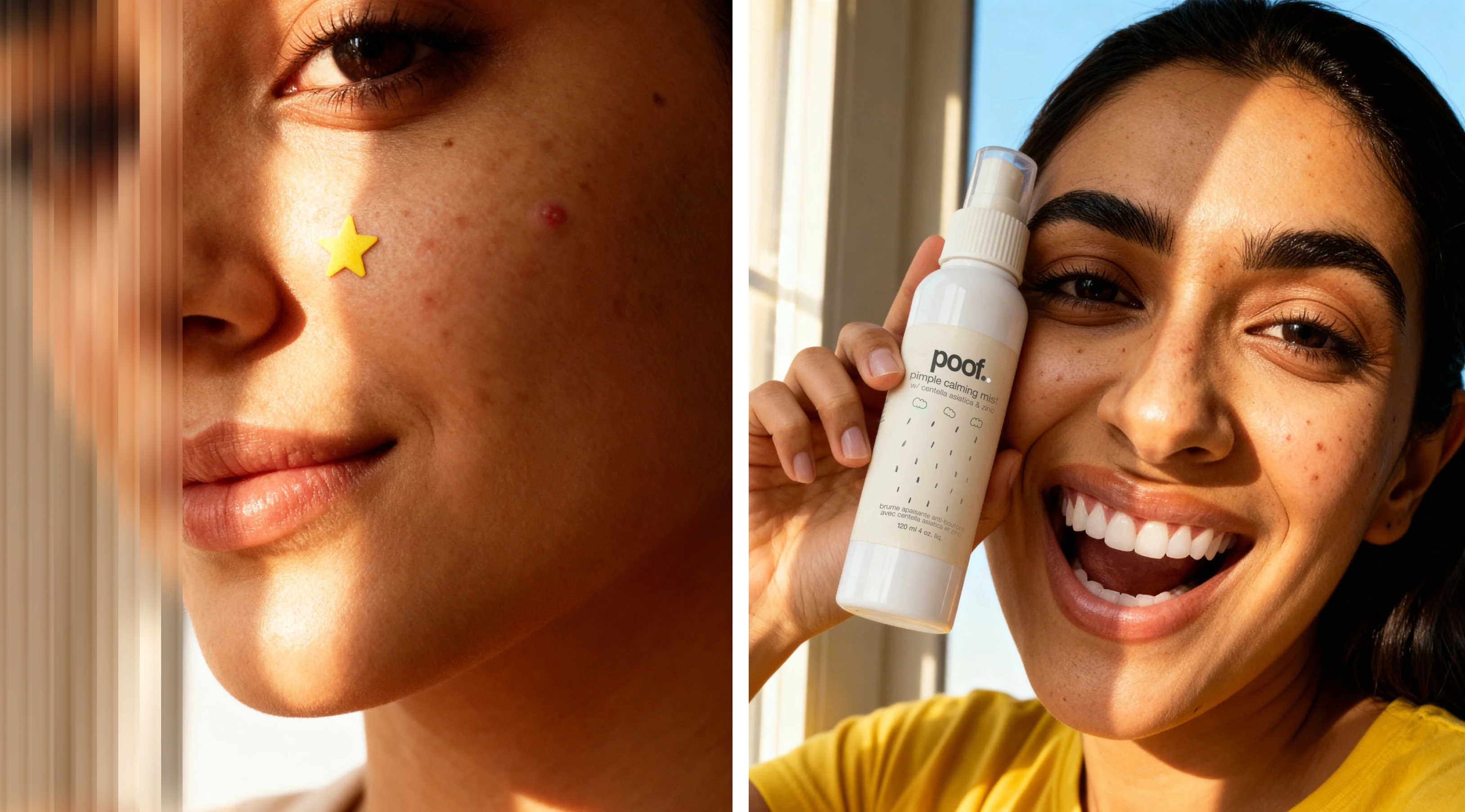
The pimple calming mist became the hero object — shot in warm beams of window light to echo self-care in stillness.
The bacne bar images were styled on red-tiled backgrounds, creating visual contrast while mirroring the energy of real bathrooms.
Typography and graphics were kept minimal to let texture1s and natural light drive emotion.
The Outcome
I packaged everything into carousels for Poof’s social media:
Hero renders for campaign visuals
Product detail shots for e-commerce use
Real photos to blend authenticity
Social post samples with copy (like the one reading “It’s okay to have acne. It’s skin doing its thing.”)
The final result gave Poof:
A ready-to-use content bank of premium imagery
A cohesive visual identity system
Reduced dependency on agencies or UGC creators
A refreshed feed that speaks the language of empathy, not perfection
Like this project
Posted Oct 15, 2025
Created real-like visuals for Poof's social and digital platforms, enhancing brand identity.