
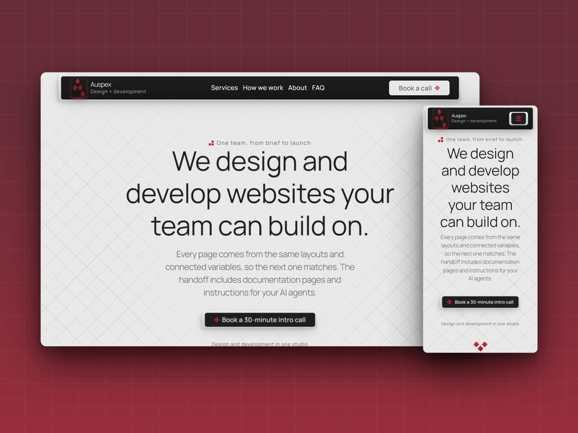
The hero on desktop and phone: one accent, one action
Role: design and development, solo
Scope: web design, design system, Webflow development
Screens: desktop and phone
Tools: Figma, Webflow, Claude, Codex
The brief
Auspex sells design and build to B2B marketing teams. The page speaks to teams with one problem: pages drift off brand as they ship them. It had to feel considered at first glance and prove, section by section, that the next page will match the first.
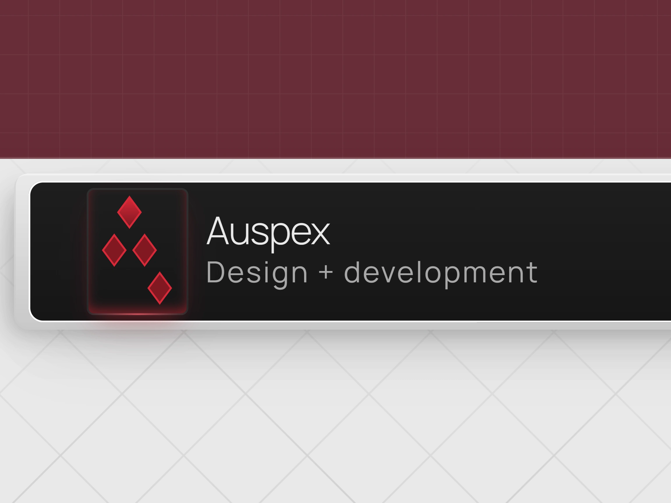
The logo: four diamonds, one piece repeated
The idea: one piece, many formations
The design has one piece: a diamond. The name was chosen to fit it. An auspex read omens in the flight of birds, and each bird is the same piece in a new formation. The logo is four diamonds, and the same diamond marks the small labels above headings and the background pattern. One decision, and the page holds together.
Web design
Color and type. Neutral grays and near-black, with one red accent. The accent is rationed: it marks the one thing that matters in a section, a button or a rule under a heading. Light sections carry the offer; dark sections carry the process and the start. Type is Manrope, picked from three pairings tested in real use. Headings at 400, body at 300. Only buttons and prices go heavier. No heading ends on a single word.
The page, section by section. Each section answers one question a buyer has, in the order they ask it.
Services: three project sizes with fixed prices and timelines, so the buyer picks before the call.
How it stays consistent: three role cards for brand, components, and pages. Each shows who works where.
The work: a bento grid of five tiles, framed as what a client receives.
Getting started: three steps on a dark ground: the call, the design, the build.
FAQ: a console with topic filters and search, for buyers who scan before they book.
Start: two ways in, a call or a written brief.
Motion. In the hero, the grid lights up in red around the cursor. On load, the grid unmasks from the top and the headline rises in.
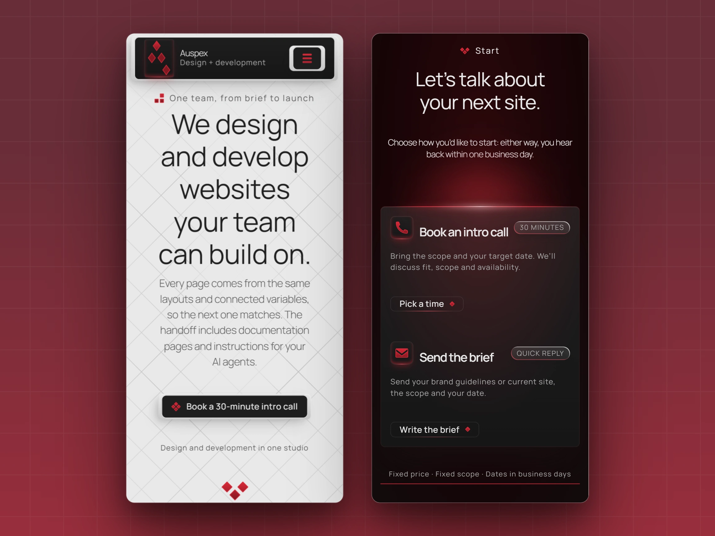
Responsive layouts, designed in Figma, developed in Webflow
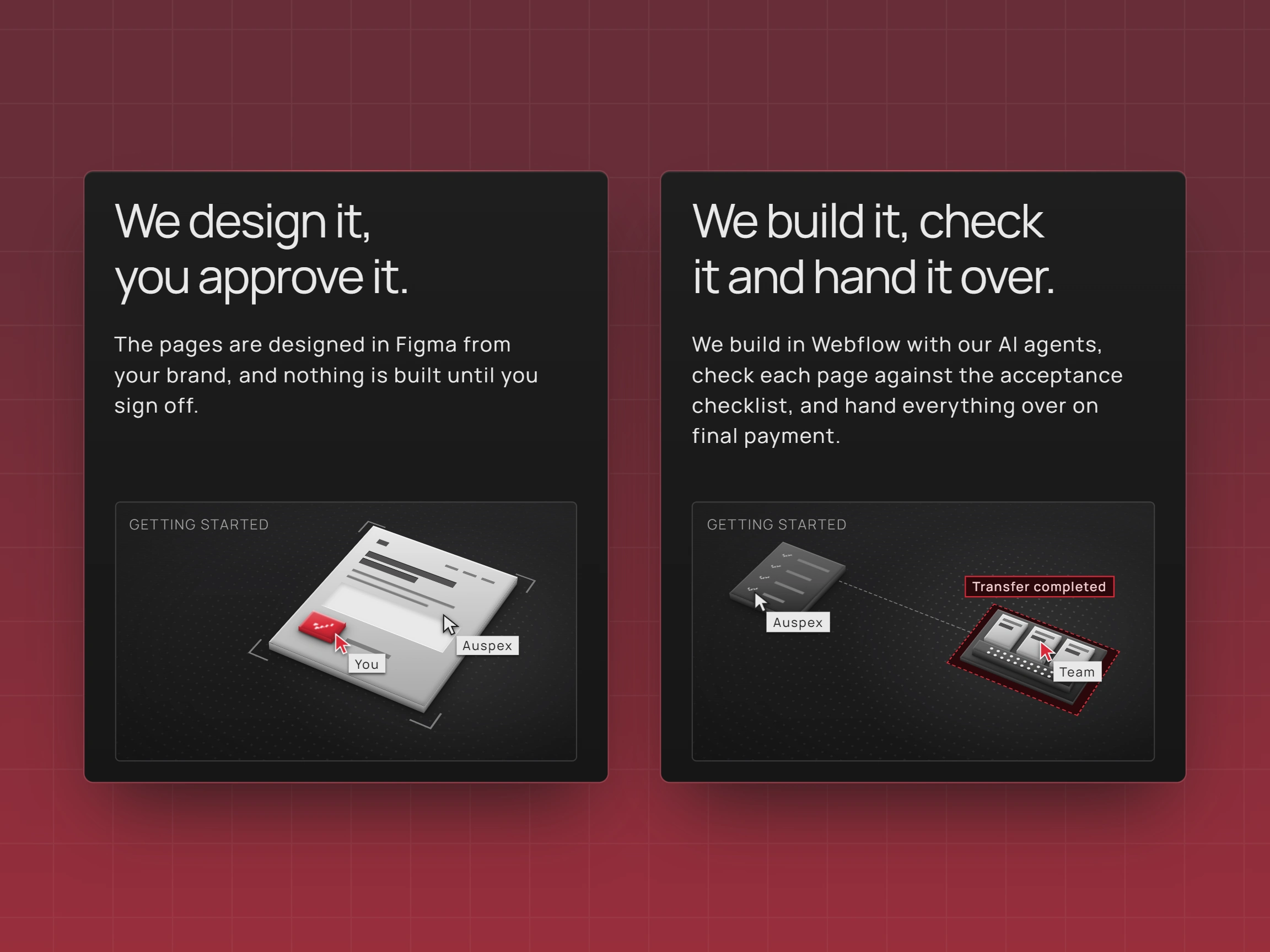
Getting started: three steps on a dark ground
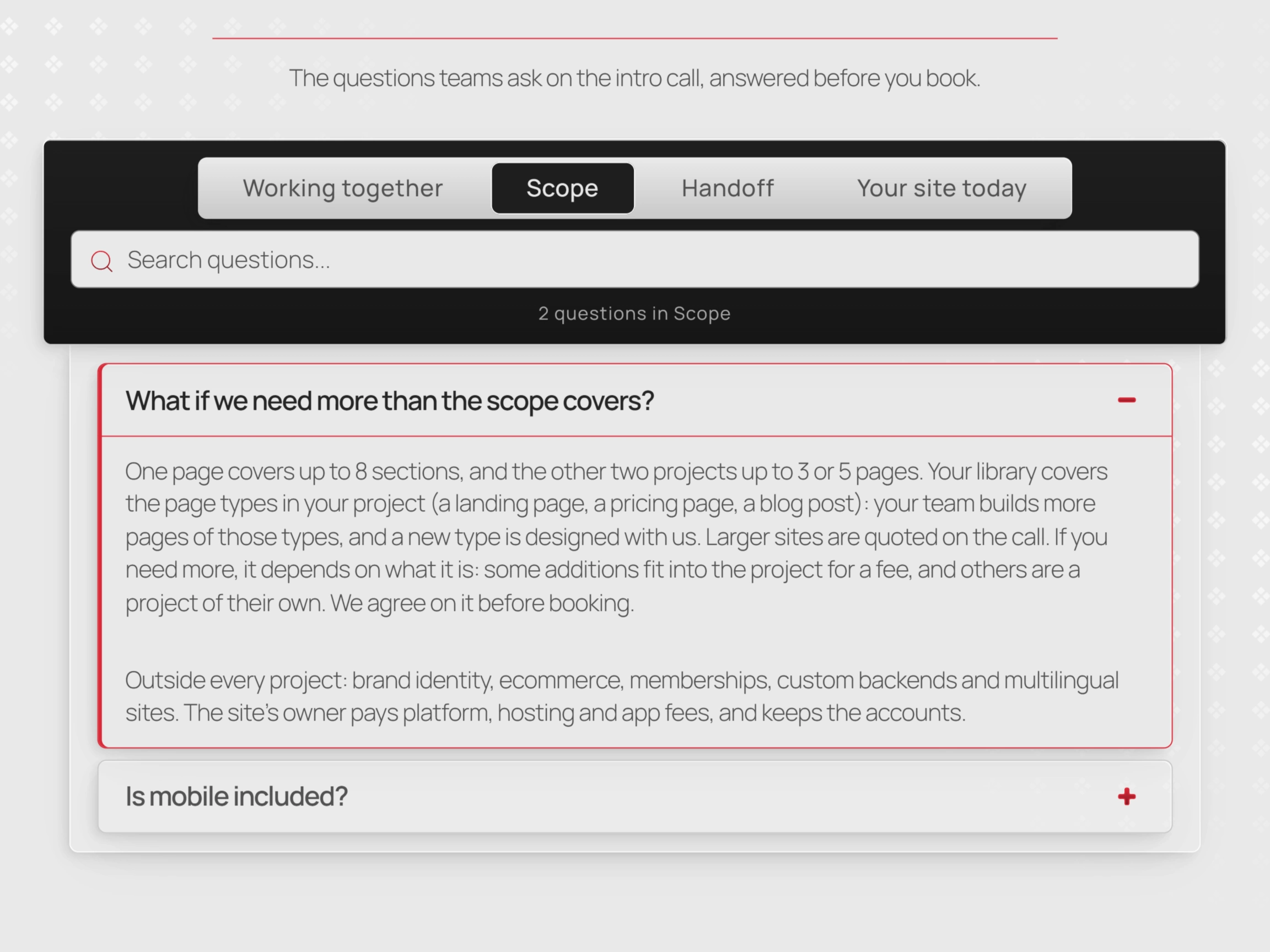
The FAQ as a console: filter by topic, search, then read
The design system
The page is built from a design system in Figma: color and type variables, then components (buttons, cards, accordions, the labels above headings), then section patterns made from those components. Every section on the page is assembled from those parts, never drawn one-off.
What that means for a client: your team adds new pages from existing sections, and they match the first. You make a color or type change once in the variables, and every page follows.
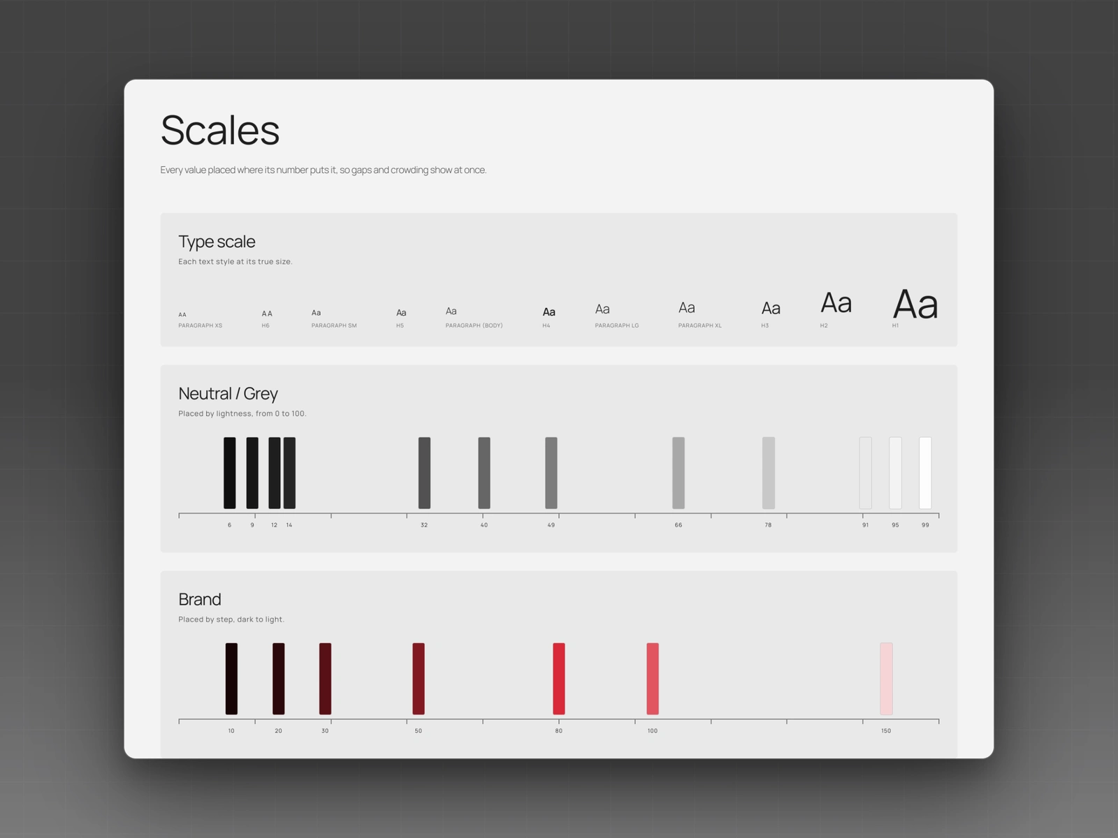
Typography and main colors
Brand and components
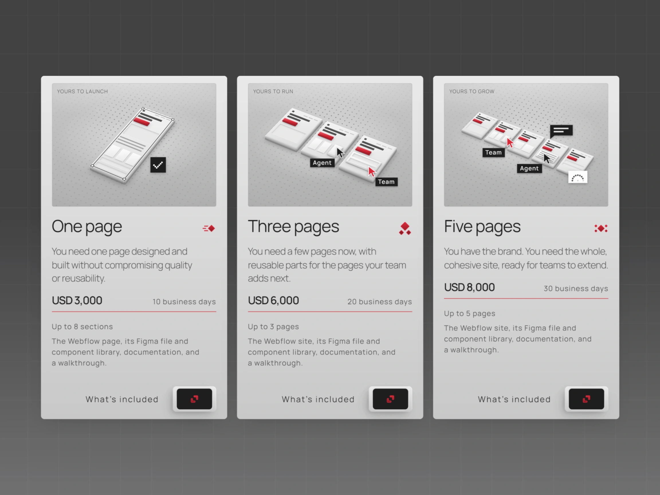
A pattern is a component made from other components
Desktop and phone
Designed at both widths, not scaled down. On the phone, each section is laid out for the small screen and the menu opens as its own panel.
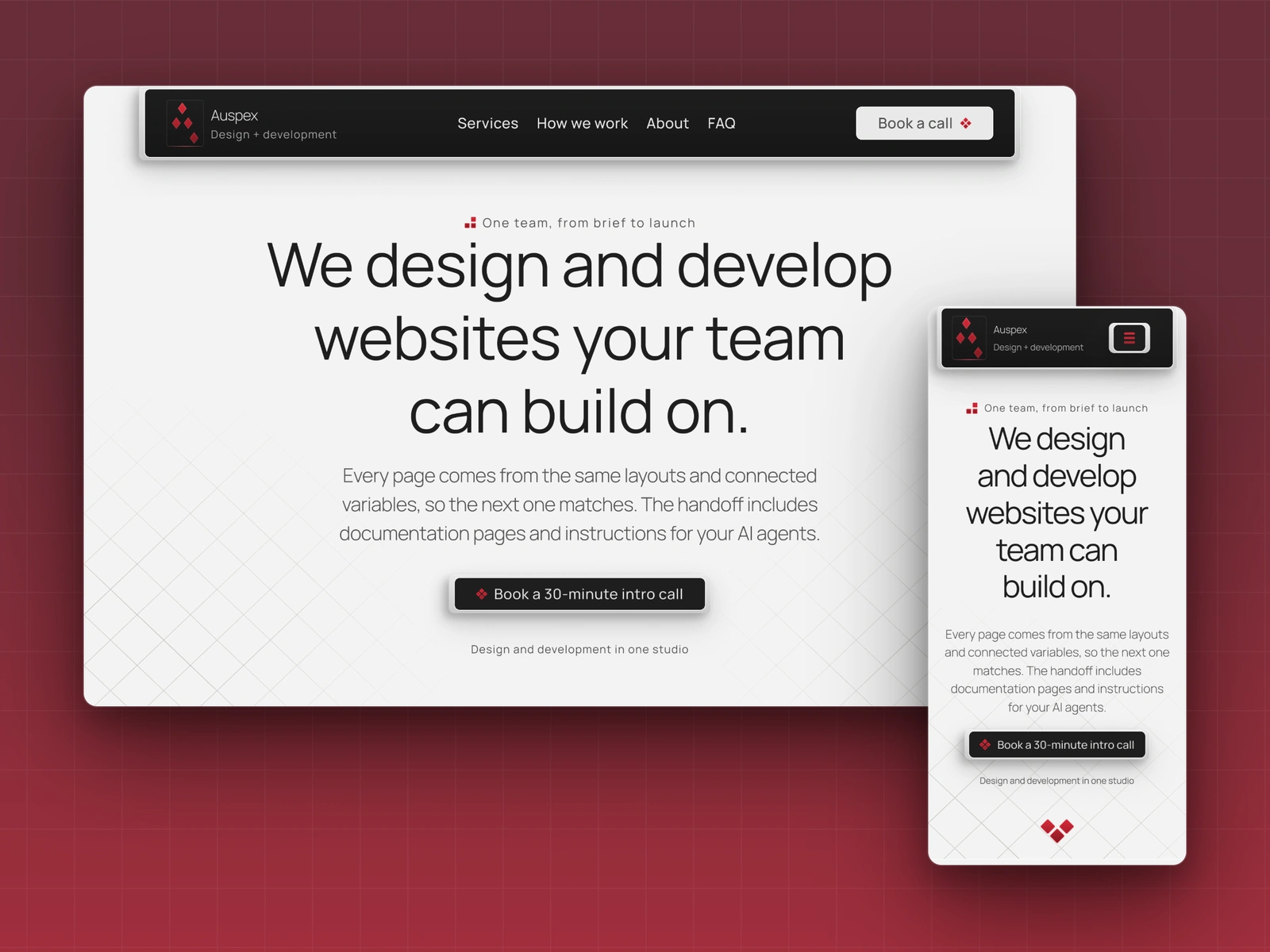
Designed for desktop and phone, not scaled down
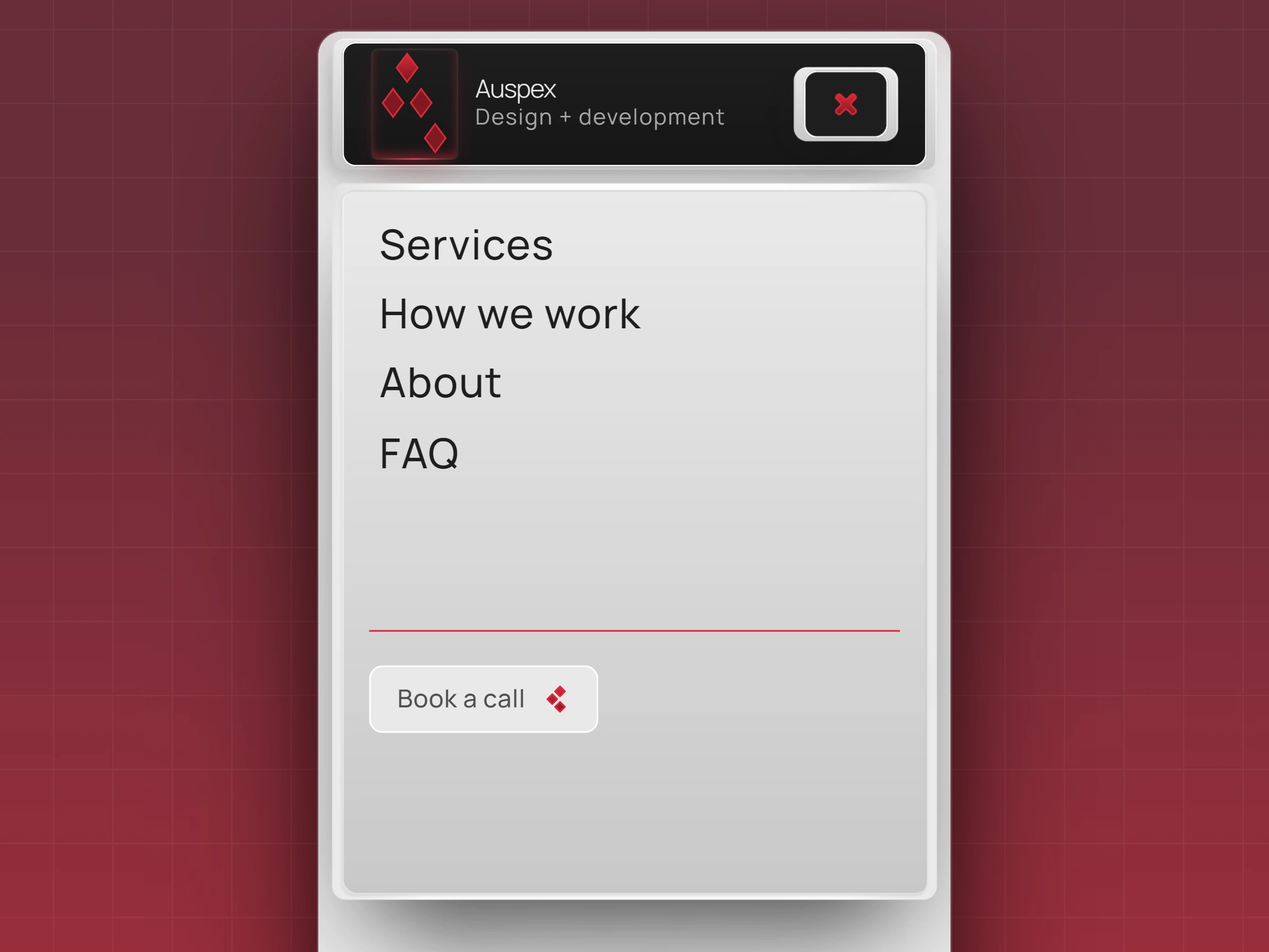
The phone menu opens as its own panel
Development
Built in Webflow from the Figma file. The same variables and components carry over, so the live page matches the design and the design system lives in the site, not only in Figma. Type scales fluidly between screen sizes. Tested with a keyboard and a screen reader.
What a client receives
The Figma file, with the design system: variables, components, and section patterns
The designed pages, desktop and phone
The Webflow site, built from the same parts
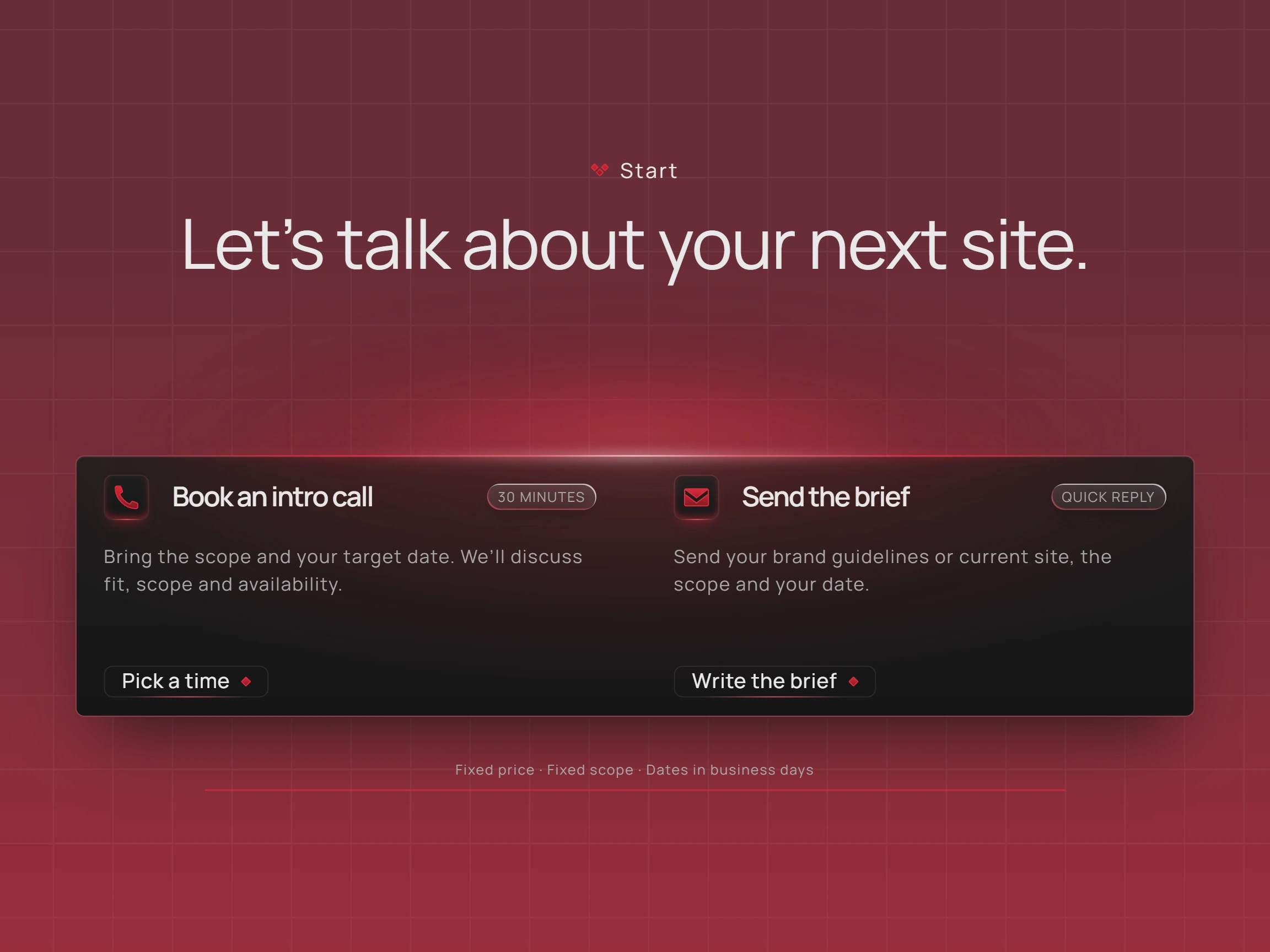
Two ways in: a call or a written brief
Your site next
If you want this level of craft on your site, start with 3 pages, designed in Figma and built in Webflow or Astro, in 7 days, at an introductory USD 700. You approve the design before I build, and the same person builds it.
Send me three things: your site or brand, the pages you need, and your deadline. Or order Website, 3 pages on my profile.
0 likes · 1 view · Nov 17, 2026
A landing page designed from one idea, so every section and detail reads as one brand, built on a design system your team can extend.


