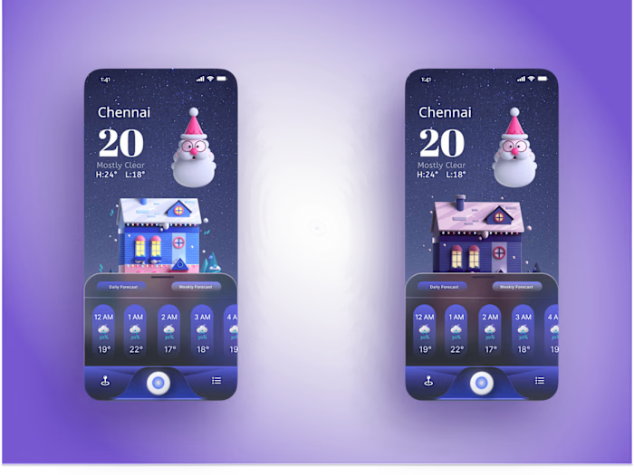
Mobile Navigator UI/UX
Designing mobile UI can be a challenge, especially when it comes to navigation. Figma is a great tool for designing mobile UI, as it allows you to easily create and manage your design elements. When designing mobile UI in Figma, you should keep in mind the following tips:- Use simple, clean shapes: when designing for small screens, it's important to use simple and clean shapes. This will make your design more user-friendly and easy to navigate.- Keep colors consistent: using consistent colors throughout your design will help create a cohesive look and feel. This is especially important for mobile UI, as users will be interacting with your design on a variety of devices with different screen sizes.- Use typography wisely: careful use of typography can make a big difference in the overall look and feel of your mobile UI. Be sure to use fonts that are legible and easy to read, and consider using different font weights or styles for different purposes (e.g., headlines vs body copy).
Like this project
Posted Jan 6, 2023
Figma Design
Likes
0
Views
31


