What if a car website

Amir Ostowar


What if a car website didn’t feel like a car website?
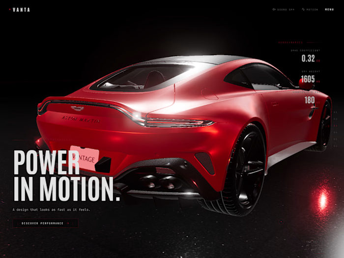
I wanted to explore that idea with Veyronis a fictional premium automotive experience built entirely with Lovable.
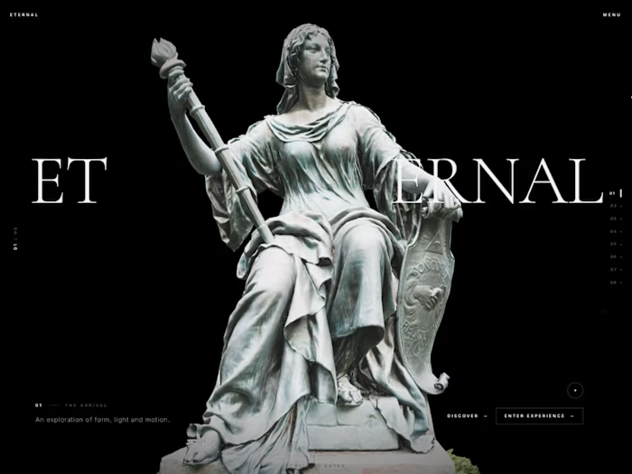
Instead of designing another traditional car marketplace, I focused on making the website feel more like a digital automotive campaign:
→ Cinematic hero
→ Scroll-driven storytelling
→ Editorial typography
→ Interactive vehicle showcases
→ Immersive collection sections
→ Motion-based transitions
→ Premium dark UI with electric yellow accents
The goal was simple:
Make the experience feel as exciting as the cars themselves.
I also intentionally created original automotive visuals and a fictional brand universe rather than relying on the usual Ferrari / Porsche / Lamborghini imagery.
https://voypix2.lovable.app/
Built with @Lovable + a lot of attention to motion, interaction and visual details.
Now I'm curious:
When you visit a premium automotive website, what matters more to you the visual experience or the actual functionality?
Would love to hear what you think 👇
#Lovable
Like this project
Posted Oct 2, 2026
What if a car website didn’t feel like a car website? I wanted to explore that idea with Veyronis a fictional premium automotive experience built entirely wi...
Likes
0
Views
1